I must insist I helped on Calin's tests.
- Welcome to Adventure Game Studio.
This section allows you to view all posts made by this member. Note that you can only see posts made in areas you currently have access to.
#2
Critics' Lounge / Re: New game- QFG style: Menus and background critique
Tue 22/02/2011 00:24:54
Progz is right. Unfortunately in my original post I did have some more helpful tips, but got lost. Skitt, pm me or hop on IRC and I'd love to help you out. I don't know of any general modeling tutorials on the internet though, I didn't learn that way.
#3
Critics' Lounge / Re: New game- QFG style: Menus and background critique
Mon 21/02/2011 22:57:36
Your animations are not great, but passable. The knee jerk, no natural arm movement, no head motion at all. Its the best thing you have up there.
I am a 3D artist by trade, (I can show you some work if you really want) I've been doing it for years now, and I can say with certainty you only have a loose grasp of modeling an animation. You have a loose grasp of proportions, shading, UV unwrapping, and basic modeling, but don't kid yourself. I'm happy that you like working inside Blender and modeling/animating, but you're trying to force a square peg into a round hole using AGS with 3D rendered sprites. Unless you're using a wireframe as a guideline, it simply looks out of place.
And your icons are just as bad as everything else. Badly photoshopped bits of the main character (instead of *actual* icons) look horribly uncanny and offputting.
#4
Critics' Lounge / Re: New game- QFG style: Menus and background critique
Mon 21/02/2011 14:15:54Quote from: mode7 on Mon 21/02/2011 09:12:42
- Extremely low polygon count
Another good point. Especially since you're just rendering out backgrounds, you can go into the millions on your polycount.
#5
Critics' Lounge / Re: New game- QFG style: Menus and background critique
Mon 21/02/2011 04:52:02
I had written a huge post on this when the forums crashed D:< So this is a much more succinct recreation:
flat character colors
bad shader on boots (plastic look)
sharp lighting removes the character from other rooms that would be lit differently
clipping on torso and hair
improperly proportioned legs and arms
badly posed fingers
no neck/spine/head movement on animation (otherwise its okay)
no no no no Papyrus font please
stats window far too big, buttons too big, etc
character portrait very weird, uncanny valley etc.
spell window far too big, fireball doesn't need a description (put spell descriptions in an optional window or the manual)
health/stamina/mana bars do not need to take up the entire top of the screen, especially if they're being covered by other windows, align them side by side vertical so you can quickly assess the levels of each in one glance (instead of three)
badly modeled environment geometry (use bevels so you don't get right angles)
bad texture work (rug, generic noise textures)
off center camera (lower the horizon some)
angle of camera does not match the perfect back view of characters
weird cloth/shawl on old man character on the neck (but decent modeling otherwise)
the old man portrait has the background of the room behind him, which makes me think that either he never moves at all, or he does move and you have a background for every conceivable position he could be in.
cave room has a generic noise texture that doesn't look like rock
shadows don't follow the light from the torches
torches look bad
wooden table has bad unwrapping / bad shading on legs, again, bevels!
wooden table / door sit weirdly on the floor
stairs in the cave look exactly like the walls, even if they were carved out they'd look different after use
cave mouth looks unfinished (pure blackness)
more unnatural right angles in the walls (in a cave, no less)
stretching in the cave walls/floor UVs
the combat action menu takes up way too much space than it rightly should
all the sprites have black outlines with bad AA
grass looks flat, boring, unrealistic
horizon stands out badly, needs some more back there to make it realistic, even cliffs don't look like that
rocks look oddly slapped on and not part of the world
This probably came out a little harsher than originally intended, but its the second time I had to write it all out. You've got some potential and can sometimes model well, so I'd like to see more of what you can do (and more 3D people on AGS.)
#6
Competitions & Activities / Re: Hourgame Saturday! 16 October 2010 - 7pm BST (8 games! play & vote!)
Mon 18/10/2010 02:38:02
I've improved Mars Attacks a bit (and added sounds :o), hopefully this new version is actually enjoyable by anyone other than bicilotti. Note that winning / losing is more tense than the original version.
Clicky clicky.
Clicky clicky.
#7
Competitions & Activities / Re: Hourgame Saturday! 16 October 2010 - 7pm BST (8 games! play & vote!)
Sun 17/10/2010 13:57:26Quote from: LUniqueDan on Sun 17/10/2010 11:00:12
Got a huge hesitation on this one, but despite of all bad things I said: Wyz for the winner!
(With Dual as the 2nd place, Cat's 3rd - the others were not really games)
Hey, mine was a game!

#8
Competitions & Activities / Re: Hourgame Saturday! 16 October 2010 - 7pm BST (8 games! play & vote!)
Sat 16/10/2010 21:47:58
I vote for Grundislav's, which made me laugh out loud.
#9
Competitions & Activities / Re: Hourgame Saturday! 16 October 2010 - 7pm BST (want early submission?)
Sat 16/10/2010 17:26:40
Woo! Finished. :3
#10
General Discussion / Re: Dig in, Minecraft [AGSCraft server]
Sat 02/10/2010 21:26:09
I'm ready for the server to be reset. Have some grand plans..
#11
General Discussion / Re: Dig in, Minecraft [AGSCraft server]
Sat 02/10/2010 14:24:47
Your whole house caught on fire mate. D:
#13
Beginners' Technical Questions / Re: Best way to insert a character?
Wed 29/09/2010 14:57:11
Character.ChangeRoom(room number)
Take a look at the manual as well, its all there.
Take a look at the manual as well, its all there.
#14
AGS Games in Production / Re: Primordia
Sun 26/09/2010 15:59:56
I'm excited to see this finished!
#15
Competitions & Activities / Re: Background Blitz: 22nd September - 6th October.
Sat 25/09/2010 06:29:26
Oh no, this almost slipped from my mind. D:
#16
General Discussion / Re: the Grandiose AGS Chain Chess game! [Intense Degree's turn!]
Wed 22/09/2010 21:41:38
I'm okay with resigning.
#17
General Discussion / Re: the Grandiose AGS Chain Chess game! [Virgil's turn!]
Sun 19/09/2010 01:48:40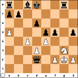
#18
General Discussion / Re: Yet another.... tablet thread
Thu 16/09/2010 06:19:04
I have an Intuos4 Medium (6x8 methinks) and its lovely. I mapped right and middle click to the stylus buttons and can function perfectly without a mouse, in everything I do, which is a lot of 3d modeling as well. The sensitivity is a bit overboard (2048 dpi), but its probably the last tablet I'll buy for several years.
If you draw as much as you say, certainly look into a cheaper bamboo, or an even cheaper brand to try it out. I don't ever go into a paint program without it.
Size is a big factor, you instantly get more precision on a larger scale with a bigger size drawing surface. The smaller it is, the more you are zooming in to get more precise linework.
#19
Competitions & Activities / Re: Background Blitz - Ends the 19th 23:59 GMT
Fri 10/09/2010 22:24:16
Ooh, fun. Did you do that pic loominous?
#20
General Discussion / Re: the Grandiose AGS Chain Chess game! [Virgil's turn!]
Fri 10/09/2010 09:09:50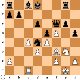
SMF spam blocked by CleanTalk