Menu

Show posts

This section allows you to view all posts made by this member. Note that you can only see posts made in areas you currently have access to.

Show posts Menu

Messages - Ykni

#1
QuoteI personally never use straight lines, I just don't like the stiffness, so I just use a large wacom tablet, and do everything by hand.

The reason the size of the tablet matters is that the larger the tablet is, the more you use your arm to control the pen, rather than your wrist/fingers, which leads to nicer more flowy lines in my experience.

@Loominous: So funny to read that you find it easier to draw straight lines on a larger tablet, my experience is quite the opposite. I find it much easier to draw smooth lines on a smaller tablet because I only need to flick my hand to draw a long line.

@Eric: I don't like rigid lines in a painted style much either. I had to change my painting style quite a bit when I started making portrait backgrounds in order to make them fit the comic style game characters. Because I don't have such a steady hand I usually do use straight lines to draw the edge of the painted objects, remove any painted bits that stick out and after merging the layers trace over the lines by hand with a blending marker. It ends up looking like this [imgzoom]http://i59.tinypic.com/k505g2.png[/imgzoom]
I wonder if a very painted style like in your examples could work for game art? Wouldn't it be very hard to animate a sprite in that style for instance?
#2
Critics' Lounge / Re: Board game squares
Wed 17/06/2015 23:30:12
I agree, leaving them white is too much contrast. Perhaps you could make them slightly transparent. Putting very detailed images on the tiles might look a bit cluttered.
#3
@Lasca: This is a helpfull tool for generating a perspective grid http://epicgames.com/community/2012/11/free-art-tool-released-thanks-to-epic-friday/
I think I found it somewhere on this forum and find it very usefull since Artrage (which I use to do my painting) has no perspective grid either.
@Misj': I've been wondering about the differences between painter and Artrage. Have you by any chance ever used Artrage?
#4
Just took some time to study all wop. Not many suggestions on my part because they all look very good to me and a lot of great feedback has already been given.

Loominous: Not much I can say about your background other than I think it looks amazing. I don't like the new foreground that you added. Even though I'm fond of this kind of framing I think in this case you can do without.

Cassiebsg: I like the round harbour and building, it has a very futuristic feel to it. I do like your previous cameraposition better though. Probably because it's more closeup which feels a bit cosier. I guess it depends on what kind of feel you want the place to have.

I just wanted to let you all know that I'm learning a lot from all the tutorials and thought processes. Thanks for spending so much time to give such great feedback and sharing your knowledge. This is a great, yet ??? experience.
#5
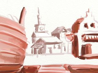
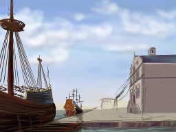
Thanks for the feedback guys. I'm struggling to decide which setup I like best, there really isn't one that feels good tbh. The improvements that Daniel made reminded me of my first setup. I now tried to combine both sketches.
+ =

The last scene isn't quite finished obviously. I decided to keep the big blue sky because we actually have a lot of those around here, pretty flat country :)
Looking at it now I realise that I lost all the intimacy of the small town in the combined image :( I should probably zoom in a bit closer.
I love the edit that you made Misj' I only saw it only a moment ago. It never occured to me to combine these scene's, it fits my story perfectly. I'll try to take both the cliff and the dock scene to the next level. Thanks for that great idea.
#6
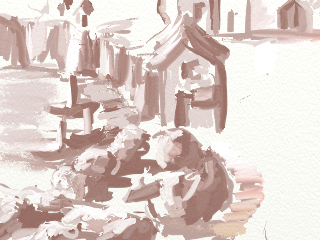
I'm sorry that I haven't given any feedback so far guys. I find it rather difficult in these early stages and my head is sort of a mess desperately trying to figure out how to fit all the requirements in the narrow space of a background. I don't like my earlier attempts so I tried something new. I am starting to see the benefit of doing a thumbnail first :D


What I like about this setup is the big ship that I can board, I'll attach a rope ladder so it's clear that you can enter the ship. I really liked the way that Ben made the harbour masters building stand out by it being the only building that faces us. I tried to mimic that, but adjusted it slightly and just made the other buildings stand further back and simpler, except the church but that will be in the very back. I think there is still room for some stalls and luggage. Still trying to figure out how to make it look dicey and I need to place the potted tree somewhere.
Other problems, the way south leads to the sea :S and there is no room for other ships other than perhaps a sloop on the right side of the dock.

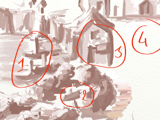
Got some  new inspiration from this image.

1. the docks
2. the path west leading down through the rocks to the docks
3. harbor master's office
4. market square that still needs stalls and a tree.


I've been thinking of a story as well. I'm actually working on a game (not sure if I will ever finish it but meh). The main character is a pirate that has been in some sort of trouble because he wakes up with a major headache trapped in the inn cellar. He only has a faint memory of a woman laughing and long red hair. When he realizes that he is trapped he manages to escape the cellar floating on a rum barrel on an underground river. He almost drowns when the water rises but with the help of a friendly ghostly pirate manages to escape and washes up on the shore of the island (just below the inn). He needs some way to get away from the island before his escape is noticed by his abductors. When he walks along the cliffs and reaches the beach, climbs up the docks and finds himself in this scene.

Ha, I do love bored panda. This could make an epic sf background, 3d cube with stalls and docks on different levels. It's all too clear why the plants are in pots. Doubt if I'm skillful enough to make it work though :( Thought it might inspire any of you guys though.

#7
Well ... I wanted to enter for this blitz, but the workshop is a lot harder than I expected. But at least I can still enjoy all the entries here :)
#8
Critics' Lounge / Re: Portrait Suggestions
Wed 10/06/2015 16:22:29
I would make the mouth a bit wider, and darkening the upper lip is a good idea as well. Adding lines from the nose to the mouth will make him look a bit more fierce, like this.
The arced brows are ok, though it gives him a bit of a surprised look. The brows in the image that you posted aren't arced that much. Here is a nice reference of facial expressions, the eyebrows play an important role in the expression but they should match with the other elements that make up the expression. So if you want to make him look angry, the eyebrows may be ok, but you should add some creases between the eyes to make it work.
#9
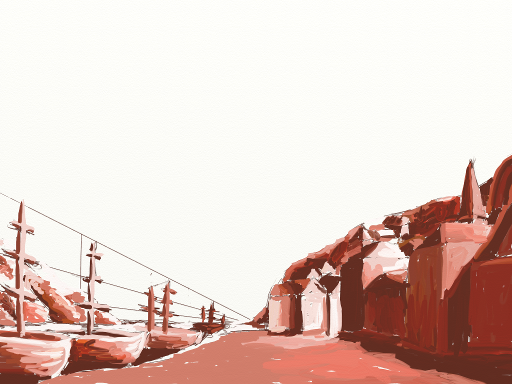
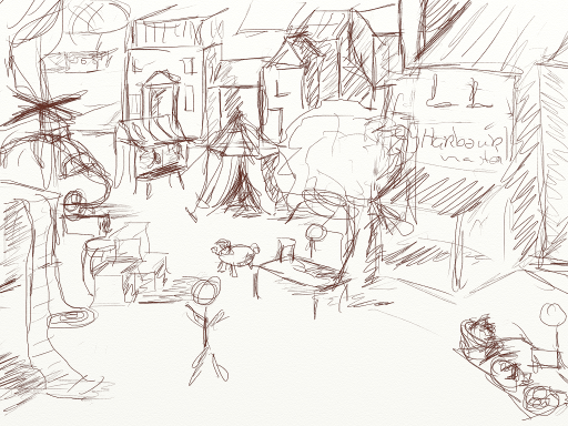
I'm a bit overwhelmed by the quality of the 'rough' sketches that you guys make. But here is my own attempt. I'm very much struggling with creating enough room to place the stalls on the market square. I was thinking about using the big white space overhead to add some branches with the hallucinogenic fruit. Probably going to make the coastline curving to the left so that the ships will not be so neatly aligned.


After reading the other info in this thread I think the first sketch probably has serious scaling issues. So here is a second attempt, the amount of items that has to be in there is giving me a serious headache. That's why I tried to find a way to make the most of all the space that I have. I think the ships could be airships as well, so that's what I tried in this quick sketch. I  noticed that I changed the perspective on this one as well, I'll probably have to lower it to make it more at eye level of the player.
This is the way I usually work, just a quick sketch to make out where thing go and then I start painting. Usually I don't make a study of values or composition (other then the sketch). I tried the golden mean, but I don't really understand how that works yet.

#10
Critics' Lounge / Re: Help with portrait
Thu 04/06/2015 22:56:20
That looks good. I love the way the eyes turned out. Makes her look very radiant.
#11
This will be quite a challenge. I can just see the scene when I close my eyes, hope I can actually paint it as well.
#12
Critics' Lounge / Re: Portrait critique
Thu 04/06/2015 00:10:01
Yeah it takes some time to get used to the pen and tablet. Did you know Artrage has a monthly competition where you can win a free Artrage copy? You might want to try that, it's on Deviant art.
#13
Critics' Lounge / Re: Help with portrait
Wed 03/06/2015 23:43:20
Wow she turned out very well. I don't think she looks masculine tbh. Perhaps raising her cheekbones a bit would make her look more girlish. A bit like this, where the cheekbone starts directly under the eye.

Couldn't resist trying how the higher cheekbones would look like

[imgzoom]http://i59.tinypic.com/mbn6dz.png[/imgzoom]

Perhaps I did a bit too much on the left cheekbone, but I think it works to make her look a bit more girlish. Also lowered the hairline a bit like Mathias suggested. Adding a bit of hair 'behind' her forehead seems to soften her looks.
#14
Congratulations to the winners.
#15
Critics' Lounge / Re: Portrait critique
Wed 03/06/2015 20:03:56
That is a very good start. Here is my first try at a portrait in Artrage :S


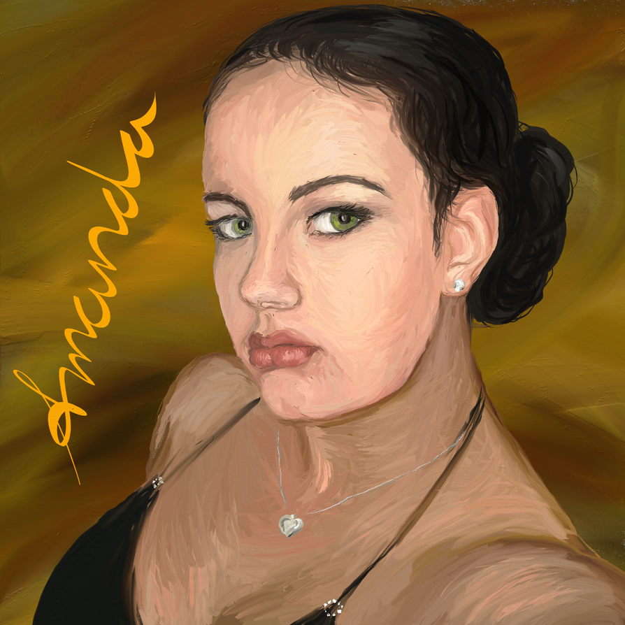
Artrage is my favorite painting tool so if you have any questions about that I might be able to help. I don't do a lot of portraits but I have made some, both in Artrage and in Acrylic on paper. There are some different ways to explore a portrait, the one that I like best is looking at the face, place your charcoal on the paper and just start tracing while you continue to look at the subject. Don't take your charcoal of the paper, just lessen the pressure when you move from one area to the next when there is no clear line visible. You keep on doing that, just tracing the face over and over again. This leaves you with a very lively sketch of the face. Here is an example of a self portrait I did in Artrage, closed my eyes to make it a bit easier on myself ;)


You always start with the nose when using this technique because that way your portait will always be centered on the paper. This doesn't give you a good basis to start painting.
As for the blending. I do think the demo version contains all features. I usually use the ordinary round brush for painting in Artrage, but I do turn autoclean off when I want the colors to blend better. I don't mind seeing the brushmarks though, in fact I rather like that about Artrage. I usually just apply a series of small strokes and let them visually blend. For a smooth look I would use the pallet knife in blur mode on these strokes. Here is an example of an avatar that I made in Artrage using this technique for a friend.


I think you used a pen to paint the eyelashes and eyebrows. I think it would look better if you use the brush for that as well. The pencil doesn't blend with the rest of the paint, the paint on the brush does which gives your painting a more natural look. You can see that in the image above with the hair on the forehead. The brown paint mixes on canvas with the skin tone paint, which gives a lighter brown paint.
Some advise on the hair. Use the dark color to paint the hair, don't paint an area but use a wider brush and paint long strokes following the flow of your hair. Then use a light color to paint the highlights in your hair, again using long curvy strokes. The brighter color mixes with the dark color giving a wide variation of shades.

I hope this helps you improve your Artrage/Portrait skills.
#16
Woot :-D Thanks to all the people that voted for my entry and a big applause for all the participants and GreenBeams for making this a fun competition.
Congratulations to all the winners!
#17
I don't know the other workshops, but I think a way to keep the focus in a workshop is starting with a clear goal. That way if during the workshop some other interesting aspects of background making arise they can be addressed in a separate workshop. That would be a way to keep momentum and focus. This might also solve the issue of the different styles, some topics are relevant to background making regardless of style and some might go into specific techniques.
#18
1a. I'd be interested in participating, provided the timing suits me: yes, I would love to participate.

2a. The best time period for me would be: Before August or else after the end of September. During that period I'll be doing a lot of painting on my walls ><
2b. The ideal duration of the activity for me would be: Not sure, somewhere between a month or 6 weeks?
2c. On average, provided that the timing suits me, I would probably be able to spend this many hours peer week during it: Not sure, there are times that I spend all my evenings painting.

3a. I feel comfortable with the concept of composition when it comes to paintings (as in giving and receiving critique regarding it): Yes, even though I'm not a pro I have had some training in traditional painting.
3b. I feel comfortable with the concept of values when it comes to paintings (as in giving and receiving critique regarding it): Yes
3c. I feel comfortable working with thumbnails when it comes to paintings: I have no idea what you mean by that. How would you use a thumbnail for you painting? So nope.
3d. I feel comfortable giving critique in general regarding other's pieces: Yes and receiving critique as well :)

4a. I would be interested in providing a tutorial in some area: I suppose I could do something about how to paint in Artrage if people would be interested in that. But other than that I don't think I'm accomplished enough yet to be teaching other people.
4b. I would be interested in participating/help in some other area: I'm not sure how a background workshop would work, so I don't know what I could help your with. But I'm willing to help if I can.

5a. Some general thoughts/suggestions: Since I'm a complete noob when it comes to making game backgrounds I'm very interested in finding out what makes a good game background. What king of things I should pay attention to, like scaling issues, walking area's ...
A part of the workshop could be analyzing good or bad game backgrounds and discussing them on the forum.
One other thing I have been wondering about is what tools you guys use for making the backgrounds. I paint all my backgrounds in Artrage, but I have been wondering about what other tools to use and their strong and weak points.
#19
Just for the record. I do appreciate the feedback on my background, so thanks for that Snarky.
I usually make portrait backgrounds for the puzzle pirates competition, so making actual game backgrounds is rather new for me. In the portrait background competition thread we use that thread to post our work from early sketches to the final work. That way it's a constant process of giving and receiving feedback and advice. I really love to see all these works in the early stages and to get feedback during the making of my backgrounds. Would that be something that we could do here as well?
#20
1st: Anke, such a great idea
2nd: Bohnito, beautiful design
3rd: Mokho, 3D >>

Love this theme AprilSkies and great entries guys. I enjoyed watching all the fine artwork.
SMF spam blocked by CleanTalk