Menu

Show posts

This section allows you to view all posts made by this member. Note that you can only see posts made in areas you currently have access to.

Show posts Menu

Messages - Zaidyer

#1


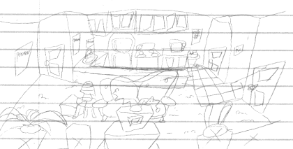
Well, because you guys asked for it, I guess I can put this up too. It's the classic Sierra-style version, modified slightly.

The template file is for AGS 2.72 and uses some old functions, so I don't know how well it will work in version 3.


Download the classic template here.
#2


Lately I've been working on a possible new interface/template for RoN based on Zabnat's "Punch Drunk Allen Trilogy: Chapter 1" demo.
To be honest, I think the classic Sierra interface is on its way out. Most people only bother to use it for the sake of tradition or nostalgia. And in RoN's case it means you have to come up with five different interactions for every hotspot. Most authors don't even do that. It's time for a change, I say!

In this new template, there's only two basic actions: Left and Right click. I dare say I'd pare it down to just one action if it doesn't test well. You can use and combine inventory items of course, and as a courtesy you can move around with the arrow keys if you want.

DOWNLOAD the alpha demo here.
Right now, only a few hotspots are actually set up to say or do anything interesting. I'm also working on the menu... I think a map and a built-in hint system could replace the non-functional buttons, but those are a little complex.

Would you want to use this interface? And would you want to play a RoN game in this style? Go on, post your comments.
#3
I'm having a really hard time at this.

I want to design an adventure based on my sci-fi comic, Spacedust.
Because of the detailed character designs I'm using, each character is very hard to represent as a low-res sprite in a 320x200 adventure game. Take a look at Gene, for instance:

Example of Gene in the comic
Full-body example of Gene in color (minus some details on the jacket that were added later and appear in the comic)

Gene's head and jacket are full of lines that define shape and detail. In a Spacedust game, he would be the star. But I'm having trouble drawing sprites for him.
Here's a rough, incomplete try at a sprite. (No shading or color adjustments.) I just shrank Gene's profile image and drew over it, with minor liberties.


Here it is on a 320x200 screen:

Seems a little big, though. But so far, my efforts to trim him down have proven horrid-looking.
I feel like I'm missing something. Feel free to make any comments or suggestions.
#4
Sphinx died because it was a project to create one large central game, instead of RoN's episodic universe model. That's where RoN lends itself to a greater degree of independence and freedom in terms of game design. I think if you want to "revitalize" RoN, you'll have to organize it better and offer more support for the average game designer. With that in place, you'll be able to add a few more rules for the sake of quality.


  • NEVER kill off an established character.
  • NEVER reveal the bum's true identity.
  • RoN is episodic. Things that happen from game to game are considered self-contained, and do not necessarily need to be referenced in future games.
  • Don't steal graphics from other games.
  • Learn how to draw before attempting to create a graphical adventure. (To that end, a tutorial will have to be written for an easy-to-follow style by someone proficient in pixel art. That said, it would most likely be superior to the style established in the first game and all subsequent derivatives, but really, it's time to move on.)
  • Be advised that anything you add to the RoN universe will be mercilessly exploited by the RoN community. Try not to use characters or situations you want to keep for yourself.
Additionally, I would offer a few crash courses in Adventure game design in general, such as Yahtzee's "Depressingly Common Adventure Flaws" series, a few websites and tutorials to learn pixel art and background art, how to write a good story, and so forth.

It all comes down to the fact that RoN needs more organization than it currently has.
#5
I've always felt that there are certain things about RoN that make it a challenge to work with, and not in a good way.


  • No quality control. Some games are fun, but others are terrible wastes of time. Pretty much anything by Captain Mostly seems to be surreal attempts to dismantle the series, and poor Mika Huy keeps getting stuck in crappy dreams.
  • No unified art style. Really, it's all over the map. If you're gonna let just anyone write a RoN game, you should at least teach them how to draw. Sphinx got it right by including art tutorials in their wiki, establishing a style simple enough that anyone who knows how to work with pixel art can pick it up. And for those who don't know, tutorials exist to teach the fundamentals.
  • Series canon has become too rigid. "Davy Jones C'est Mort" should have been ignored immediately, but it wasn't. From that point on, every little detail in every little game has piled up to create quite a big mess that new authors will be hard-pressed to break into.
  • Community support for new authors is low. Ideally, there would be a RoN wiki to point new authors to, with links to only the most pertinent articles they'll need to build games the RoN way. Currently, that doesn't exist. All you get is "You're building a RoN game? Cool! We'll wait."
In my opinion, all of these problems need to be addressed for RoN to be fixed.
#6
This is a fun, short game. The ending was not entirely unexpected, but I liked it. The music is especially good and really breathes life into the game, too.
#7
The copyright holder always has a legal right to shut you down, but they usually choose to let it slide as long as you're not profiting by it.

This, however, does not preclude the possibility that your web host will shut you down on their behalf, fearing legal action. And if you happen to have enemies, it's possible for them to take you out by pretending to send a cease and desist order.
The best way to go about a fan project is to keep it under wraps until it's ready.
#8
Here's another update:

This time, he's a little shorter. I reduced his height to 73 pixels so that he would fit better in a playing field that is only 144 pixels tall. I also tried to correct the perspective a little bit... Shading is still not final.
#9
Gosh, my little topic seems to have snowballed quite a bit!

Let's do a quick comparison between my character and Bernard.


The two are relatively distinct from one another, but the inspiration should be obvious. I think that's where these paint-overs sort of got off track... They changed the overtly cartoony intention of the original design too much. Now we're talking about things like realistic lighting and hair. That's good advice, but it doesn't apply to this particular art style without changing it completely.

I'd prefer to think of the highlights as coming off of a light source that is most convenient for the readability of the sprite. Usually, that's somewhere in the air above the sprite and off to the side a little, between the character and the fourth wall. The importance of highlights is also another factor: I prefer to save them for the final touch, after the main sprite has already been established. It's icing on the cake, especially for a cartoon character.

As for the hair, well... I don't know what I'm going to do with it to make it stay consistent, but I'm not going to change the style unless I can figure out something appropriately wacky. Still, I may have to go back to the drawing board before I continue.
#10
I'm now working on the front view. Here's what I've got so far, side-by-side for comparison:


This is the part where the extra highlighting has come back to bite me, since it's a bit tricker to figure out how to make it look right on this pose.
#11
Here's a progress update so far...


And here it is in a game:


A few things are going on here. First, I changed the color of the walls. I chose purple, but it could probably be some other color. It's supposed to look like a pitiful old shack that was decorated in the 70's, so suggestions and simple paint-overs would be helpful.

Next, I went over most of the picture elements with anti-aliased brushes to smooth off the hard edges. I might possibly re-draw the furniture, though, since they're unimportant set pieces. Right now the bright colors and harsh edges make it look too much like the player should be interacting with them. (Only the TV Set is intended to be a usable hotspot.) Suggestions here would also help.
#12
Critics' Lounge / Re: Robot Sprite
Mon 09/04/2007 14:37:23
If you're going with hand-drawn graphics instead of pixel art, you'll want to figure out a way to make sure the final sprite has a solid-color outline, since AGS can't do alpha-shaded transparency and the jaggies will look pretty bad.
Try adding a background layer below the finished sprite, filled with a dark, solid color. When you save out the image and go to tell AGS what's transparent, you'll end up with a nice clean outline.
#13
Backgrounds are probably my weakest point in adventure game design. I spend more time on character art, so my experience with background art is low to non-existent.

Here's a preliminary sketch I'm using to lay out the room and the objects in it:


And here's the current progress at painting it in:


I'm at a loss as to how to work with this. The idea here is to emulate the "wacky" exploded perspectives of Day of the Tentacle, but it's never easy. I'm also having trouble with colors and painting techniques, so for now I've just left it all at hard edges.

If I can't figure this out I may have to ditch the motif here and go with a regular perspective in the Super Jazz Man style, where the entire background is treated as pixel art instead of a small painting. Either way, suggestions and advice are strongly encouraged.
#14
Critics' Lounge / Re: Robot Sprite
Sat 07/04/2007 06:00:15
Q-Borg?

It's rather flat for a character that large. In fact, it seems a bit too large, even for a 640x480 or 800x600 screen resolution. Looks like this was thrown together in less than five minutes.

I seriously recommend picking a screen size for your game, then drawing your character to fit inside it. Try also to give the character a bit more personality. Sure, it's a robot, but what kind of robot is it? How big is it? What does it do? Is it some sort of wacky bugle-droid, or does it serve some other purpose?

Here's a really quick sprite to give you some ideas on what to do to give this thing a bit more polish so he'll fit into a game environment. It's not perfect by any means, but I hope it helps.


First of all, this is much smaller. It'd work in a 320x240 environment as a rather large boiler with feet, or a miniature basketball-sized machine in 640x480.
Without much to go on, I've given him a shiny chrome exterior. There's also a vague impression of a riveted seam on the main body, because one-piece robots aren't very interesting or practical for the guy who has to get inside and work with the machinery. To keep the colors simple and effective, I gave him glowing green eyes. Looks much more like a robot with these visual cues.

I hope this helps. Designing a character sprite for a graphical adventure takes a good deal of thought and planning.
#15
The highlights are more or less an extra step that requires very little work. Crafting the sprite from nothing more than a piece of black-and-white concept art took an hour, but adding the highlights took ten to fifteen minutes afterwards. Plus, that's only four extra colors in addition to the base 12 of the sprite, making an even 16.
Day of the Tentacle was limited to only 8 colors per palette. There are a lot of places in the original game that would have benefitted from twice that amount, such as Doctor Fred's curiously jaggy lab coat. Most modern animated cartoons use simple color highlights anyway... What makes this different?
#16
I had some time today, so I decided to redraw the sprite. Unlike last time, I shrank the concept art and used it as a basis instead of just winging it. The result is actually a big improvement.


I also took about 10-15 minutes to do a really quick highlighting job. I originally didn't want to do it that way in case it killed the style, but it's starting to grow on me.

#17
From concept art to game sprite:


Not exactly a one-to-one conversion, but the concept art helped tremendously in setting up the character design. This is probably the third or fourth shot at this character I've taken so far, but every improvement helps. I'd say it's a strong match for the Day of the Tentacle art style by now, but I'm looking for ways to improve and bring him a little closer to his initial conceptual design, without making him too busy or difficult to animate.

Crits and suggestions are encouraged.
#18
Wow, the feedback on this one is pretty encouraging! He's definitely a keeper.

However, I have found that while it's easy to define a character, it's not so easy to keep him consistent throughout his different poses.

Here's the downward-facing sprite, with foreshortening lines intact from the original pose. I originally drew this frame from scratch, but ended up using a few elements from the side view and a lot of pixel-pushing to get it to look right. It looks more like he's facing leftish now.
Suggestions and examples would be helpful to get this one fixed up.
#19
One of several ideas I have going for an adventure game is a beginner's project starring a pirate captain. As if the world didn't have enough pirate-themed adventure games already, right?
(Blame Pirates of the Caribbean for this one.)

Anyway, here's Edward Artemis, captain of the "Commodore's Scourge".

I used the techniques outlined in Project Sphinx to draw this one. The sepia-tone background was a deliberate choice to frame the color scheme of the character, giving him an old-timey look.

Captain Artemis himself is surprisingly intelligent for a pirate, being both stately and manipulative. This is why none of his eyes or limbs are missing; he just gets somebody else to do the dangerous work, or finds an alternate means to ensure his success. Through the opening chapter of his story, the player will find that he's completely willing to sacrifice his entire crew to acquire a valuable treasure, being reasonably sure he can draft a new one. (A task which itself will involve a lot of trickery and misdirection.)

Comments and alterations are welcome.
#20
Monkey Island 2 template v2.7

I'm using AGS 2.71, so I had to modify it to get it running properly.
SMF spam blocked by CleanTalk