Menu

Show posts

This section allows you to view all posts made by this member. Note that you can only see posts made in areas you currently have access to.

Show posts Menu

Messages - eternal_renegade

#1
Quote from: Andail on Wed 07/08/2013 13:43:57
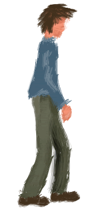
It's too curvy - I thought this was a female figure before I read the text. The waist-hip ratio is far too feminine.

The calves are too thick (your calves aren't thicker than your thighs, right?), thighs appear too short, with the shading beginning over the knees.

It looks like he's pressing his arms against his sides. The shades also give him a bit of a hunch. Try a more relaxed pose.

I assume the exaggerated head size is a stylistic choice, so I'm ignoring that.

Oh thank you. :) I updated the first post with the new version based on your paint-over. It's easy for me to go to far with something when really it should be simplified. I appreciate the input!
As far as the large head, you assumed right, I believe a larger head is good for making a more expressive character at a lower resolution.

Quote from: selmiak on Wed 07/08/2013 23:26:52
Quote from: Andail on Wed 07/08/2013 13:43:57
I assume the exaggerated head size is a stylistic choice, so I'm ignoring that.

after reading that I noticed he actually has a really tiny head with a pope hat on, zoom in and you'll see it in the original :D

Lol. I suppose you're right, however, the top of the head has a bit more shape now.

#2
Critics' Lounge / PixelArt - Male Template 1
Wed 07/08/2013 05:32:06
I'm not really a pixel artist, so I coming here and asking for advice. :) I want to make some templates that I will later animate (And I may share those.) So any advice you can give would surely help. This sprite isn't very tall (About 4 heads), and I'd like to improve anatomy, then later I will make a female, possibly a child, and someone a bit bulkier perhaps.

Anyway, Thank you! :)

[imgzoom]http://i17.photobucket.com/albums/b74/eternal_renegade/MaleTemplate-001.png
[/imgzoom]

EDIT(8/8/2013):
[imgzoom]http://i17.photobucket.com/albums/b74/eternal_renegade/MaleTemplate-001-2.png[/imgzoom]
#3
Critics' Lounge / Re: How to improve my music.
Wed 07/08/2013 00:35:59
I just listened to the songs, sounds like you are off to a great start! :) I did notice some unintentional key presses in your recordings, but I won't get into that. Like Viking said, there could be more variety for sure.

Sometimes when you don't know where something should go from here, I usually will play the main melody in different keys, and I might experiment playing harmonies with the thirds and fourths of the root notes in the melody. If the chord progression is feeling a bit stale (due to overplay) but you are not ready to leave from it yet, you could re-voice your left hand chords, which can also sometimes make for some good transitions into an actual chord progression change.

If the first song was my song though, I would develop the melody further, I felt the melody 'could' be stronger but it's not necessary.

Hope this helps :)
#4
pretty cool, the only thing I see here is that a little more work can be done, but then again it is a tutorial. But finding sprites that work can be difficult however. But it is a good tutorial. :)
#5
Pandora's half-sister's mother's uncle's father's 2nd-Cousin's cousin's son's box?

Correct me if I am wrong. :)
#6
General Discussion / Re: Why 2D gaming died?
Mon 09/02/2009 23:01:40
I see good points and bad points here.

You see on a graphical aspect, setting up the world works kind of like a movie. You actually can use lights and the lights will light the objects and cast shadows.

But I think creating models that work well takes just as much time and patience and really is a different work ethic.
You can give objects different surfaces that will change how light will effect it, define how it is shaped, how it looks, etc.
It's really a more detailed process in general, however with easier functionality, I feel it can allow developers use more of their creativity.
2-D or 3-D is not what makes a game great, it's up to the developer and what he/she does with those things.
#7
Sweet, I shall be entering. :)
#8
Yeah actually, I must say that I liked the empty middle. I think it creates the spacious feel, and delivers great contrasting tones.

That's my thoughts at least. 
Now going with gated pads; if you want to use gated pads I would suggest using them very far into the background used to spruce the melody and propel it forward. :)
#9
Critics' Lounge / Re: Sketchy-Style Walkcycle
Thu 14/08/2008 02:07:53
Quote from: gypsysnailhello, I want to say this is a great sketch! Somethings I could say that need to be improved on is the way the guy walks - it looks like he is being bumped forward that his head goes down a bit too much and a little too hunched from a straight back.

Alright I will see what I can do to fix that.

Quote from: gypsysnail
Also I'd suggest doing the hair a little less movement and more uniform movement. The hair seems to change too much in each movement making it look like a new person in each position.

I was trying to make it look incomplete for a style, but if it's more of a benefit to have it more stable. I will make it more uniform.

Quote from: gypsysnail
You did a good sketch and I can see great potential for this to be in a game by you.

Thank you very much, this helps me tons! :)

Quote from: Mr Flibble
You might want to watch the music video for Take On Me for an example of sketchy people walking done exceptionally well.

Just watched it! Very inspirational! Unfortunately it's not exactly the style that I want, looks too perfect if you know what I mean.
#10
Critics' Lounge / Sketchy-Style Walkcycle
Wed 13/08/2008 09:30:12
Well I am going for a painted-sketchy effect on the way the movement works. This was done with a tablet, would definitely appreciate criticism or comments.


I'll try different walks too with different characters (Might actually design a game out of this in this style!)

Does this need any changes? Would love opinions as well.
(Oh and there is a reason to the transparent in-between frames, I believe it helps define the messy style a bit more and smooths it out in an abstract way)
#11
I don't think it sounds anything like stairway to heaven. But it put my gf to sleep quite literally. Like every time I pressed play, her eyes fell shut.
#12
I thought it was put well together! :)
If you need help with anything, I am glad to.
I am getting better at pixel art, and well I make music as well so yeah!
#13
I am curious if anyone else is having problems listening to entry 3?
#14
Actually originally I thought she was pregnant as well.
I think it looks really good however. :)

Besides that (I am not a professional) but her center of balance by the look of things, is where her belly is.
It makes this triangle shape coming from her shoulders down to her waist and then back to her legs..
Maybe if her back didn't look like it was tilted backwards, and moved it forward a little bit, she would look more natural.

**Other than that, it looks amazing!**
#15
Well I am entering, sending PM.

;)
#16
Critics' Lounge / Re: Few Lo-Res Characters
Sat 26/07/2008 11:50:00
Alright thanks!

-More Contrast/saturation
-Less colors
-Define Characters more

To answer your question InCreator, I was thinking along the lines of a side-scroller sort of way. Basically all of the walking would be left and right. The background images would have a flat perspective (I really don't know if this is good.)
#17
Critics' Lounge / Few Lo-Res Characters
Fri 25/07/2008 23:31:06
These are a few characters I made recently, just experimenting with color, shapes, and sizing. Criticizing is certainly welcome. :)
And thoughts/ opinions are too.


I don't really know what I am going for, somewhat western maybe.
#18
Critics' Lounge / Re: Music for C&C
Wed 09/04/2008 09:51:01
I like the overall feeling out of these. But I do think that these could be shorter, I didn't even listen to all of Hurricane  because for what it was, it just felt too long. And least all by itself, if what was being used for something specific then sure! :)


Now for Wires, it was chaotic, assuming that was the mood you where going for. For some reason everytime the drums kicked in, it reminded me of the JapAnime Movie Metropolis with their chase scenes.
#19
Yeah, the in game sprite shall be bigger, room resolution is 200x320.

I will definitely take both replies into account and work on it shortly! :)

EDIT:
Well here is an update, added two more frames and posted it in the top post.
#20
Ok so I am really starting to get involved, slowly however. Anyways I can get away with this walkcycle and I know it can be improved (feels so basic) , so yeah C&C time!


x2:


Here is an update:


x2:


Update 02:
Added more frames and some motion


X2


I will work on this portion for now and move on to other angles when the time is right.
SMF spam blocked by CleanTalk