Okay, great, I was going to take a look at the updated manual first just to check the new version out, and then download it afterwards. But there's no reason I HAVE to wait to upgrade.
- Welcome to Adventure Game Studio.
This section allows you to view all posts made by this member. Note that you can only see posts made in areas you currently have access to.
#1
Site & Forum Reports / Re: Getting 404s for every page in the manual for v3.0...
Fri 13/04/2012 11:41:05 #2
Site & Forum Reports / Re: Getting 404s for every page in the manual for v3.0...
Fri 13/04/2012 10:54:23
Okay, thanks. I tried finding some tutorial stuff about AGS v3.0 (and up) on the Wiki, but could not find any. Although I didn't look around for too long, so I'll take another look. The last version of AGS I used was v2.7.1 I think, so I really just need to be brought up to speed with the new version. I'm quite excited about it because I've heard that it's a bit simpler to use, and while I do my best to understand the technical side of things I don't really have a natural talent for it; I'm more of a creative type.
#3
Site & Forum Reports / Getting 404s for every page in the manual for v3.0...
Fri 13/04/2012 10:19:12
Returning to AGS after a long time, and upon looking up the manual for v3.0, each section I tried clicking on displayed a 404. It seems a little odd that the entire manual being inaccessable wouldn't get noticed, but maybe I just happened to stumble upon it while it wass still quite a recent problem? Anyway, I was trying to look up a few pages on the site the other day, and getting 404s then too, so I think it may be the site, and not the fault of my browser or anything. Either way, I tried to search for other people posting about the problem and didn't find anything to indicate that anyone else had encountered the problem, so I tried accessing the pages on my Mac. Still didn't work though.
For clarification, the place I'm trying to access the manual from is here:
http://www.adventuregamestudio.co.uk/manual/StartingOff.htm
...and all the links in the main section (not the side menu) give me 404s when I click on them.
I hope I've posted this in the right forum. The 404s say to report them in the forums, but the description for this forum says to report engine, editor and forum bugs here, and makes no mention of site issues. I'm guessing it does extend to them, but when I tried to find a sticky or something listing what to post and what not to post in certain forums, I couldn't find one. So I apologise if this is the incorrect place for this thread.
#4
Critics' Lounge / Re: Robot to C&C
Thu 15/11/2007 14:23:33Quote from: Candall on Thu 15/11/2007 14:13:38
Ah, that kicks the hell out of my paintover. Sticks closer to the original style too... do something like that.
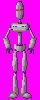
The only other thing I might try is making the eyes lower. Eyes appear to be lower on the face when you look up at someone, and low angles are often used in movies to represent a character who is powerfull and threatening, because the camera angle suggests that they are towering over the audience. It can also suggest the eyes have sunken, which is a sign of unhealthiness, and the human mind has a tendency to be repulsed by unhealthy features on a person, (this has to do with the theory of sexual selection, but that's going a bit off topic).
#5
Critics' Lounge / Re: Robot to C&C
Thu 15/11/2007 13:41:35
I'd suggest giving it eye sockets. At the moment it just kinda has eyes but no indent within the head. Eye sockets done right can really make someone's features look scarier. Check out Marlin Brando's eyes in "The Godfather" or as a more direct example; the endoskeletons in "Terminator 1/2" and you'll see what I mean.
Also might be good to give it a mouth or teeth. I know that technically as a robot it wouldn't need that, but lots of robots in fiction still have something that resembles teeth or a mouth.
Legs are kinda long, but you might want that. I don't really know what the robot is actually FOR, so long legs might help it do the job it's supposed to do.
In fact, I think it may help to think about the specific jobs the robot was created for. If it is some kind of assasin, think about how the robot would work practically in battle. It might have inbuilt holsters, or areas for concealing weapons. If it was built for thinking and diabolical scheming, you could give it a large head to represent that.
Either way I'd say you should probably lose those breast plates. They look like boobs to me, and I'm not sure how seriously people playing your game would take a robot with boobs.
But to me it does look like a nice style you've got going. At the moment your robot does kinda look more netural than evil though. If you want inspiration concerning robots, I highly suggest watching James Cameron's Terminator movies, reading Isaac Asimov's science fiction works, and possibly even trying to find pictures of and information on actual robots. They're begining to develop more and more robots with that resemble human figure.
Edit:
Here is just a little something I did quickly, just to give you an example of the kind of things you could do. I've changed the style quite a bit, so you might want to just see if there's any features that you like and emulate them when working on your robot. Of course you could also just use my paintover if you wanted, I don't mind.
#6
Critics' Lounge / Re: TMC walkcycles C&C
Tue 13/11/2007 22:36:14Quote from: largopredator on Tue 13/11/2007 21:16:43
Thanks for the feedback. I think I'll be able to sort out the front walkcycle, so, on to the more pressing matters:
The up walkcycle.
I've gone through all other animations but this one before to fix proportions and clean up the lines, so it's still quite bad and very much like Eric's original animation. I've tried to make a new one but I haven't gotten past the first few frames yet, there's just something about this angle that makes animating difficult.

I think you're trying too hard to show off all the movement that's going on. remember subtle movements can make all the difference. As a guide you need to remember that the legs won't go out to the side like that, they should stay within his shoulder width.
#7
Critics' Lounge / Re: Captain - WiP (updated with sailor)
Tue 13/11/2007 01:55:51
If you wanna keep him looking goofy; have him slouch or lower his shoulders. He might look a little off balance, but this will come off as just part of his doziness, and the posture itself will be peferctly possible for someone to hold comfortably.
There's nothing wrong with giving a character an off balance stance, because sometimes people do indeed stand like this, but problems arise when there's no way they could hold it comfortably without falling over. A relaxed stance can't really be relaxed if you have to exort a lot of effort to keep it going.
There's nothing wrong with giving a character an off balance stance, because sometimes people do indeed stand like this, but problems arise when there's no way they could hold it comfortably without falling over. A relaxed stance can't really be relaxed if you have to exort a lot of effort to keep it going.
#8
Critics' Lounge / Re: Alien Portrait
Sun 11/11/2007 22:05:59Quote from: Stephew on Sun 11/11/2007 21:04:14
I tried to make more contrast. I also added some scale-like things to the top of his head. Do you have any tips for making the face look rougher? I stink at textures.

Dot it with slightly darker pixels than the green of his face. Also, reptile skin tends to be fairly matt, so you might want to lose the shine on his face, but that's really your call. He dosen't HAVE to be a reptile, that's just what he looked like to me, and I wasen't sure if that was the look you were going for or not.
#9
Critics' Lounge / Re: TMC walkcycles C&C
Sun 11/11/2007 20:45:27Quote from: largopredator on Sun 11/11/2007 18:32:54
Those are some really helpful suggestions, I've never really accounted much for anatomy and weight distribution.
Thanks. Not accounting for weight is a problem that even some proffesional animators seem to have. Espiscally ones in modern games. Personally I respect for a game with good animation, because many don't, and it honestly just looks lazy.
#10
Critics' Lounge / Re: Alien Portrait
Sun 11/11/2007 17:40:33
Mouth is a little slanted, and if kind makes him look a little dopey.
Also, his color scheme suggests he's supposed to be a reptile (or whatever the equivilant of a reptile is on his planet is), so maybe you should make his skin look rougher.
Also, his color scheme suggests he's supposed to be a reptile (or whatever the equivilant of a reptile is on his planet is), so maybe you should make his skin look rougher.
#11
Critics' Lounge / Re: TMC walkcycles C&C
Sun 11/11/2007 17:20:13Quote from: largopredator on Sun 11/11/2007 16:44:19
You're right about the the stiffness, that's especially my issue with the front walkcycle.
Alright, well, your main problem in regard to it looking stiff is something I've already mentioned: the legs straighting out.
The thing is, if you stand with one foot in front of the other, and then you straighten out your front leg, provided you keep your shoulders behind your knee, you will notice that your weight feels more distrubuted to the back (and here I go again with weight distrubtion). This is good if you want to stand all straight and regimental, but if you're walking in a relaxed way, you're more likely to put your weight foward, which means bending that front foot, and not straighting it.
It only needs to be bent a little bit for your weight to go foward. Standing with one foot in front of the other again, try really relaxing your front leg, and then bending and straiginting it slowly. You will notice there's a small point where your leg bends and straightens faster, right before it's completely straight. The point at which it does not bend as fast is where your weight will go from being more at the back to quite definatly more at the front. This is good to know if you want your character's knee to be kinda bent, but not that bent.
More things you could do to make the character's walk look more relaxed; try to making him prepare his feet for hitting the ground. So, you could have him angle his heel onto the ground and then, kind of roll it onto the floor. (This kind of walking can also be quieter when done right, FYI).
If he's loose his upper arms are going to move more. At the moment only his lower arms really move. The thing about being relaxed is more of you moves around because more of your body is suggestable to force. So, for example, someone who is standing relaxed will move more if they are pushed than someone who is standing all stiff.
Also, are you gonna put fingers in at any point? Because someone's fingers can tell you about their mood while they walk. I, for example, often walk around with clenched fists without realizing it because I can be quite a tense person.
#12
Critics' Lounge / Re: TMC walkcycles C&C
Sun 11/11/2007 15:57:56
I like it, it just seems like the arm swings on the down animation don't have as large an arch as the side walk cycle.
Also the knees look a little static.
As a whole, he seems to have quite a stiff walk. But that might just be how he walks. I don't think it's usual pratice to ever completely straighten your legs whilst walking unless you are indeed marching, or something like that.
Also the knees look a little static.
As a whole, he seems to have quite a stiff walk. But that might just be how he walks. I don't think it's usual pratice to ever completely straighten your legs whilst walking unless you are indeed marching, or something like that.
#13
Critics' Lounge / Re: Captain - WiP (updated with sailor)
Sun 11/11/2007 14:32:53
I think you might need to make his knees straighter, because at the moment it looks as though he's leaning back, but at the same time, he's got his head foward, and he's putting his weight foward with his legs. In other words, he's got his weight distributed all over the place, and the end result is that he looks as though he's very off balance and could fall over quite easily.
Straighten up the back leg, and make his back foot flatter, and his stance will look much more feisable I think. But I do agree that his legs are too low.
Straighten up the back leg, and make his back foot flatter, and his stance will look much more feisable I think. But I do agree that his legs are too low.
#14
Critics' Lounge / Re: Cutscene rendition of character VS sprite rendition of character
Sat 10/11/2007 10:32:51
Okay, thanks a lot. I actually draw the cutscene version first and then based the sprite on it. Now that you mention it, the buttons being right on the line does look pretty dumb. I think I might have been getting tired when I did that part. I was mostly trying to make sure the faces were right, but I'll fix that stuff all the same, not sure what to do with the bow tie though, since there isn't really much room for it. Although I could make the lapel wider and make more room...
#15
Critics' Lounge / Cutscene rendition of character VS sprite rendition of character
Sat 10/11/2007 08:16:30
Hi there guys. As a test, I have drawn the main protagonist for game I've been planning now in two forms; a sprite version which would be around during play, and a bigger, more detailed version which would appear in the more key cutscenes in the game.
The trouble is, they look kinda simular, but not THAT simular. Usually if I had to draw a sprite from a different angle or something, what I'd usually do would be to take the original sprite drawing as a basis to figure out how it would look from a different angle, but since these two different renditions of the same character are completely different sizes and have essentially a different style to them, I'm not sure how to go about making them really look like the same person, if you get my drift.
Anyway, maybe it will make more sense with graphic examples;
Cutscene rendition of character:

Sprite rendition of character:

Anyway, thanks in advance to anyone who can help. Also, is it just me being obsessive, or does the sprite have a slightly inhuman quality to it? (The character is supposed to be human).
The trouble is, they look kinda simular, but not THAT simular. Usually if I had to draw a sprite from a different angle or something, what I'd usually do would be to take the original sprite drawing as a basis to figure out how it would look from a different angle, but since these two different renditions of the same character are completely different sizes and have essentially a different style to them, I'm not sure how to go about making them really look like the same person, if you get my drift.
Anyway, maybe it will make more sense with graphic examples;
Cutscene rendition of character:
Sprite rendition of character:
Anyway, thanks in advance to anyone who can help. Also, is it just me being obsessive, or does the sprite have a slightly inhuman quality to it? (The character is supposed to be human).
#16
Critics' Lounge / Re: testpictures and gameidea
Sun 16/09/2007 20:14:00Quote from: Mouth for war on Fri 14/09/2007 14:12:43
I won't use those backgrounds in the actual game...I got them from the web just to try out my idea. I don't know how to make the character better. A friend used his videocamera and filmed me when i walked. then i saved a image of all the frames i needed and they automatically came out of proportion.
What? How? I don't know of any video editing programs that change the size of a picture during framegrabbing, and I've used my fair share of video editors...
#17
Critics' Lounge / Re: New Cartoon
Fri 14/09/2007 16:44:36
Hey, I already saw this on Newgrounds and I thought it was real funny. I wouldn't have guessed that the author was also a member of these forums though...
What studio do you work for? I've worked for Aardman in the past myself.
Quote from: Neil Dnuma on Tue 11/09/2007 20:57:39
I work at an animated TV-series, and the animators are all impressed!
What studio do you work for? I've worked for Aardman in the past myself.
#18
Critics' Lounge / Re: Not Your Typical Walk Cycle
Sun 09/09/2007 13:06:36Quote from: Stupot on Sat 08/09/2007 07:09:20
When my sister was pregnant she didn't walk at all.... she got Kev to do everything while she watched Jeremy Kyle and ate ham sandwiches.
My sister does that too, except she's never been pregnant in her entire life...
#19
Critics' Lounge / Re: Pixel Skull
Sun 09/09/2007 12:47:45
They're both pretty awsome. The first skull strikes me as more cartoony.
With that second skull, are you trying to achieve a sense of eerieness or scariness? If so, you should put a higher contrast on the colors you've used for it. And possibly make it look a little dirty and cracked too. I think the outline stands out a little bit too much aswell.
As soon as I saw this topic's name I thought "gotta see this one". I love skulls. I don't know why.
#20
Critics' Lounge / Re: First background!
Wed 05/09/2007 12:31:20
These backgrounds are so trippy and unique, that personally, I'd very much like to see the character that goes with them.
SMF spam blocked by CleanTalk