Menu

Show posts

This section allows you to view all posts made by this member. Note that you can only see posts made in areas you currently have access to.

Show posts Menu

Messages - Brentimous

#1
Critics' Lounge / Re: Low Res Character
Fri 22/10/2010 17:17:19


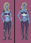
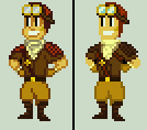
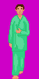
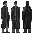
Here's my take. Hopefully it'll give you some ideas. Darkened his outlines, deleted the steroids from his shoulders, did some bleh shading, added pockets, and gave him fists of Low res rage. I changed the type of suspenders he had, but looking at it now, I think I like yours better. I really love his face, and the feet you had were fine, though a bit dark.

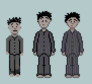
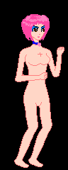
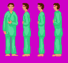
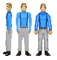
As Lad said, definitely just concentrate on the front view and get everything perfect there before starting work on the side. Otherwise it's twice the work and that'll just lead to frustration.
#2
Here's my take.

#3
Critics' Lounge / Re: Grim Reaper - Again!
Tue 08/06/2010 19:36:29


Quoteevery single one of my six (six!) graphics programs broke in some way
That's the price you pay for pixelizing Death.

I have to leave for work, so I didn't get a chance to play with the wings, but having a glimpse of the second wing between the head and the other wing seems to be the reasonable way to show it. You'll need to add some more detail to them to differentiate the two. I really loved how you did Death's face. I lowered his killing arm, but looking at it now, I think it could probably go either way. Cheers.
#4


The 2nd guy was my first attempt, and after copying/pasting him into the background, I still felt he didn't fit. So I reworked a few minor details and gave him some very basic shading, and now I think he's usable. Still cartoony, but usable. Hope it helps.
#5
Critics' Lounge / Re: SteamPunk Pilot
Sun 06/06/2010 20:14:17


Just messing around with it some. Maybe it'll help give you some ideas.
#6
The gun looked like it needed to be much closer to his chest. Looking at it now, his arm is now too skinny/long, but hopefully it'll help. Also, I didn't add this, but on the front sprite there's a grey pouch connected to his belt that isn't shown on the side view.


#7
Her arms look like Popeye's after eating a can of spinach. I think everything could be slendered down a notch. Unless you're going for a big muscled look, in which case going all out and copying the Popeye look might make for an interesting result. I'd personally google images of Wonder Woman. Not for reference on how a muscled female should look, just for fun on a lonely Saturday night.

Slenderized version that's probably a bit too anorexic.
#8
Had a lot of fun with this one.


Anyone recognize it?

Ben,
That was actually my first idea! Couldn't get Jade to look right, though.
#9
Critics' Lounge / Re: DN Games: LOGO
Wed 06/01/2010 00:31:29
Don't really have experience in designing logos, but maybe this will help give you an idea or two. Not three, though. Good things never come in three... Only 42.


And a quick edit showing the N in bizarro world, since you seem to like that type of thing.

#10
Go for it. You did all the major grunt work, I just added a few pixels.
#11

I thought you did a great job with the legs. I just put in a bounce and added a bit to the moving arm.

And as an added bonus, here's that edited side view I never got around to posting.

#12
Nice to see a little bit of interest growing. As stated before, I'd contribute to whatever kind of competition we had whenever possible. This month won't be possible due to me using all my free time on a MAGS game, but come December I'll RON like I've never RONed before.

If we're looking to just get some games out, I'd be interested in doing something like a "Make a Game in Two Weeks" competition. Since all the resources are there, the deadline seems pretty reasonable.
#13
The talking monkey's right, her chest was a bit on the odd side. I made some changes to that, evened out her feet, snipped her arms just a tad, and pushed that hair in her face to the left some more.


I didn't see any problem with the side view of her face, but I agree that the lines on her back could be altered a bit.

Overall, I really liked the style of the character. Best of luck on your creation.

#14
Reality-on-the-Norm / Re: Town Square
Sat 17/10/2009 19:03:30
I was making a town square earlier in the year to try and match the Krysis-style graphics.


BigBrother also created a pack of RON backgrounds for an abandoned Lunchtime of the Damned remake that look pretty amazing.

#15
So... I think it's about time we let some people get their RON on in the easiest, fastest, most accessible way possible... THROUGH A FIERCE, BLOODY, IN YOUR FACE, TO THE DEATH EXTREME ONLINE COMPETITION.

First and foremost if anyone's interested, well.. is anyone actually interested? I think it'd help start some RON-centered activity in the forum, maybe generate some new interest.

Second, would these be held on the RON forum or the Competitions area of AGS?

As with past competitions before the server change, I'd contribute whenever possible.
#16
Is there a size limit of any kind? Or some preferred dimensions?
#17
Critics' Lounge / Re: Starting pixel arts
Thu 15/10/2009 21:47:39
Had some time to kill, so I thought I'd give Young Yoda a shot. He looks like he's about to dodge a bullet Matrix-style, but I blame that entirely on the puppeteer. I like the face of your old Yoda.

#18
Shortened him up, tuned the colors a little, and gave his shoulders a nice shave.


#19
Critics' Lounge / Re: How to stop 'marching'
Wed 30/09/2009 06:34:23
When doing frontcycle legs, I tend to have the legs moving in a diagonal direction. When a character's left leg is extending, I move it a pixel to the right. So it'll look a bit like  "\" when it's extended fully. Hopefully that extremely complicated bit of of ASCII art will help you on your way to animation glory. Doing this help gets rid of that stiff Lego-man walk.

Also, the foot should get slightly smaller as it moves backwards.

Demonstration:


I'm still a rookie at this sort of thing, but hopefully these pointers will help.
#20
Looking very good. I thought his right leg/hand were a bit thin for the side view, and his legs were spread too far apart for his front view. A quick paintover to demonstrate.


Not sure if it'll bother anyone else, but the coloring for his shirt is much brighter on the front than from the side. As for the shading, I'm no expert on that subject so I can't really tell if it's realistic or what not, but I do like what you've done here, particularly the back of the jacket.
SMF spam blocked by CleanTalk