So you know the outline font feature? Well, I was wondering, since it doesn't technachly HAVE to be an outline font, what kind of weird, creative things could be done with the outline font feature? I made a handful of little pixel fonts that come with overlay fonts - Two of them come with a traditional outline font, and all of them come with another overlay font that can be used for anti-aliasing the base font. These were just made for fun, but I might make some more in the future. Feel free to use any of them however you wish!
NOTE: In all of these fonts, to type the heart symbol, simply use the broken bar - ¦ - wherever you need a random heart. If you have any comments or suggestions, I would love to hear them. Again, these are all completely free to use, so have fun! (ノ'ãÆ'®')ノ*:・゚âÅ"§
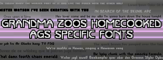
ALL FONTS
Spoiler
LIPBY CHONK
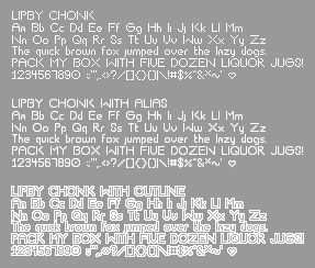
This is best viewed at size 9 - Type a broken bar “¦†for a heart symbol
CRUNCHY BEEF
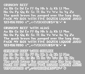
This is best viewed at size 10 - Type a broken bar “¦†for a heart symbol
CHUNKY DUNK
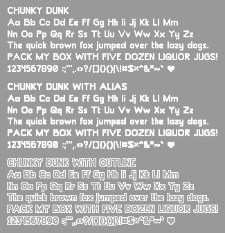
This is best viewed at size 14 - Type a broken bar “¦†for a heart symbol
YET BUMBLER
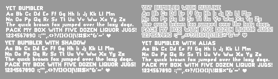
This is best viewed at size 9 - Type a broken bar “¦†for a heart symbol
THIS SMACKY
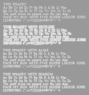
This is best viewed at size 9 - Type a broken bar “¦†for a heart symbol
PLOP DUMP
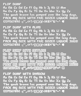
This is best viewed at size 10 - Type a broken bar “¦†for a heart symbol
SMACKY FORMULA
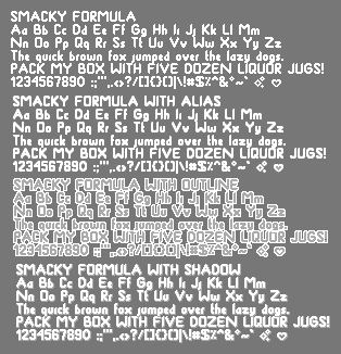
This is best viewed at size 11 - Type a broken bar “¦†for a heart symbol, or an at symbol “@†for a sparkle symbol
PORTABLE TUBE
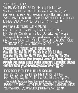
This is best viewed at size 10 - Type a broken bar “¦†for a heart symbol, or an at symbol “@†for a sparkle symbol
EASE OF USE
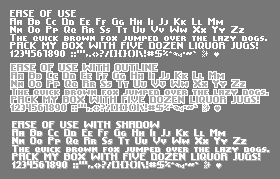
This is best viewed at size 8 - Type a broken bar “¦†for a heart symbol, or an at symbol “@†for a sparkle symbol
TOUR DE FORCE
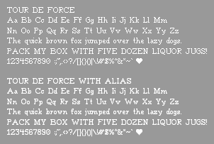
This is best viewed at size 12 - Type a broken bar “¦†for a heart symbol
SLAP AND CRUMBLY
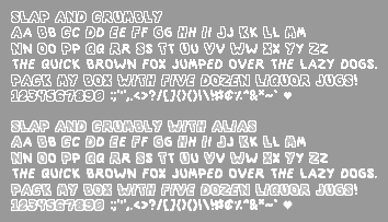
This is best viewed at size 12 - Type a broken bar “¦†for a heart symbol
IS WASTED
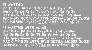
This is best viewed at size 10 - Type a broken bar “¦†for a heart symbol, or an at symbol “@†for an ink/blood splatter
TUBE OF CORN
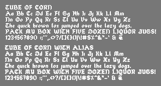
This is best viewed at size 12 - Type a broken bar “¦†for a heart fourish, or an at symbol “@†for an alternate and symbol
APPLY BEEF
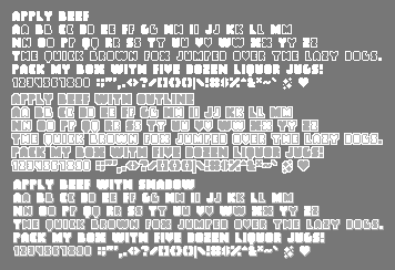
This is best viewed at size 12 - Type a broken bar “¦†for a heart symbol, or an at symbol “@†for a glitter symbol
PROPEL REPEL
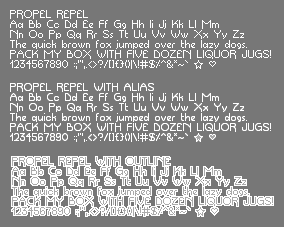
This is best viewed at size 10 - Type a broken bar “¦†for a heart symbol, or an at symbol “@†for a star
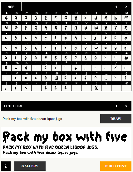
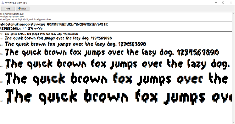
HYDRATING LIP
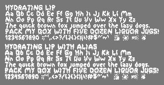
This is best viewed at size 13 - This font does not have a heart symbol. Instead, you may type an at symbol, a percent sign, an ampersand, or a broken bar (@ % & ¦ respectively) for various ink or blood splatters.
This is best viewed at size 9 - Type a broken bar “¦†for a heart symbol
CRUNCHY BEEF
This is best viewed at size 10 - Type a broken bar “¦†for a heart symbol
CHUNKY DUNK
This is best viewed at size 14 - Type a broken bar “¦†for a heart symbol
YET BUMBLER
This is best viewed at size 9 - Type a broken bar “¦†for a heart symbol
THIS SMACKY
This is best viewed at size 9 - Type a broken bar “¦†for a heart symbol
PLOP DUMP
This is best viewed at size 10 - Type a broken bar “¦†for a heart symbol
SMACKY FORMULA
This is best viewed at size 11 - Type a broken bar “¦†for a heart symbol, or an at symbol “@†for a sparkle symbol
PORTABLE TUBE
This is best viewed at size 10 - Type a broken bar “¦†for a heart symbol, or an at symbol “@†for a sparkle symbol
EASE OF USE
This is best viewed at size 8 - Type a broken bar “¦†for a heart symbol, or an at symbol “@†for a sparkle symbol
TOUR DE FORCE
This is best viewed at size 12 - Type a broken bar “¦†for a heart symbol
SLAP AND CRUMBLY
This is best viewed at size 12 - Type a broken bar “¦†for a heart symbol
IS WASTED
This is best viewed at size 10 - Type a broken bar “¦†for a heart symbol, or an at symbol “@†for an ink/blood splatter
TUBE OF CORN
This is best viewed at size 12 - Type a broken bar “¦†for a heart fourish, or an at symbol “@†for an alternate and symbol
APPLY BEEF
This is best viewed at size 12 - Type a broken bar “¦†for a heart symbol, or an at symbol “@†for a glitter symbol
PROPEL REPEL
This is best viewed at size 10 - Type a broken bar “¦†for a heart symbol, or an at symbol “@†for a star
HYDRATING LIP
This is best viewed at size 13 - This font does not have a heart symbol. Instead, you may type an at symbol, a percent sign, an ampersand, or a broken bar (@ % & ¦ respectively) for various ink or blood splatters.
[close]
HOW TO DESIGN YOUR OWN PIXEL FONT
Spoiler
Basics of Font Design
So basically, when you're designing a font, there are a bunch of guidelines you need to follow to make it look good. Sounds simple, I know, but I managed to forget this when I first tried this, and so I figured I'd put up some information. I tried to condense it, and here's what I came up with.
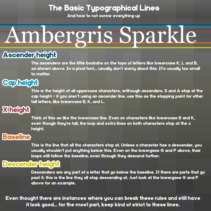
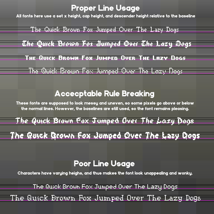
Clearly, this is the cliffnotes version. If you want to go a bit more indepth, you can find plenty more information through this link.
Getting Started
There are two main programs I use for my font design. The first I use is a simple browser program called Bitfont Maker 2. It's very simple to get started in - just click a spot to draw, click again to erase, and hold it down to draw/erase multiple spaces. Here's a little rundown of what everthing does.
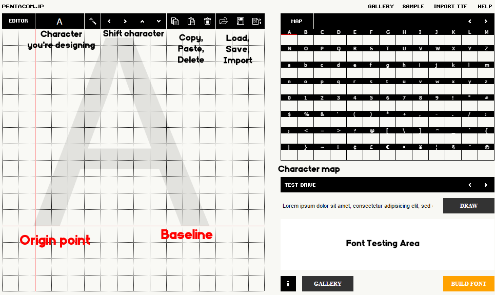
Since you can't draw the guidelines in this program, just make a note of the x, cap, and descender heights. When you've finished drawing a character, it'll appear on the grid to the right. The space under the character grid is where you can see how your font will look, and let's you test it's legibility before you export it. You can click the arrows above the character map to change pages, but for an english AGS font, here are all the spaces you should fill in.
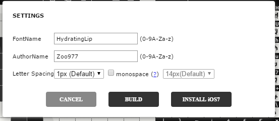
Once you have everything looking good, just click export to name your font, and set the spacing. I usually use one pixel spacing by default, but it may vary depending on the font.
Now here's the thing - What if the character spacing looks wonky? And this bitfont maker only exports fonts at 16 pixels - what if you need a smaller font? There's a free windows program named Type Light I use for all touching up. When you boot it up, it'll look something like this.
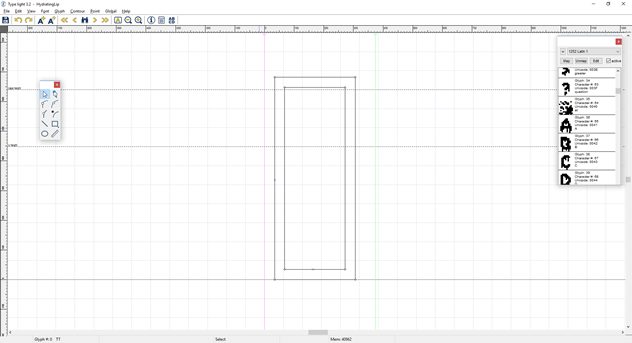
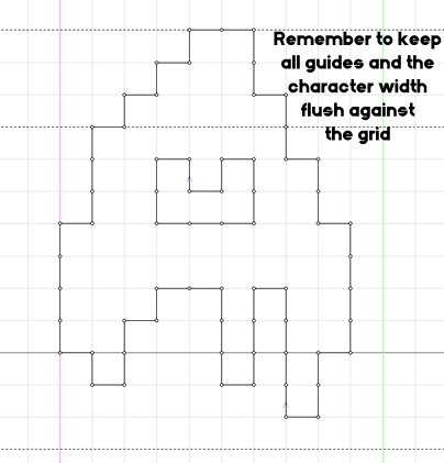
An important thing to note - if you're making a pixel font, go to "View > Grid > Snap to Grid" to make sure all edges align with the grid. A pixel font isn't clean or rounded, it's blunt and harsh. Scroll down the list of characters, and click on a character to touch up it's appearance and shift the character spacing, if you so desire.
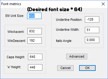
As for the font size, figure out what height you want the font to look best at. Usually, I add the height of the tallest character from the baseline, and the lowest ascending point (If the tallest point is 10 pixels above the baseline, and the lowest falls 2 beneath it, you want it at size 12, for example.) Multiply this number by 64. Go to "Font > Metrics", and put this number in the box labeled EM unit size. This box should be at 1024 by default (16 pixels * 64 pixel grid - Get it?)
Once you're done doing touch ups, just save your font, and you're ready to install it!
If there's anything you don't like about it after installing it, just edit the font file and reinstall until you're happy with it!
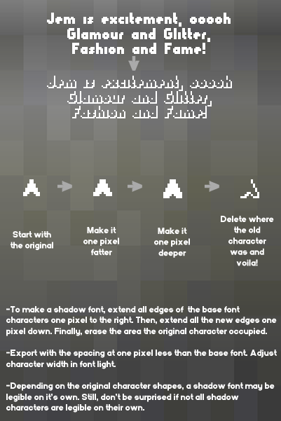
Making Overlay Fonts
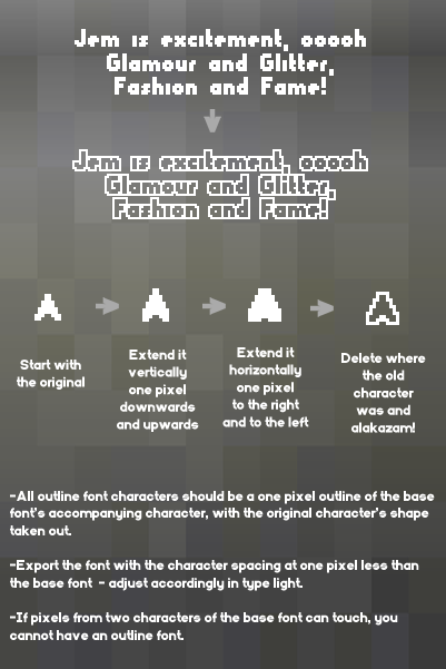
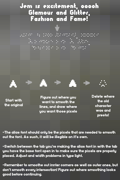
Right now, I only make alias, shadow, and outline fonts, so I put together some brief guides here. For all of these, remember-
So basically, when you're designing a font, there are a bunch of guidelines you need to follow to make it look good. Sounds simple, I know, but I managed to forget this when I first tried this, and so I figured I'd put up some information. I tried to condense it, and here's what I came up with.
Clearly, this is the cliffnotes version. If you want to go a bit more indepth, you can find plenty more information through this link.
Getting Started
There are two main programs I use for my font design. The first I use is a simple browser program called Bitfont Maker 2. It's very simple to get started in - just click a spot to draw, click again to erase, and hold it down to draw/erase multiple spaces. Here's a little rundown of what everthing does.
Since you can't draw the guidelines in this program, just make a note of the x, cap, and descender heights. When you've finished drawing a character, it'll appear on the grid to the right. The space under the character grid is where you can see how your font will look, and let's you test it's legibility before you export it. You can click the arrows above the character map to change pages, but for an english AGS font, here are all the spaces you should fill in.
Once you have everything looking good, just click export to name your font, and set the spacing. I usually use one pixel spacing by default, but it may vary depending on the font.
Now here's the thing - What if the character spacing looks wonky? And this bitfont maker only exports fonts at 16 pixels - what if you need a smaller font? There's a free windows program named Type Light I use for all touching up. When you boot it up, it'll look something like this.
An important thing to note - if you're making a pixel font, go to "View > Grid > Snap to Grid" to make sure all edges align with the grid. A pixel font isn't clean or rounded, it's blunt and harsh. Scroll down the list of characters, and click on a character to touch up it's appearance and shift the character spacing, if you so desire.
As for the font size, figure out what height you want the font to look best at. Usually, I add the height of the tallest character from the baseline, and the lowest ascending point (If the tallest point is 10 pixels above the baseline, and the lowest falls 2 beneath it, you want it at size 12, for example.) Multiply this number by 64. Go to "Font > Metrics", and put this number in the box labeled EM unit size. This box should be at 1024 by default (16 pixels * 64 pixel grid - Get it?)
Once you're done doing touch ups, just save your font, and you're ready to install it!
If there's anything you don't like about it after installing it, just edit the font file and reinstall until you're happy with it!
Making Overlay Fonts
Right now, I only make alias, shadow, and outline fonts, so I put together some brief guides here. For all of these, remember-
- Design the overlay font in BitFontMaker as well. This will make everything so much easier, trust me.
- Keep BitFontMaker open in another tab, but have the base font in this one. This way, you can check your work before exporting the font. Make sure you don't save over it!
[close]


 ââ,,¢Â¥

