In this post I will be going over two questions. 1. Is this art too simplistic for a game? and 2. Which style do you prefer out of the two styles I have used.
Hello! I'm Lolman, i'm also new here. I am in no way a professional pixel artist and actually have a degree in History rather than design or anything. Pixel art has just been a hobby of mine and I've created very little non private art for the past few years I have done it. However, I've started to pick up an interest in producing my own Point and click adventure game (much like the ones I used to play as a kid). I've helped develop games in the past (mostly 3D) but I've always secretly wanted to produce a "retro" point and click with, in my mind, a modern twist. Although, I'm not sure about the style I love (a very very simplistic art style). So I was wondering if you guys could give me your opinions as I've messed around with this kind of style for a while now but I know a lot of people prefer detail to imagination(Although I want my story to just guide people rather than dictate people).
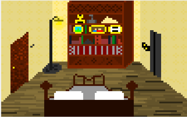
Style Number 1 : This Style is very blocky but it allows me to create a 3d effect and produce more detail. Although I dislike this because I feel like I have to make it look "bad" (noisy) for it to work...
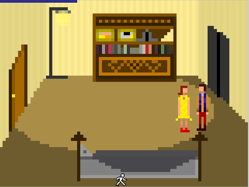
Style Number 2: This style is much more simplistic and has little detail but I like it more. It leaves a lot up to the imagination and make the world a lot more cleaner. In this image you also see the type of style I want for my characters. This is basically finale as I love the sword and sorcery style. Although the downside is that I lose the 3d effects and rely more on straight lines for depth.
I see lots of art using this style and I know some games do it as well (although I honestly can not remember the name on them). Also recently a game called "the last door" came out and uses a very similar style to the one I was messing with. This gave me a little more confidence that people won't brush this game away because it was too simplistic in style.
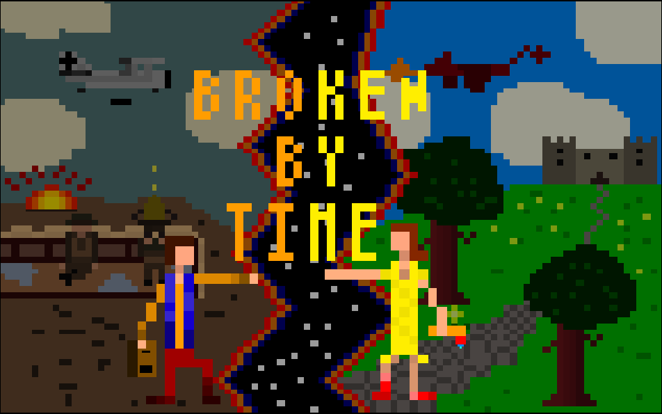
Finally: Here is my title screen for the game. I cheated a little on the style but I wanted it to look my way.
Please post your opinions below! And don't worry if you really hate the art, everything is helpful.
Hello! I'm Lolman, i'm also new here. I am in no way a professional pixel artist and actually have a degree in History rather than design or anything. Pixel art has just been a hobby of mine and I've created very little non private art for the past few years I have done it. However, I've started to pick up an interest in producing my own Point and click adventure game (much like the ones I used to play as a kid). I've helped develop games in the past (mostly 3D) but I've always secretly wanted to produce a "retro" point and click with, in my mind, a modern twist. Although, I'm not sure about the style I love (a very very simplistic art style). So I was wondering if you guys could give me your opinions as I've messed around with this kind of style for a while now but I know a lot of people prefer detail to imagination(Although I want my story to just guide people rather than dictate people).
Style Number 1 : This Style is very blocky but it allows me to create a 3d effect and produce more detail. Although I dislike this because I feel like I have to make it look "bad" (noisy) for it to work...
Style Number 2: This style is much more simplistic and has little detail but I like it more. It leaves a lot up to the imagination and make the world a lot more cleaner. In this image you also see the type of style I want for my characters. This is basically finale as I love the sword and sorcery style. Although the downside is that I lose the 3d effects and rely more on straight lines for depth.
I see lots of art using this style and I know some games do it as well (although I honestly can not remember the name on them). Also recently a game called "the last door" came out and uses a very similar style to the one I was messing with. This gave me a little more confidence that people won't brush this game away because it was too simplistic in style.
Finally: Here is my title screen for the game. I cheated a little on the style but I wanted it to look my way.
Please post your opinions below! And don't worry if you really hate the art, everything is helpful.