Menu

Show posts

This section allows you to view all posts made by this member. Note that you can only see posts made in areas you currently have access to.

Show posts Menu

Messages - PepsiNarcolepsy

#1
Critics' Lounge / Re: First sprite
Sat 15/05/2010 01:09:41
Yeah I'll have to work on him some more too...The hand is getting there; the placement of the thumb seems a bit...off? Your edit does present some good ideas though, so I'll just experiment a bit for now. Thanks!

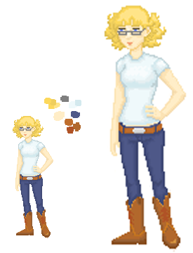
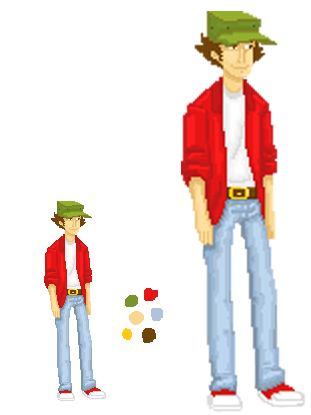
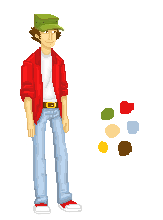
Maybe I should have mentioned this earlier, but my original idea was that Aaron is part Mexican, so maybe yellow/tan tinted skin would work better than pink tones. It does need to be darker though.

Don't when I'll be able to get to re-editing, I've got some busy times coming up with school. I'll post it when I do though!
#2
Critics' Lounge / Re: First sprite
Thu 13/05/2010 01:42:24
Ricco: Thank you!
Ha, I tend to do that when I'm drawing xP Happens sometimes when I don't draw the whole body...

Tramponline: Thanks again for the comments :) I chose that style because it seems to be popular these days, and mine kind of look that way too, lol. Plus they're easy to draw with pixels! But I can see what you mean.
I know that there are still issues with Aaron's arms/hands, but I don't think they need to be longer...Typically, when a person is standing up straight, the tips of their hands don't reach very far past the crotch/upper thigh area, so proportionally I think he's right...Although the hands are still kind of blocky, so that's probably why his arms seem stubby.
And changing the hair was a personal decision; I have another character from something else whose hair looks exactly like that, and I didn't want them to look too similar. Sorry :(
And thank you!

Pablo: Thanks a lot for the color advice! That's one thing I was wondering about, since traditional AGs tend to rely on minimal color...It's hard for me to stay away from gradients since I typically gravitate towards soft shading rather than cell shading. But the darkening does look much better, I'll have to play with the colors some more. The issue is that Aaron's supposed to be a bit darker than her- maybe I'll adjust his skin tone too.

Mad: I really like your edit too; I'll definitely have to readjust some colors. I also really like what you did with her hair!
Where exactly could his anatomy use some work? Is it still the arms/hands? So hard to do with pixel art! D:
Thanks!
#3
Critics' Lounge / Re: First sprite
Wed 12/05/2010 02:01:11
Yeah, I was thinkin that the problem was in the position of her head and neck...I'll fix that. Thanks!

Thanks for your input on her looks, Tramponline, although the funny thing is, I designed Bonnie based on the idea of breaking stereotypes, haha. I guess you could say that Bonnie's "shtick" is her mannerisms... Unfortunately, I'm fairly sure there won't be any voice acting, but it will be pretty obvious in the dialogue text that she has a thick southern accent. She has some characteristics of the stereotypical down-home country girl- boots, gold curls, knows her guns (lol), has freckles, (although I couldn't include them in the sprite, argh)- but she's not the traditional southern girl-next-door who likes horses and baking pies. She grew up in a small town but she's a bit liberal and would thrive in a place like New York, and wants to be a historian or an archaeologist, and so on. By no means is this to say that people from Texas are not scholarly or liberal, haha, but that's the stereotype that I focused on inverting (and so there's one simple reason for her having glasses *shrug*). Plus, she's meant to be the foil for Aaron's goofiness and tendency to leap before he looks. Of course she's not all serious though! She genuinely loves her hubby and they have a similar sense of humor.

As for her outfit, it is plain, I agree with you. But since the running tone of the story is a lighter take on the post-apocalyptic genre, I thought it would fit for the main characters to seem more like they're on a road trip than fighting for survival. Aaron's red shirt was actually supposed to be a plaid flannel overshirt, but I realize that plaid would be almost impossible to animate easily, so it was simplified. :P 
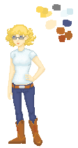
I dunno, at the same time, I think some accessories would pizazz her up a bit, but then I don't think she would bother with jewelry, since there's no practical purpose for it... I'd say the best accessory for her would be some type of rifle to sling over her shoulder. XD

Sorry if that got a little wordy, I've maybe put too much thought into this, heh heh xP I look for a good story in the games I play, so that's where my focus is first!

While I'm at it, here's the concept art for the two I did before the sprites. I'm more artistically-minded than technically-, so this is a new challenge for me. Not really looking for critiques here- I realize that there are several issues with anatomy and such, particularly Aaron's arms and hands, neck and shoulders, also that half-complete thing he's holding up that's supposed to be his hat -_- Not to mention I don't draw guns very often so things may be off there as well.


Anywaayyy....
Re-Edits!

So I spruced Aaron up a bit. Made his hat and hair a bit narrower, and changed the bill. Also lengthened his arm and made the hand a little more discernible, and moved his buckle to the right some more.

Moved Bonnie's head and neck a smidge to the right. Not very noticeable but I think it looks more correct than before. Maybe I should give her a slight smile? Make her less severe-looking?


Better?  :D  
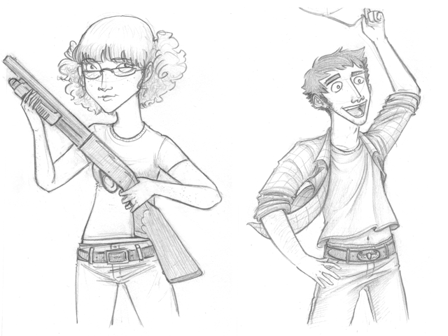
Thanks for your critiques guys! I'm working on Aaron's down view, then some time later I'll hopefully be back with a walk cycle. Still open to suggestions! :)
#4
Critics' Lounge / Re: First sprite
Mon 10/05/2010 01:21:22
  Hey, cool :D I like how you redid the bill and I think I might try to incorporate that, it looks much better and smoother. The bill's always the hardest part as far as perspective goes, (at least it seems to me :P) If the top of the hat seemed out of perspective, it might be because the top is supposed to be slanted downward at the front (it will be more obvious in the side view).
  The buckle seems to be in a better place too...I see how you defined the hands some more and it look  My problem with hands is always not being able to define the fingers, and I see how you were able to make the thumbs stand out some more. I'll keep that in mind too... Thanks a lot for the help! :)

So now I've got my work cut for Aaron...Now here we have Bonnie, Aaron's wife and traveling companion. She's the voice of reason for the pair and definitely has that "Don't mess with Texas" attitude. While Aaron is the main player character, I think Bonnie at one point will be playable too for a bit, later on...Still thinking about it.


-My main issue is somewhere in the area of her neck and shoulders...Maybe her head is positioned in the wrong place? Her shoulders aren't/are too wide? Anybody else see what's wrong?
-Also I'm wondering how her hair looks to you guys. The style is just supposed to be short and curly, but I've been looking at it for quite a while and need someone with fresh eyes to tell me if they get a weird impression from it.

Thanks for the help so far guys! :)
#5
Critics' Lounge / Re: First sprite
Sun 09/05/2010 20:39:13
Thanks for the tips! I can see what you mean about the hands, and I'll probably end up taking your advice on the Down idle frame... I still have no idea what this guy will look like when he moves, so I just want to be sure his design is okay to go! :P
I'm finishing up the sprite for his girl Bonnie, so I'll probably end up posting her too.
Thanks again!
#6
Critics' Lounge / First sprite
Sat 08/05/2010 21:48:16
    Hello! I'm just gonna start out saying that I'm totally new to making sprites and games. I've done my homework though, and I'm willing to work hard, so I know I've got my work cut out for me.
    I've been lurking around the forums for a little while and it seems there are some pretty talented and experienced folks here, so I was hoping a noob could get some advice! Basically I just finished my first sprite; it's only the idle/down view but I wanted to get that nailed down and finalized before I do the other views and walk cycle.
    The basic premise for the game is that this dude (Aaron) and his girl are living daily life in the years after the zombie apocalypse, cruising around the American Southwest in their mobile home, collecting supplies and taking down zombies and highway gangs. The whole thing is pretty light and comical though, so nothing really dark or serious.


-I like the look of it but I'm not experienced enough to know if this kind of thing is ideal for gameplay. As far as I know, there wouldn't be a problem with having a slight angle on the pose (instead of straight on), although I'm thinking now that this could pose a problem for a down-left walk...unless I just flipped him? Is that generally frowned upon though? I don't know. It seems to me that in Curse of Monkey Island there weren't too many straight-on walking views and it always looked ok...but then again it's been a while since I've played it.
-Also, there are some issues with his hands looking club-like...if anyone wants to take a stab at improvements I would appreciate the input.
-The resolution I plan on using is 640x480, so the size is about right, do you think?
-Just in general, how do you think he looks for other animating purposes? (color, proportion, etc)

And I'm welcome to any other critiques you guys may have! Thanks so much you guys for taking the time to help. :)
SMF spam blocked by CleanTalk