This looks great, i'll add it to my site soon. Sorry for not replying sooner, i've been swamped so i've had no time for my site during the last week.
- Welcome to Adventure Game Studio.
This section allows you to view all posts made by this member. Note that you can only see posts made in areas you currently have access to.
#1
Modules, Plugins & Tools / Re: MODULE/TEMPLATE: MonkeyTemplate v0.82 - For (Enhanced) SOMI-style GUIs!
Tue 19/09/2006 12:40:56 #2
AGS Games in Production / Re: DOCTOR WHO - Screens
Tue 12/09/2006 14:09:22Quote from: Duckbutcher on Sun 03/09/2006 15:17:07I think this is a cool idea but you would have to make double animations for everything unless he loses his hat very early on. It looks like a great game, cant wait for the demo.
Interesting you should say that. I've actually drawn a hatless version of the Doctor sprite. depending on whether I feel I've got the patience, I may have the doctor lose/hang up/pocket his hat at some point in the game.
#3
Advanced Technical Forum / Re: MODULE: Simple statusline v2.2
Tue 12/09/2006 13:40:52
Ok im confused, what is this and should I put it on my site?
#4
Critics' Lounge / Re: Hi res lady for your savage critics
Fri 08/09/2006 12:53:26
I agree with ProgZmax, plus just think of how much harder this is to animate. Also maybe you should move the breasts down a little, you know make them a little saggier.
#5
Critics' Lounge / Re: Running Un-Away
Fri 08/09/2006 12:47:56Quote from: MadReizka on Fri 08/09/2006 08:24:58I dont think so, but I did just imagine it running 3 times faster then running away LOL. Pretty funny in my mind.
Is the animation too fast? It looks like its gone mad

#6
Modules, Plugins & Tools / Re: 3 MODULES: Face Right, Fading, Teleport
Thu 07/09/2006 13:03:55
Thats a good point, I didnt think of it in that way. I know practically nothing about coding as i've only played around with it so far.
#7
Modules, Plugins & Tools / Re: 3 MODULES: Face Right, Fading, Teleport
Wed 06/09/2006 13:37:29
Some of these things might be simple to you but to us newbs they can be quite complicated, so it helps us out by making things simple. Oh and incase anybody asks I do still consider myself a newb, i've made no games or modules I just made a website for modules.
#8
Modules, Plugins & Tools / Re: 3 MODULES: Face Right, Fading, Teleport
Wed 06/09/2006 12:41:45
Sounds really usefull, i'll have to add them all onto my site. Great work.
#9
Modules, Plugins & Tools / Re: MODULE: Grid-Based Inventory v1.1
Tue 05/09/2006 13:10:07
Sounds good, i'll have to give it a try. I'll add it to my site soon.
#10
Critics' Lounge / Re: An always-on gui and possible char for crit/help
Fri 01/09/2006 12:14:29
Some shading would help, make the middle of the X in front of the staight line lighter and the middle of the X that goes behind the straight line darker. Also try to add some wood grain to the buttons or something.
#11
Critics' Lounge / Re: My 1st Tablet Background
Fri 01/09/2006 11:59:41
Just a thought for ingame. What would be cool is a glowing pair of eyes inside the hole in the tree which when you interact with, a bat or something flys out.
The main crit I have for this background is that I think the grave silhouette's should stand out a little more and you should have more of them fading back to where you can hardly see them (like they are now). Oh and change the far hill with the graves on to a slightly darker colour. Other than this, really great background.
The main crit I have for this background is that I think the grave silhouette's should stand out a little more and you should have more of them fading back to where you can hardly see them (like they are now). Oh and change the far hill with the graves on to a slightly darker colour. Other than this, really great background.
#12
Critics' Lounge / Re: An always-on gui and possible char for crit/help
Fri 01/09/2006 11:46:51Quote from: Azaron on Thu 31/08/2006 21:56:09Is the original sprite from a kings quest game or some other seirra game? I've got nothing against paintovers but you could try drawing a sprite from scratch using a referance pic or something. Nice GUI but I really do think the border needs more colour.
Hey all. I have a gui that will mostl likely be used for a first person game. I like it, but I'd like to get some more input on it. The second image is a possible character design if I decide to use a player character sprite. It's actually a paintover and alteration of a more famous sprite.
I really need some advice on how to smooth the colors in the sprite.
#13
Advanced Technical Forum / Re: Car lights and overlays?
Tue 22/08/2006 12:40:28
He uses a black overlay with the section to be lit up drawn in the transparent colour. This should also be transparent, it makes everything but the section you drew dark.
#14
Modules, Plugins & Tools / Re: MODULE: MultiResponse v1.1
Tue 22/08/2006 12:36:41
It sounds great, should speed up some scripting times. I'll add it to my site.
#15
Critics' Lounge / Re: Webpage pics
Mon 14/08/2006 12:45:12
Im just posting to say that I changed the picture and it's now part of my website, check first post.
#16
Critics' Lounge / Re: Webpage pics
Sat 12/08/2006 13:01:58Quote from: GarageGothic on Fri 11/08/2006 12:41:09My first thought was that these are games that inspired people to make adventure games so I thought the charachters might look good on the site. Yes I'll replace Garfield with some other charachters.
I don't see the point in having retail game characters if the site is about AGS?
Edit: I would probably replace Garfield by the way, first of all that big orange cat really draws attention from the other characters, and second of all, that game no longer exists officially. How about Alexander from Cirque de Zale instead, or Jake McUrk, Fatman or Jessica Plunkenstein?
Quote from: DanClarke on Fri 11/08/2006 13:04:07Now that I look at the text, I agree. Second one it is.
Also, the gap between 'Adventure' and 'Game' is too far, and really 'Game' should have a capital letter. Defininitely the 2nd one as said.
Quote from: Domino on Sat 12/08/2006 01:37:13Yes I see what you mean. I'll try moving things around.
I like it so far, but the one thing that bugs me, is that when i read it, it looks like Adventure Studio game. I don't know why i see it like that, but to me, that is the only problem i see so far.
I do like the graphic itself though, very colorful.
I cant upload the changes untill monday, Im going away for the weekend. Thanks for your suggestions, I'll also change the site by monday as well.
#17
Critics' Lounge / Webpage pics
Fri 11/08/2006 12:11:44
I made two simple pictures to replace the top right blue cup on my
Website.

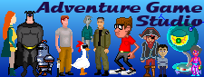
Which one do you like best? The one made with charachters from retail games or AGS games. I'll add the best one to the site in a few days.
Please note that these were done quickly with ripped sprites, I just cant stand having two blue cups at the top of the page anymore.
Edit: Changed the picture, now what do you think? You can now click on my sig to see what it looks like on my site.
Website.
Which one do you like best? The one made with charachters from retail games or AGS games. I'll add the best one to the site in a few days.
Please note that these were done quickly with ripped sprites, I just cant stand having two blue cups at the top of the page anymore.
Edit: Changed the picture, now what do you think? You can now click on my sig to see what it looks like on my site.
#18
General Discussion / Re: What Kind of Poster Are You?
Tue 08/08/2006 13:57:57
10) JJk poster- You have little time in posting a reply. You stay away from long threads where someone has posted alot of text, and you don't type too much either. The forums you visit don't see you often, but you swing by every now and then. Any topic that does interest you has already been disscussed and anything you would have to say, somebody else has already said first. This sacres you away from the forums.
#19
AGS Games in Production / Re: Indiana Jones and the Crown of Solomon - New screen, Paris-France at night.
Tue 08/08/2006 13:24:58
Looks good, I really like the paris screenshot. I cant wait for this to be finished.
#20
Completed Game Announcements / Re: Ben Jordan Case 1 Deluxe
Tue 08/08/2006 13:03:57Quote from: jet on Tue 08/08/2006 13:00:04It's sven Gordan
Good times.
Sven Goran? Link, please.
http://www.adventuregamestudio.co.uk/games.php?action=detail&id=695
SMF spam blocked by CleanTalk