Also wanted to add really enjoyed this game. Really atmospheric and cinematic. I caught up on some AGS games this year on steam. 
This section allows you to view all posts made by this member. Note that you can only see posts made in areas you currently have access to.

 !
!
 )
)
Quote from: selmiak on Fri 24/05/2013 20:53:00
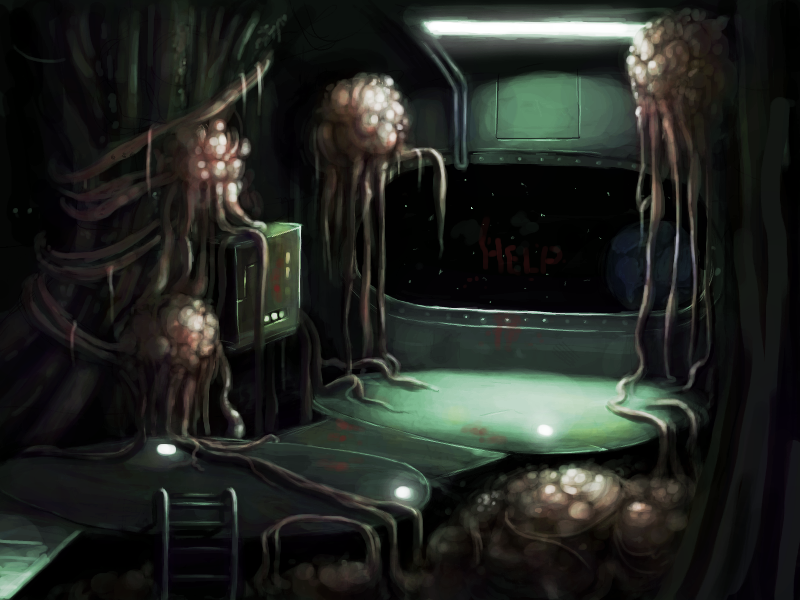
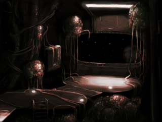
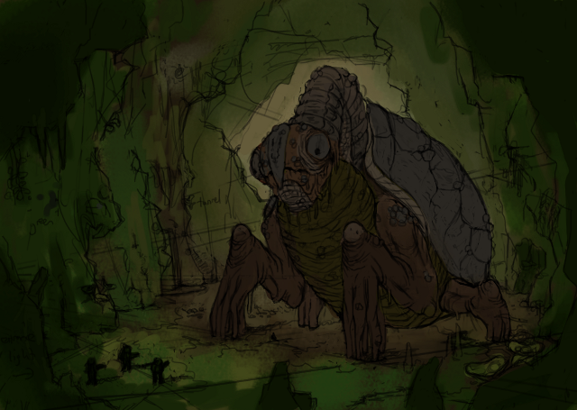
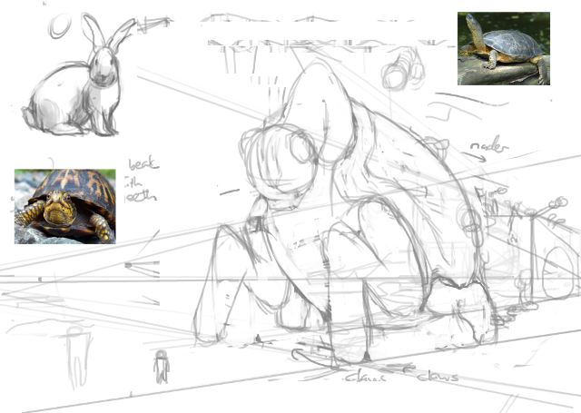
and please explain how you color these b/w lightvolumes pictures. I always wondered how you do that? Some special layer overlay setting in PS? Or just paint over it with 100% opacity and use the b/w image as a pointer? I am also interested in how Mordalles does this.
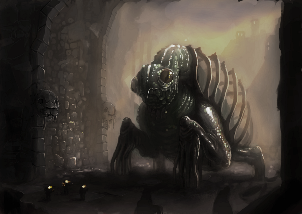

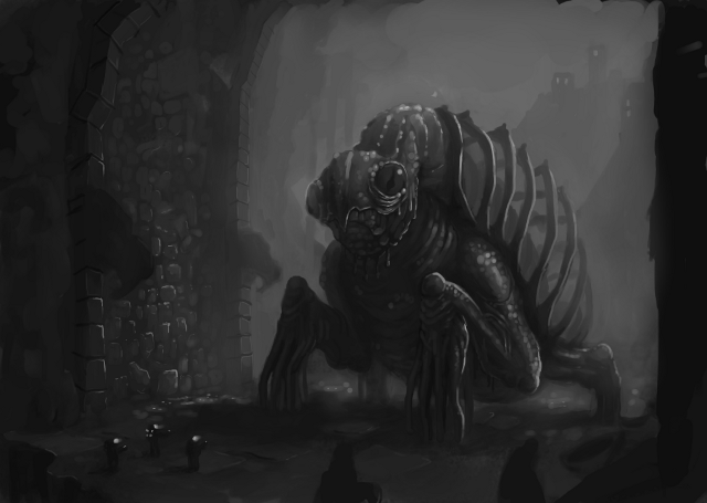
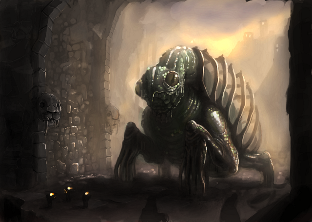
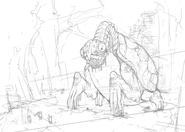
 around with values and forms, and possible backdrops. some sort of temples in the background, with man made pillars in the tunnel. still very much loosely painted monster with details lacking. at the moment its mostly shadows, light still has to be added. light is coming from top right corner, kinda behind the monster. that shell is giving me nightmares.
 ...
...
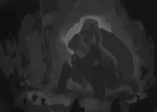
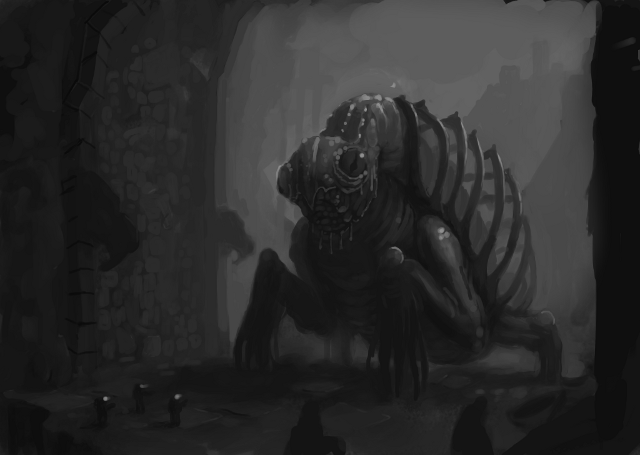
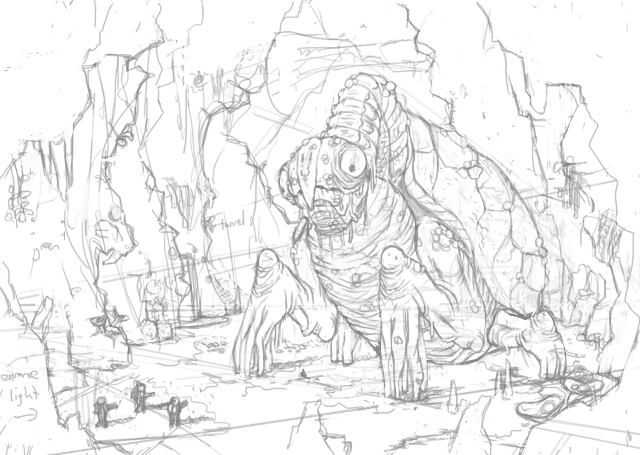 ... around with values and forms, and possible backdrops. some sort of temples in the background, with man made pillars in the tunnel. still very much loosely painted monster with details lacking. at the moment its mostly shadows, light still has to be added. light is coming from top right corner, kinda behind the monster. that shell is giving me nightmares.
  )
)
 )
) )
)