Menu

Show posts

This section allows you to view all posts made by this member. Note that you can only see posts made in areas you currently have access to.

Show posts Menu

Messages - ninepug

#2
caught in the jam.


15 colours + transi.

note, those not as redish as the other purple purple thingies at the back are wings :x.
#3
It's some kind of strange sea creature thingie.


10 colours.
#4
entry :3


8 colours including transparency.
#6
Wow! Looks awsome :D.
Very Monkey Islandish in look and hopefully in feel too :3 (haven't played enough Sierra games to determine if it's looking like that instead, anyway, it's looking deliciously oldschool)
Love the colours.
#7
Idea: ProfZmax, it's the devil having a picnic!
Atmosphere: Zyndikate, candlelight and pirates~
Design: Zyndikate, alot of delicious detail :3
Composition: Ildu, everything seems to be in harmony.
Functionality: Zyndikate, stuff for the inventory and it already has sprites in it :].
Technique: Zyndikate, details and the soft lighting is pure rock :}.
#8
Beware of Godzillas!
Love your style :3.
#10
Wish I could muster the patience to get rid of my pseudo-WIP technique ;].

Background was done in Painter with the variable coloured pencil brush.
imo it is the best program to simulate real materials but unfortunately it's hard to get the colour as clean as in photoshop, though it might just be that I don't know what I'm doing x).
Perfect for the impatient type as it does alot of the blending and texturing by itself.

Looking forward to your entry Ildu, may the awsomeness be with you c:.
#11
Looks and sounds absolutely amazing.
I'd lend you my voice if it wasn't so.. erh, bad.
Can't wait to see this completed :).
#12
Thanks for the interest :3.
Reasons for not continuing on it are.. time .. and laziness, and the fact that I hadn't planned it properly to begin with which means that I'm a bit stuck with what to make of it. Might start over with the same graphics, not too sure about that though.
#13
Kinda weird resolution and kinda undone entry ... is better than no entry! :3


I don't mind the first post collection of backgrounds at all, nor any critique.
Couple of very nice entries so far, hopefully more to come :).
#14
1
2
3
Screenshots of something you won't see again. :[
if it isn't okay to release something that won't be finished, feel free to delete this post or to mock me, mercilessly
#15
Not sure why we even have to vote, SCUMMbuddys entry will win for sure..  :-X
Eeh.. sorry

Idea - Zyndikate  having the waterfall power the station is excellent integration of the enviroment, and besides, I like zeppelins.
Atmosphere/Mood/Emotion - TheJBurger  plenty of atmosphere, goes well with my fear of heights.
Storytelling/Authenticity - Ildu

Design - Ildu 
Composition - Ildu
Colours - Ildu  Muted muddy to neon green, what's not to love? :3
Lighting - LimpingFish

Camera Placement/Angle - TheJBurger  again, awsome sense of height.
Walkareas - MashPotato
Exits - Ildu
#16
Totally wicked awsome Ildu, :D!
Looks brill, love the dusty? texture it has.
and yes, Bioshock is looking good as well :3
#17
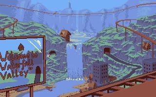
Made an attempt at a pixel background.

Would work a bit like the monkey island island overviews with different locations to travel to :3.
The orange thingie is a train track fyi, and it's originally in 320x200, also just fyi ;3

Love the backgrounds so far, alot of great ideas and atmospheric pictures :D.
#18
Wow, everything is so very astoundingly good O:

Best Idea - Scotch, even though (as you said) it isn't suited as a functional background, I'd love to be treated to something like this in a game. Reminds me alot of a cover for a fantasy book :3 (The good covers).

Best Design - Loominous, the mood is absolutely killer fantastic, and things <3.

Best Functionality - Mikko, it's the only one that I can figure out how the walkable area would be like xD. Also has some nice clear objects.

Best Technique - Loominous, wow :3.

I would've voted for my own but it seems to have some problems showing up :(.
I'll just have to make another one next time :3.
#19
Critics' Lounge / Re: James Zing! (A sprite)
Thu 05/10/2006 21:57:56
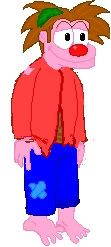
Made an attempt at a quick and messy paintover, hope it's okay :).
As this is my first attempt at a paintover or even a real critique, take it with a large grain of salt or two ;D.

I lowered the top of his head, the space between his brow and eyelids was a bit too much and made it look like his face was melting out from his skull like that witch from .. Wizard of Oz! can't actually remember the scene but I'm sure it was something like that.. might have been a horror movie..
Anyway!
Positioned his neck to the middle of the body and lowered his shoulders, making him more relaxed, same with the hands.
Leveled his feet as the perspective that is on the hands and head didn't seem to fit with them, other possibilty is to change the rest of the body to fit with the feet, depends on the backgrounds.
Hopefully some of this advice is useful.. though I'm not too sure of it myself :-X.
I do like the sprite and it's expression, kinda reminds me of the Gobliiins series :D, quite nice :3.

#20
Ooh coolio swamps :D.
Here's my attempt

Smugglers den (or something ó_ò).
Not sure if it's enough of a swamp to count :-X (or at least I'm not sure what counts as a swamp).
*crosses fingers for possible horrofic mangling*

Edit: Ouch, seems like my photobucket account is acting up :-X. Oh well ;D.
SMF spam blocked by CleanTalk