Menu

Show posts

This section allows you to view all posts made by this member. Note that you can only see posts made in areas you currently have access to.

Show posts Menu

Messages - Geratuza

#1
Critics' Lounge / Re: Bald Eagle - Photoshop
Thu 10/09/2009 15:20:06
I get your point, kaioshin. It's just that I believe that the theoretic approach as you describe it is not very productive. Personally, I did not learn of it as much as I believed I would.
Instead, if you want to learn to draw an eagle, google for 5 or 10 pictures of eagles. Look carefully at them and try to create an own one that comes close to the others, but is no exact copy of any of those. (Also, there might be tricks that other people discovered while trying to draw eagles.)
Or if you want to learn drawing sunsets, pick like 10 pictures of sunsets and create an own one in the spirit of the references.
Of course, the first pictures will not look as professional as the copied ones you are doing now. But it's a learning process, you will get better! Dare more freedom. Allow yourself to create (a lot of) less good-looking pictures, discover the flaws, practice new techniques and approaches, experiment with light and perspective, ask others for their perception of your picture... To me, this way was much more of a help than what I did before (what was similar to your approach). I just wanted to share this experience, because when looking back now, I see this time as a time of stagnancy from the point of getting skilled in drawing.
#2
Critics' Lounge / Re: Bald Eagle - Photoshop
Wed 09/09/2009 20:48:15
Hey kaio. I think it's a nice copy of the reference. Having a look at the works you've posted here (and on deviantart) I wonder what your point about drawing is. Is it just being able to copy something you see? I think that won't help much in creating games. If your point is to learn how to draw athmospheric backgrounds and realistic creatures and people, you should try to copy less and create more by yourself. I also copied pictures before and became quite good (I think) in it (just using the basic round brush though). However, since I stopped that and tried to create more scenery by myself instead, I have learned a lot about all the important basic stuff like lighting, perspective/plasticity and composition. It's a feeling and understanding of those basic topics that I did not get while I was just copying from references. Just my two cents. (It looks good however ;-) )
#3
Idea: Ghost
I had to lol several times for that idea. Also, the sea itself as the cradle of life is a very ancient topic ;)

Atmosphere: nihilyst
Interesting choice of colours that gives the scene a unique mood.

Technique: nihilyst
The right part of the screen looks awesome, although two techniques have been used (few colors and sharply distinguished areas for the clouds, many scattered colors for the gras). Also, the mountains in the back could need some AA. However, it's good, sharp pixelart.

Design: nihilyst, because of the weird mountains.

Composition: Misj'
Good overview of everything, the eye is lead to the important scene. nihilyst's entry is not bad as well, but there's those four quarters/squares (mountains, clouds, wind, platform) that seem to symmetrical, even if they meed somewhere around the golden ratio.

Functionality: Misj'
Enough exits and space for objects and characters.
#4


It's a zombie-negro-head. Fits to all models of Patent No. 5C4R74A-D (zombie-bodies). The knob serves as a flexible joint inside the bodies thorax.
#5

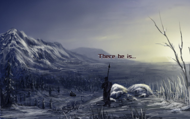
Legend says that there is a magic place, where a dying mammoth goes to to unite with its ancestors. But, if a real warrior is at its side in its moment of death, its spirit will unite with him and give him all his strength.
Of course, you - as a young tribesman - want to be the one who gains those powers as the first living person. But it's a long journey where you encounter many dangers like sawtooth-tigers, cannibal-tribes and snow-storms in the mountains.
While in the beginning it's all a selfish thing, the young man understands the mammoth more and more. In its last minutes on earth, they stay silently together in an uneven friendship. blabla (i've recently seen 10.000 bc ;) )
#6
Idea - jerakeen

Atmosphere - jerakeen

Design - jerakeen

Composition - jerakeen

Functionality - Misj'

Technique - Misj'
#8
As far as I know, stars are either blue, white or red (doppler shift effect, depending on the movement of the stars (towards the observer or away from him)). Also, we do not look long enough at those stars, so we don't notice the movement. This way the stars appear only white to us.
The same goes for the nebulars -- the hubble pictures used a very long exposure time (sometimes several hours). For the human eye, the colours wouldnt be visible.
ergo: space looks mostly black and white to us... That's at least what I've read about it.

http://www.astro.ucla.edu/~wright/doppler.htm

http://www.vendian.org/mncharity/dir3/starcolor/
#9
Vote to Kastchey for his idea and technique. And Bobbin.
#10
i'm missing bobbin threadbare though ;-)
#11
Exactly. Congratulations.
#12
Critics' Lounge / Re: FOA-Style Input Needed!
Sun 05/04/2009 09:52:02
You have to change your whole background creation method to get even near FoA-style. There's so much going wrong that I can foretell that you won't reach a consistent style that's close to FoA during the next two years (if ever).
Go for an own style instead, that's consistent throughout your whole game. To make it look better than your current bg's, work on your understanding of perspective and lighting. Paint your backgrounds as a whole instead of creating collages.
I'm sorry for being so harsh, but that's the only way of actually doing something productive with some graphical quality in the next time.
#13
I did not listen to each song in its full length as I found many of them annoying, but I did enjoy #23 and #34, they are special.
What I was missing the most (especially considering that this is meant to be a soundtrack, not just a bunch of different note- and percussion sequences) are recurring motifs that go into the ear and can be found in different tracks in different variations, depending on the scene the tune is written for. But perhaps I did not listen long enough to get them.
#14
Critics' Lounge / Re: Style critique
Fri 03/04/2009 05:44:43
Personally, I like to play games with a dense athmosphere. For backgrounds, this heavily depends on interesting, moody lighting (color, brightness, shadow cast). As it is now, there's almost nothing of this.
Another point I wondered about is that the objects (in front on the bed and on the shelf) are more detailed and have finer lines than the background. This way they stick out slightly. In my opinion they should blend more with the background.
#15
there you are ^^  (i just made one, in case that anyone wants to participate)
#16

waking up outside in a spooky night

edit: actually, the animation was meant to make it easier to see the outlines, but it was confusing, right. so, as it has served its purpose by now I'll replace it by a static pic
#17
I liked it :) I'll make one today.
#18
Here's a record of a plain midi-file I've made. It uses the chord-progression C-B-F-C, with a short Gm-A#-F-C-break at 0:50. It's mostly slow, becoming a bit more dynamic at 1:30.
However, it's a stupid, boring tune compared to the awesome piece of PixelPerfect. I'm looking forward to hearing more exquisite music like PP's in this contest.
#19
The topic for this backgroundblitz is
Microcosm

You are a volunteer for a scientific project in which your whole body will be shrinked dramatically. Find a small world within our world that you want to visit during the experiment.

Feel free to paint an unrealistic interpretation of a miniature world, like an ant-city with ant-statues and ant-hospitals etc.
Perhaps you will even meet beeings there that usually are too small for our eyes to see. Including sprites of those is appreciated, but not necessary (as this is a bg-blitz).


The voting will start on April 6 unless there is the demand for an extension.

(copy from last bg contest follows:)
The voting will be done in these categories:

Idea - The underlying idea to the background. Doesn't necessarily have to coincide perfectly with the theme of the week, just strike you as interesting/amusing/inspiring; a place you'd really enjoy visiting within a game.

Atmosphere - How well the image manages to evoke a certain feeling or mood.

Design - How well the elements in the image are designed, such as landscapes, buildings, decorations, clouds, doorknobs, etc.

Composition - How well the elements in the image work together/are positioned in relation to each other.

Functionality - How well it would work when adding sprites, including appropriate walking distances, a good angle for character sprites, clever walkway solutions, easily understood exits, etc.

Technique - How well the ideas are executed in form of rendering.

__

Trophies (edit)

(It's a city silhouette behind a magnifying glass)
#20
This has been a very interesting contest with a lot of very special and unique entries. Let's see how the next one will turn out. I'm about to think of a new topic.
SMF spam blocked by CleanTalk