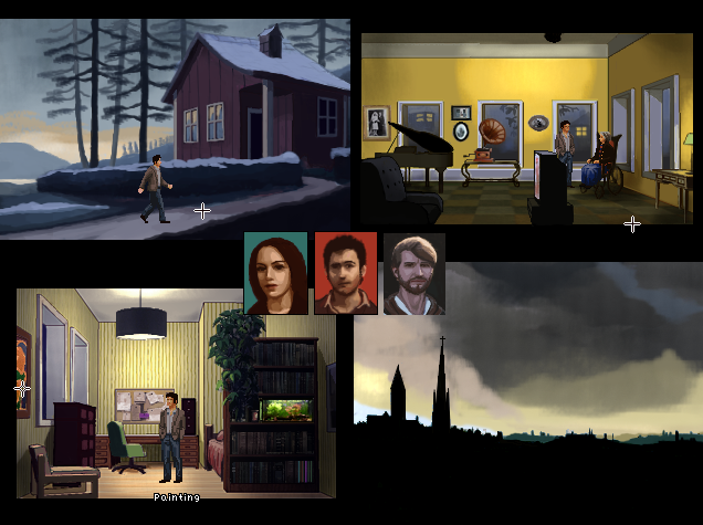
I'm trying to solve the font issue (avoid using super-pixelated letters which make some people's eyes hurt) in my low-res game, and have experimented with importing some TFFs with the AA turned on in the settings.
Everything would be perfect if it wasn't for the fact that AGS lumps together some letter combinations and make them hard to read. The font type itself is standard Verdana which normally has a really smooth nice legibility. Why are the letters rendered so awkwardly in AGS, and can I tweak it somehow? Or how do people typically circumvent the low-res texts issue (if they do - if they find it an issue)?
Everything would be perfect if it wasn't for the fact that AGS lumps together some letter combinations and make them hard to read. The font type itself is standard Verdana which normally has a really smooth nice legibility. Why are the letters rendered so awkwardly in AGS, and can I tweak it somehow? Or how do people typically circumvent the low-res texts issue (if they do - if they find it an issue)?


