I really think the game deserves a better poster (no it's not very good), because the in-game graphics is so beautiful. That's my sincere opinion, no offense!
- Welcome to Adventure Game Studio.
This section allows you to view all posts made by this member. Note that you can only see posts made in areas you currently have access to.
#801
AGS Games in Production / Re: Heroine's Quest - The Herald Of Ragnarok - Updates!
Fri 24/05/2013 08:47:39 #802
Competitions & Activities / Re: Monster Workshop - Week 2
Thu 23/05/2013 15:20:37
Ben, definitely good progress. Now I think you're ready for some level 2 c&c 
What I'm missing now is some kind of story. Some expression, some action, some movement. So you have a monster here, and being the only living figure he's the focal point of the scene, and at the moment he's not doing anything in particular. I can't even read if he's angry, if he's violent, or if he's just waiting for someone.
It would help immensely if we had a second figure, perhaps a human, a conjuror who just finished the summoning ritual. Or someone running away. Or hiding. Without a second character, I really think your monster has to do something, or express something, maybe pain from being summoned, maybe frustration, maybe he's raising a clenched fist against the moon.
On a technical level, I think it's looking good, but not all of the veins work. The veins on his thigh, for instance, look more like worms than anything belonging to his body. One reason may be that we don't see enough muscle tension or definition - veins typically bulge out on top of really defined or articulated muscles. Apart from that, I think there's too much highlighting on him. Consider that it's the moon emitting the light, and the moon is pretty low. Much of his left side should be in darkness, as well as his calf and most of his rib cage.
#803
General Discussion / Re: How do you pronounce .gif?
Thu 23/05/2013 06:53:02
I think there are enough exceptions to Eric's rule that GIF can safely take the hard G as well.
Gilbert, gimmick, guitar, give, girl, gift.
We also have "gimp", which is incidentally another graphics-related acronym, and an existing word, pronounced with a hard G.
Case re-opened.
Gilbert, gimmick, guitar, give, girl, gift.
We also have "gimp", which is incidentally another graphics-related acronym, and an existing word, pronounced with a hard G.
Case re-opened.
#804
Adventure Related Talk & Chat / Re: Is OROW still happening?
Wed 22/05/2013 09:19:24
We can fire one up after the illustration workshop has ended. I don't know how much time people have (for me this time of year is the busiest) but it's worth a shot.
#805
Competitions & Activities / Re: Monster Workshop - Week 2
Mon 20/05/2013 19:12:48
Wow, lots of nice improvements!
Cat: It's really starting to look like an illustration now! I'm not exactly terrified by your monster - which is due to scaling issues, I believe (I still see it as a few inches long) but it doesn't matter because it's turning into a really nice painting.
Selmiak: Great! Placing it in a deep cave adds a ton of atmosphere.
Ben: Well rendered Nice skin textures with scary veins and all that!
Sookiesock: Awesome progress. However, I'm not too fond of the horse's movement/posture. At first I thought it was just rearing there on its spot, but now I get that it's jumping over the hand of the monster. While that makes it slightly more logical, it still looks a bit too static, too orderly, so to speak. I think it would create a better sense of speed if it was galopping by, leaning in the curve. But even if it is supposed to skip over the monster's hand, I think you need to make it look more airborne, and less standing on its hind legs, waiting to be scooped up.
Cat: It's really starting to look like an illustration now! I'm not exactly terrified by your monster - which is due to scaling issues, I believe (I still see it as a few inches long) but it doesn't matter because it's turning into a really nice painting.
Selmiak: Great! Placing it in a deep cave adds a ton of atmosphere.
Ben: Well rendered
Nice skin textures with scary veins and all that! Sookiesock: Awesome progress. However, I'm not too fond of the horse's movement/posture. At first I thought it was just rearing there on its spot, but now I get that it's jumping over the hand of the monster. While that makes it slightly more logical, it still looks a bit too static, too orderly, so to speak. I think it would create a better sense of speed if it was galopping by, leaning in the curve. But even if it is supposed to skip over the monster's hand, I think you need to make it look more airborne, and less standing on its hind legs, waiting to be scooped up.
#806
Competitions & Activities / Re: Monster Workshop - Week 2
Fri 17/05/2013 19:55:52
Ok, new update as of May 17th
[imgzoom]http://esseb.com/andail/graphics/floating6.png[/imgzoom]
I really wish I had picked some photo references early on for the biker rider, because now he's looking pretty generic. Ah well.
I changed the woman so that she's no longer aiming at the monster, because that was, as Loominous pointed out, looking a bit futile, if not silly. Now she's just posing with a really big gun, I think. All this is a bit retro-cheesy, but I kind of like it The vehicle looks odd because it was resized and hasn't been refined since. Will work on it later (not much of a motor person...)
Added a sun in the background, and plenty of highlights on the bike riders to make them stand out better. There's still too much grey areas, which gives the picture a certain dullness, so I will either add more colours or smear out everything to give the picture some kind of motion blur effect
[imgzoom]http://esseb.com/andail/graphics/floating6.png[/imgzoom]
I really wish I had picked some photo references early on for the biker rider, because now he's looking pretty generic. Ah well.
I changed the woman so that she's no longer aiming at the monster, because that was, as Loominous pointed out, looking a bit futile, if not silly. Now she's just posing with a really big gun, I think. All this is a bit retro-cheesy, but I kind of like it
The vehicle looks odd because it was resized and hasn't been refined since. Will work on it later (not much of a motor person...)Added a sun in the background, and plenty of highlights on the bike riders to make them stand out better. There's still too much grey areas, which gives the picture a certain dullness, so I will either add more colours or smear out everything to give the picture some kind of motion blur effect
#807
General Discussion / Re: Game of Thrones (and the gratuitous nudity therein), split from Oblivion thread
Fri 17/05/2013 16:44:37
Yes Snarky, you just have to look hard enough! And use your imagination.
#808
General Discussion / Re: Game of Thrones (and the gratuitous nudity therein), split from Oblivion thread
Fri 17/05/2013 13:55:35
I agree the last episode - and the one before that too, I would say - haven't been that eventful, and yes, lots of filler nudity. But I seem to recall that in both previous seasons, somewhere around episode 7 or 8 the pace slows down a lot and the plot becomes basically about transporting people from A to B.
I usually don't mind the sexual content of GoT, but I think it has to be done with some tact lest it appears cheap. If there's nudity because they choose to depict people having sex, which people have, then I don't really mind. But if it comes to the point where they just take a couple of young girls and let them strip for no apparent reason, I as a viewer will start to feel uncomfortable. It's at times like that I'm glad I haven't managed to persuade my girlfriend to watch it with me - I simply would have no good answer if she'd ask me the purpose of it all.
Apart from that issue, I still enjoy GoT, although I must say the last two episodes in season 1 remain the strongest parts for me.
#809
Competitions & Activities / Re: Monster Workshop - Week 2
Thu 16/05/2013 21:43:38
Thank you Loominous
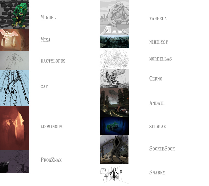
Miguel:
I think you might have worked too much adding texture and detail to your figure before putting him in a context. It may prove hard to make him fit in the picture retroactively. Still great job on the skin texture.
Misj:
Cool idea, and the composition is looking promising. I wonder how well the pose will work when it comes to interacting with the other figures; right now it looks a bit stiff, almost like a statue.
dactylopus:
Dramatic composition, very cartoonesque. It will be interesting to see the full background.
cat:
I see you have started colouring the piece now, and while it is a dramatic perspective, I'm not sure how monster-like this creature will be. At the moment it looks like a baracuda. The problem with not including a human figure in the scene is that you lose the proportions a bit. This could basically be an inch-long kelp eating fish for all we know.
loominous:
As always great lighting and masterful drawing. At the moment I'm not getting any monster-vibes at all - he's looking more like a stern uncle, just about to tell his nosy nephew to get the heck out of the library - but that might change.
ProgZmax:
Hm, this is a tough scene. Lots of things going on, lots of angles and perspectives to keep track of. This might be a big darling for you to kill, but I would consider scrapping the foreground sniper, and bring the worshipers closer. I think just having them and the monster interact is enough action for one picture. But if you manage to pull it off it would be really cool.
waheela:
This one is very original, and the most comical of the bunch. When the monster is centred like this, with very little else going on, it's important to make it interesting to look at. Right now it's a bit too plain dinosaur. This is basically a portrait - work more on an original monster design!
nihilyst:
Tons of Giger-vibes here. Which is a good thing. Not much else to say atm
mordalles: (mind the spelling, Loomie )
Easily one of the most promising illustrations so far. Great monster, lots of personality, both scary and full of character.
Cerno:
Hm, this monster hasn't found a natural pose yet. There's something with his wings and posture not really adding up. I would experiment more with his pose before moving on to shading and texturing.
selmiak:
Not scary, but a nice comical touch.
SookieSock:
Good start, but I think you have to rearrange some elements in this picture. Both the monster and the horse archer are competing for the foremost percent of the picture. They're also basically - as far as I can see - turned the same way. Maybe move something back, into the picture, just to give them more room. Really nice colours so far.
Snarky:
Hard to say what you can make of this at this point. As a b/w drawing it's really nice, but the composition and perspective, along with his featureless face, may prove hard to develop much further. Still full of personality, and quite scary, I should say.
Kasander:
Scary indeed, but I'm missing something. This is too much Magic the gathering-portrait. I would like something more to look at.
TheeOhFour:
I think you've stressed a bit so far, so I'm really looking forward to seeing what you can come up with given a bit more time.
Alright, here's my latest update.
Someone adviced me to go back to the earlier, less defined monster, so I did that. I even made it more featureless. The only thing I'm worrying about now is that this illustration won't be so much about monster design, but hey Also went back to a more straight perspective, and started working a bit on the people on the bike. They will take most of the remaining time to finish.

Miguel:
I think you might have worked too much adding texture and detail to your figure before putting him in a context. It may prove hard to make him fit in the picture retroactively. Still great job on the skin texture.
Misj:
Cool idea, and the composition is looking promising. I wonder how well the pose will work when it comes to interacting with the other figures; right now it looks a bit stiff, almost like a statue.
dactylopus:
Dramatic composition, very cartoonesque. It will be interesting to see the full background.
cat:
I see you have started colouring the piece now, and while it is a dramatic perspective, I'm not sure how monster-like this creature will be. At the moment it looks like a baracuda. The problem with not including a human figure in the scene is that you lose the proportions a bit. This could basically be an inch-long kelp eating fish for all we know.
loominous:
As always great lighting and masterful drawing. At the moment I'm not getting any monster-vibes at all - he's looking more like a stern uncle, just about to tell his nosy nephew to get the heck out of the library - but that might change.
ProgZmax:
Hm, this is a tough scene. Lots of things going on, lots of angles and perspectives to keep track of. This might be a big darling for you to kill, but I would consider scrapping the foreground sniper, and bring the worshipers closer. I think just having them and the monster interact is enough action for one picture. But if you manage to pull it off it would be really cool.
waheela:
This one is very original, and the most comical of the bunch. When the monster is centred like this, with very little else going on, it's important to make it interesting to look at. Right now it's a bit too plain dinosaur. This is basically a portrait - work more on an original monster design!
nihilyst:
Tons of Giger-vibes here. Which is a good thing. Not much else to say atm
mordalles: (mind the spelling, Loomie
)Easily one of the most promising illustrations so far. Great monster, lots of personality, both scary and full of character.
Cerno:
Hm, this monster hasn't found a natural pose yet. There's something with his wings and posture not really adding up. I would experiment more with his pose before moving on to shading and texturing.
selmiak:
Not scary, but a nice comical touch.
SookieSock:
Good start, but I think you have to rearrange some elements in this picture. Both the monster and the horse archer are competing for the foremost percent of the picture. They're also basically - as far as I can see - turned the same way. Maybe move something back, into the picture, just to give them more room. Really nice colours so far.
Snarky:
Hard to say what you can make of this at this point. As a b/w drawing it's really nice, but the composition and perspective, along with his featureless face, may prove hard to develop much further. Still full of personality, and quite scary, I should say.
Kasander:
Scary indeed, but I'm missing something. This is too much Magic the gathering-portrait. I would like something more to look at.
TheeOhFour:
I think you've stressed a bit so far, so I'm really looking forward to seeing what you can come up with given a bit more time.
Alright, here's my latest update.
Someone adviced me to go back to the earlier, less defined monster, so I did that. I even made it more featureless. The only thing I'm worrying about now is that this illustration won't be so much about monster design, but hey
Also went back to a more straight perspective, and started working a bit on the people on the bike. They will take most of the remaining time to finish. #810
Competitions & Activities / Re: Monster Worskhop - Week 2
Tue 14/05/2013 19:29:45
Misj, yeah don't worry too much about that. Look at my process; I didn't even show any references (although I have most of the work sti ll ahead of me, with plenty of references to find and publish). I expect to spend the whole upcoming week just painting the figures on the bike. I'm also extremely dissatisfied with the monster at this point, so c&c is welcome.
[imgzoom]http://www.esseb.com/andail/graphics/floating3.png[/imgzoom]
[imgzoom]http://www.esseb.com/andail/graphics/floating3.png[/imgzoom]
#811
Competitions & Activities / MONSTERWORK SHOP - FINAL VERSION DUE TONIGHT (MONDAY)
Tue 14/05/2013 13:31:37WORK MONSTERSHOP WEEK THREE
So, for those still going strong, please submit your final piece before midnight. Starting tomorrow, we will then vote for our favourite entries. Break a leg everyone!
#812
The Rumpus Room / Re: Name the Game
Mon 13/05/2013 19:16:05
Rats, i'll have to forfeit this one (can't access my comp right now)
#813
Competitions & Activities / Re: Monster Workshop - full sketch due tonight (Monday)!
Mon 13/05/2013 18:47:17
Loominous, yeah that was exactly my thought.
#814
The Rumpus Room / Re: Name the Game
Mon 13/05/2013 16:24:30Quote from: Khris on Mon 13/05/2013 11:54:22
Somebody created a 1:1 Windows version of Castle Adventure, in case you want to wallow in nostalgia
http://www.benshoof.org/blog/castle-adventure/
Oh man, get out of here!
I played that one a LOT as a kid. Even my father helped me. I will definitely give it a go.
#815
The Rumpus Room / Re: Name the Game
Mon 13/05/2013 16:22:54
Haha, I just wanted to win once because I haven't known any of the previous ones 
Shows how much I suck at this
Shows how much I suck at this
#817
Competitions & Activities / Re: Monster Workshop - full sketch due tomorrow (Monday)!
Mon 13/05/2013 15:50:00
I guess I've settled for sci-fi. I don't know if I've chosen too ambitious a project; this one will crave LOTS of time that I don't really have, but hey, it's a challenge.
The perspective is just everywhere right now. I've gone with some kind of fish-eye perspective, but I don't know how well it works. I want a swooshy, speedy feeling.
I've used close-up photos of fleas as references for the monster, but clearly it also has snake-like qualities. Since it's a sci-fi setting, I might add glowing parts on it - concept artists I've studied seem to like adding glowing parts on their monsters.
So now I have like 20+ hours ahead of me drawing those humans on the motor vehicle...

Back to OP
The perspective is just everywhere right now. I've gone with some kind of fish-eye perspective, but I don't know how well it works. I want a swooshy, speedy feeling.
I've used close-up photos of fleas as references for the monster, but clearly it also has snake-like qualities. Since it's a sci-fi setting, I might add glowing parts on it - concept artists I've studied seem to like adding glowing parts on their monsters.
So now I have like 20+ hours ahead of me drawing those humans on the motor vehicle...
Back to OP
#818
Competitions & Activities / Re: Monster Workshop - full sketch due tomorrow (Monday)!
Sun 12/05/2013 19:09:20
Alrightie, just posting to say that in order to stay in this workshop, you need to have a sketch ready by tomorrow. The sketch should have your monster and all key elements that you wish to include in your painting. It should also show roughly what kind of environment, perspective and composition you're aiming for. It doesn't need to be some kind of perfect pencil-drawing, but your final painting has to be at least vaguely based upon it (so you can't throw in a brand new, totally different painting the day before the final deadline - that's not how this workshop works).
#819
General Discussion / How Oblivion, the movie, could have been much better
Fri 10/05/2013 11:49:56
Hey, remember when sci-fi movies were only for nerds, but that didn't matter because there weren't any sci-fi movies anyway? Well, those days seem to be gone, since sci-fi has now turned mainstream. And since we know that 90% of all sci-fi is crap, this means that we have a lot more crap on our hands these days.
Well, Oblivion isn't all crap (wouldn't waste my time writing a lengthy article on it then), but it's far from good, so I've compiled a little list of suggestions on how to improve it.
* Replace alien mastermind with humanity. I think the strongest part of science fiction is when it discusses our own race, our society, and our shortcomings. This huge computer-god doesn't speak to me. I don't know what it's meant to represent. If it turned out that people were behind this deception (trying to quell a rebellion) I'd feel much more enthused. Now the ending brought back memories of Indepence Day, and boy had I been working hard to suppress them.
* Stronger female characters. Okay, first of all it makes no sense whatsoever that his companion, Vika, walks around in high heels and perfect make up all the time. I mean, all they know is that platform and each other, and all she does all day is sit in front of a giant iPad, so why wear anything but a functional and moderately sweaty jumpsuit?
On a side note, Hollywood needs to stop portraying people that mourn by having them stand quietly, stare emptily, and let huge perfect tears drip down their cheeks. That's not how you cry. Most people wipe around their salty crying fluids and sob and cough until their makeup - should they wear some - is smeared out all over their face.
When we're introduced to the second female lead, we meet someone who spends the first half of her time onscreen just looking sad and confused, following Jack around and generally acting like some kind of mute pet. I mean, she's the one who knows what happened, she remembers, so naturally she should be pissed off and vengeful and furthermore she's also an experienced astronaut so she should take command and tell Jack to tag along while she prepares to kick ass.
* Tone down the American references. I know, it's an American movie, but I don't really think even a purely American crowd needs to see famous New York landmarks in each and every scene just to stay engaged. And when Jack starts re-enacting a game of football that he can't reasonably have any knowledge or memories of, he just comes across as a dumb jock. Let him represent humanity, not a nation.
* Skip the cloning part. That's just one twist too many, and a super-clichéed one at that. It's enough to learn that he was fighting for the wrong team all along. Moon has already done the best existential take on cloning that'll likely ever be made, so just don't go down that avenue. Furthermore, the final scene, where one of Jack's clones finds Julia, is just utterly confusing. What's the message here - that his clone is just as good? That it doesn't matter if you die, as long as you have a clone around somewhere? It just seemed like the film makers had to think of a solution where Tom Cruise both awesomely sacrifices himself - since that's the whole damn point of the movie - but still lives, because Tom Cruise couldn't stand not having both? Was the focus group perfectly split between the two endings? Of all the stories ever told where we thought a character heroically sacrificed their life, only to turn out alive in the epilogue, this has to be the silliest.
* Fix the whole memory issue. We learn early on that Jack and Vika had their memories erased (for security reasons). In my opinion, that's just too... drastic. With no memories, there's no reason to come up with an intricate alternative reality, there's no reason to provide any explanations at all, you can just have them perform those mindless tasks like robots, because isn't that what Tet wants anyway? Why keep them even partly sentient? Why let them be humans at all?
I'm spending time criticizing this movie because I think it has some really strong points, and it kept me engaged for very long. First of all it's really well crafted, with lots of authentic-looking details and designs, absolutely stunning scenery and generally awesome special effects that don't go overboard with a million CGI monsters jumping around the screen, giving you migraine. I love how low-key it is at its outset, and how effectively the suspense is built up. The drones seem real and work well (at least the first couple of scenes, then they become increasingly annoying). I actually feel like I'm there.
So, here's my suggestion for a much better version:
There's no alien super computer. Natural disasters (caused by climate change?) have struck Earth and people have started evacuating. The space colony exists, but some refuse to leave Earth. The powers that be need to bring with them plenty of resources, and also to get rid of the rebels who protest about their resources being stolen. The powers that be brainwash two people into believing they're fighting aliens, so that they can stay behind for drone maintainence. Almost all of their memories are intact, only they've been programmed to see rebels as aliens. They are still being supervised and monitored, but not to the extent of Tet's omnipresence.
When the rebels finally manage to smuggle a nuclear bomb to the enemy, we don't have to see more. We don't have to see the space colony, or what the powers that be look like, because it just deprives the movie of its much needed mystery. Most of all, we don't need to see another damn alien mothership interior.
#820
Competitions & Activities / Re: Monster - a hi-res illustration workshop
Thu 09/05/2013 21:51:34
Yeah, Kasander, it's amazing to see Frazetta's perfectly harmonious compositions. That along with the dynamic poses of his figures are just eyecandy. I had books of Frazetta which I studied before there was even an internet, but I didn't understand until almost recently how much he worked with geometry.
SMF spam blocked by CleanTalk