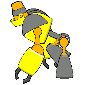
Just some stuff that immediately caught my eye:
Look at her belly button... it's not in line with her crotch, which should be the line of symmetry.
Her shoulders go down a bit low. Might want to extend her upper arms upward.
Is that black line across the breasts part of the design? If it is, you may want to suggest bulging. If it's meant to be a wrinkle, you should lose it... it's cutting across the "filled" part of the shirt where there should be no room for slack cloth.
You may want to consider moving the breasts higher... mainly because that part of the curve that blends into the armpit is not very natural as is.
Her left knee (from her perspective) cuts in a bit deeply making it look as if her leg is two sausages in a link.
Unless her nose is meant to cave in a bit, it needs to round off toward the left side (our perspective) a bit. As it is, it appears that her right cheek (her perspective) is swollen.
I know that sounded like a lot of criticism, but I actually like this sprite a lot. Good luck!


 i hope you finish this project.