Menu

Show posts

This section allows you to view all posts made by this member. Note that you can only see posts made in areas you currently have access to.

Show posts Menu

Messages - Cassiebsg

#5481
I think being an update to your game, that posting on your game post was the right place to post. Besides, I believe that you and anyone can always post on the Completed Games section threads (as long as relevant, that is). Let's say I just downloaded your game and wanted to comment on it? ;)

If I'm wrong, then please let a mod correct me.
#5482
The Rumpus Room / Re: Corrupt-A-wish!
Fri 19/06/2015 17:42:49
Granted! But now you moved through live at double speed and have thus shorten your live in half.

I wish the summer arrived already!
#5483
Again, by eliminating the ones I like less (1, 3 & 6) due to lack of outline/contrast the shapes just blur into each other. Just look at the bust or painting on the back wall and you can barely figure out what's happening in there. Left with 2, 4 and 5... and since 2 has no shadding, I'm now at 4 or 5. I think I would go with the softer shading of 5, since I have a hard time figuring out how the shading is happening on picture 4 or better said, where the light(s) source is.
#5484
>>Use Burden of Guilt on handrail. (Seems to have perfect "hook shape" ;) )
#5485
1st. Dr. Mokho
2nd. Dr. Bohnito
3rd. Dr. Mandle

Great entries everyone! (nod)
#5486
Funny, I would trash all those with thick outline, I just don't like them.
My vote goes to 4 after eliminating 1 and 3, due to lack of outline/contrast, and seems the one that has some better shading, even if ever so slightly.

But then again, would be better to see them against a background. It's hard to judge what works best otherwise (IMHO)
#5487
Critics' Lounge / Re: Board game squares
Thu 18/06/2015 18:40:49
Don't think the square frames should be transparent. And now with names on, seems kind of cluttered.
I think you should leave them nameless, or add a "mouse over" with the name instead. Alternative, you could picture the locations in each square. Though, am not sure if it would not become too much visual info. :-\
Try fading the BG a bit, so the game elements "pop out" of the picture.
#5488
Mandle, try VirtualDub to edit the video. ;)
#5489
@loominous, I actually like the foreground stall on the left best, seems to frame the picture better, and not mess with the Harbor Master's house. Only thing that bothers me is the "black" patch on the lower right side. Maybe you could try and remove that? That way you have a neatly framed south exit. ;)

PS - Sorry if I'm not providing that much feedback, but with such talented ppl in here, all I can see is beautiful pictures...(laugh)

#5490
Been struggling a bit with getting the camera just right after I'm scaled everything up.
But think It's okay now (or good enough for me to continue working on the model anyway). Also still not completely happy with the building. :-\ Anyway, this is what I managed to do today (don't mind much the materials chosen atm, they just help me visualise the model better atm.)


Guess tomorrow's work (if I have the time) will be to study lighting the scene a bit better.. (roll)

Selmiak, thanks for the feedback. :) Though, am not using Blender to sketch and paint over later on. I plan to render the scene with materials and hopefully get a decent scene out of it. ;)
#5491
Thanks, and I just realized that I accidentally saved my file as PNG (without trasparency!). Now I need to do the outline again. >:(

EDIT: Okay, redone the outline work and added some shadows. I'm happy with it. :-D

The Green Landspeeder:

[IMGzoom]http://i725.photobucket.com/albums/ww258/Cassiebsg/Misc/SWJam.png[/imgzoom]

Sorry, no animation since it's parked. :P
#5492
I subside to what cat said, and add that I've already learned more about drawing and painting from this workshop, than I ever did from drawing classes I had in school and uni!
#5493
I'm working on one, so waaaait for me... (laugh)
#5494
Thanks a lot for the feedback Misj'. :)
I also normally prefer lower camera angle, though that is the easy part when working with a 3D model, just lower the camera. (laugh)

The "dark streets" was me trying to mark the walkable area, really. :-[ 
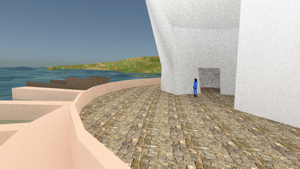
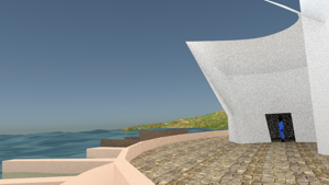
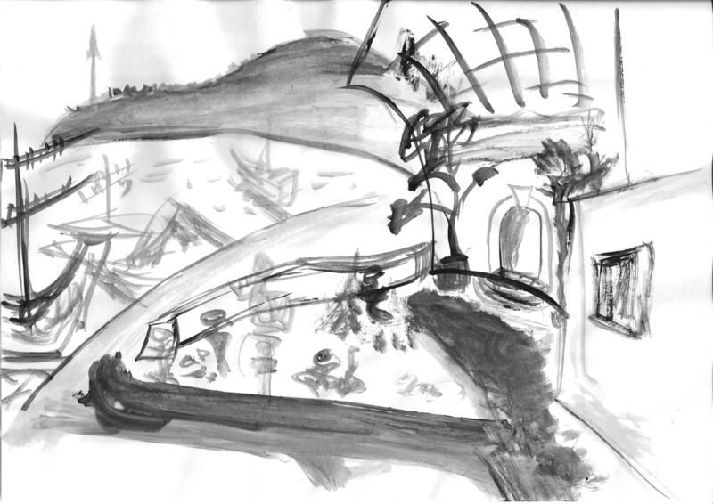
And experimenting in the 1 drawing with maybe using a cobblestone street. And for the foreground, I thought that silhouettes of traders and their stuff could just fill that patch of "white" on the lower left. I'm not sure I want to close the courtyard like that, though. So I'll play with it a bit more and see what comes out from a quick 3d model.

@Dropped Monocle Games, from your new draft the only thing that jumps to my eye, is that the 2 buildings (behind the stalls and previously marked in red by ThreeOhFour) are still using the same line for the end walls. I would probably extend the building on the right a bit more to the left and give them some touch/sharing walls space. Or you can go the other way, if you wish some apart space between the two for a small narrow street. As is it's looking a bit odd. :)

EDIT: Just adding a small updated picture with my 3D quick model (not finished, barely started really!)... Original post with more "details.
#5495
Updated original post here!

Okay, been puzzling a bit with trying out my design into 3D, but it's not really working, so today I took a bit of time to sit and do some "doodles" on paper, to try and workout my space. Think I got something that might work, will have to go back to blender and try it out, since there's a few shapes am still unsure (and my lose doodle doesn't help much).

Here's my latest update (check original post for details).


#5496
Critics' Lounge / Re: Portrait Suggestions
Tue 09/06/2015 20:15:48
I actually like the original eyebrows and mouth better. Though the mouth does look like he's "pointing" his lips, like he's getting ready to give a kiss... (laugh) But it transmits, to me, a more inquisitive/suspicious type of face.
Grok's edit is nice, but he looks more "soft" and relaxed. Less menacing, if you get what I mean.

As for the portrait, maybe a scar?
#5497
Voted, even though I probably won't participate (I can barely do a BG in a month! :-[ ), but sure wish to follow this and see how it turns out. :)

Anyway, since the first 2 weeks don't work for me, I voted on the remaining weeks (just so you know). (nod)
#5498
The Rumpus Room / Re: Name the Game
Mon 08/06/2015 19:57:33
It still looks like a flying ship... so maybe... Discworld: Noir? (the scene reminds me of the flying turtle, and I remember ships in Noir - though I haven't actually finished the game, so maybe there is no such scene. (roll) ). 
#5499
[IMGzoom]http://i725.photobucket.com/albums/ww258/Cassiebsg/Misc/notabug.png[/IMGzoom]

Not a bug! It's Dinopig!
A long lost relative of our lovely farm pigs.
#5500
Thanks for the feedback loominous! :)

You know, I hate boxes... yet, I seem to always end up in them, as soon as "buildings" come into the picture. (roll) As for the "stalls"... well, that's what comes to mind. A rectangular shape with stuff to be sold on them, and eventually a roof to shade from the sun and rain. :-\ Is "stalls" to be taken literally, or figuratively? Cause I probably would rather have sellers sitting or standing by their stuff on the floor, and eventually one of two stalls...

I never tried painting "blobs" and shades before. Normally I just draw the lines and then shade (and most of the time it's a real location I'm drawings, so the shades and contrasts are already there.) And I started thinking "shades and blobs" but still ended up with lines. (laugh)

I'll see if I can produce some blobs and shades, that I'm happy with... I'll be baaaaack... ;)

EDIT:
@selmiak: I know there's a clipping setting for the camera. I often also have problems with it. :( 
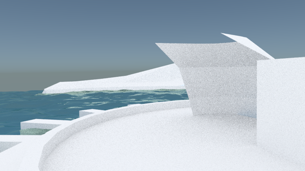
Let me open and see if I can find it. BRB

EDIT2: Select your camera, click on the camera icon on the right to select it's pane, open "Lens". There's one called "Clipping" there. Try and increase the END value.
SMF spam blocked by CleanTalk