Menu

Show posts

This section allows you to view all posts made by this member. Note that you can only see posts made in areas you currently have access to.

Show posts Menu

Messages - Damien

#121
Wind Up.mid

The idea: a wind up fortune teller robot. Wanted it to sound like a dying music box, hence the tempo decrease.
#123
Grinder's entry hosted on 2dadventure.com:
-link removed, see next post-

I will try to make something untill the deadline, my inspiration is absent at the moment.
#124
Critics' Lounge / Re: Short MIDI
Sat 29/07/2006 02:19:35
Pretty cool, it would work well in a tense game cutscene.

Here is an edit with some ideas:
Click me.
-since you mentioned Turkey, the edit uses ethnic instruments,
-changed the bird tweet so it doesn't get too repetitive
-made the bird tweet shift from the left to right speaker and back to the midle
-added a percussion track
-added some pitch changes to make it more interesting

Hope this helps.
#125
A first AGS game I played in a long time and it is pretty amazing.
Great story, dialogs, music, and graphics + the parser worked really well. I was impressed to see the commands like:
Spoiler
"point at the knife" or "slide the painting under the door" work.
[close]
#126
QuoteDo you mind if I use this in the game?
Feel free to use it.


About the talk view, you could try rotating his head more like in this photograph, for example. That way the facial features (jaw, cheeks, ...) would be more noticeable and you could use their movements to add more detail to the talk cycle.

Sorry for not making an example, but I have little time right now.
#127
I like the sprite and the style used for it. Here are some tweaks that could help you:

1 - the original frames
2 - duplicated frames 1 and 5 from the original animation and changed the order of
     the frames so it runs more smoothly
   - fixed frames 3 and 4 where the char looked like he was about to fall on his back
   - tried to make the legs longer
   - maked the char shortest in the frames where his feet are furthest apart
3 - shifted the animation to right for one frame
   - played with the collar bounce
   - made the shoulders move in both directions
4 - tweaked everything from above

The paint-overed animation - 10 frames, 1/10sec per frame:


As you can see, there is a small limp. That's probably because the leg animation is copy-pasted so the same leg always goes forward. Also, there are some jerky head movements and few stray pixels I didn't fix.

Keep it up.
#128
Critics' Lounge / Re: My first background.
Sun 04/06/2006 20:44:44
I think choosing colors by hand makes the background much more pleasant to look at. Sure, it takes more knowledge and effort to do it, but this is the CL after all so there isn't much use in saying everything's perfect.

Example:

Now, imagine if there were no blue tones or orange highlights, just monochromatic shadowing. It wouldn't be as half as interesting as it is now.
The orange highlights are directly lit by the setting sun and the blue color from the sky gets reflected on the unlit parts of the snow. Ofcourse, if the sky was cloudy, then the shadows wouldn't be that blue and sharp, and the highlights would be a bit more dull, too. Someone correct me if I'm wrong.
#129
General Discussion / Re: Music Programs
Sun 04/06/2006 16:08:40
You could try Sound Club For Windows. It has it's own instrument bank, supports mod formats and you can import your own recordings in it, too. Unfortunatly, I think there is no mp3 support, but luckilly, there are a lot of free wav to mp3 (or ogg) converters out there.


T_ed89: Your avatar is a 959x598px size bmp resized to 60x60px. That makes it 1.6mb which is pretty unneccessary. Here, have a smaller (60x60px, 4kb) version so the Dial-uppers don't suffer too much:


And the link to the image:
Code: ags
http://i5.photobucket.com/albums/y178/DrunkyDuck/Help/molieux.png
#130
Here's some advice for making the face:


x2:


-If you connect eyebrows like that and color them black your characters will get a 'cavemanish' look. Seperate them and try reusing the hair color instead of adding another.
-The makeup color stood out too much so it got replaced with the darkest skin shade.
-The eyes are a bit smaller now and pure white was replaced with the shirt's grey color.
-I see you've added another color for the lips, I've remade them using the hair color again. Also, 2 tones are used so the edges look a little smoother.
-Since the lightsource is above the character, the face got shaded this way too with highlights on the cheekbones and on the upper side of the nose.
-Made the ears smaller and lowered them down.
-Dark lines on her hair got softened with the hair's midtone color.

I think that's all.
#131
Actually, I think KrisMUC was giving the tip to Morgan, since the image he posted was resized in a paint program, not using BBcode.
#132
Paintover:


2x:


Steps:
1. Original sprites
2. Fixed some double pixels + minor lineart changes
3. Chose the lightsource to be above the sprites and shaded them, removed the black outlines
4. Final palette fixes and a some pixel pushing to finish it

Now, let's see some legs/wheels/catterpillars/...
#133
Here's an edit focused more on the coloring and shadowing:


1. Original sprite
2. Drawn out the palette, some colors already changed from the original version, chose the lightsource to be above the soldier and shaded accordingly, red x represents to color removed in this step
3. More color tweaks, blue lines point to the colors that were merged into one because of their simmilar values
4. Some face tweaks, goggles removed since there is a pair on the helmet, white color removed in this step
5. More color merging and some minor shading and contrast changes
6. Final paintover and it's palette - 9 colors total + transparency

Hope this helps.
#134
One thing, when saving your work, please actually save the image as png (or gif) instead of just renaming the bmp. This will make your images' size 10x smaller without any visible loss in quality.
#135
Critics' Lounge / Re: low-res character sprite
Sun 16/04/2006 12:47:00
I like it, here's a paintover to help you decide what to do next:


Steps:
1.original sprite with it's pallete drawn out
2.pose tweaked a bit
3.removed the big eyes, fixed the hairline to match the south view, tweaked the head in 45 degree facing position
4.some shadow tweaks
5.reduced the palette for a few colors
6.reduced the palette for some more colors (overdid it), made shadows more blue and highlights more yellow (shifted the hues)

I hope you find some parts of this usefull.
Keep it up.
#136
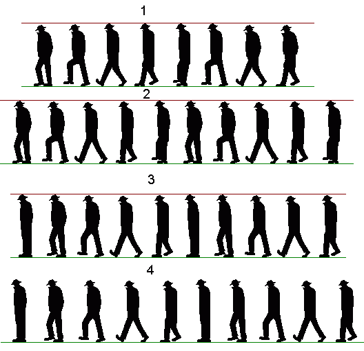
Quotehey Damien i dont suppose you'd gibe me a copy of your cleaned up line art would you?
Enjoy. Resized to a 4:3 ratio.


(Un)fortunately, I won't be able to finish mine since I'm leaving for 6 months.
#137
General Discussion / Re: fanboyism
Sat 25/02/2006 12:43:11
QuoteSome of the synths sound out of date/cheesy?

Could you explain? How does an instrument sound out of date?

Zor, if you like James Blunt, I suggest checking out Jeff Buckley's music.
#138
I've made some progress with the rocks and the foliage, this is a learning process for me so don't expect nothing good.
Like I said before, Pay no attention to the black outlines. ;)


Sorry for the .jpg, but I didn't want you to waste your bandwith for this unfinished version.
#139
Quote from: Grundislav on Mon 20/02/2006 00:22:04
Greetings from snowy sunny Miami!


(Those tiny people are Farlander and Lorena)
LIEK ZOMG, HAX.


Sorry.
#140
Thanks Bullough, your BG is ace and I can't wait to see the next step.

Just one minor thing, I noticed the window reflections are at a 45 (more or less) degree angle.
The thing is, from the viewer's point, the reflections would be right under it's source.

Also, is that the Loom tree in the lineart?
SMF spam blocked by CleanTalk