Menu

Show posts

This section allows you to view all posts made by this member. Note that you can only see posts made in areas you currently have access to.

Show posts Menu

Messages - Damien

#181
Some nitpicking:

I suggest darkening the shades on the wood. Also, the roof of the shed looks weird. I don't know what you were going for, but now it looks like it's filled with dirt.
#182
Instead of making the lightsource left from him, try to shade your character like the light source was above him. That should work well with most backgrounds.
#183
Critics' Lounge / Re: A cute room (WIP)
Mon 16/01/2006 22:10:04
You might consider adding a ceiling. Also, the doors look a bit small compared to the rest of the scene.

Also, is this a room main character lives in, or is it his apartment?
#184
Critics' Lounge / Re: A cute room (WIP)
Sun 15/01/2006 20:49:23
Very nice BG, I like your style.


Things changed:
-the part of the door frame closer to the viewer lowered 1 pixel
-added some highlights on the fridge
-lowered the carpet's saturation
-added a kitchen area

Things you could add:
-a small table in front of the sofa (cluttered with garbage, of course)
-a TV
-wallpaper peeling off on some places
-other stuff people mentioned
#185
I decided to go with a BG made by Fizz:


The idea: Dr. Gonzo is freaking out in the bathtub and aren't able to exit the scene untill you've done something about it. Oh, and it has nothing to do with White Rabbit.

The tune: TuneContest.zip
Just scroll down and click on FREE, then wait 20 seconds and enter the code displayed on the screen.

It is loopable, but it works without looping too.
#186
Critics' Lounge / Re: New Improved Walkcycle
Sat 14/01/2006 00:16:23
Looking good so far.

Some things that you could fix:
-his whole body is jerking back and forth, make it so he's onyl bumping up and down
-you could make the arms bending in the elbows and draw his fingers in a more relaxed position
-his knees are way to high
-you could make his upper body rotate a bit and add some movement to his shoulders

Also, you've mentioned you're using flash. Isn't there an option to keyframe the vertexes, that would give a much smoother animation.
#187
Well, if you're going to use the simple style for your BG (which looks great, BTW), I suggest you lose the noise on the floor. Then texture it by drawing lines a few shades darker and a few shades lighter by following the flow of the boards.

As for the cellar BG, I suggest sticking with the last imageof it you posted, then adding more shading to unshaded objects and some simple texturing to the walls and the floor.
#188
Critics' Lounge / Re: DOTD Side view
Tue 10/01/2006 14:14:49
I suggest you shade your characters simmilar like the ones in Disney cartoons. Using base color + one level of shading. It will work better than pillow shading it. You could also use more contrast on the shades.
His hand is still too thick, and I think you could move the belt buckle one pixel to the left.

The structure of his face is also hard to guess. This page could be usefull to check out how to shade it properly.
#189
QuoteAudioslave - Out of Exile
Not as good as their first album, but still has some good songs such as 'Doesn't Remind Me', 'Dandelion' and 'Your Time Has Come'
Ah yes, Audioslave. #1 Zero and The Curse are my favourite tracks from the new album. No special feeling connected to them, tho.
#190
Critics' Lounge / Re: DOTD Side view
Mon 09/01/2006 15:28:21
Paintover time:

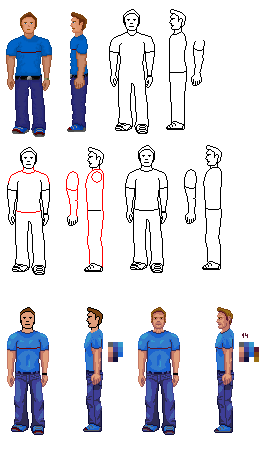
So, I restored the original linework, modified it a bit (red outlines), made the legs longer. It took me some time because I always kept going back to modify that sideview arm, but I failed to make it look natural. The lightsource is now above him, not in front anymore.

Just wanted to give you a basic idea how to shade certain areas on his body like the jeans, the shirt and especially the face. That's why shading is exaggerated on some places. You can always play with the contrast to fix that. The snickers were shaded well before, I shouldn't have messed with that.
The shading was done like on the alien edit in the other thread. First adding the base color, then the shadowing and in the end, the highlights. After that shading the linework so it's lighter around the highlights.

Your version had around 110 colors, the edit has 14.

Sorry I haven't shown more steps of the paintover 'cause I forgot to seperate them, and mspaint has only 3 undo levels.

Hope it helps.
#191
Ok, here goes. They are just the songs I've been listening the most the last year (and earlier) and that I always keep returning to. Although most of them aren't connected to a specific event, they give me some familliar feeling in my guts followed by goosebumps on my skin.

4th of july - the date my grandfather died
Spirit carries on - find the lyrics and you'll see the connection.


GEE, I HOPE I DIDN'T OFFEND ANYONE....

       ...AGAIN AND AGAIN AND AGAIN!!!
#192
QuoteI suppose that they remind you of what a stupid fucking cunt you are, you stupid fucking cunt?
HAHAHAHAHAHAHAHAHAHAHAHAHA!

No.
#193
I've got a few:

Muse - Megalomania
Muse - Screenager
Muse - Falling Away With You
Dream Theater - Learning To Live
Dream Theater - The Spirit Carries On
Dream Theater - Eve
Soundgarden - 4th of July
Soundgarden - Searching With My Good Eye Closed
Tool - Pushit (Salival)
Tool - Lateralus
Tool - Jimmy
Jeff Buckley - Hallelujah
Jeff Buckley - Lover, You Should've Come Over
Jeff Buckley - Jewel Box
#194
Critics' Lounge / Re: Alien for C &C
Sun 08/01/2006 00:07:49
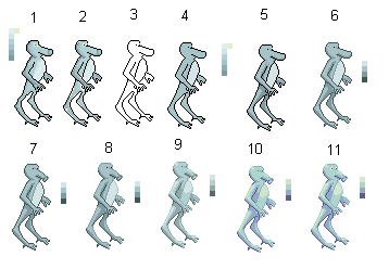
Here's a paintover:


Steps:
1.Restoring the lineart
2.Fixing the jaggy lines
3.Removing the color from it
4.Laying out some basic coloring from the original palette
5.Starting to shade, i choose the lightsource to be above him since this works best with adventure games
6.Fixing the shading and making the black outlines dark blue (again using the color from your palette)
7.Fixing his snout
8.Again playing with the linework, making it lighter where his body isn't shaded
9.Adding some highlights, making some linework lighter again
10.Final image, palette redone by adding more blue to the darker tones and yellow to the lighter tones
11. The same as 10. with eyes from the original and with slightly brighter highlight color. 4 unique colors used.

I hope this helps.
#195
QuoteBut on a serious note, here are some amazing shred guitar clips:
That guy is a robot, obviously. I mean, just look at his moves.

These videos make me want to chop up my guitar for firewood.
#196
QuoteDamien,
How you calculated 294 colors.
if I copy it in GIF i only use 256. explain to me.
Well, your first version was in .png format. I saved it to disk and opened with IrfanView and clicked on image information or something simmilar. Then a window poped up showing the number of unique colors.

A .gif file is restricted to 256 colors (correct me if I'm wrong) so if you use a program that can convert to gif without distorting the image (photoshop, gimp, graphics gale,...) it automatically converts it to 256 colors or less.

I hope this answers your question.  :)
#197
I beileve Pesty ment 256 actual unique colors on your sprites.
Arangel, you use 294 colors, and HilBilly 584. If you save it as a .gif it will automatically be reduced to 256. Just don't use mspaint for that.  :)

Although it seems to you guys that you used a small amount, your programs automatially anti-aliased it creating much more than 15 or 8 colors.
#198
First of all, that sprite has been improved greatly, keep it up.

The colors you used would be ok for a cartoony game, but if you want to make it a bit realistic, I would suggest using less saturated ones.

I'm guessing you're using mspaint (that's what I use for pixelart). So, this is a color edit screen, but it's simmilar to this in most drawing programs. The color range in the white rectangle is considered high saturation. I would suggest you not to use the colors fom there unless you really need it (for a colored light source or something). If you want more control over the saturation, you can also use the textbox with Sat: text left of it.
There are some contrast issues which can be fixed by adding darker shadows. Like on his shirt. I can barely see what's going on there.
There are some double pixels in your lineart that need to be fixed too. Here is what I mean about double pixels:


And the last tip would be to never ever save pixel art as an .jpg file. This makes paintovers extremely hard to do. If you're using photoshop or the Gimp, save it as gif, and if you're using mspaint, save it as a .png file.
Also, there is no need to change the resolution in the image itself to zoom it, just use this forum function:
Code: ags
[img width=x height=y]The link to your image[/img]

Where x and y are the desired dimensions of the image.
Choosing the skin tones is always tricky, I'd suggest using the ones InCreator posted in his paintover. Or atleast trying to emulate simmilar colors.
#199
Critics' Lounge / Re: Background - Jungle
Fri 30/12/2005 23:37:15
The river bothers me too. That blue color is something I would expect from a very deep pool of water with nothing but the sky being reflected on it, or a very bright bottom. If it is not supposed to be transparent, I would go with desaturated green color, and if it was, you could make the bottom more visible.

But that was just nitpicking. Odlična slika!  :)
#200
General Discussion / Re: Pixel Joint
Fri 30/12/2005 23:26:59
Cool place, I visit it almost on a daily basic.

My PixelJoint Profile

See you there.
SMF spam blocked by CleanTalk