Menu

Show posts

This section allows you to view all posts made by this member. Note that you can only see posts made in areas you currently have access to.

Show posts Menu

Messages - DanClarke

#361
Quote from: loominous on Tue 19/04/2005 21:24:39


The changes should be explanatory, or so I hope.

Nice casual lines and form. The shading is somewhat strange though and doesn't really help convey the form imo.

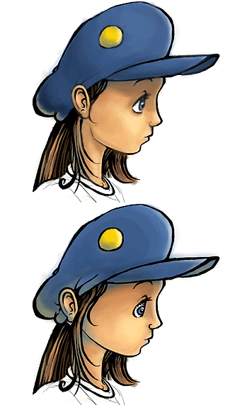
Nice edit Loominous, i like what you've done with the shading in particular, although i think he bone structure looks a bit too 'defined' for her age.

As for the eye, i did say in the original post that the style doesnt represent how she looks in game, its just that i like to mess with different styles, to see what i can achieve.
#362
Quote from: Babar on Tue 19/04/2005 15:58:50
the only problem with the ear (as far as I can see) is that too much of it is visible, and the hair behind it doesn't look like it is going behind an ear. It looks like she has an ear tacked on to her hair and hat. Also, isn't her neck too big?

Lol yeah the edit looks a lot like my mum, but alas she looks far too old in that sketch. Yeah im not at all happy with the hat, and the ear is probably a bit too big. As for the neck, i think it is quite long but im not so sure if it's too long for it to look wrong, rather than suiting the style. Ill probably redo it taking into account some of the comments here, cheers for the feedback everybody, appreciated as always. :)
#363
Quote from: Fawful has fury on Tue 19/04/2005 00:58:48
The only problem I see is that the hair on the other side of her face looks as if its growing off her chin.

erm...i cant say i really see that myself lol.

Al_ninio, i see what you mean about the ear, but i think ill just put that down to a slight head tilt rather than anything else :p and im quite happy with the eye :)

Id quite like to do a full piece in this style, perhaps ill make some sort of promotional poster once the games closer to completion :)
#365
Quote from: miez on Mon 18/04/2005 11:43:31
Can you make a high colour BG and have your favourite graphics program downgrade it to 256, or do you need to handpick your 256 colours?

sure, you can do that then have it limited to 256 colours, ill spare you the tedium of handpicking 256 colours this time!
#366
Critics' Lounge / TLOTTL Gloria art (again)
Sat 16/04/2005 22:55:51
Ive been doing some sketcvhes for reference as I'm currently tinkering with the walk cycle, so i needed some side on drawings to make sure she looked right. Here's one oif them, which i coloured and added some lighting.


Comments welcome.

P.S: I just realised the hat lines behind her ear are a bit crappy, i was meaning to finish them but i forgot, doh! :p

P.P.S: The style doesnt really represent how she looks in game, i just like messing with different styles when i sketch, as you may know.
#367
Id quite like to play some of the older sierra games on my mac (OSX) and scummvm does a superb job with the lucas games, but im just wondering if anybody knows of a good program to run sierra games with the ease and perfect (or close to) emulation that Scummvm has? It would also have to have a Macintosh build.
#368
I suggest distinguishing the path from the bg a little more.
#369
LOL i didnt even realise i was in this, ive just come around to reading it now!  :)
#370
Critics' Lounge / Re: Boring Bathroom
Sat 16/04/2005 12:51:36
Quote from: InCreator on Sat 16/04/2005 09:18:51
Floor needs color!
This pale yellow does not qualify as "color".


erm...what?
#371
Critics' Lounge / Re: Outlines?
Sat 16/04/2005 10:39:33
if you use photoshop, you can adjust the opacity and/or colour of your outlines even after you've finished your work, provided the lines are on a seperate layer.
#372
As the old saying goes, 'the best technology is invisible', so a good GUI for me should be intuitive, simple, self explanatory, and functional over any style. I find that SamnMax's GUI is the best that i've used in an adventure in my opinion, its all of the things ive listed, with the added bonus of giving more on screen room. (ok so sierra did technically pioneer this one, but SamNMax did it how it should be done :))

This is also the GUI type ill be using for TLOTLL.
#373
Ok, this is my first one of these, so i'll try to make it interesting. Ive always preferred interior BG drawing to exterior, so that's what this one is going to be, and your theme/title for this BG is:

'The Old Kitchen'

320x200
256 colours

Interpret this as you will, good luck everybody.
#374
Quote from: Zooty on Fri 15/04/2005 17:13:35
I declare danclarke the winner, feel free to strat a new blitz.

Congrats

Wow, thanks for all the votes everyone, i'm touched :)

Ill have some time to think of something cool for you all and ill post it up later this evening. Thanks again!
#375
Quote from: Snarky on Thu 14/04/2005 22:19:54
Andail, don't you think that if you post an image in the Critics Lounge, you should make it clear what part of the work is yours and what was done by someone else? Newbies who post paintovers without attribution have been thwapped in the past. Marking the image with a "(c)" in your own name comes very close to being dishonest, in my opinion.

You may not care for comparisons, but your thread title ("Gah, another rejected background") and responses like "I can't understand how a background with such high quality could be rejected!" positively invites them.

As for what I'm aiming for, the criticisms of your other color piece apply in part to this one, too. Your colors still intrude on the pencil outlines.

Edit: I'd like to make it clear that I don't think you're being deliberately dishonest, just that the way you present these backgrounds may be misleading.

This is an interesting point.

I was always under the assumption that the BGs youve hosted for criticism were drawn by yourself. I think Snarky is right in that you should make a point of stating that the BGs aren't your own. Your website also suggests that the work is your own.
#376
Quote from: Flukeblake on Thu 14/04/2005 06:01:00
Meh.Ã,  Ã, :-\

hardly constructive.
#377
Thats awesome, i can really see the time youve put into it, and the transition in lighting is really nice. My only comment is that the top of the bell looks a bit 'pissed' if you get me? Just doesnt look quite right but that would be a minor fix. Apart from that i think its excellent.
#378
Quote from: Andail on Thu 14/04/2005 17:34:30
I think the car is great in general, although the wheels are a bit too big.

lol. Please. No.
#379
My top 10 games:

1. Final Fantasy 7
2. Monkey Island 2
3. Final Fantasy 8
4. Legend Of Zelda: Ocarina Of time
5. Grim Fandango
6. The Curse OF Monkey Island
7. Day Of The Tentacle
8. Super Mario 64
9. Sam And Max
10. Tekken 3

I could go on all day with favourites, and will probably come back to change this at some point lol.

EMI was pretty lame all in all. Some nice bits here and there, but some really pathetic things in terms of design and planning:

-Wherever Elaine and Guybrush went on their Honeymoon, the people there must have been quite persuasive in their tones, because Elaine magically had her British accent replaced with an American one on return.

-Melee Island seems to have had a serious redesign. (for the worse.)

-3D. Why? It stripped the game of the personality that the previous 3 held so well.

- Monkey Kombat.

-Giant Robotic monkeys? ...no thanks.

Need i go on?
#380
Quote from: Sinsin on Thu 14/04/2005 11:15:28
Quote from: BOYD1981 on Tue 08/07/2003 00:13:18
a can of chilli and a length of hose...

in indiana jones and the fate of atlantin you get a hose but he thinks its a snake

My game will aslo include some hose, the length is yet to be determined though.
SMF spam blocked by CleanTalk