Menu

Show posts

This section allows you to view all posts made by this member. Note that you can only see posts made in areas you currently have access to.

Show posts Menu

Messages - Darius Poyer

#201
Its quite strange to be judging these four entries by six different categories. perhaps a bit overdone but ill give my votes.

For the best in idea, atmosphere, design, composition, functionality and technique, my vote is given to Jim Reed on all categories.
#202
Bulbapuck Where your graphics suffered the actual gameplay made up for it. It was a humorous and nonsensical adventure. i really enjoyed it.

Wyz You definitely created the room with the best looking background, it kind of a shame you didn't get any original character in there. Your game was the one i spent the most time in as well because the puzzle wasn't too intuitive. solid game for an hour nonetheless.

FSi I was confused at first but i did enjoy your quirky graphics, it sure beats using the original ags guy to me at least. a bit or a shame regarding the lack of colour and very odd animations.

With all that in mind my vote goes to Bulbapuck, for simply providing a full experience. well done to you all. :=
#203
Since the turnout has been... less that sufficient. i will extend this colourballing experiment to the 24th of this month, adding another week.

hopefully someone will have something... come on there has to be someone out there with an idea for this!


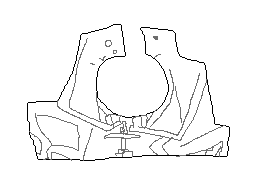
see that? two guys playing poker, the possibilities are endless here!
#204
Critics' Lounge / Re: DN Games: LOGO
Sun 10/01/2010 02:03:41
if the logo came first, and the particles came from behind it, that would be great.
#205
Critics' Lounge / Re: DN Games: LOGO
Sun 10/01/2010 01:45:18
perhaps you could SLAM the logo in, quick fade, then start the particles. it seems odd to have the effect before the logo is even there.
#206
Critics' Lounge / Re: DN Games: LOGO
Sun 10/01/2010 00:18:13
no dont speed it up.. slow it down if anything.
#207
While dreaming you thought you saw something interesting in the sky. Once you woke up you scribbled it down on a piece of paper.
When you looked at what you drew, after the dream was long gone, all you saw was this:


What's this bizarre dream-object?

Prizes:
   

Rules:
-The outline may be rotated, mirrored, but not scaled.
-The outline may be altered, as long as it is still recognizable.
-Keep all of the content inside of the shape.
-A colour background can be added if you wish.


No colour limitations.
#208
Thank you Macay, i will have a new contest started soon.
#209
Critics' Lounge / Re: DN Games: LOGO
Sat 09/01/2010 03:48:54
for the animation id really advise an expansion-effect, like a balloon.

Expand and fade the squares while the logo fades in, then reverse it.

it'll probably work out.
#210
I'm glad you all seem to like it. I did sort of want to claim Nosferatu in some way (sorry NsMn).

Hopefully I've got time to finish it. mainly since I've never done an AGS game before.

It wasn't actually that hard to make a horse and wagon. I've tired to make a car before and that was way more difficult, especially when it comes to orientation. I guess the real challenge is to make the horse look strong and all. I hope that comes through.
#211
Critics' Lounge / Re: DN Games: LOGO
Fri 08/01/2010 22:15:31
well done dualnames. and with some animation it'll get even sweeter.
#212
So, here is my project, just a small teaser for anyone interested:


i hope it's mostly self-explanatory. I don't feel like doing any progress threads or anything.
#213
Id suggest looking further into the Stickied topics here.

But here is one very helpful image breaking down a simple walking animation:


you could easily only focus on the legs first, then move on to the arms. the head-bob is entierly up to you if you feel its fits in. this picture is really more directed at proper animation for film and so on, but it does apply.


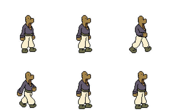
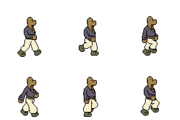
another good idea is to first do a rough animation, like so:


and then adding more frames later-on:


Those animations are not mine by the way, i found them somewhere, i cant remember now sadly.

anyway, hope this helps you a bit at least.
#214
Critics' Lounge / Re: DN Games: LOGO
Tue 05/01/2010 21:22:58
Ive tired to address the issues of symmetry brought up by Chicky. Ive also tired to further accentuate the 'D' based on what MrCheminee did with his paintover.


I used the 'M' in the Games as a center line because i felt that even though its not the perfect center the eye is drawn to not only the center character of the word 'games' but also the 'v' crevice.


Then i've curved the 'N' as well to visually connect it to the 'D'.


Anyway, hope this helps.


EDIT: i should mention that i removed the vertical lines on each character. i suppose they where a kind of shading, but i just found them distracting.
#215
Well then, i give my vote to Macay as well. It was simply a delight to read.
#216
The style looks very interesting, in a good way.

Id have to say that colouring would definitely heighten the visuals. the use of simple black and white would make the characters seems very flat against the backgrounds. If you don't plan to incorporate colour, than at least some basic grey shading for the backgrounds to make the characters pop a bit more.

good luck.
#217
I do agree with ProgZmax, and subsequently with Chicky as well.

Perhaps you can reach the result quickly, don't change all of the colors, simply change the background to black. Not a total black, something like a blue- or green-black. i think you'll definitely see a big difference.
#218
The flutter was the final flutter of a dying bird, infected by the spiral.

#219
Quote from: StarLite on Sat 02/01/2010 19:35:43
Hi Bill, nice work on the pond. I'm wondering if this program might be of use to you. It's simple to use and the results are excellent. Good luck with your project

http://www.xiberpix.net/SqirlzReflect.html

this is the second time i've seen you suggest an obscure piece of software...

there is a very simple principle that would apply to this whole thread really, its that just because you can do something, that does not mean you should. for instance, just because you have the technology to do all of these fancy water effects does not mean that they are a good idea. a game's graphical appeal would always get richer by sticking to one single process without using allot of added software. if you where to simply hand-draw everything, and animate water yourself, not only would you realize that the entire endeavor is fairly fruitless, but perhaps also that because it all had your personal style to it, it would all fit together in a more compelling fashion.
#220
some interesting entires so far.

@Jim Reed
I think you've overstepped the guideleines a bit there, no colour and an over-elaborate background. still, it looks good, well defined with its shapes.


I'll try to make an entry for this at some point as well, i think i have a decent idea.
SMF spam blocked by CleanTalk