Menu

Show posts

This section allows you to view all posts made by this member. Note that you can only see posts made in areas you currently have access to.

Show posts Menu

Messages - Darius Poyer

#81
Quote from: Radiant on Tue 26/07/2011 14:45:17
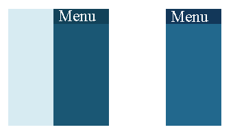
Also, to add some color to the page, links now display in orange when hovered over. Otherwise, I think we've got a pretty good stable page for now, although additional suggestions are always welcome.

The orange hover looks very nice.
#82
I tried to play it, but it was hard to care about anything. There's a core game-play issue with adventure games as it is and I think you could easily have optimized game-play by just creating context sensitive clicks, and having the inventory on screen instead of occupying the right click with that function. Something like left-click to use, right click to examine is more than enough.

I have a problem with the graphics as well. I don't mind shoddy graphics at all, but I'm always bothered when pixel-resolution is ignored. And here I see it being ignored within the same sprite, and for the protagonist even. Out of all things, the thing you have to look at all the time should be soundly designed and executed.

Beyond all of that, the principal issue for me in the writing. It made me want to stop playing like nothing else. I didn't ever want to engage with the on-board computer ever again after that first interaction. If there's anything an adventure game needs, its good writing or an engaging plot.

What makes me hopeful is that you seem to know this already. I hope you make something better in the future.
#83
Quote from: Radiant on Thu 21/07/2011 10:14:32
I'm not sure what to do with feedback like "the blue is too muddy for my tastes so I'd suggest using a different blue". Could you give an example please?

When working with color in general it's useful to understand the component's of a color. By varying all the components of a color you can easily create striking contrasts, and that's what I think you are lacking at the moment. Any color has a value, saturation and a hue. In the three main colors of the page, the one represented in the menu-bar, the column to the left and the background. They all have the same hue, hue being what you could roughly call the color of a color. Because of that they blend together without creating any contrasts between them.


to the left is a tiny mockup of the current colors(#124259,#1a5774), to the right, my altered palette (#123759,#22688d).

Ignoring the background for a moment. The colors currently used have a hue value (according to Photoshop) of 199 for both of them. In my example the hue value is 209 and 201. Its not that large of a difference but it makes the colors distinct without going off the blue hue spectrum. using the white background does help with that as well but I can completely understand why you would probably want to avoid that since the content columns of the page have a white background as well.

Basically, because you only changed value and saturation of the colors for the page ignoring the hue, you ended up with colors that bleed together a bit too much. It looks muddy because there is some lack of contrast.
#84
QuoteI did that, but it doesn't seem to make a difference. We're down to two fonts now, though; maybe we'll have to replace Titillium by something else.
Its good to keep font-count low anyway in my opinion.

Quote(chrome frame)  have no experience with that, what is it?
IE users could download this program called chrome frame that would enable pages browsed in Internet Explorer to render using chrome. That bit of code simply makes sure that if it exists it's used, just a nice precaution really.

QuoteYou mean making the four corners of the page round instead of square? That was my first suggestion too, but my artist suggested against it.
I just saw some removed bits of code in the bottom of the css that suggested to me that perhaps you tried to implement something like that but failed, so I though it could have helped if that was indeed the case.
#85
Critics' Lounge / Re: Need walkcycle help
Fri 15/07/2011 14:53:27
My suggestion is to use less colors and less frames, entirely what you didn't want... But i think that would help alot.

I fixed the alignment of the back for the gif.


and heres the same one with frame 6 removed. I'll get to that later.


About the colors
I can see why you want many colors in the final product but while developing that you should use just a simple one color shading for each leg to simplify the process. Even when polishing that up I think the most you should do is add a transitional color as a kind of AA between the shadow and highlight. I really don't think anything else is needed.

The Animation.
10 frames is a bit much I think. I removed frame 6 because I didn't think it helped the animation at all. Whenever I've animated walk-cycles I find that the point where the legs overtake each-other is a very fast transition and in this case, the sixth frame had very little movement in it at that crucial time. Overall, I think 8 frames is a good mark for any walkcycle.
Additionally, where the foot makes contact with the floor, in this case its in frame 4 and 9, the foot really shouldn't go further down at that point, I made that change in the gif's as well, although I accidentally used a full transparency instead of the black on the shoes, it should still read though.


EDIT: completely not professional help by the way.
#86

Not sure if I'm entirely happy with my entry, but it's fine. I decided to stick to a limited palette, in this case I used the Arne palette and it worked out alright I think.

It's a robot.
#87
I think id prefer Arj0ns entry as a design for a protagonist. But my vote goes to a mix between an idea of a good protagonist and the execution of the art, that would be Darkdan. My vote goes to Darkdan.
#88
Titilium Maps looks odd, perhaps adding "text-shadow: 0 1px 1px rgba(255,255,255,.1);" to the h1,h2,h3 {} css code would help smooth out the strange anti-aliasing of the font.

All fonts are too unique, especially when mixing Serif and Sans Serif fonts. I would suggest using one font for headlines and one for texts if you want some variety, but three fonts that are this distinct make it look a bit unfocused.
In relation to fonts, the google font API is very good for remotely linking fonts and they have a great library of free to use fonts, look at that if you havent already.

The colors are a bit strange, The blue is too muddy for my tastes so id suggest using a different blue and also adding some color to work with the blues in general. a quick and striking example would be to incorporate orange, as thats blues complementary color. It could work for headlines or the menu when hovering. (I use this page for color selection, its a nice and simple online colorpicker http://www.colorpicker.com/)

also heres a fun simple bit of css code that lets you change the selection colors for text, i like to use this for pages i work on, should be self-esplanatory;

::-moz-selection{ background:#1C80EB; color:#fff; text-shadow: none; }
::selection { background:#1C80EB; color:#fff; text-shadow: none; }

Why bother with ie6 support by the way? seems like that's really pointless now, especially since ie9 solves almost all previous ie problems.

what I do is just use html5 and a reset.css, I havent had any cross browser issues with that so far.


adding this is to the header of all pages is a good idea:
<meta http-equiv="X-UA-Compatible" content="IE=edge,chrome=1" />
it forces IE to use chromeframe if its installed, just a precautionary measure.

Also your head tag doesn't close for some reason. At least when I view source I cant see any end tag for <head>.


Generally I find the page works well though, clear and far more comfortable then the old one.


you might want to take a look at this as well: http://border-radius.com/
#89
Very nice one Jimbob, uses the shape very well. It's a shame you used such a yellow yellow for the beak, as it blends with the stark white so much. I think a redder yellow beak would have make it a bit more striking.

also why the hell do i like this?!
Quote from: Armageddon on Wed 29/06/2011 04:09:36


Mein Zoomba
#90
Interesting topic this time. It has created a certain itch in me. Maybe I will do something for this. I'm particularly interested in the potential focus on interpersonal-relationships breaking down. Would be a good character-wiring exercise. Color me intrigued!
#91
Well it seems disaster almost struck once more, as I completely forgot about this. Even though I was visiting the forums on a daily basis, and in fact checking up on this very thread on those days, amazing. So let's end this.

The much coveted golden color-ball goes to,

hofmeier

It was an interesting take on the concept with a clear execution topped with a nice relevant reference, good job! Just look at those festive confetti poppers, certainly feels like victory.
#92
Critics' Lounge / Re: Laser Lens
Sat 30/04/2011 20:43:21
That's a good point khris. Perhaps the beam being slightly focused already, and then this final lens focuses it further? I don't know about optics...
#93
Critics' Lounge / Re: Laser Lens
Sat 30/04/2011 01:35:04
my suggestion would be this:


To further distinguish them by making the deactivated laser appear "unlit". I did that by just using very desaturated colors for the lens of the deactivated laser.
I also pushed the actual laser beam in a bit, so you see it coming out of the tube, not sure if that's desirable but i liked it.
#94
Critics' Lounge / Re: Sci-fi themed verb coin
Sat 16/04/2011 05:08:28
I hope I'm not overdoing it, but here's a suggestion regarding the overall-design


I thought it was odd that the circuit-board was directly connected to the screens. I think it would make more sense to have the screen connected to the same circuit-board by cables. Then it also nice to have the screens at a bit of an angle maybe.

I assume the box in the center is the inventory? I worked on that assumption so I thought that should have been bigger too.

The shading isn't that great here but it just a quick example of what could be done.
#95
They pretty much always had some kind of theme, at the very least a context to the shape. If you look back at all the old colorballs like window or IN YOUR FACE they all have something like that.
#96


THE SHAPE


THE THEME
To depict a passage to somewhere. The entrance to a grotto, the road to a kingdom, the path to salvation, maybe some animals burrow or whatever. As long as it's a passage to something, somewhere.


THE RULES
YOU MAY NOT resize, rotate or manipulate this shape.
YOU MUST use at least one shade of pink.
YOU MAY post up to an infinite amount of entries.


THE CARROT ON THE STICK


#97
thank you Stee!

that must be the biggest trophy in colorballing-history right there.

New contest in a few minutes!
#98
I don't know what happened in the last four posts... four votes for me? three? two? It's a bit confusing.

I'd like to suggest we just move this along, break it off now, ive got a contest all lined up, lets just reanimate the ol' colorball already.

Anyone in opposition?
#99


How to improve Krakatora

Above are a few things I've been thinking of that would improve the game fairly significantly. Different power-ups and a new death system. I would also like different enemies that offer different challenges, like a miner that throws his pickaxe at you, or some close-combat foes.

For level-design I would have needed more variety in pretty much every aspect, more ways to approach encounters, giving the player different power-ups and maybe even ways to cause damage to foes using the environment (pushing rocks from heights etc.). I would also have like to incorporate more plant-life and doodads in general, crates and lamps, things like that.

Finally, more save-points and perhaps better handling of story in general. I'd like to have some animated cut-scenes so I could explore the dark-ones more as a race, in small ways and help give the player a clearer idea of his role as a god.

That covers it in broad strokes I think. There are many more issues that are small but significant, id like to keep it general though.


Game-design is a terribly complicated subject I need to get better at, maybe re-making Krakatora into a decent game is a good way to get closer to understanding it all. Weather or not I will take all these ideas into a new game is not something I'm sure about just yet, but I wanted to share my ideas on the subject never the less.
#100
Critics' Lounge / Re: Tree Painting
Wed 23/02/2011 20:14:05
Here's something that I have found amazingly useful to help understand composition and color use in general.

This facinating lecture on color theory and composition:
http://www.thegnomonworkshop.com/store/product/472/Color-Theory:-The-Mechanics-of-Color

And this one, is a good basic introduction to understand how color interacts with things. This one is more geared towards 3D as well as digital painting, but still focused more on the digital painting part.
http://www.thegnomonworkshop.com/store/product/185/Practical-Light-and-Color

I would suggest starting with the latter if your interested in both, but if you watch one, I'd suggest the first one.

If I where to give some simple advice, that doesn't require you to pay money. Learn the difference between value, Saturation and Hue. Learn to use value as a base-compositional element and you can easiily draw the viewers attention where you want, creating clear focal points.
Closely tied to this is using a Monochrome Harmony. Look into these things and you will learn a lot.

Here is something I painted on my first day learning Digital art. It combines effective use of value with a simple Monochrome Harmony:
http://i6.photobucket.com/albums/y246/otomosc/caves.png
SMF spam blocked by CleanTalk