
It's an embalming tool
PS.
they REALLY don't look like that.
This section allows you to view all posts made by this member. Note that you can only see posts made in areas you currently have access to.
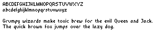
Quote from: Radiant on Mon 26/12/2011 20:56:44It used to be like that actually. I decided to lower the center line on most letters because it helped the uppercase letters connect to the lowercase ones.
I think the uppercase E, H, K, N would look better if the middle part was one pixel higher.[...]
Quote from: Radiant on Mon 26/12/2011 20:56:44[...] On the other hand, I'm not sure why the lower p does have a round corner.[...]It's a bit complicated. Firstly I wanted to incorporate some slanted lines to add features to some letters. Imagine a font as being structured according to three lines. One marking the maximum height, one for the minimum height, and one for features, like the middle line in the 'e' or 's'. One such structure for lowercase and one for uppercase. Because the 'e' I ended up with here I decided to incorporate two 45 degree lines in addition to the previously mentioned structural lines. Like this:

Quote from: Radiant on Mon 26/12/2011 20:56:44[...]Finally, the lower z looks like it's cursive.The 'z' looks cursive because it's hard to convey its shape otherwise, the 's' can suffer some simplification because its a letter thats used often in easily recognizable contexts. The 'z' is a pretty rare letter so when it comes up it needs to read very clearly.

Quote from: Dualnames on Mon 26/12/2011 17:01:59
the problem lies with a,e,o.

Quote from: WHAM on Sat 22/10/2011 01:29:26
Didn't want to bump the 2 year dormant thread from slumber, so I'll post this in this thread instead:
http://www.youtube.com/watch?v=fqiyDzjZHrk
I made a Let's play / developer's commentary of my first ever game: Infection - Episode 1 - The Ship. Take a look and feel free to let me know what you think either through commenting the video or sending me a message or something.
Quote from: tzachs on Mon 10/10/2011 19:09:35That script is very old, so when I read it again I was surprised as well. I enjoyed a lot of the odd double entendre's and campy dialogues. I'm very glad to hear you've read the script.
I have just read the script for Nosferatu. The writing is beautiful, the art is breathtaking and since the scope is really small I see no real reason not to carry on with this game. Admittedly it will be short and the gameplay is limited, but the experience will definitely be worth it, it has a lot of character in it.
Quote from: Diath on Mon 10/10/2011 20:47:10You can read the script and basically get to see what the game would be. Sadly, it seems, I wouldn't revisit that one. I wrote it probably more than a year ago.
I would really love to see that Nosferatu game come into fruition, it looks and sounds very good!
Quote from: Eggie on Mon 10/10/2011 17:20:45Don't worry, I will be going down the RPG route in some way. It won't be Alchemsit, but something similar.
They're so pretty!
I really want to play Alchemist, there's plenty of cool little stories you could get out of that mechanic!
Quote from: abstauber on Mon 10/10/2011 13:56:08Hey! what's that supposed to mean? Just cause its pink black and white...
Haha, that page is soooo emo
But very nice artwork there, I would have loved to play at least one of these.
edit: Oh wait, I can play WanderlustD/L
Quote from: NickyNyce on Tue 11/10/2011 01:04:44It's an odd problem, what I demand from myself keeps changing so I end up abandoning projects earlier. I'm just not content with something that's functional, it has to be something interesting and new.
You sound a bit like you are your own worst enemy. You have an awesome talent and should make something small to light your fire. Hopefully that will get you into gear so we can be rewarded by playing your games.
Quote from: Peder Johnsen+ on Mon 10/10/2011 22:05:10Thank you Peder, that's all I could hope to do.
I love how you used the agser.me service for something this awesome.
Quote from: dkh on Mon 10/10/2011 13:43:34I would personally love to see this kind of thing happening more often myself!
Wow, some really mindblowingly awesome stuff there! Breaks my heart to hear that these are all 'failed' attempts but an excellent decision to put these up for everybody. Very inspiring! Thanks.
Quote from: Lord Hemlock on Mon 10/10/2011 19:50:49Your topic is specifically about your LP work though. This would cover Let's plays in general, especially the gems people may have found digging through the dirt.
I started a thread like this over in the Critic's Lounge, but I suppose this would be a better place to put it.
http://www.adventuregamestudio.co.uk/yabb/index.php?topic=44594.0

 .
.