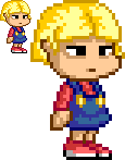
I didn't really notice it, but now that you mention it she does look a little odd. Here's one with her eyes changed a bit... And I do mean just a bit.
- Welcome to Adventure Game Studio.
This section allows you to view all posts made by this member. Note that you can only see posts made in areas you currently have access to.
#22
Critics' Lounge / Re: Little Girl Protagonist Sprite - Critique?
Thu 15/04/2010 23:26:11Quote from: S on Thu 15/04/2010 22:59:21It was hard finding the right colour with the pallette I was using. I'll give it another try...
She looks great!
I'd make the outline of her chin ligther, or the outline of her hair more pronounced (i.e. darker), because the contrast makes her look a bit like a reclining "C" (if you see what I mean); she's like a pot without a lid, an incomplete circle, etc.
Apart from that I'd change nothing else. Love the facial expression!
Quote from: Captain Ricco on Thu 15/04/2010 23:05:07Most people say the light should come from above, but I guess I've gotten into a habit of just making one side darker than the other, usually the left.
Looks great, though, I think the ligh in her her should be coming from above no?
Here's a slightly updated version. I've altered the hair outline to be darker and I've tried to make the shading look a bit more like it's coming from the top right. Maybe could do with some more tweaking in that regard... Thanks for your input so far.
#23
AGS Games in Production / Re: Red Dwarf: The Game
Thu 15/04/2010 19:19:25Quote from: Blobby 101 on Mon 12/04/2010 11:22:43Maybe try widening Kryten's head a bit, making the chin and the top of the head a bit less narrow. Also, the arms could do with lengthening and maybe straighten his posture, since the bent legs don't quite look right for Kryten who is usually a lot more upright and stiff.
Sorry for the lack of progress recently - this spriting is harder than i thought
I'm getting it done though, no matter how long it takes
P.S:Just to demonstrate how bad I am at pixel art


The armour detailing is pretty good though, and the subtle shading on his head does a pretty good job making it look angular without it being too distracting.
#24
Adventure Related Talk & Chat / Re: Dr Who \ Doctor Who Games
Thu 15/04/2010 18:27:54
Pretty cool idea, actually. Would be interesting if you could get one person per Doctor. Although I have a feeling not too many people will be stampeding to take up Colin Baker's part...
#25
Critics' Lounge / Little Girl Protagonist Sprite - Critique?
Thu 15/04/2010 18:14:20
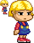
Hi, new member here... Although I've lurked here in the past. Got back into AGS somewhat (well, I got into it in general and didn't give up immediately when I couldn't get instant results like I did before) and I've been also trying to get back into the swing of spriting. I used to do it a lot more a while back, but I'm a bit out of practice so I might need a few pointers on what I might be doing wrong.
This is a sprite of a possible protagonist for a future game I might want to make, after I do a whole lot of practicing and taking it slow. It's kind of obvious I'm going for a pretty exaggerated look, although even if you're exaggerating something you've got to abide by certain rules. Please let me know if there's anything you think would improve it, or general advice on how to improve from what you can glean from this.
This is a sprite of a possible protagonist for a future game I might want to make, after I do a whole lot of practicing and taking it slow. It's kind of obvious I'm going for a pretty exaggerated look, although even if you're exaggerating something you've got to abide by certain rules. Please let me know if there's anything you think would improve it, or general advice on how to improve from what you can glean from this.
SMF spam blocked by CleanTalk