Menu

Show posts

This section allows you to view all posts made by this member. Note that you can only see posts made in areas you currently have access to.

Show posts Menu

Messages - Eric

#1121
Can just any old person vote? If so:

Idea - Misj'
Atmosphere - Kastchey
Design - gameboy
Composition - gameboy
Functionality - oraxon
Technique - Kastchey

I feel like Misj's is, on the face of it, the most accomplished of these, but I'm drawn to the maps drawn by Kastchey and gameboy the most.

Katschey has effectively recreated the warmth of the photograph in the pixels of his map, though I'm not sure how functional those text boxes are. I would like to see a version without them, or maybe in the game, they would pop up as you hovered over the hotspots of the different locations.

Gameboy's map has somehow achieved a great amount of detail for the amount of pixels he allowed himself. I especially like the parking lot in the bottom right for some reason. I especially like that this map could be diegetic, like the map of the town in Full Throttle, with a character sprite running around in it. As a minor critique, I wonder if the color of the sand on the beach might not be reversed -- sand drenched with water from the waves being darker than that dried by the sun.

Oraxon's made a nice overhead map, all the locations easy to see because of the labels. I wish there were a greater range of values, so that my eye were drawn more to the locations themselves. I love the place names.

Misj's map is especially interesting, because it's a map that would, in essence, represent a number of maps with slight changes (the dot). As I said, it's quite well done, and probably deserves to win, but subjectively, I'm drawn to Katschey and gameboy's maps more.

Someone has to be the least favorite, and unfortunately for me in this round, that's Puzzler's map, which is a bit too photorealistic for my tastes, which is, again, completely subjective. I actually really like the first draft, the overview map of the town square from a viewpoint only slightly above the roofline. I wish you'd stuck with that one.

Take all of these opinions with the grain of salt that represents the fact that I've never drawn a game background in my life!
#1122
Thanks! Not nearly as accomplished as you, Bulbapuck or Vandal, but I'm happy to participate!
#1123
Here's one from a n00b. I figured I might as well make some music that could fit in the game I'm planning. Not sure if there will be a chase sequence, but as the game's a humorous one, set in the early 20th Century, I tried to make some music I could imagine accompanying the Keystone Kops during a chase. As you listen, imagine comedic acrobatics, people falling from ladders, freshly paved sidewalks being tracked through, and hallways where people are coming out of doors every which-a-way.

Keystone Chase

#1124
Critics' Lounge / Re: Walk cycle process
Sat 25/02/2012 07:27:12
WaffleBombs - Thanks for the compliments and the advice. I think, like me, you are new here. So welcome!

Khris - I saw that, and stupidly thought, "Well, I want to animate something more than 50px tall," not even thinking that it's a stick figure that I can enlarge. I think I'll stick with the Colossal method for the side views of this particular try, and maybe adapt the ratios of this for the front/rear views. Thanks!
#1125
Critics' Lounge / Re: Walk cycle process
Fri 24/02/2012 11:39:50
Thanks very much for the feedback, anian!

Quote from: anian on Fri 24/02/2012 10:34:12
If you're going for a serious walkcylce (as in not a comedy game), you might want to soften the walk - make the character take a shorter step and not bend the knees so much. Also his hands are wobbly, like there's no bones in them and is being electrocuted, I'd turn that into a simpler swing of the hand.

This is actually reassuring, because, if this works, I will attempting a humorous game. This character, when I draw him elsewhere, is somewhat physically based on Disney's Goofy. His arms are a bit spaghetti-er, and his structure and poses exaggerated. That's why I started the gait and the arm swing so extreme, but what works in a static illustration doesn't always work in animation, so I'm learning.

This is also the reason for the "snap" of the hands. I'm thinking you're right, and it doesn't work, but I might try it through the other half of the walk cycle just to see. Also, if I thought I sucked at drawing hands when I could outline them in black, I'm downright hideous when it comes to trying to suggest them through pixel coloring.

Quote from: anian on Fri 24/02/2012 10:34:12Btw. the look of the sprite seems really nice. Though the hands could be a few pixels longer (or shorten the torso a bit)

Thank you. I think I might need to lighten the sweater a bit if I actually intend to use this sprite with backgrounds. I'll need to figure out values of the backgrounds, I guess.

Funny that, you're right, the arms are short. In real life, my arms are, for some reason, each two inches shorter than they should be. I found out in a statistics class when the teacher was using the, "Most people's bodies are square, head-to-toe = arm span," example, and I threw off the teaching model with a deformity I'd never realized I'd had up until that point!

Quote from: anian on Fri 24/02/2012 10:34:12The first walkcycle also had the problem of the legs being too in front (the legs were not going backward enough so it looked liked the character was off balance)

This is what I was picking up on when I wrote above that I thought the character needed to lean forward more. I knew there was a balance issue somewhere.

Thanks so much for the feedback!
#1126
Critics' Lounge / Re: Walk cycle process
Fri 24/02/2012 10:05:47
Well, I found a better walk cycle template by Eric Colossal, who, coincidentally, lives just down the hill from me. This one was tucked away in the contribution thread, whereas the older version, which was not as good, is the only one linked in the tutorial thread.

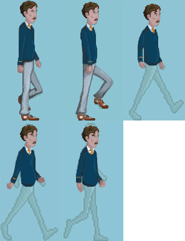
I stretched the cycle template out, because I'm working with a tall, gangly character, and started a...you guys call it a paintover?...process. I've done torsos, heads and arms for 1/2 of the cycle, and two pairs of legs. Thought I'd share a little more with you guys. I feel like I'm not doing horribly, but I'm prepared for when you all find this thread and show up to throw tomatoes at me. My posts here will hopefully serve to keep me accountable, and keep me making progress.

100%:


200%:


I kept Mr. Colossal's template in the background at a lower opacity to show where I've followed and where I've deviated from it.
#1127
Critics' Lounge / Re: PDF catalog
Thu 23/02/2012 19:26:04
I tend to work in favor of more white space in design, and would add more to the right and bottom of each picture. Here's what I'd do:


(Obviously I've trimmed some of the text in Photoshop, but this should give you an idea.)

I might also consider a thin, 1- or 2-pixel border around these images.
#1128
Critics' Lounge / Re: PDF catalog
Thu 23/02/2012 09:29:35
Quote from: Nikolas on Thu 23/02/2012 07:37:25Most importantly, though, I'm interested in the graphic side of things and the design side of things... Any comments are most welcome.

Looks pretty good to my eye. The one thing that sticks out on first skimming is that the pictures in the bio section could use a little more padding. The words are kind of cramped around the pictures.
#1129
Critics' Lounge / Eric's art thread
Thu 23/02/2012 08:46:44
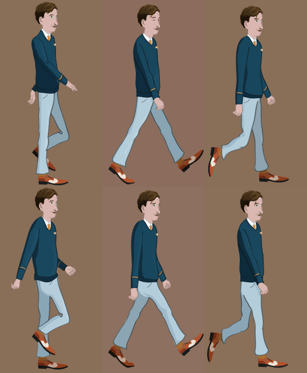
UPDATE: You're going to have to wade through a few posts of crap before you get to anything that looks good, but as of March 7, this is the best I've done:


Hi folks. I'm a new member here, and have enjoyed looking through this sub-forum more than any other part of the site. There are some amazingly talented people congregated here.

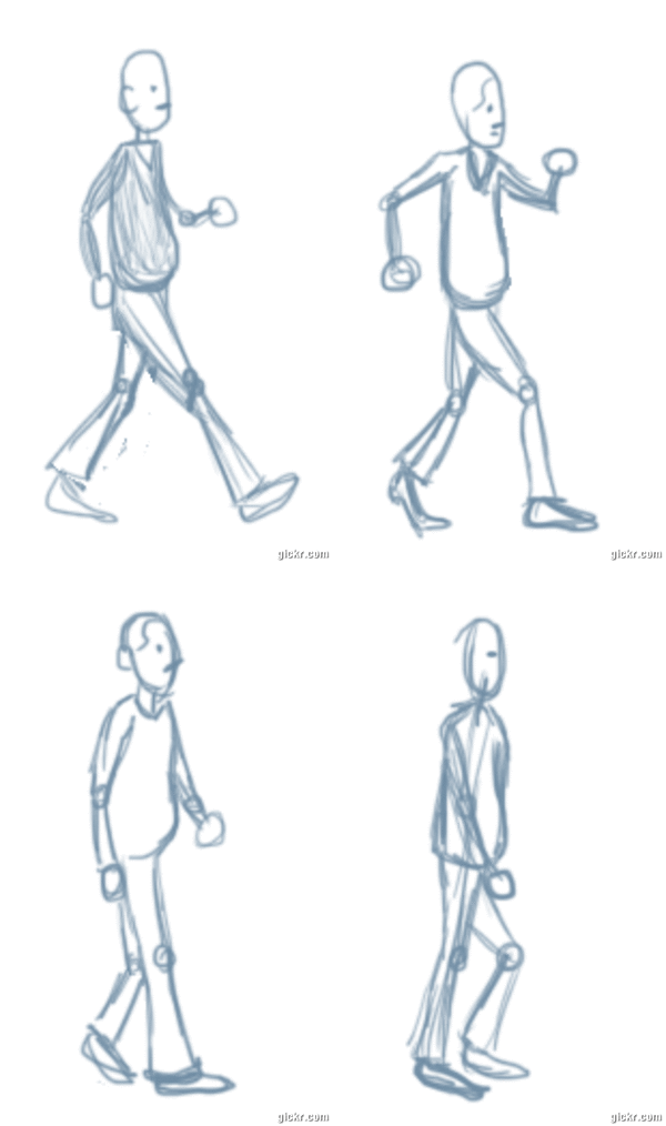
...Which is why I'm a little embarrassed to share my learning process with you. I'm slowly, slowly attempting to make a small game of my own, and by far, the most daunting part is animation. Tonight, I decided to start learning by trying to animate the key frames of a walk cycle. Results were not that great, but I have made some process.  At midnight, I had never animated a walk cycle before, and now I've made several tries at it:

I hand drew 1/2 of the walk cycle just to sort of get my bearings. Very very loose doodles here, and throughout my other attempts below as well.


Toned down the extreme frame where it looks like the character looks like he's about to break into a run, did a doodle-over second draft, and tossed on some color in Photoshop:


With this version, I was also trying to deal with the physics of the body. This character has a bit of a paunch that I wanted to see bounce a little when he took steps. This is me trying to get my head 'round the effects of gravity and inertia that happen as we take steps. Here's a version with a faster framerate:


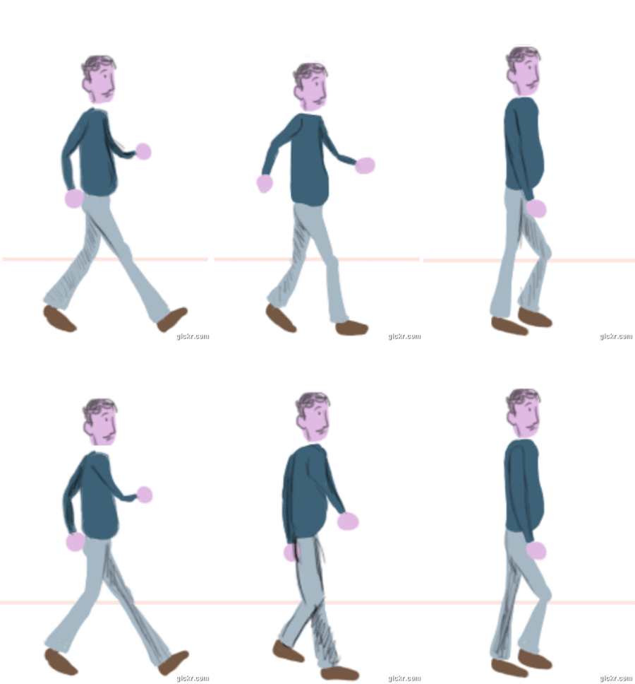
The arm swing and gait are still a bit extreme here. After this draft, I thought it might be helpful to break things down to an abstract level, and did a sticks n' shapes version, making the swing and gait not so exaggerated:


Still lots of issues, but I think it doesn't look too bad if you cover up the stick feet (wish I'd done the joint on the ball of the foot). I also think that the figure should lean forward slightly.

I've found a number of the tutorials linked in the sticky'd post useful, and I especially wish the Biomotion lab app allowed you to advance through their motion capture walk cycles frame by frame. I'm still looking around at some other resources, and hopefully will find some time to improve later this week. I feel like being able to do something like this is a hurdle I have to clear before thinking seriously about making a game of any length.

Anyway, thanks for checking in on my learning process so far. Hope you aren't too horrified!
#1130
Hi, everyone. I'm a newcomer to your boards, and have been devouring as many posts, especially in this sub-forum, as possible over the past week. I'm a long-time fan of adventure games, growing up with the LucasArts games (I had the NES version of Maniac Mansion), and some other less remembered games (I'm talking things like Jack Orlando or Guilty). I even coincidentally have an adventure game writer on my dissertation committee.

I've often thought about trying my hand at making a game before. I had a brief fling with text-based interactive fiction, the sort of precursor to adventure games, but was frustrated by the programming language I was attempting to use.

Now, inspired again, I'm here to give game making another shot. I look forward to being a contributing member here.
SMF spam blocked by CleanTalk