Wow, that was a fantastic presentation. I don't think that AGS has every, or could ever, be presented better. The very hands on approach was very good and I think they took away a lot more then just the "Hey, look at this cool game I made." And for the little amount of time you had, you gave them the whole scoop. Even when you were demoing AGS I thought "Wow, that looks really easy. I should try that!"
- Welcome to Adventure Game Studio.
This section allows you to view all posts made by this member. Note that you can only see posts made in areas you currently have access to.
#541
Adventure Related Talk & Chat / Re: The Shivah (and me) on Gamasutra and Youtube
Thu 12/10/2006 22:32:50 #542
Critics' Lounge / Re: Please crit my portfolio
Tue 10/10/2006 21:27:11
Very nice. Not a fan of the eyeball, but the scroll bar is very cool. Everything is organized okay, but maybe bring the news to the top of the about page. Also, you should show a screen shot or two to get people interested. A link is alright, but it just makes it a hassle for people to look at everything.
#543
Critics' Lounge / Re: This is why i haven't been around....
Tue 10/10/2006 21:23:01Quote from: Mouth for war on Tue 10/10/2006 18:50:13
amazing!!! absolutely amazing

Please do not revive old threads unless necessary. You have added absolutely nothing to this thread. If you want to let the creator know how you feel about his work, send him a PM.
#544
General Discussion / Re: Screw the Wii, lets talk nuclear bombs!
Mon 09/10/2006 22:02:49
The Wii IS the nuclear bomb. Just an innocent game of pong and BLAMMO!
#545
Critics' Lounge / Re: Drawing up for Crit.
Mon 09/10/2006 06:05:03
Over all it looks very RPG. Great character.
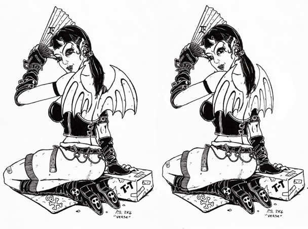
The perspective of the wings was off. The legs were too, and still a tad of in my edit. Removed the line in the skirt, because it took me forever to figure out what it was. The Line looked like the leg line. I mean, it could have been kept, and was partially correct, just confusing. The arm was a bit disproportionate, and the angle of the shoulder was askew. Did a little eye edit too, just too much going on.
The perspective of the wings was off. The legs were too, and still a tad of in my edit. Removed the line in the skirt, because it took me forever to figure out what it was. The Line looked like the leg line. I mean, it could have been kept, and was partially correct, just confusing. The arm was a bit disproportionate, and the angle of the shoulder was askew. Did a little eye edit too, just too much going on.
#546
Competitions & Activities / Re: Animation Challenge - What's inside?? WINNER ANNOUNCED
Sat 07/10/2006 06:26:52
Eh, I thought you idea might have been the gold light suitcase from Pulp Fiction. Congrats MashPotato.
#547
General Discussion / Re: Web help needed: The link
Fri 06/10/2006 05:52:57
Make the two sections one page. So the link is opening another page, which has the two pages on it.
#548
Competitions & Activities / Re: Tune Contest Sans Pun - The Afterlife (Oct. 5 - Oct 12)
Fri 06/10/2006 04:11:31
I was upset I missed out on the last one, but this topic sounds great too. I'll be sure to give it a try, but not sure what will come of it.
#549
Critics' Lounge / Re: My first flashmade photoalbum
Fri 06/10/2006 04:08:45
Over all, it's alright. Functions correctly. If it was something other then personal photos, then I'd say change the fonts and colors because they look very kiddy and amateurish.
#550
Adventure Related Talk & Chat / Re: Good Response
Tue 03/10/2006 04:43:27
7h1rD p3r50n TotTaly bR34ks teh 4TH W4ll!
f1R57 P3rs0n a|| t3h w4ys!
f1R57 P3rs0n a|| t3h w4ys!
#551
Critics' Lounge / Re: how can this dodo be improved
Tue 03/10/2006 04:31:40
I think a better way then saying "You should try it yourself" would be that we don't know what your style is. Your style for the rest of your art could be way different from anything we provide to you. So by doing one yourself, we can help you get to your ideal coloring goal.
#552
Competitions & Activities / Re: Animation Challenge - What's inside??
Mon 02/10/2006 21:46:00
I've got a very good idea about what you, Darth, think's in the case, but after trying to animate it several times, I've given up. So, after this ends, don't tell what it was before I get a chance to guess! 
#553
General Discussion / Re: MilkShape
Sun 01/10/2006 05:55:09
This isn't really the place to ask this. Try the help file, or the MilkShape website.
http://www.swissquake.ch/chumbalum-soft/
http://www.swissquake.ch/chumbalum-soft/
#554
General Discussion / Re: Visual Programming
Thu 28/09/2006 21:43:13
VB does have a compiler, but, I belive, it sets the .exe up as an install and it just installs those .dlls.
I mean, the game will run, but some functions don't work without VB.
I mean, the game will run, but some functions don't work without VB.
#555
Critics' Lounge / Re: Pencil sketch in my style. Comments?
Thu 28/09/2006 21:37:13
I love the style, but the preportions are a bit off. Well, more so, besides the head and neck. I did a quick edit for you to see. The left eye was high, the head was a bit wide, the right shoulder was thin, both forearms were a bit skinny and bent too much, and the right breast was bigger then the left a bit.

#556
General Discussion / Re: Visual Programming
Tue 26/09/2006 05:37:35
Visual Basic is bad for making games. Unless the player has all of the .dll's then they can't play the game. Basicly, they either need Visual Basic too, or you have to package a bunch of .dll's with the game. Why not make some "functions" for AGS.
Your just better off learning C++, and that's the plain truth.
Your just better off learning C++, and that's the plain truth.
#557
Critics' Lounge / Re: Quest for Glory: So you want to be an artist?
Mon 25/09/2006 01:13:02
I agree. The previous posts seemed too beginner, but this Shapes and Tension was very interesting. I've always had a feel for the concept, but your post has some extremely good examples. I hope people reference these in the future and I hope to see some more of these myself.
#558
Critics' Lounge / Re: Opinion on a 3D Pre-rendered background...
Sun 24/09/2006 20:01:00
Looks much better. However, windows don't light every wall the same and typically only one wall gets the cast shadow from the panes. And maybe the far left wall is a bit too bright. And the fan too. It might be correct value wise, but it stands out too much.
And I don't think the plant is that big of a deal. What kind of texture is on it? I'd just leaf (hah, get it?) it a flat color.
And I don't think the plant is that big of a deal. What kind of texture is on it? I'd just leaf (hah, get it?) it a flat color.
#559
Critics' Lounge / Re: Web Banner
Sun 24/09/2006 07:26:21
http://img.photobucket.com/albums/v458/evil1359/aventurama_2.jpg
The values don't get very dark. I added some darker shadows below the small letters to make them stand out from the background. They're the same colors and they really need that, or some thick lines to make them stand out. The "A" wasn't ther focal point, which it should be. Some brighter colors and some (poorly done) shadows.
Not perfect, but you get the idea, I hope.
#560
Critics' Lounge / Re: Web Banner
Sun 24/09/2006 05:15:13
Yeah it looks good, but you may still want to darken up some of those values to the same value as the dark outline.
No, but I've thought about going into that field of work.
Quote from: i k a r i on Sat 23/09/2006 19:54:04Evil, thanks a lot for your advices, you sound like a graphic designer, are you?
No, but I've thought about going into that field of work.
SMF spam blocked by CleanTalk