The glows and the like are fine. The real problem is contrast and composition.
I angled the "A" the other way to emphasis it's importance. It also dragged your eye left, and now it keeps it centered.
You had no dark values at all. It's an Adventure game site, and with a name like Adventurama, I can assume it's comical. Line quality plays a big part in comics. So I added some bold lines to make everything pop and added some contrast. It's a good idea, but it looks too Microsoft Power Point.
Also, keep in mind with lettering like this, it's almost making the "A" the logo. Which is nice if you don't already have a logo design and just this banner. A big "A" would make a great icon or "sticker".
Oh, and I got rid of the blue/grey thing. Bright colors and grey don't mix really well. If it was a telephone number it might work, because you want people to know that. Which a name, the URL isn't that important, because they're more likely to remember the name anyway and look it up on a search engine.
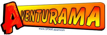
