Menu

Show posts

This section allows you to view all posts made by this member. Note that you can only see posts made in areas you currently have access to.

Show posts Menu

Messages - Fizzii

#201
Quote from: Farlander on Wed 28/12/2005 09:42:12
The triangle is quite easy...

The triangle actually requires skill. It has to be hit a certain way in order to get a certain quality of sound from itÃ,  ;D

Easiest instrument probably varies for each individual. It probably also comes down to personal preference. I find violin pretty easy, but I've been playing for 13 to 14 years. I've also played piano for 13 years and find it harder to express the music with that. And while piano is good for beginners because no intonation is required (unlike violin, with screechy notes), it is difficult to be really good at it (at a high level) because the keys have to be touched a certain way to get a nicer sound out of it (well, that's probably similar with violin :P). The 'easiness' of an instrument does depend on what kind of standard one is looking to get to though.
#202
Hints & Tips / Re: META
Mon 12/12/2005 11:31:53
Quote from: jane on Mon 12/12/2005 11:22:02
I'm in cave and can touch door but am absolutely lost at what to do next.............when I try to change inventory nothing happens, button drops off as well - I put it back but what else should I be doing?

Have you fixed the button so that you can use it?

I've figured out how to cross one chasm, but not sure how to get across the other... I guess I'll muck around with this brilliant BHT editor a bit moreÃ,  ;D
#203
Completed Game Announcements / Re: META
Fri 09/12/2005 06:05:49
Quote from: mags_don on Fri 09/12/2005 04:30:15
OK,first of all..cant exit out of the game unless you use control alt delete..hmm..dont know if i like this..sorry ???

hehe

Quote from: Radiant on Thu 08/12/2005 21:47:39
Warning: not for the faint of mouse.

Spoiler
To quit, try Ctrl+Q
[close]
#204
Critics' Lounge / Re: Fall Portraits
Mon 07/11/2005 11:09:10
I think they are quite good! Especially the colours.

The light is quite good, though maybe you should watch it on the first one, where it also falls below her neck, and seems blown out in comparison to the rest of the picture.

In general, I'd say flash isn't needed for these types of photos - in a studio, maybe. Flash tends to make everything in focus, and tends to take away from the atmosphere (Light and shadows help add to atmosphere if done right). The only thing is is that without flash, one has to be very aware of how the shadows are falling. In general, I think you've done a good job with that :)

Composition wise - it would've been nice to see her feet as well in no. 3, but since you were trying to capture the leaves as well, that would've been difficult. No. 7 is not a very flattering angle, though it is a 'fun' shot. No. 9 is cute. The background might be a bit distracting due to its sloping away and has other elements there. I like the colours in No.1 a lot, but maybe the camera could have been angled a bit more over her face.
#205
Quote from: Mr. Mozzarella on Tue 25/10/2005 21:44:32
I am also looking forward to it
but why did you never update the website?Ã,  ???

Thanks :)

Simply put, keeping the website constantly updated takes time. We rather prefer to spend our energy working on the game. But who knows, we probably will update one day in the future.
#206
Your photos definitely show creativity.

What I'd usually do is take several shots of the same subject, at different exposures and angles. You may end up with plenty of lesser-quality pics, but generally you'll get at least one or two that are really good. Dusk might be possibly a better time to take photos, but taking photos near bridges is also good since there's some light.

Also, watch the way the light falls onto the models' faces. In a couple of them - 004, 010, the light is very strong on their noses. It might make for interesting results if part of their face were lit up as well.

And, you probably intended for them to look at the camera for most of the photos, but I feel there's just a bit too much awareness of the camera. They're trying too hard to pose for the lens. Their personalities might be brought out a bit more if it weren't so obvious they were posing for a photograph, adding a sense of mystery/allure/whatever to the photo ;)... But that may be just my opinion.
Some links:
http://www.finetuning.com/articles/571-tips-for-night-and-low-light-photography.html
http://www.travelphoto.net/photos/english/photo-tips/html/night-photography.html
http://malektips.com/digital_night_photography_help_and_tips.htmlhttp://www.rlrouse.com/photography-at-night.html

With your second bunch of photos - I like the symmetric composition of 004, though the image is sloping down ever so slightly to the right. 001 has cool casual poses, but it would be nice if the wall was lined up straight as well. I like 006 for the composition and poses as well. The dead centered composition of 002 doesn't really work for me, and while the reflections are cool, they fight with the main subject. Maybe composition by thirds, or another angle to the shot...

Anyway, some very nice photos there :)
#207
Quote from: khrismuc on Sat 30/07/2005 14:05:51
The water shows too much of the reflection.

You can see that only the top of the hut should be visible, same goes for the tree.

heh, good point :) That does depend on where the horizon (eye level) is though, which I wasn't sure of... if the eye level is above the hut (which it probably is, looking at it again) then another point to make is that the hut should also be a lot more curved in that case to fit the perspective.

Definitely some good points made in this thread :)Ã, 
#208
Great work Alias! I really like the colours of the sky :)

A few things I will point out as well:

- Try to avoid using the burn tool - it seems that you've used it on the hut and tree anyway... if you didn't, then make sure that the shadowed areas of the hut and tree are less saturated than the areas in light; because shadowed areas don't have so much light, therefore they can't have so much colour either.
- Since it's low light, there will be some reflected light from the grounds and atmosphere onto the shadowed parts of the tree/houses etc.
- Even though the light source is from behind the mountains, reflections don't reflect flat onto the surface of the water - the water reflects like a mirror, so the reflections should be vertically underneath the real object (eg. tree reflection should be vertically under the tree, and about the same distance from the edge of the water as the real tree is)

- Water should probably be a lot darker, as it is a reflection of the sky.
- The bottom of the hut should be more curved compared to the top of the hut. The only area where the side view of a rounded object would appear straight is when it matches up exactly on the horizon line.
- Grass colours would startÃ,  taking on the colours of the atmosphere. So, there should be some pinks too.
- Tree foliage - I would expect more clumps of foliage, instead of just one mass... there's bits sticking out towards the viewer too, so you'd have to consider that otherwise it looks flat. (try and think 3d). Personally, I find the shape a bit too neat, but that's my opinion ;)

Quick paintover showing some of this:

(Some of the detail got washed out, my bad)
Ã, 
Looking forward to seeing your next edit :)
#209
Critics' Lounge / Re: Nose Cave
Thu 28/07/2005 02:01:11
It's a nice start, and definitely a good idea :)

As said, try to avoid overblurring/oversmudging because it makes it look flatter and messier around the edges. Lowering the opacity of the brush when painting might help.

Also, be careful with your choice of colours - nose interiors aren't really orange and grey, at least, I hope not ;) - maybe more reds/pinks. As caves are usually rather dark, the colours of the ground and foreground shouldn't be so saturated.

Messy paintover:
- The colours are now basically the same hue, rather than orange and grey, which didn't make much sense to me - it could probably be even more red or pink than it is at the moment. Colours are a lot more desaturated because of the low light.
- I wasn't sure where the source lighting was. Foreground is darker to contrast with further into the cave, though you might want that the other way round.
- Mucus doesn't look so slimey but some highlights and smoothing would probably fix that - like what you originally had, but less saturated.
- Hard edges between colours are often better than blending everything in smoothly, which is why smudging/blurring everything isn't a good idea.


Well, I hope it helps :)
#210
Critics' Lounge / Re: Hillside background CC
Tue 26/07/2005 02:04:04
Very nice work! :) The fog is very cool.

The only thing I would comment on is the colours - given the lighting, one wouldn't expect to see greens or browns like that - I would expect the whole scene to be a lot more blue and little or no greens/browns because of the blue atmosphere and low light. This can be fixed with some colour adjustments.

I do like the grass and the leaves by the way too :)
#211
Hints & Tips / Re: Radiant's Kings quest 3
Sun 17/07/2005 11:37:11
...

Spoiler
coin
[close]
#212
Not bad at all! :)

Some of the hills in the distance lack a bit of form... the one in the middle for instance, could do with highlights on one face of the hill, so that it looks more 3d.

Composition wise, it is rather empty, but I guess that the antarctic is pretty much empty apart from penguins ;)

Just a tip: While smudge tool is a really useful one, don't abuse it... for example, in the distance where it meets the sky. If you ever make backgrounds that have more texture (comparitively to ice), you might like to use it less ;)

But I think it looks pretty cool :)
#213
Critics' Lounge / Re: Mountain and and a river
Mon 27/06/2005 00:32:42
I use Photoshop CS, but it should be possible to do similar stuff with Artgem, since I don't use any fancy tools or effects (well, I do have a tablet, but if you're using mouse, you'd just have to spend more time doing mouseclicks ;))

- The main idea is to get the colours down with correct shading and lighting. Details, such as the grass, should be done last.

- I usually use a hard round brush. For the clouds, I coloured in whites/bluegreys, and smudged together for a softer look, but you'd have to be careful not to oversmudge things, or get carried away using that tool ;)

- I also pick several colours from the colour pallette, including for shadows and highlights. I used around three different shades of blue for the sky - lighter blue for closer to the horizon; and four or five different greens, with lighter green further away (this adds to the depth of the picture, otherwise it looks more flat and not so realistic).

- As Zor pointed out, the river didn't really look like a river. I think that it's not just that it's highly unlikely to be surrounded by rocks, but also because since the water is a reflection of the sky, the bank side should also reflect in the water. I lower the opacity when doing reflections.

- Opacity, (meaning lack of transparency), is useful for blending colours when you lower it... that is, making it more transparent. (Artgem should have an option for it somewhere, but I wouldn't know where)

Anyway, probably the best thing to do is to sketch your ideas properly on paper first, then scan it in and paint over it, instead of going straight to Artgem and starting with a blank canvas... or at least use it as reference when painting it, so you have your ideas down to see. Hope this helps :)
#214
Critics' Lounge / Re: Mountain and and a river
Sun 26/06/2005 11:39:41
I think it looks more like a mountain-side slope, with river going down it, am I correct?

I think the river could be thinner, and it would look more like a river if we could see the other side of the bank.

It's not bad at all for a start, but colour wise, the areas further away (that is, closer to the horizon) should be lighter and less saturated. Also, a natural bank of the river would not be lined with rocks that look like they've been put there by a bricklayer :)... it'd more likely have dirt and some rocks scattered loosely, or something. I personally would've chosen a more yellow-green green than a very green green too.

You could also fill up the scene by adding rocks, trees/shrubs, and mountains in the distance. Even flowers (if it's spring)

This is a quick paintover I did, showing my ideas... I don't know if this is something you had in mind, or not, but your piece certainly has potential :)
#215
Critics' Lounge / Re: Rubber tree
Tue 14/06/2005 09:09:06
Looks quite good. :) I like the style too, rather cute. If it were me, I'd probably darken the leaves a bit more - they're a bit bright... I would've added some twigs too and have the foliage come off the leaves rather than the branches, but I'm a stickler for detail and realism ;)Ã, 
#216
Critics' Lounge / Re: Practice Background
Thu 09/06/2005 07:34:16
Quote from: Not Yet... on Wed 08/06/2005 14:21:59
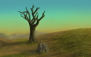
Eh, in my opinion the shadows seem to go a bit wrong way, as the sky's colors don't suggest that the sun is actually in that direction. I hope you get what I mean... But that's not a huge problem.

I'm guessing that you're saying that since the yellow is on the horizon, it would suggest the sun is there, or nearby there, because otherwise the sky should be darker? (And so the shadows should be toward the viewer, and the tree and rock should be more silouhetted, or something?) Um, ok, I guess I'll have to study light a bit more. Thanks :)

Quote from: Redwall on Wed 08/06/2005 14:22:23
The only problem with shadows like that is that it will look odd when you put characters (without shadows) on that background. . . assuming it's for an adventure game, of course.

I'm not making an adventure game with this picture. It was an exercise :)
#217
Critics' Lounge / Re: Terragen
Thu 09/06/2005 07:25:19
Quote from: Dark of Night on Thu 09/06/2005 02:27:02
This is what i have to show for 3-D. I can't remember what program i used, but hopefully i can learn and get better.

Looks good! :) I don't know much about how to 3d model, but I would suggest using more textures for the objects, because they repeat when they wrap around and it doesn't look so realistic then.

As for Terragen, well, it's kind of neat, but looks very Terragen-ish. I particularly don't like the way it does clouds - it wraps them around in the sphere, but if you go outside and look at clouds in the distance, you'd see that they aren't distorted or stretched because they are far away. That's my opinion anyway :P It could probably be used for a game, by a bit of photomanipulation and painting over it...
#218
Critics' Lounge / Re: Practice Background
Wed 08/06/2005 12:02:29
Thanks YakSpit and khrismuc! :D

Yep, the sun is supposed to be setting - except that the shadows aren't on the right side (I guess my excuse is that the viewer is facing south rather than north ;)) As for the empty sky - I think I'll leave it empty because I don't think clouds are imperative to this piece ;)

Third edit:


- changed mountains
- fixed sky gradient a bit
- gave the shadows more diffraction and longer, hopefully
- slimmed down the tree branch
- added shadow to hill slope

Thank you for the comments :)

Alias - I have been writing some tutorials on and off for a few months now - I will post them when I'm done ;) - maybe in a month's time, after exams.
#219
Critics' Lounge / Re: Practice Background
Wed 08/06/2005 10:10:43
Quote from: Pablo on Wed 08/06/2005 09:15:46
Is it grass? It looks more like some green liquid.

Green liquid - heheheh, I like thatÃ, description ;) Well, I did do the grass the lazy way (that is, using the grass brush in Photoshop, which often turns out blurrier), but that's because I was trying to get the colours right more than detail as such.

But here is one with revised grass anyway:


Quote from: Skurwy on Wed 08/06/2005 09:40:57
these shadows are a little bit too schematic as for me

How do you mean?Ã,  ??? I don't quite understand...

Thanks for the critiques! :)
#220
Critics' Lounge / Practice Background
Wed 08/06/2005 09:06:24
Well, I was trying to do something a bit different with atmosphere, colours and lighting from what I usually do... I would like to know if there are any irregularities with my use of colour, shadowing, or other :)

SMF spam blocked by CleanTalk