Quote from: GarageGothic on Mon 23/01/2006 19:16:58
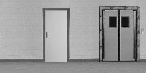
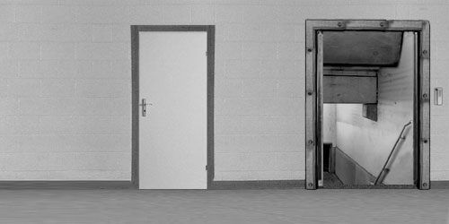
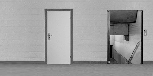
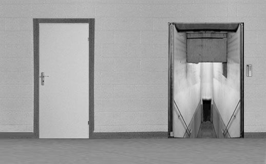
I think the staircase works fine now. However, the new door frame and the sliding door itself clash with the rest of the background. Perhaps it's the sharp black edge around the door frame, but for some reason it looks more like a drawing than a photograph. I would suggest toning down the contrast for a better match - and note that I preferred the old door frame without visible bolts.
Yes, you're right, it has too much contrast. I quite like the frame, though, because it looks worn, not so pristine (it's not a drawing, I made it from a photo of a single metal plank).
QuoteAfter seeing the reference photo I'm quite intrigued by the way you construct your backgrounds. Great work!
Well, it's not much of a hassle, more like some quiet, relaxing past-time. Librarian's work. Only sometimes it's hard to find proper photos of things you want to collage. Like, you type into google images: 'glasses' and you get a photo of a girl in glasses with some other person's intimate member in her mouth. It's distracting.
Thanks for your opinion (valuable as always), but now stop reading the forums, go and finish Shadowplay. We want it.
EDIT: Back to contrast: I've checked it, but I don't know... it's more menacing the way it stands out. I want you to be scared to go down there. I will tone it down, but just a bit. And lighten the outer phase around the frame.