Menu

Show posts

This section allows you to view all posts made by this member. Note that you can only see posts made in areas you currently have access to.

Show posts Menu

Messages - Ilyich

#141
The Rumpus Room / Re: Happy Birthday Thread!
Mon 29/10/2012 19:45:04
Happy birthday to everybody's favourite bovine AGSer! [insert an appropriately inappropriate cow joke here]! Keep on rocking (from side to side in a variety of season-related costumes)!  :cheesy:
#142
Critics' Lounge / Re: Eric's art thread
Mon 01/10/2012 20:24:26
So, I've tried to do a paintover, and there's not much that can be done here without adding new objects. It's hard to make a straight-on view of some buildings not flat-looking, I guess. And it has it's own charm the way it is as well. :) The only thing I can say (and it's a very boring and obvious thing :)) - drawing all the faces of objects is important. So, if you have a slightly extruding column (like the ones on the yellow-bricked part of the building) and you're not standing right in front of it - you'll see two of it's sides and rendering both of them is essential. :)

Oh, and here's a paintover itself. Best viewed in comparison, since I doubt the difference is very noticeable otherwise. :)
#143
Critics' Lounge / Re: Eric's art thread
Mon 01/10/2012 17:26:40
Quote from: selmiak on Sun 30/09/2012 18:48:33
Use the 'R'-key shortcut to rotate everything so that you can draw your 45° angles. And ESC sets it back to normal rotation ;)

That's news to me too! :-[ Is it a new feature? I only have CS3 and it doesn't seem to work here.

As for the background - I really like it! The colour scheme is wonderful and the style sits nicely between realistic and painterly.
I feel that the it could do some good to bring out the shapes a bit more, though, since it still looks a bit flat, like a theatrical set. I'm not quite sure how to do that, though. I'll probably try to do a little paintover a bit later and see. :)
#144
Dualnames, I was just thinking about suggesting The Holy Mountain and Alejandro Jodorowsky's work in general! Not only is it weird as hell, it is also absolutely brilliant, which is a rare combination. Oh, well, since I'm too late to suggest that, I'll have to think of something else...

Okay, here we go - Love Exposure by a strange japanese director Shion Sono. It's not exactly a shocker, but it's a bizarre and magnificent 4-hour long tour de force about faith, love, martial arts and panty shots. For a more gruesome and disturbing affair you can also watch his Suicide club, altough it's not nearly as good.

Also, while we're still on the subject of weird Japan - Takashi Miike. Odishon and Ichi the Killer would be my main choices, but there's a lot of nutty stuff in this man's collection.

Peter Greenaway is another good candidate if you're in a mood for an intensely intelligent art-house kind of disturbing. My pick would be Zed and Two Noughts - it has some of the most memorable scenes in film history, in my opinion, and is generally quite unforgettable, despite being quite a mess. The Cook, the Thief, His Wife & Her Lover is also a classic.
#145
Thanks, Nix, glad you liked Patchwork! :)

The problem you are having with winsetup probably has something to do with Windows' permissions. Try running winsetup as administrator (right-click -> Run as administrator).
#146
First of all - these are indeed really nice and fun to look at, nice going!

Now, what instantly jumps at me is the general lack of contrast value-wise, especially on the interior shots. A good way to keep track of this is turning your image grayscale from time to time and see if it reads well enough in black and white. It should. Also, in reality, interiors are dark. And although our eyes adapt to the difference in lighting between outdoors and indoors quite quickly, it's still a good idea to make the difference noticeable in the artwork. In your case, since the insides of the hangar are almost as bright as the outside, it sort of feels like this hangar doesn't have a roof. :) Lighting the important parts of the image and putting the uninteresting ones in the dark shadows is a trick that's about 4 centuries old, but still as effective as ever. :)

Another related thing is the use of blacks. Steve Purcell, coming from a comic book background and being a good friend of Mike Mignola (Creator of Hellboy and an amazing artist. Refer to his work for examples of spectacular use of high-contrast b/w lighting) uses blacks quite extensively, and I think you should try it as well. Silhouette foregrounds is another important part of the DoTT and S&M style, so that too might be worth a shot.

Here's an edit that, hopefully, illustrates some of these points:
#147
Eric, the neo(n)-classical background was painted for one of the Background Blitzes here, just for fun and practice. :)

As for my process on Patchwork - to be honest, it's really simple and terribly uneducational. I start with a very messy sketch, then turn it into a more refined lineart drawing, and then just colour it. That also pretty accurately describes the layers in my .psd files. :)

The stages look something like this (clickable):


Looking at it now, I don't think I've used any construction lines for perspective apart from the horizon line on the initial sketch, but there isn't that much to construct here, really. :)

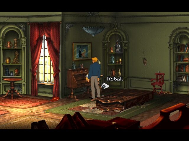
As for the scaling issues - firstly, it's much less of an issue in higher resolutions - it's still far from perfect, but it doesn't ruin the sprites completely, as it does with pixel-art. And secondly - 2-point perspective doesn't necessarily mean scaling - if anything, it's easier to get away with slight cheating. Just keep your line of horizon above the character's head and vanishing points far apart and the lack of scaling on the character will not look too jarring. As an example - here's a screen from Broken Sword 2 (which I believe is mostly hand-drawn, by the way - no 3D, just rulers :)):


I think it's pretty obvious here that unless George goes to the very bottom of the screen, he will look absolutely fine without any scaling at all.

And as I said already, I think 2-point perspective works just as well with interiors, even though it's often tempting and/or useful to have a straight on view with 3 out of 4 walls clearly visible.
#148
Hey, I just wanted to say big thanks to Chicky(Chook?!  :cheesy:), david, CaptainD, Fitz and everyone else who played and enjoyed Patchwork! I somehow missed the right moment to respond and thank you guys for the feedback, but I really appreciate it, and it's better late than never, right? :) Cheers!
#149
Quote from: ThreeOhFour on Mon 03/09/2012 14:39:53
...if I was making a deadly serious game then I'd probably get away with it less (although I'd totally try!).

And judging by one of your old unused backgrounds (the one with the snow and a train) you would totally get away with it! Damn! :cheesy:

StillInThe90s, first of all - awesome background! Very nice composition and design, hats off to you!

And I'm hardly a SketchUp enthusiast - I've never actually used it myself. :P But I think it's an interesting technique that can be useful to some and it seemed appropriate to mention, given the appraoch Eric was trying out. And I'm definitely not suggesting that everyone should do it this way, I'm not mad. :) As I was saying - it's all up to the style you're going for, and drawing wacky perspective in a gritty cyberpunk game would be no less ridiculous than making a DoTT remake realistic 3D. :)

Getting back to the original subject of perspective and what's our perspective on it - I just realised that I've drawn very few backgrounds where it's actively used. In natural landscapes you can even get away with knowing nothing about perspective at all. And where I do need it I usually just set up the horizon and a few lines going to the vanishing points on a seperate layer and draw the rest of it more loosely.

Although it's still nice to work with a complete perspective grid sometimes, since you can really go wild with it, drawing orthogonal planes left and right. And you can still end up with a mess of a perspective if you're not careful enough, as I did here :)


#150
Quote from: ThreeOhFour on Sat 01/09/2012 15:30:57
I try to stay away from vanishing points.

Booo, Ben Chandler, boo! Saying such awful things! Vanishing points are our friends! Our tiny, dot-shaped friends! ;D

Which brings me to something I think is important - perspective should be treated as a tool, not a rule. And as with any tool - you are free to use it as you please or not use it at all, but it sure helps a lot if you are trying to draw a realistic looking environment. And the more realistic you wish to go - the closer you should stick to these... tools. For example, Ben's art, apart from being awesomely beautiful, is always somewhat whimsical and abstract, which makes it always evocative, but never familiar from the real life, and it's a direct result of the loose approach to perspective and colours (and the other way around too, of  course).

Moving on, I feel that 2-point perspective is always a better way to go. 1-point perspective can be useful in low res, but when you're working at higher resolutions you can always make a more complicated, interesting and dynamic composition with 2 points.

I would also suggest trying Google SketchUp - it's really easy to use and can help a lot if used right. Here's a small tutorial on what I think "using it right" means from one lovely devianart artist: http://feigiap.deviantart.com/art/Google-sketchup-to-painting-2-285039677

The main problem with your otherwise lovely background right now is that the shape is too simple. And proper perspective is much more useful to create complicated shapes, with lots of different planes. So, basically - it's a perfectly nice method, but it will still take a lot of work to make something great with it. :)

A wonderful example of using complex 2-point perspective for 2D backgrounds is The Journey Down: http://www.skygoblin.com/the-journey-down/bilder/tjd4.jpg - the perspective there is quite precise, but not at all rigid.
#151
Hints & Tips / Re: Patchwork
Sun 02/09/2012 16:35:40
Quote from: MiSaNtHrOpE on Sat 01/09/2012 04:24:57
Spoiler
The Pixie does not move from the tree. Both characters pissed it off.
[close]

Spoiler
The pixie still should fly down on the rock below when both of the characters are far enough. If it doesn't - it might be a bug, although it still shouldn't be a problem. You just need to place some sort of trap on that rock. A sticky trap.

Oh, and pixie dust is the air element.

Regarding the rainstick - you need to find some pebbles. They're just lying around somewhere. :)
[close]
#152
AGS Games in Production / Re: Conspirocracy
Mon 27/08/2012 03:14:52
This looks and sounds fantastic! I'm a sucker for games in a contemporary urban setting, so this seems right up my alley!

The isometric view of the city is especially delightful. I want to go to there. :)
#153
Hints & Tips / Re: Patchwork
Wed 22/08/2012 23:35:39
Spoiler
Have you made a proper rainstick? If yes, does she say anything about letting the guy make his preparations when you try to use it? If so, you still have to either make a lightning rod or fix the computer. Or both. :)
[close]
#154
AGS Games in Production / Re: Primordia
Tue 14/08/2012 11:01:14
Fall 2012? Yes, please! Hauntingly beautiful stuff!
#155
Hints & Tips / Re: Patchwork
Tue 14/08/2012 10:50:28
Fitz,
Spoiler
What can fire spirit eat?
[close]

Spoiler
If you guessed right - where can such object be found? Look around there.
[close]

Spoiler
It's probably the most pixel-hunty bit in the game - there's a bunch of twigs under the Dryad tree.
[close]
#156
Hints & Tips / Re: Patchwork
Tue 14/08/2012 10:12:38
Fitz,
Spoiler
You just use the cellphone when the time is right, yeah.

As for the toolbox - have you thoroughly explored the cave? Maybe you need to illuminate the dark part.
[close]

Spoiler
It's in the car. You just need to have a look inside. :)
[close]
#157
Yay for the release of the Summerbatch! I'm very happy to have my first game in such a great company, and it's nice to see people finally getting to enjoy all the stuff we've been working on!

I've been lucky enough to play all of these games already and I've thoroughly enjoyed all of them, so I'd like to give my thanks to the developers from the position of a player. Thank you, guys, you did a great job!

I've especially enjoyed:
Nancy the Happy Whore, which plays exactly like a good old adventure of yore, but with more sensible (yet still delightfully wacky) puzzles and more sreamlined gameplay. I really liked the humour and the general fun and carefree feel, and it's great that it's a really sweet and warm game, despite the seemingly racy subject matter.

And, of course, PISS. It is by far the most ambitious of Ben's games to date, both thematically and in terms of size, it feels a lot like Planescape, it's beautiful, sad, funny, intriguing, inventive and has a lot of heart. And altough it's bigger than your usual 304 game, I still wanted it to go for a while longer, which I think is a sign of a really good game. :)

Eric, thank you! Glad you liked it!

Spoiler
I think there is a hint as to in which order you should use harmony and rainstick in the Book of Summonings, and I doubt that Lin would've been able to operate a modern smartphone. :) I do agree that a few extra interactions could've helped clear some things up, though.

The rain is indeed a hand-drawn 5- or 6-frame animation, done with some help of custom scattering brushes. It's probably my favourite thing in the game as well. ;D I can make you a gif or psd of it if you'd like. :)
[close]
#158
Hints & Tips / Re: Patchwork
Mon 13/08/2012 19:19:27
Spoiler
Since Daniel clearly needs his glasses himself, maybe you can find something to make a new pair of glasses for Blok?
Are there any lens-like objects or something that has actual lenses around?
[close]

Spoiler
Maybe somewhere in the wizard's study?
[close]
#159
Hints & Tips / Re: Patchwork
Mon 13/08/2012 18:21:59
Heh, musical puzzles are the worst. ;D
Here's a succession of hints:

Spoiler
You have to make them sound harmonious. Which means only activating the ones that sound good together. Order in which you activate them is not important here.
[close]

Spoiler
You have to activate 3 out of 5 crystals. You'll be told when you've struck on the right combination. :)
[close]

Spoiler
Oh, alright, it's the 1st, 3rd and 5th crystals from left to right. :)
[close]

Spoiler
-They "sound right". Now what? -You have to find a way to transport that sound to the room somehow.
[close]


#160
The Rumpus Room / Re: Happy Birthday Thread!
Mon 13/08/2012 09:15:43
Happy Birthday, Tabata! May there always be appropriate smileys for every occasion and lots of great adventure games to be played! :)

And a Happy Birthday to Wonkyth as well! Cheers!
SMF spam blocked by CleanTalk