Wooo! First trophy! Thank You everyone! Was super fun 
This section allows you to view all posts made by this member. Note that you can only see posts made in areas you currently have access to.
Quote from: BigHairyEyeball on Mon 31/07/2017 15:14:44
I've got some of the pixel art for my game REDWORLD up here, if anyone wants to look at it: http://imgur.com/a/pSdcn
 !
!
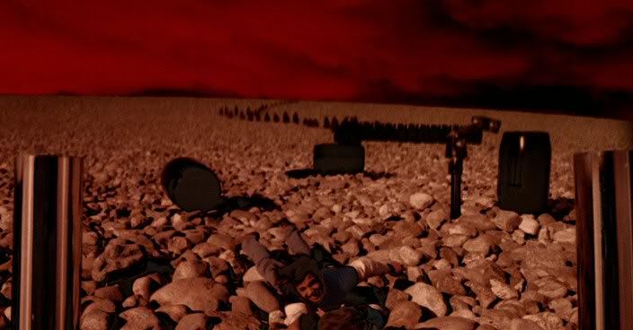
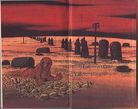
 ). The fun thing about the boat is that I actually wasnt sure what I have seen. I was looking elsewhere and it happened too fast for me to know for sure if the man pushed the girl out of the boat or if she fell out. This made the final decision really tense
 I'm mostly happy with this one (the shading still seems a little bit flat to me though). I might animate it at some later time )
already started creating
I'm mostly happy with this one (the shading still seems a little bit flat to me though). I might animate it at some later time )
already started creating
Quote from: cat on Mon 17/07/2017 16:54:34I'm not sure, haven't checked yet. Probably I would have to use some programming magic to make this happen.
Will the 2x1 pixel still work in AGS? I mean, can you make sure that the character always stays "on-grid"?
Quote from: cat on Mon 17/07/2017 16:54:34Yeah, more detail would help. Also some fixes (like in case of the animal skeleton - in 2x1 it can already stay as-is and in 1x1 there are lots of shapes and lines that need to be fixed)
I think what the 1x1 version is missing is detail. Have a look at the gif CaesarCub has posted and add some more dithering, especially on the left bridge part and the slopes.
Quote from: CaesarCub on Mon 17/07/2017 15:20:36When you create a new image you simply tick the "advanced options" checkbox and choose pixel size from the dropdown list
Where do you set it for non-square pixels? Or are you just making a 2x1 grid and coloring inside it?
Quote from: CaesarCub on Mon 17/07/2017 13:33:48I had the same issue, I used many programs like Pyxel Edit, GrafX2, Cosmigo ProMotion and Graphics Gale. I think the only one from those which supports the 2x1 pixel size is ProMotion but I hate working in this application for some reason. It has LOTS of feautures but I find it hard to use no matter how long I'm using it.
My main issue with the 2x1 pixels is that you have to keep making sure everything is in the non-square grid, and all the drawing software I use is not helpful on that aspect, so it always ends up being more work for me.
Quote from: CaesarCub on Mon 17/07/2017 13:33:48Oh that is so freaking cool! Thank you for providing me with the gif! I will not use the same method of creating my backgrounds (obviously) but referencing it should help me achieve the Sierra "feel"
On the technical side, what Gurok mentioned is true, pre 256 color Sierra backgrounds were a list of commands that the computer would draw.
Here is a stolen gif that shows one background being rendered
Quote from: Slasher on Sun 16/07/2017 19:32:15I bet the new one is a lesbian. That would make all the SJW scream with joy
There has to be a gay Gordon doctor at some point...
Quote from: nihilyst on Sun 16/07/2017 18:09:53Damn. Too easy. I accept your answer sir. The first one.
Is that one of the Deathstalkers?
Quote from: Gilbert on Sun 16/07/2017 19:09:40I would totally watch that
Teenage He-man and his fantasy gay adventure with Skeletor?
Quote from: manifest class on Sun 16/07/2017 14:24:04Hmm... Can't say I completely agree with that. It depends. If the developer wants to learn how to be funny there is no other choice but to try and then analyze where he or she succeded and failed. It's like saying "if you can't draw, please stop trying". I personally belive that if you really care about some skill then you simply have to keep trying until you get good at it.
If you aren't funny, please stop trying.
Quote from: Blondbraid on Mon 10/07/2017 17:24:35This. Contrast + Surprise is what makes us laugh. It's easier said than done though. Making funny moments in my game scares me as well. I'll try to stick to some simple rules found floating around the web, mix it up with some funny stuff from my life and see what happens. Also, be sure to show your funny scenes and jokes to other people. You as the creator lose the ability to judge if your jokes are funny or not because you can't feel the surprise anymore.
try having characters that contrast each other[...]
A good way to make a funny payoff is to subvert the audience expectations, if they are led to expect something, show them the opposite.
Quote from: manifest class on Sun 16/07/2017 13:08:54Hmm... Brien son Of Conan
It sounds like an awesome game! Just remember not to make the sequel about this guy:

Quote from: manifest class on Sun 16/07/2017 12:40:48
I know you said the backgrounds aren't part of the game, but what game is this exactly?
Quote from: Gurok on Sun 16/07/2017 12:45:14The game will be called Barbarian Quest (obviously
Could this be a Conan the Barbarian game?
 ) but it's not about Conan because
Quote from: manifest class on Sun 16/07/2017 12:40:48I'm really happy that it made you think about exploring/discovery from SQII as those elements will be a big part of the game like in nearly every Space Quest and King Quest game.
It looks cool. Reminds me in a remote way of Space Quest II, with the exploring of the planet and discovering of new beings and cultures.
Quote from: Gurok on Sun 16/07/2017 12:45:14Ah! True. I'll keep it in mind and try to stick to 50% ordered dither only
Sierra really only ever used a 50% ordered dither, like the part I've highlighted in magenta
Quote from: manifest class on Sun 16/07/2017 12:54:23That's true
Random fact: Izera just joined the forum today!
I decided to join because I really wanted to get feedback from fellow adventure lovers and creators. Also, AGS is the engine/editor I chose for the game so It seemed appropriate to register on the forums
Quote from: manifest class on Sun 16/07/2017 12:27:49Haha! Yeah I was afraid someone might say that. Not sure how to make him into a strong barbarian in 2x1 without that illusion. He either has "breasts" or flat chest
In that particular image the protagonist in 2x1 looks like a bare-breasted woman!
Quote from: ClickClickClick on Sun 16/07/2017 11:49:20I originally tried the same full-scale gradient on 2x1 but it felt somewhat off. I liked this narrow one better for some reason. You may be right though - the more I keep looking at the narrow one the more wierd it seems now
Overall I like the 2x1 better, but you should try to get the dithering from the 1x1 to work.