I think the shadows look pretty good. but I just dont like the walls. =( they seem very messy.
- Welcome to Adventure Game Studio.
This section allows you to view all posts made by this member. Note that you can only see posts made in areas you currently have access to.
#22
Hints & Tips / Re: COSMOS QUEST II
Wed 14/05/2008 16:45:23
I just started the game and seem to be stuck..
I dont know how to get rid of the robot in the very beginning. Is it too obvious?
I dont know how to get rid of the robot in the very beginning. Is it too obvious?
#23
Completed Game Announcements / Re: Infection - Episode 1 - The ship - Version 1.1 released
Tue 13/05/2008 16:43:02
oh...Then I will play the new version! 
#24
Completed Game Announcements / Re: Infection - Episode 1 - The ship - Version 1.1 released
Tue 13/05/2008 03:27:07
All right..
I haven't finished it, but I have played through it to an extent.
It is A LOT like 7 days A skeptic.
The first time I played it, I was stuck infront of my sleep chamber. I could not move, and had to restart the game. (it was in the very beginning so I didn't have backtrack too much.)
I noticed that when the character walks into a hallway going right, he will appear on the left of a room. This can be confusing, and isn't consistent. (In movies, directors try to be consistent)
I was kind of lost of what I was doing..
Its a good first game. It just needs work; You'll get it. I love the sound effects, mostly the doors opening and closing. Dying noise is pretty sweet too. (But I still stand by the fact that Ellies voice is annoying.)
Anyway, I will finish it as soon as I can.
#25
Completed Game Announcements / Re: Infection - Episode 1 - The ship
Mon 12/05/2008 04:30:43
Ok finally playing it. (though I only played it for 2 minutes..I will play more after I type this out.)
But the graphics very much remind me of the "...Days a..." graphics. I like simple. (of course detailed too..)
The voices already kind of drove me up the wall though..just talking to the two characters in the beginning of the game. You can tell the girl is reading a script..she annoys me.
Buuut I will let you know how i completely feel when I finish the game! I guess I am just typing all this to take up space..AND
To thank everyone who told me what program to use for .RAR files. Thankies.
#26
Completed Game Announcements / Re: Infection - Episode 1 - The ship
Fri 09/05/2008 06:31:18
Well, it usually is a zip file I can open. when I unzip it, it goes into and .exe file, which is a playable file. (most games on AGS- when unzipped- are .exe
But the file i downloaded of Infection, can't even be unzipped. Its just an "unknown" .rar file.
But the file i downloaded of Infection, can't even be unzipped. Its just an "unknown" .rar file.
#27
Completed Game Announcements / Re: Infection - Episode 1 - The ship
Fri 09/05/2008 04:33:17
maybe put it in the more common exe file?
My computer wont do anything with rar or WINrar program. =(
But from what I heard of it..which is not much, and seen it sounds like the 7 days of Skeptic??
My computer wont do anything with rar or WINrar program. =(
But from what I heard of it..which is not much, and seen it sounds like the 7 days of Skeptic??
#28
Completed Game Announcements / Re: Infection - Episode 1 - The ship
Thu 08/05/2008 16:41:16
I cannot play .rar files on my computer. What program do I use to open it?
#29
Completed Game Announcements / Re: Infection - Episode 1 - The ship
Thu 08/05/2008 03:27:47
aww...I downloaded it and it wont work. =(
#30
Critics' Lounge / Re: GUI - First Ever
Sun 04/05/2008 15:52:26
The pinky on the hand is kind of driving me crazy..It's a bit pointy, and looks kind of akward.

I made the pinky more attached to the hand, (though this does make the hand look a bit fatter) and made it less pointy.
I just put it in white so you could see it easier.
I made the pinky more attached to the hand, (though this does make the hand look a bit fatter) and made it less pointy.
I just put it in white so you could see it easier.
#31
Critics' Lounge / Re: Title Screen in progress--need help with comp
Sun 04/05/2008 05:20:12
I am not very good at landscapes myself...but I did notice something.
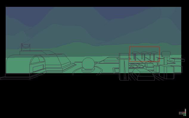
I think the things I boxed in need to be smaller. to give it a look that it's farther back.
I think the things I boxed in need to be smaller. to give it a look that it's farther back.
#32
The Rumpus Room / Re: Cheesy subtitle for AGS
Fri 02/05/2008 03:26:14
AGS: When pointing and clicking IS enough.
#33
The Rumpus Room / Re: Favourite quotes from AGS games.
Fri 02/05/2008 03:16:48
Ben Jordan 1 Revise -
"You pick it up, and place it in your purse....did I say purse? I meant wallet."
SO lara bow!!!
"You pick it up, and place it in your purse....did I say purse? I meant wallet."
SO lara bow!!!
#34
Critics' Lounge / Re: C&c for first sprite.
Sun 27/04/2008 05:39:17
maybe re-do the beard? make if fuller?
and I do agree with the others. the gun seems a bit small for the guy.
But really, great job!
and I do agree with the others. the gun seems a bit small for the guy.
But really, great job!
#35
Critics' Lounge / Re: c+c on game character
Sun 27/04/2008 05:36:12
Ooo i love it! but maybe make his hair a less "highlighter" yellow?
#36
Critics' Lounge / Re: C & C for BG and sprite
Sat 26/04/2008 09:24:10
I actually really like the dark one..
alot!
Yes it would be hard to point out items ect...but It looks like a middle-of-the-night look.
alot!
Yes it would be hard to point out items ect...but It looks like a middle-of-the-night look.
#37
Critics' Lounge / Re: Skitzo's Images
Thu 24/04/2008 05:41:06
And with that attitude your amatuer art will stay that way..
Critique and advice is what makes one grow in whatever they are doing.
Critique and advice is what makes one grow in whatever they are doing.
#38
Critics' Lounge / Re: Skitzo's Images
Wed 23/04/2008 23:34:55
I agree with the others.
The cones are really big compaired to the other objects, and the mailbox is a different style from the car..
The cones are really big compaired to the other objects, and the mailbox is a different style from the car..
#39
Critics' Lounge / Re: Background for C&C
Mon 21/04/2008 21:23:51Quote from: Stupot on Mon 21/04/2008 15:19:40
Nice looking BG.
The bench seems a tad small though...
also, the shadow of the bench and the fence don't agree with each other... and neither of those agree with the position of the sun.
Very good point with the shadows!
#40
Critics' Lounge / Re: More new tablet BGs
Sun 20/04/2008 06:49:38
The shading of the bricks look great on ShonenAiGuy's castle. Maybe take that shading.
But he still used the flatness. >.<
But he still used the flatness. >.<
SMF spam blocked by CleanTalk