Menu

Show posts

This section allows you to view all posts made by this member. Note that you can only see posts made in areas you currently have access to.

Show posts Menu

Messages - Karens

#61
AGS Games in Production / Re: King's quest 4
Wed 25/04/2012 02:19:52
Yeah, I think those old "pixel games" were charming too.
Sometimes I wonder if the overly simplified graphics helped to stimulate the imagination and sense of fantasy in the gamer,, sort of putting in the blanks and questions of an adv. game, like a book. I guess in that sense a very detailed visual 3d world would feel less ..creative for some.

Hmmm,, Grim Fand. had a rather sterile 3d look compared to today's standard, I agree (and I didn't like the game all that much either, to be honest, the plot and story never really grabbed me.

Thanks, I hope it won't take too long, getting this thing wrapped up :)
#62
AGS Games in Production / Re: King's quest 4
Wed 18/04/2012 17:21:49
Thank you :)

and yeah, there are three of us now, working on the game and website.

quote; "This game is going to be for AGS, what Avatar become for the film industry..!!!"

There are some pretty nice looking 2d games for AGS though, Im not sure how to compare to them. My backgrounds are done in days, some of their 2d work is painstakingly drawn by hand, weeks on end, pixel by pixel. An enormous job compared to creating a scene in 3d, so Im not going to even begin to compare my work with that, but thank you very much for your kind words, it's nice to see AGS getting more into different arenas, like 3d, or pre-rendered 3d to be correct :)
#64
Critics' Lounge / Re: KQ4
Tue 10/04/2012 06:21:32
mmm, yeah, maybe something like this then, balance out the green color sorta,, I like it,

#65
Critics' Lounge / Re: KQ4
Tue 10/04/2012 05:28:58
Thank you Sinsin:)


some more tweaking,, slowly getting better,

#66
Critics' Lounge / Re: KQ4
Mon 09/04/2012 14:27:05
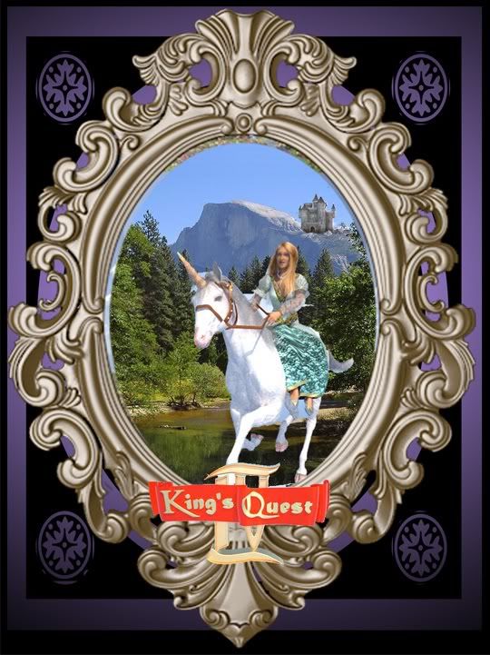
Yeah, those are great points, the horse, girl and logo defin need to be bigger and more in focus,, and the items around the frame need organizing and more space,

also, Im wondering if I should do the shot at night, with a big yellow moon behind the castle, and maybe a scary goon chasing her on the horse while she's riding for her life in a more dramatic fashion (like the original Sierra cover), her hair up and flying around in the wind,, and with a more panicky expression on their faces.. hm

goon;


#67
Critics' Lounge / Re: KQ4
Mon 09/04/2012 13:25:51
tweaked the cover, not sure about the composition,, too noisy, busy...


#68
Critics' Lounge / Re: KQ4
Mon 09/04/2012 08:04:11

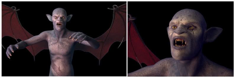
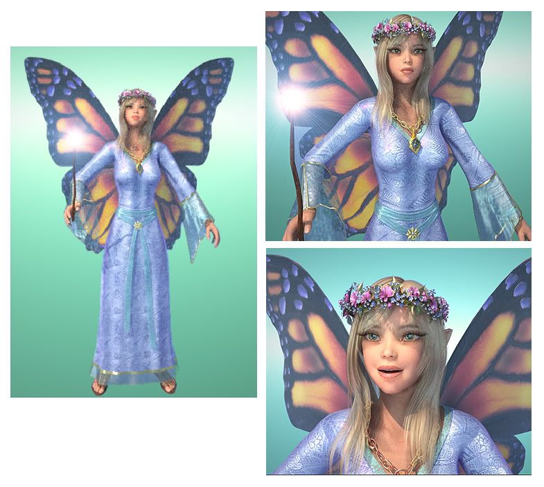
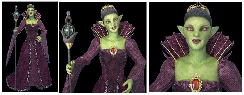
updated and finished Genesta and Lolotte;


#69
Critics' Lounge / Re: KQ4
Sun 08/04/2012 08:31:08
a template for a new cover idea,, maybe add some extra faces or something around the frame,,  sorta boring though. so if anyone has any ideas, let me know,


#70
AGS Games in Production / Re: King's quest 4
Tue 03/04/2012 19:17:09
Quote from: GrimReapYou on Sat 31/03/2012 17:29:09
It's pretty easy if your willing to take some time with them, take them in an external editor, add an alpha channel and  do a little edge trimming, takes time though :P


Thanks FrantT :), and yeah, the 3d app generates alphas automatically, so it's very easy to composite things, you can both generate back and foreground alphas at the same time as everything is rendering (so Im actually just rendering the model itself on a static background, it saves a lot of space and you don't have to edge trim anything.
#71
Critics' Lounge / Re: KQ4
Thu 29/03/2012 19:01:45
Thanks :P,,
and yeah, that's a good point, seeing as the roses in the garden and castle are similar to the pink version,,  pink it is then! :D,,


#72
Critics' Lounge / Re: KQ4
Thu 29/03/2012 16:59:17
Quote from: anian on Thu 29/03/2012 16:40:02
I think 6 is a bit better, just because it's not that "classic" as red roses. Which btw make me think of Alice in Wonderland, while the pinkish once are still romantic and poetic yet not too "girly", if you get what I mean.  ;D

yeah, the pink isn't bad, it's got more of a deep salmon sort of quality than the bright girly kind of Barbie doll pink,,  Im a bit unsure though cause I think the deep red works better against the brown color in the planks under the logo,, hm, what do you think Tabata, I have a feeling you've got some kind of vision here? :)
#73
Critics' Lounge / Re: KQ4
Thu 29/03/2012 15:31:13
classic red roses...


closeup of nr. 6;


with the logo...


#74
Critics' Lounge / Re: KQ4
Thu 29/03/2012 12:57:14
Interesting ideas! I never thought of changing the flowers and design, but I don't see any problem with it being a little different,,
I did a test with different light and color, not sure what looks better or worse,,
the yellow ones are nice too, but the pink go well against the blue stone,


#75
Critics' Lounge / Re: KQ4
Wed 28/03/2012 10:39:46

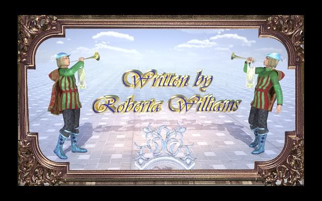
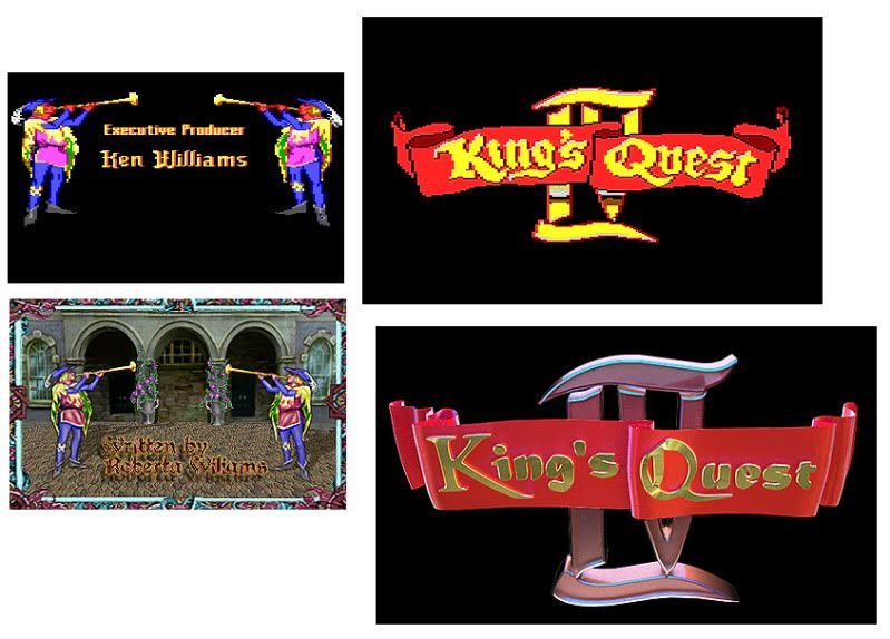
some other opening screens, I dunno if the remake stone wall feels a little under saturated with color compared to the original..


#76
Critics' Lounge / Re: KQ4
Sun 25/03/2012 12:58:33
Quote from: Tabata on Sun 25/03/2012 10:57:53
Since it is a remake, I think, the trumpet players belong there.

For my personal taste the frame is too similar to the most colors of the background â€" I would prefer it darker (maybe golden, like old frames) and the blue from the letters darker, to become more separated and to stand out from the bg.

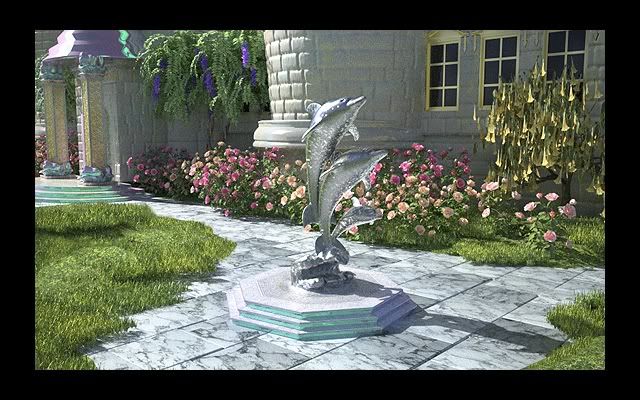
And again an unbelievable wonderful sight to the garden.

great ideas, I eliminated the columns and all the other clutter too. Still looks a little weird, but defin better,,
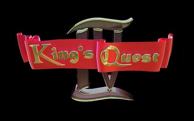
also changed the logo a little, the colors, so the gold letters stand out more,


#77
AGS Games in Production / Re: King's quest 4
Sun 25/03/2012 10:35:14
Quote from: Armageddon on Sat 24/03/2012 09:07:56
Jolly Rover was made with AGS. And technically he didn't do any of the art, he hired a guy to do it from his basic designs. :P

Yeah, the art is nice, but somewhat lacking in detail here and there, very cartoony, I guess it fits the light tone of the game, but overall, imo it doesnt quite justify the terrific gameplay and puzzles.
Maybe next time he'll do the sequel in 3d.. ,)

and thanks Darth for editing the post, I'll be more careful next time when adding non related pics!
#78
Critics' Lounge / Re: KQ4
Sun 25/03/2012 10:21:13
Thank you, cute princess btw! :)
,
and that's exactly what I intended, keep models high res and high poly so I could zoom in or walk in without loosing detail.


Some opening screens Im working on (Im kinda unsure about the trumpet players,, and maybe just skip the columns behind them and add in a more medieval courtyard, it looks too,, I dunno celestial or something now... hm


#79
Critics' Lounge / Re: KQ4
Sat 24/03/2012 06:18:13
a little bit of tweaking,


#80
Critics' Lounge / Re: KQ4
Fri 23/03/2012 22:53:48
Quote from: Lad on Fri 23/03/2012 22:20:13
Just a few ideas.
The horizon should be a little curved. If possible then a bit lower or higher. Right now it is almost exactly in the middle and it somewhat bothers me You could just move your camera for that so no further editing is required for it.


oh yeah, the angles are just temporary (and just to show the geometry and objects), it won't look like that in the final thing, (and I agree, the horizon is too high for the pink castle, the other one is also not very good, the angle. In the close up pic Im going to move the camera much lower and tilt it up so the dark castle will seem more ominous and intimidating (almost like a 3rd point perspective),
SMF spam blocked by CleanTalk