Menu

Show posts

This section allows you to view all posts made by this member. Note that you can only see posts made in areas you currently have access to.

Show posts Menu

Messages - Kastchey

#921
If you have trouble making a consistent side or back view, there's a simple yet effective method you could use. Take the view you're happy with, and draw some horizontal lines next to all the key spots of your sprite. Then carefully place the to-be-corrected sprite on the other side of the lines. Like this:

Then you'll see which areas need to be corrected (the forehead is too large, the bottom line of the nose should be moved one pixel up etc.)
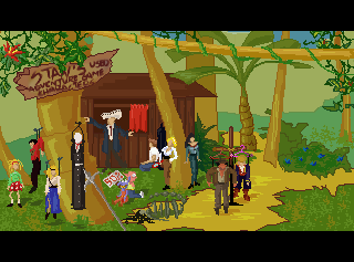
And this is what I came up with:

The shadowing might still look a bit awkward and overall more could be done to make this sprite better, but it hopefully does look like the same woman in both views now.
#922
Heh. See if you can identify the others. There is not a single no-name character in the picture, each of them comes from a game.
#923
Oh... good... God. This is purely... well, evil.

I thought I'd rather comment on each entry when the competition's over, but I couldn't resist this one.
And I must say I'm really impressed with the entries so far.
#924
Critics' Lounge / Re: Works of Sparky
Fri 17/04/2009 08:38:39
If so, then you could put some more work into his facial details and into the shape of his hat. It's a step in the right direction, but as for now the portrait looks more like an, uh.. a redneck (sorry for the term) version of Indy made for a parody of Indiana Jones series. Or at least as if you were trying to sprite a farmer head using Indy picture as a reference. Something like that.

A quick paintover for a better explanation:
#925
I made an attempt to 'feminize' your sprite and this is how it turned out:


There might still be some anatomy and shading issues, but this is just a quick paintover.
#926
Okay so the technique plain sucks this time, anyway, here goes:

Welcome to.. Stan's Used Adventure Game Characters!
So what will it be, Mr. Developer? How about this young pirate? Or this brave archeologist? I assure you, each of them will give your game a real unique touch!


#927
Thank you very much, both of you. You gave me a lot of useful hints to consider and I'm sure it'll be much easier for me to pick a version now.
ProgZmax, I made a quick sketch a random background object scaled to fit the character sprite and added it to the picture, worked just fine. So I guess you were right.
Neil, your approach to color perspective in my background is quite atmospheric and adds some depth the picture was indeed lacking.

Thanks again.
#928
In a dream I saw a silhouette of a woman, trying to lead me somewhere unknown. I followed, though no matter how hard I tried, her face eluded me. All I could see were strands of long, wavy hair and an airy dress flowing in the fog - or so I believed.
Suddenly, the shadow stopped. She turned her face to me and I saw...  uh, this:


... so, what did I see?

Rules:
1. It can be everything as long as it has some means of walking. Legs, wheels, tentacles, anti-gravity device - whatever. Just keep in mind that I saw this creature moving.
2. Try to make the colors stay within the outline.
3. No scaling and, attention - no flipping this time!

Good luck and have fun =)

Edit:
Quoteumm...Remember that flipping and rotating are two different things. So add rotation to the prohibited list if it was your intention :)
Okay so no flipping, rotating, revolving, twisting, side turning, mirroring ie. turning around a center point or axis in any direction.
And trophies added:
#929


This should get you a directory containing all your slices as separate images plus a Photoshop-built html file.
#930
Wait a second... if I got you correctly, you took a template website, then cut out the unnecessary parts and then replaced the template graphics with your own design, is that right?
Do you use Slice>Save for Web method? Photoshop should be able to arrange your elements into a nice, working table.
#931
Oh damn, I just got myself into thinking up the next contest =)
I must say that Björn Redbeard was my personal fav. A viking with such a gentle, dreamy face - lmao :)

And no worries SpacePaw, I'm sure nobody's going to feel bad here.
#932
Thank you very much, that's a lot of interesting thoughts. You clearly have a point about shading. I didn't pick any exact light source with the main version of the sprite because I'll probably have to use different shading in different locations (and it is only half my fancy - weather and time of day are important to the storyline also in the original short story I'm basing on). I applied more identifiable shading to the contrasted version of the sprite (in pictures one and two), because of the light coming from the west in this particular background (which is my character's right-back side), but perhaps I could still put some more work into it.

In the first versions of my sprite I also had a clear outline similar to what you did in your edit, but exactly as you figured out, I thought it might spoil the effect somehow. But that's why I asked for opinions - I wanted to know if it would be pointed out as an issue or not. Now I'm pretty sure I'll use your advice, I definitely want the game to be functional.

Blocky outline around the trees was my attempt to 'pixelate' the painted background, sort of a walk around for the painted bg+pixel character problem and apparently it didn't work. I guess I'll stick to the conventional methods then.

Good you mentioned the resolution problem. I still have a feeling that in the first example the background looks rather enormous when compared to the sprite, making the character look like a midget. Is it just me or is the background in the examples two and three better scaled? Or the opposite?

Thanks again for your reply, this is exactly what I was hoping to get and it's going to help me a lot.
#933
I want to finally decide which graphics style should I pick for my game. I would be really grateful for opinions, if anybody would care to give one.

So basically I have this character sprite:

and this background:

and I need to make them fit together.

I suppose I have two main problems here. One is a saturation difference between the background and the sprite - I should either use more vivid colors for the sprite, or desaturate the background.
The other is that the background is painted and the sprite is pure pixel art. It doesn't yet mean they won't go together, but perhaps I could start a new set of pixel art-style backgrounds to match the sprite better. Or maybe simply resizing the background would do the trick, I'm not sure.

So I came up with these three possible solutions so far:
1. 300x240 background, warm colors + vividly colored sprite


2. 240x170 background, desaturated + vividly colored sprite


3. 240x170 background, desaturated + cold colors for the sprite


I haven't yet made a sample of a pixel art background designed specifically for this game, but it could be something of this sort (but a different color choice). This might be considered the fourth option, but I don't have a good sample for that.

Does anyone feel like expressing their view on this, or have other ideas? I know there's not much difference between them and all, but still I'm a bit puzzled.
#934
Critics' Lounge / Re: WiP female warrior
Sun 12/04/2009 22:43:55
QuoteBesides, I don't want to fall into the typical large-breasted warrior princess stereotype...
Perfectly understood. I'm also sick of this legion of busty Xenas one gets as a result whenever they type "fantasy"+"female warrior" in a search engine.
#935
Critics' Lounge / Re: WiP female warrior
Sun 12/04/2009 22:20:23
True, as pretty as this picture is turning out, the lady's blank face expression makes her look more as if she was killing flies, rather than aiming her sword at somebody.

Also, that might be just me but, doesn't her chest seem a bit too flat? I mean, I know she's supposed to be a sporty type if she can wave a sword, but when I cover her head for a moment and look at the rest of her body, it reminds me more of a young boy than of a woman - not exactly masculine, but definitely flat.
#936
It's already been discussed in one of the previous threads Jakerpot made. He doesn't intend to fix the weird anatomy of the character sprites he uses, because he prefers to keep the style of the original artist. Clerk is included only as a reference. And the down view is probably when the character walks down, i.e. front view.

And Jakerpot, rbaleksandar is right with the back view issue. The outline does not look exactly the same for both the front and back view of any sprite. You made your doctor look sorta spooky, as if his head was facing the wrong way. In short, when you're making a back view: less visible arms, more visible back. Look:
Front
Back
#937
Critics' Lounge / Re: Shading help
Sun 12/04/2009 15:54:24
QuoteHello all, I took a break from my game and now that I'm going back into it, I find that I really could improve the graphics with better shading and coloring.
I'm curious, does it mean you don't like it how the previous version of this cute vampiress turned out? The one with her wearing a short black dress? I personally find the previous shading style quite appealing, even if really simple.
#938
Critics' Lounge / Re: Font Test
Sun 12/04/2009 15:27:36
I suppose that one of the main characteristics of a well-designed and fitting font is that you don't actually notice it while reading. I'd go for Venice Classic out of these seven, because it's the only one that doesn't draw my attention off the actual text. And it's not too narrow either... but yes, PixAntique fits the character size better than Venice Classic.
#939
So one more thing from me... this is what I've been working on after I dropped the above project, but now I think I'd rather focus back on the old one. So here goes the now-freezed newer one. Placeholder title: Parasites. Late Baroque background, otherworldly parasitic beings, dead rising and inquisitorial hunt included (or to-be-included).

The first background for the game, a castle ballroom. Don't mind the awkward ceiling please, as the whole picture is still far from finished.

And a larger version here (I cut out the GUI area):


Character portraits:
Portrait 1
Portrait 2
Portrait 3
Sketches
#940
Critics' Lounge / Re: Font Test
Sat 11/04/2009 17:29:20
http://www.adventuregamestudio.co.uk/yabb/index.php?topic=37228.0

And as for the font, it's a bit eye tiring to me, but I think the speech bubbles might make it better.
SMF spam blocked by CleanTalk