Quotei think for character sprites it's better for the light to come from above, that way you can flip them if needed. You wouldn't need to flip this front pose, but for a sideways view it would look really weird if the lightsource would change when the character changes direction.You're right, and I usually make two different side walk animations (like here) to avoid the weird effect you described. Though it can be called a time-wasting method, I guess.
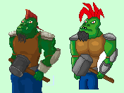
SpacePaw: It is better now, even if a bit messy.
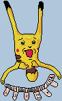
 Any reason to that?
  My main point was the tail.