Menu

Show posts

This section allows you to view all posts made by this member. Note that you can only see posts made in areas you currently have access to.

Show posts Menu

Messages - Mad

#101
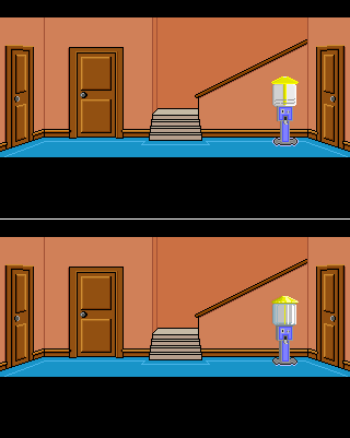
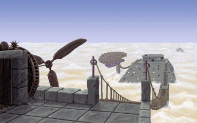
You've done a really good job on the glas, but I think it's a bit to detailed compared to the rest of the room. You should maybe stick to two or three colours as in your previous versions and the other elements in the background.

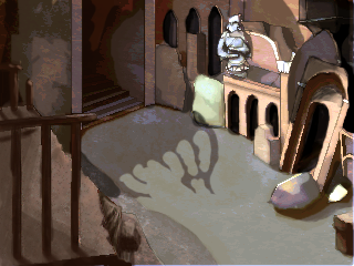
And, what happened to the line on the carpet at the base of the machine? You should keep the original perspective. Only a minor thing...

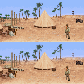
On a different note, are you really going to use all those interactions in the gui?!
#102
Ahh, ouxx got there before me, and he already pointed out what bugged me the most about this - the foot.

Nontheless, I had already made a quick paintover, so I might aswell show it.


Since this room does not follow a correct one-point perspective (and that's fine, it still works!), I just pushed a few pixels on the stand to give at least some impression of perspective.

Another thing is the lack of depth of the stand - changed that.

Altered the lighting a bit. The main thing here is the contrast, imo it just needed more.


There is still some room for improvement, so just work on it a bit more.
#103
Darn, just had a browse through the old Blitzes and found this from five years ago:

http://www.adventuregamestudio.co.uk/yabb/index.php?topic=24273.msg301633#msg301633

If at least some of you aren't bothered and there are a few takers, I'll leave it as it is, otherwise I'll think of something new!!
#104


Relevant excerpts from the official Sol Earth Alliance Archives (SEA-Arch):


Species CT-241C.008; AKA Insectoraptor

It's a super-fast carnivorous insectoid native to 61 Cygni theta. Not unlike our angler fish, this nocturnal preditor lures potential prey with a bioluminescent tail to strike with a short term burst of speed. With an average length of two metres, it even tackles prey far bigger than itself relying heavily on its chitinous exoskeleton. Although the Insectoraptor, as it is now known, has evolved to prey on other native nocturnal species attracted to light, it will strike at anything in its vicinity, even unsuspecting settlers from earth! (Sol Earth Alliance Sir David Attenborough Institute for Interplanetary Life; SEA DAIIL-CT241.008)


  61 Cygni theta

8th planet in orbit around 61 Cygni. Only hospitable body in the Cygni A system. AKA Frontier 9. (Sol Earth Alliance Inhabitable Body Classifaction and Regulation; SEA IBCR-61CT.F09)


  Species CT-001H.002; AKA Cygnedes

Sapient inhabitant of Cygni theta. These herbivorous vertebrates moves in a bipedal manner and are classified as harmless and fall into the cognitive category 3 (CC003; minor intellegence). They have a primitive sign language with just a small spoken vocabulary. Until now their mating habits are completely unknown. Species markt for relocalization into assigned habitats for further investigation. (Sol Earth Alliance Sapient Creature Regulation; SEA SCR-26793.78)

(SEA-Arch entries approved by the SEA Information Board (SEA-IB No. 27b))


(yes, that was another slow, very slow Friday afternoon!)
#105


You may create a background depicting any kind of medical facility: a surgery, dentists, any practice or hospital from any cultural background or time period, even scifi or fantasy, and it could be sinister, abandoned, or comical, ...

I guess you get the picture!

There are no size or colour restrictions, but the BG should be compatible with the current AGS version.

Voting will start on April 8th, unless an extension is absolutely required.


Have fun!
#106
Wow, thanks everyone!

Tough competition with great entries all around.

I'll try to keep the ball rolling and come up with a new one pretty snappy, at the latest tomorrow...
#107
Idea - oraxon
Atmosphere - SookieSock, nice and dark - like a gothic noir hogwarts express ;-)
Design - joelphilippage, great colour scheme and very functional design.
Composition - SookieSock
Functionality - joelphilippage
Technique - oraxon, just love your loose and light style!

#108


And a little mock-up:
#109
Quote from: quo_sp on Thu 03/03/2011 16:44:04
BaptisteTheFool, i will have in mind for future revisions, now I want to advance all I can.  ;)

Actually I am working with the demo, scripting, animations  and adding objects and details for the demo backgrounds.

I have reworked some backgrounds too, here an example, left actually BG compared with old BG.

I actually think that both versions have their merits. I like the flowing hard sand of your first version, but I see your point in making this BG grainier to better tie in with the others. Each of the versions go a bit far IMO, that's why I tried to blend them together.


I also tried to tighten the colour scheme and changed some of the values in the background, since I found them to be to dark.
Also, I attemted to make another small hillock leading down the slope behind Indy creating a kind of middleground. It didn't turn out quite as clear as I wanted, but maybe that's something you could think about adding.
#110
I thought I'll elaborate somewhat this time:

Idea - loominous. Very cute. Has something of Calvin and Hobbes, which is a very good thing.
Atmosphere - Mordalles. ...even without the corpses.
Design - Ilyich. It really works as a whole.
Composition - Ilyich. This absolutly delivers what it promises on the packaging.
Technique - Mordalles. You said it needed refinement, but I like the roughness of it.
#111
Just a minor thing, really, but shouldn't there be a bag at the end of that shoulder strap.
As I said, it's not that important, so take it or leave it.

... you're still doing great stuff here IMHO!
#112
One you'll always find at every good murder mystery:


Professor Plum!
#113


No, it's not steam-punk, it's peddle-punk!

A pre-historical society cranking up their pyramids (and themselves up in lifts), trying to be as near to the gods as possible!
#114
I really like the clouds/sky in your version, Ilyich! It has loads of depth and character and shows off perfectly what I wanted to bring across in my earlier post.
#115
Great image!

One minor gripe, at least for me, is the clean cut look of the pathway. For it to look like a trodden path, the edges should be a bit more scrubby/shaggy.

Another thing is something ProgZmax already mentioned in your other thread, (also a great piece!). The sky does look a bit flat, especially since you've got some light coming through the clouds hitting the ground. Some of that light should also be reflected in the clouds themselves.

Couldn't find a better reference image, but maybe it helps a bit.

Hope to see this in a game very soon!
#116
Again, a very rough idea:


...some kind of balcony?

But these a very valid concerns, Icey! I think you should maybe start the left front and the right upper corner from scratch. Try to scetch the buildings as they would have been in tact and then start demolishing them in places. Just to get an idea of the actual architecture of the place.
#117
just a few rough pointers:


- if the arches aren't purely decorative alcoves or something of that kind, there should be more depth to these elements.

- from the other shadows you have drawn, I estimated the light source being somewhere high in the rightish vicinity. So I guess the building should be casting a shadow as well.

My paint-over is very rough and exaggerated so that the areas I am talking about become more obvious. Some of the elements are, as others have already pointed out, rather warped perspective-wise, making the lighting quite difficult.

All in all this is a nice scene and I'm eager to see were you are going with this. Keep it up.
#118
Idea - oraxon
Atmosphere - Buckethead
Design - zyndikate
Composition and functionality: - zyndikate
Technique - zyndikate

#119
just another few ideas:


- added tyre tracks fanishing into the distance and a shadow under truck
- made a well trodden path to the left
- tinted the background elements and horizon with the sky colour.

The only other thing I'd maybe change is the washing line, it's very solid looking and therefore quite distracting. If you've got PS or Gimp etc. put the line into a separate layer and make it semi-transparent. Might do the trick, it's worth the try!

When you've added the tents in the background, I think you'll have yourself a really exellent BG and should move on to other things! (...and get the damned game finished ;))

#120
I don't think you need to alter that much to get the perspective right in this.
I guess the palm trees are the major culprits here: Judging from the movie scenes, they are very tall, but in your image they just seem to draw the horizon to the front creating the illusion of a steep hill. This is caused by a lack of known size reference for the eye/brain to compare the palm trees to. By adding the cars and/or tents to the far back, as seen in the photos, you'll have such a reference, and I think that will make all the difference.

I hope my rantings do make some sense, but I guess to find out, you'll need to try my ideas.

One other easy way to create the illusion of distance is of course to lose detail the further back you go. In your case that would be the graining of the sand.
SMF spam blocked by CleanTalk