Menu

Show posts

This section allows you to view all posts made by this member. Note that you can only see posts made in areas you currently have access to.

Show posts Menu

Messages - Mad

#121
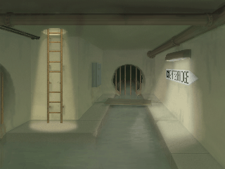
The thing I noticed first is the height difference between the tubes and the walls. Maybe you should make the walls reach a bit higher and than fade them to black just as the hydroponics.

The other thing you could consider is the vast floor space behind the tubes. If your not going to fill that with machines and thing-gummies that go ping etc., I'd take the back wall further to the front.

One hardly notices the highlights on the glas you've added. Just take that a wee bit further like in Darths edit.

#122
My first picture using a graphic tablet, yay!


Still need to practice a bit though... :P


EDIT:

Maybe not quite deserted...

#123
I think I got most of it:

In the family gene
There is a glimmer of a dream.
To bravely sail uncharted seas

Taking chances, ooh yeah (something?)
The highs and lows, we'll take the lot
And right before our eyes (something, maybe divine. Or: right before I survive?)
I get some peace of mind.

Maniac Mansion.  Maniac Mansion.
The Eddison's family dream.
Maniac Mansion.  Maniac Mansion.
That's our dream (or game?)

With a few other suggestions, you'll maybe get there in the end!
#124
Idea - Oraxon
Atmosphere - loominous
Design - loominous
Composition - Mordalles
Technique - Mordalles

@cpage: I'd love to see your BG finished.
#125
Critics' Lounge / Re: BG - theatre - toilets
Tue 11/01/2011 09:27:29
Just noticed that Calin did a similar paintover during my time of general offlineyness...

I'll post mine anyhow:


I'm absolutely with theo concerning the topic of outlines. If you really want dark outlines maybe make them slighly greyish, as in my PO, but better still take a darker shade of the object its outlining.

I find the use of pure white a bit harsh, so I replaced it with a slightly blueish off-white. Maybe a question of taste and not that important...

I changed the value of the highlight on the wall.

The shadow under the sign should be darker.

Ceillings more often than not have lighter colours in confined spaces to make them appear roomier.

And you were definitely missing a door handle ;)

And lastly I just wanted to say that the general composition of your BG is great and that you've really managed to pull off the DOTTish wonky perspective! You often see backgrounds trying to achieve that effect going just that bit too far.
Great work. I'm looking forward to playing one of your games!
#126
Just a minor nitpick from me.
If the wall paintings are not on plaster, but directly painted on the blocks of stone, one should still be able to see the seams.


I did this very cheaply by applying lines with low opacity...

Otherwise great work, keep it up!
#127
Made a paintover:


I'm absolutely no expert on two-point perspective, so if this is totally wrong, someone please correct me before I do any damage here!

On a different note, I think the composition of this BG is a bit off. If my memory serves me correctly, this is the tent where Belloq actually stays, so all the furniture shouldn't be pushed to the edge, where they aren't really much use. I know you are not quite finished, so I presume that you'll add a bed and other necessary things.

By the by, I totally love the idea of a Raiders game, and judging by the picts you've already shown us, you are doing a great job. Hope you'll see this through and keep up the good work!!!
#128
Quote from: Stefano on Wed 15/12/2010 18:27:10
Same thing is happening to me: I can't see the...
Spoiler
...shopping list anywhere.
[close]

Hints:
#1
Spoiler
It's hidden in a secret safe.
[close]
#2
Spoiler
The safe is actually hidden very typical as such things go...
[close]
#3
Spoiler
It's behind the picture in the study.
[close]

I'm also stuck:
Spoiler
I'm in the lab and I've got the blueprints, but can't get past the laser-thingy. Frankly, I haven't got a clue how to proceed!
[close]
#129
Monsieur OUXX is absolutely right about the perspective of some of the furniture.
In my paintover I very roughly corrected the carpet, table and chair. They are very chunky and lack detail, but show how they could work.

My main gripe lies with the frame of the background. It's probably supposed to be the view through a window, but it's very hard to read.

My solution would be to show the outline of the tent:


The paintover is far from ideal, so should you want to go this way, it'll be best to construct the outline of the whole tent beforehand.

#130
Idea - Bob Bannerman
Atmosphere - Pinback
Design - Pinback
Composition - Oraxon
Technique - Pinback

Really nice piece there, Pinback. It's especially nice seeing some more colour creeping into your work  ;).
#131
Idea - Tier
Atmosphere - Zyndikate
Design - Zyndikate
Composition - Tier
Technique - Zyndikate
#132
Quote from: Chicky
Mad, please make a game in that style! Lots of love - Chicky.
In the works... and thanks a lot ;).


Quote from: cat
Awesome Tier! This totally reminds me of Lemmings...
Yeah, that's it, Lemmings! It totally reminded me of something, but I just couldn't put my finger on it!

@Tier: Great background btw. It's just so nice and crisp!
#133
Unfortunately not very imaginative, it's just a generic sewer:


Starting out, the BG was going to be this nice allusion towards "Neverwhere" by Neil Gaiman, but the only thing remaining of that grand idea is an illegible sign saying "Knightsbridge"!

Hey, wouldn't that story, or that world make an excellent game...
#134
Idea: Ilyich
Design: Oraxon
Functionality: Oraxon
Technique: Ilyich
#135
I guess you could do it quite similar to the way you animated your trees, with which I was very impressed btw, since it's all voodoo to me!

But instead of letting the single clusters of leaves move independently, you could let the palm fronds twist around the central axis (stem), and then let them sway back and forth again depending on the direction and strenght of the wind.

Since my ramblings are hardly intelligible, let me try and illustrate:


I don't know how difficult this would be to implement on your existing tool, but I think the effect could be quite neat.
#136
Idea: Blue - I like the twist on the topic.

Design: Tier - This BG looks like a probable space dock, has loads of depth, and I like the crisp, stringent colour scheme!

Functionality: Tier - A good camera angle with a huge walkable area, and there are so many possible, interesting hotspots.

Technique: Pinback - I just love the painted look of this, very atmospheric. Also, I am a sucker for pixelled, indexed BG...
#137
#1 ProgZmax

Superbly pixelled! Especially Terry Jones is so recognisable.

#2 Pinback

Very good design, indeed, and I like the monochrome look. Could have been a contender for the first spot, but it is a bit jumbled in areas imho, so that some of the features aren't very readable.

#3 loominous

Just. Über-. Cute.
#138
I think the general anatomy is quite alright, if she's a bit on the plumb side (bottom-heavy as one might say ;)) , which gives the sprite some character!

But as Khris already mentioned, she could benefit from some more shading to especially define her torso a bit more. Most people have the light source coming from the top, slightly from one side or the other, which is generally quite effective.

I think the colour scheme is simple but effective concerning the main colour and outline. You've already got one darker shade for the trousers, but I'd choose a shade with more contrast to the main colour. This, of course, also applies to the upper body, should you shade it.

The face could do with a bit more feature, which is possible in even such a small sprite. Maybe look for some inspiration in other sprites of that size you might find here or the great wide interweb.

My main concern here are the feet! As they are now, you are looking at them from above. Again, look at some references for this.

Hope this helps and we'll see an edit soon.

Edit: Oh yeah, her neck is a tad on the longish side...
#139
Critics' Lounge / Re: Portrait seems boring
Sat 11/09/2010 07:41:03
That is a really good edit!

And if you're going with that restricted pane, I'd lose the bun, or give her a hair style the viewer can read more easily:


I also changed a few pixels beside her nose. I am not sure there'd be a shadow there unless she had a deep crease or scar.

But as I said, you've made a fantastic improvement taking all the comments from everyone on board!
#140
Critics' Lounge / Re: Portrait seems boring
Fri 10/09/2010 14:44:25
I think Sughly is absolutely right, the very light skin tones are very distracting!

I actually liked the annoyed look of your previous edit the most. In the last one she looks quite timid. But then again I don't really know what your aiming for, since I guess you took the photo as a general reference(?)

So I made this paintover, adjusting some of your shades and using the colour scheme of your last edit, because it somehow works quite well imho.


I didn't do the neck and hair, because I ran out of time, but especially the hair needs some work: I don't think you'd get as many highlights on her right hand side, considering the angle of the light source!

Keep at it, this is a very good sprite!


Edit: Ahh, didn't see loominous' post there. Very cool method, I'll keep that in mind!

Edit 2: Ok, couldn't be a**ed to work, so I made this:


This should illustrate, what I meant about the hair. Her right hand side is shadowed and only some of the locks catch the light.
SMF spam blocked by CleanTalk