Menu

Show posts

This section allows you to view all posts made by this member. Note that you can only see posts made in areas you currently have access to.

Show posts Menu

Messages - Mad

#141
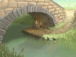
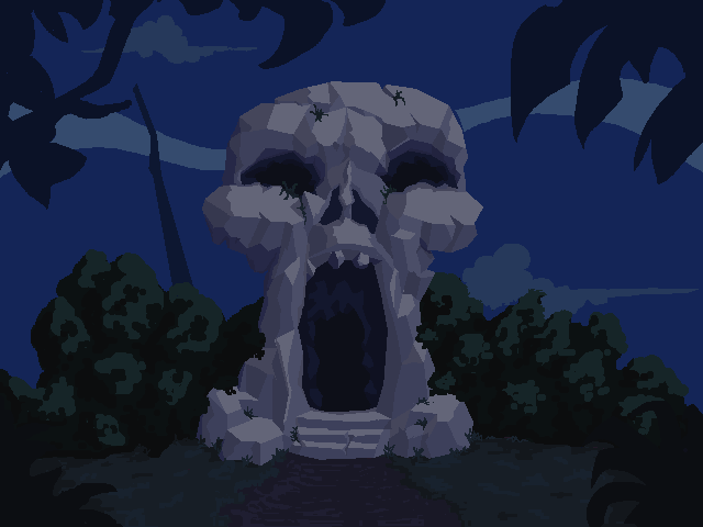
Idea: abstauber - Just a nice twist on the whole Troll-Bridge-Toll Theme.

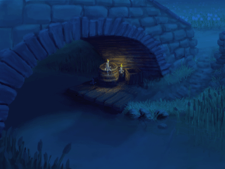
Design: loominous - It is a wonderful composition, with great use of light enhancing the funny details like the sign on the door and the donation bowl!

Technique: loominous - Again, this piece does it for me. I would just love to play a game in this style. Everything seems light and airy, without looking too washed out.

Functionality: Kelma - The BG has well defined walkable areas and likely, clearly visable hotspots.
#142
That's what happens, if you lock the guys up in a bionic workshop:

(2x)                      
#143
Quote from: loominousNever got around to finishing it, but here it is.
Pity, that's as always a lovely sprite. Hey, now we'd just need a bionic dishwasher and we'll have ourselves a nice portable kitchen!

If you care at all, also take an Edward Waffle-Iron-Hands in bronze:


Quote from: SughlyHaha, fair enough. Congrats on getting your entry in Alun! Nicely done
Like I said, it is a great piece of art, I for example wouldn't be able to produce. Maybe I am being a bit nit-picky, but someone has to win, as sad an affair that is.


Quote from: AlunSo... I guess I start a thread for the next Sprite Jam now?  Do I do that right away, or am I supposed to wait until a specific day?  (Sorry for the stupid questions; like I said, it's the first time I've won one of these...)
I guess you can start whenever you're ready. Just be there when it ends in two weeks time.
#144
Quote from: anian on Fri 03/09/2010 21:54:54
Quote from: Mad on Fri 03/09/2010 21:45:25
I am frankly astonished, that no one's mentioned the boobs until now, since they're quite... noticeable.
...well that's probably cause a nicer word was used, like "breasts." Don't worry, you were probably distracted.  ;D

Oops, right you are, but I just read the posts from Baron's last edit downwards!

...and I'm not too concerned about their size  ;)
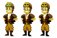
, but I was more distracted by the clingy dress  ;D!
#145
I am frankly astonished, that no one's mentioned the boobs until now, since they're quite... noticeable.

As they are now, the dress looks moulded to her upper body.
I'd do something like this:

#146
Alrighty, this jam is officially over!

And I think I can decide this one by myself ;D:

Sughly, your sprite is really excellent! It is well executed and has a lot of character, but unfortunately the light bulb is barely recognisable as something artificial. It could be any ole glow-dragon  ;).
Alun, your mobile fridge is a great idea, although I'd be not too keen on getting the beers out of there myself. This is a good example of what I had in mind, when I thought of the topic!

So both of you grab yourselves a well deserved trophy: The Edward Waffle-Iron-Hands!!!

The silver one goes to Sughly:


And the golden one to Alun:


Thanks to both of you for participating!
#147
Ok, I'm going to close this in about 12 hours from now!

@Alun: If you still want to enter, but need a little more time, just say the word.
#148
Critics' Lounge / Re: SteamPunk Pilot
Thu 02/09/2010 16:28:26
Didn't really change that much, since I wanted to keep to your palette, and it is a pretty good sprite, as it is!


My major gripes are the featureless face and shirt. They look a bit bland and contrast-less (is that a word!?) compared to the rest of the sprite:

- I added a spiffing stache, enhancing his aeronautical skills!
- I'm not so sure about his sideburns going up to his mouth... changed that.
- gave the shirt some features (draw 1 => get 1 free!!!)

I also changed some minor things that are probably down to personal preferences:

- I don't like the eyes (probably just me)
- I find the blue goggles distracting.
- I fiddled with the shading of the helmet and trousers... not so sure if it's an improvement!

...but there you go!
#149
Bump ;D

So, only three more days to go!

I guess Sughly would appreciate some well earned competition...
#150
Made a very rough paint-over with just a few pointers:


- objects, features in the background become more blueish with distance, e.g. the rocks, the clouds...

- the rock in the middle is so shallow, that one would be able to see some of it under the water, same goes for the sand.

- I think some sand would pile up in the cavities of the cliff.

- for me the flat wall of rock does not work composition-wise. That is one suggestion in may paint-over, but I am sure there are better ways to do this.

Like I said, some rough ideas, that hopefully help.
#151
I've made a little inspirational piece:


Anyone for freshly ground Kopi Luwak?!

Edit: By the by, a really cute entry there, Sughly !
#152
Not quite finished, since I lost interest, because the BG is not really very imaginative!
But there you go:


Maybe I can motivate myself to continue this some time later this week...

EDIT:

Made a night version.


Just. Very. Cheaply. Straining. After. Effect!
#153
Hybrids

You surely remember this guy, or even this terrible attempt at a so-called animated classic!

Although very different in viewing pleasure, both films feature some kind of hybrid between living being and tool/appliance.

I want you to go to your lab and/or magical cave and construct such a hybrid:
It can be any living being, animal or human, crossed with any tool or kitchen appliance.

There are no restrictions size, colour, or resulotion wise... go wild!
#154
Hey, thanks everyone!

I'll try to come up with an equally successful theme for the next one...
So, expect the new jam soon! By which I mean tomorrow...
#155
OK, found some more time to verbalize some of the things I tried to address in my paint-over:


The skull does look a bit like a toothless old crone, and since I guess you're going for an eery mood, that is not a good thing.

Even if you're not going for the ragged look of my paint-over, you should maybe alter the base of the skull, since for now it gives the impression of tree roots.

If the skull is frequently visited, grass would not grow at the foot of the steps, and maybe a well trodden path would lead up to it.

As it is, the eye is drawn to the left hand corner. If there is an exit there or another game relevant feature, that is fine. If this is not the case, you should maybe close that area up.

Besides the clashing colour, the bush in the front has a lighter value than the background elements. This detracts the player from the important bits.
#156
I'll go with ProgZmax's entry!

I'd just love to see a sequel made in that style and resolution. It'd probably be a bugger to animate, though!
#157
started to make a paint-over and noticed that Monsieur OUXX  already pointed out a lot of things I wanted to convey:


I also tried to tighten your colour scheme, because some of the colours really clashed, imo.; especially the plants in the foreground with the bushes behind the skull. Unfortunately, my take on it turned out a bit dark and I have not got the time to tweak it anymore.

Some of the lighting on the rocks is a bit jumbled and confusing, but as I said no time anymore...

Hope it helps, nontheless!
#158
Did someone say imp!?


...well at least impish  ;)
#159
Woah, I always wanted to call an ice hockey mask my own... For playing ice hockey of course!

And Loominous, pilferinloot are deserving winners!
#160
Idea - Alan v.Drake: I just like the whole randomness of it: eyeballs, deformed bird-like carcasses and whatever that moonstone thing below the tree-chalice(?) is! One constantly picks up on new little details.
Technique - Alan v.Drake: The collage-like effect of the different elements somehow adds to the creepiness, methinks.
Usefulness - pilferinloot: It has a defined walkable area, a lot of potential hotspots, and a sense of purpose, (since the eye seems to draw one in). Very useable indeed!
SMF spam blocked by CleanTalk