Menu

Show posts

This section allows you to view all posts made by this member. Note that you can only see posts made in areas you currently have access to.

Show posts Menu

Messages - Mad

#161
Critics' Lounge / Re: RON stuff (re-touching)
Sat 15/05/2010 18:24:55
I really like your latest version!

Methinks there are only some minor things you could improve on:
The shading on her forehead is a bit off, I don't think the shadow over her left brow is quite right.
The skin colours could do with more contrast.
And finally, the eyes are too blue in blue, she looks like a Fremen.

But you're nearly there!
#162
Critics' Lounge / Re: First sprite
Thu 13/05/2010 08:56:29
I guess you're going for the gangly look, otherwise I would shorten his whole body a few pixels and give him more shoulder. Either way, the hands definitely need to be bigger. As a rule, they're as big as the face.

I think his face could do with a bit of improvement aswell: He looks a bit popeyed as it is and the nose looks a bit stuck on... I don't know, maybe you should go with the way you pixelled the girls face, because I thought you did a pretty good job of her!

Hope my ramblings help, just give it another go!
#163
Critics' Lounge / Re: RON stuff (re-touching)
Wed 12/05/2010 23:16:09
I really dig ProgZmax sprite and tried my hand at a similar approach:


I guess the shading still needs quite some tweeking, but I think for the resolution your aiming at with your sprite this is the size and style you should be going for.

Maybe ProgZmax finds the time to give this a better shot...
#164
Critics' Lounge / Re: First sprite
Wed 12/05/2010 14:15:13
These are very promising sprites, but I think Captain Ricco is right in saying that they could benefit from a different kind of shading.

I whipped up an example, working from Pablo's improved colour scheme:


I also think you could work on the anatomy some more, especially concerning the guy.

By the way: I love your scetches, they have alot of character and motion!
#165
A day at the dentist's:

#166
There you go:


Actually wanted to animate her, but couldn't be bothered... far too fiddly

#167
Idea: Dualnames - very original and dark interpretation.
Technique: Xellie - It's clean, but nicely executed.
Usefulness: Xellie - I can just see how this could work in a game (hotspots, exit etc.).
#168
...just a quickie!

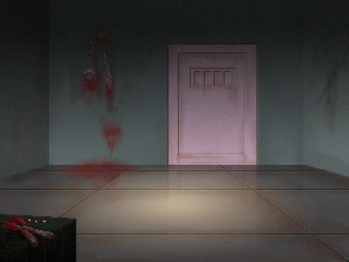
ye ole generic lab:


It's been done umpteen times, what's the harm in another one!?
#169
Since the votes are not really tumbling in, I'll toss in my ha'penny worth... if I may... also being a participant and so on...ramble-di-doo

Here it goes:

Idea - Questionable - like Misj' already mentioned you've obviously put some thought into depicting a totally different scene which still represents the given world in a sufficient way!

Technique - TheRoger - You said yourself that you tried your hand at a style your not familiar with, and I think you managed quite well! With a bit of practice and maybe fiddling with the brush settings, you'll get there or even better acquire your own unique style...

Usefulness - Questionable Again, I have to concur with Misj'. Your Background offers the common adventurer the most to do!
#170
I used this lovely piece by Ben304 as inspiration:


And a link to the whole thing. They don't connect seamlessly because I didn't want to mess about in Ben304's pic!
#171
Critics' Lounge / Re: first backgrounds....
Fri 26/02/2010 14:10:33
I did a quick paint-over:


Didn't have too much time, so it's far from perfect, and there are still a few stray pixels...
But I just wanted to demonstrate, that simple lighting/shadows are far more effective than colour gradients in a low-res picture as yours.

Maybe a question of taste, but there you are. Hope it gives some ideas for what it's worth!
#172
When toad falls for toadstool...

#173
You could use panels with which the player has to interact to open a specific door.


And additionally to animating the doors (on the far wall) when they open, you could play a sound effect making it clear if the doors in the front have opened after interacting with the respective panel. You can of course also give an audio signal as a negative response and let the character say something to that respect...

ps: note that my example is a wee bit on the smallish side and very crudely done (emoticon of choice).
#174
I think you don't need to see the door frames, part of the doors etc. to let the player know, that they are essentially there. We don't see the front wall and still assume one exists.

Using floor space is the way to go, methinks. It's been done often enough with those kind of view points.

I mocked up an example using your general layout:


I hope this helps in giving you another direction to go with your problem.
#175
OK, time is up!

Thanks for all of your nice entries, but there can only be one...

And because I really dig the simple shading and the cool pose, the winner is Borga or rather Kastchey!
#176
Finally an entry...woop! :P

And a really nice one at that, Kastchey.
Thanks!
#177
VIKINGS

For this sprite jam I want you to draw some axe-wielding, mead-quaffing (go easy on the ravaging!) vikings.

They may be male, female, cartoony or realistic - hell, do some space vikings, but please make the sprites usable in AGS.

Happy spriting...
#178
Hey, thanks a lot!

It's a pity there wasn't more competition, because I thought your idea was really cool.
I would have liked to have seen more entries on this topic...


OK, I'll start a new compo tomorrow, because I'm on the road atm.
#179
A bit on the obvious side, but I just couldn't resist!

So there you go...


"What do you mean by 'It's more of an active part'!?"
#180
I present the arch nemesis of Pac-Fish:


He is actually a really nice cephalopod if you get to know him better, he just resents fish stealing all of his pearls...

SMF spam blocked by CleanTalk