Menu

Show posts

This section allows you to view all posts made by this member. Note that you can only see posts made in areas you currently have access to.

Show posts Menu

Messages - Mad

#41
Thanks a lot, everyone!

That was a tight one, not the least of which is down to the great standard and variety of the entries!
Hope to see you all participate in the next jam...
#42
1. The Baron - although he has not got the classic evil look, one instantly recognises some sinister intent. I also like the line art a lot.
2. The Salesman - nice, functional pixel art.
3. Bonesy - very cute, but still obviously henchman material. Could give those yellow b@$#@rds a run for their merchandise money!
#43
Thanks for the kind words, Mandle.

To answer your question, the sprite is pure fiction, since my boy is only 5 months old.
But saying that, that will totally be the first evil henchbot we will build to live out my dreams of world domination through my spawn... ;)
#44
Meet arch-villain to be Lord Crimson (that's Cyril to his mum) and faithful Henchbot 1.0:

#45
Unfortunately never got past the initial sketch on this one...


Concept: Anke - like the slightly different angle to the theme. On second glance, one gets a glance into an intriguing back story, methinks.

Artistic Execution: Daniel Thomas - beautiful stuff, great lighting!

Playability: Sox - Character scaling might be an issue, but who gives a s#@$ when there is soooo much to point and click at.

#46
Great start, but I think the walk is a bit too exaggerated and therefore comical for your sprite at least. Also, the constant highlights at the knees give the impression of the sprite having bent legs throughout the whole cycle.

I guess, the best way to have a somewhat realistic walk cycle for such a small sprite, is to mostly just work with the lighting.

[imgzoom]http://i845.photobucket.com/albums/ab12/Mad1978/Mobile%20Uploads/TrooperLoop.gif[/imgzoom]

[imgzoom]http://i845.photobucket.com/albums/ab12/Mad1978/Mobile%20Uploads/TrooperRow.png[/imgzoom]

My version is quite messi (edit: meant to write 'messy'. Not football related at all) and looking at it now, the arm swing is also too exaggerated,  but maybe it gives you an idea, of what I am getting at.

Maybe you should look at some fate of Atlantis walk cycle for reference. Those sprites are of simular size to yours.

Edit: again, it is best to ignore the arms in my edit. He really does look like a Bee Gee using his walk...
#47
Great edit!
Leaps and bounds away from your first version. I think lighting a sprite from the top or top/side is a good choice. That way it doesn't clash with the BG too obviously.

I think you could be more consistent with the lighting (something I didn't manage with my first edit, either). Also, the hands are a bit awkward,  imo. In sprites this small I tend to blur finer details such as individual fingers.

[imgzoom]http://i845.photobucket.com/albums/ab12/Mad1978/Mobile%20Uploads/Trooper.png[/imgzoom]

My second edit addresses minor things which may be matters of personal preference: The arms and hands are quite big. I think one has to keep in mind, that the large helmet and boots might distort the overall expectancy concerning the latter. (Hope I made some sense just then).

Either way, hope this helps a bit. Take or leave what you want, that's what c&c is for.
#48
Sooo many entries to choose from...

concept - Misj: Well, what can I say, Kids are scary! I should know, I've got two of my own.

artistic execution - loominous: Composition, lighting, colour scheme - all great. I wish I had just half your talent...

playability - GreenBeams: So many little details, so much to potentially click.

Special mention: selmiak, for pure unadulterated Rainbow Airbrush 80ies Bliss!
#49
Made a quick paintover:

[imgzoom]http://i845.photobucket.com/albums/ab12/Mad1978/Mobile%20Uploads/Spaceman.png[/imgzoom]

The only real issue with your sprite, I tried to address, is that it looks like it's standing on tiptoes. The rest is just cosmetics, I guess.

I like the overall look of the sprite. Simple, clean, and therefore effective.

I would like to see it in a background of yours, to get an impression of how well the black outlines work...

Hope this helps.

Edit:
Don't know if this is still relevant, but I found myself with some time to kill.

[imgzoom]http://i845.photobucket.com/albums/ab12/Mad1978/Mobile%20Uploads/Spacemen.png[/imgzoom]
#50
Really enjoyed following the last few blitzes. And I couldn't be an idle bystander anymore.

[imgzoom]http://i845.photobucket.com/albums/ab12/Mad1978/Mobile%20Uploads/DerBdragons.png[/imgzoom]
#51
I think I get where you're coming from concerning the loss of detail.

The things I wanted to address with my version were the very dark shadow under the nose and the ruby red lips.
The first ever so slightly looks like a beard only suited for tragic tramps and dictators. The latter is maybe a tad too metro for Indy.

Maybe, it could already help to tone both things mentioned down a bit.


All in all, I think you've already got a great sprite there.


Edit: the thing looking like a beard in my edit is supposed to be a five o'clock shadow. :wink:

Edit 2: some more food for thought...

[imgzoom]http://i845.photobucket.com/albums/ab12/Mad1978/indyPO103.png[/imgzoom]
#52
There has been quite some change since I've seen the thread, and I really like the latest edit.

I made a paintover of my own, while I've been on the go. So, this may be obsolete,  but I'll post it anyways:

[imgzoom]http://i845.photobucket.com/albums/ab12/Mad1978/Mobile%20Uploads/indyPO102.png[/imgzoom]
#53
Concept: Lasca. Great movie that would make a zany gaming experience.

Artistic execution: oraxon. It's got everything going for it: great composition, excellent colour scheme,  and superb brush work!

Playability: Miez. So much to see, so many hotspots to click, and I want to explore them all!

These were really hard choices to make, 'cause all the other entries were excellent as well.
#54
Long Time No Post...

...but just couldn't let this awesome topic pass me by:

[imgzoom]http://i845.photobucket.com/albums/ab12/Mad1978/1eyedWillie.png[/imgzoom]

Reference

Great entries from everyone so far, and I hope to see many more!!!
#55
Critics' Lounge / Re: Improving some Sprites
Tue 09/10/2012 19:08:21
The new version is definitely better than the old one. I don't see anything wrong with the overall anatomy, but, as you said yourself, there is a lack of consistency between the different views.

I tried aligning the front and side view:

[imgzoom]http://i845.photobucket.com/albums/ab12/Mad1978/PunkDinoPO.png[/imgzoom]
I also altered a bit of the shading and outline and tried to define the snout in the front view.
I used your concept art as reference.

Great sprite! Looking forward to playing another game of yours, soon.
#56
Critics' Lounge / Re: RPG Characters
Mon 03/09/2012 22:59:21
Tried my hand at this:

[imgzoom]http://i845.photobucket.com/albums/ab12/Mad1978/rpgChaPO.png[/imgzoom]

My first version is very true to your original sprite, I just pushed a few pixels here and there.
The main thing I wanted to achieve was some clearer lines and a more defined face.

With the second paintover, I tried to address your suggestion of making the sprite appear less anime-/chibi-like.
I just made her body that wee bit bigger and her stature slightly more defined, as well as her eyes just a pixel smaller.
#57
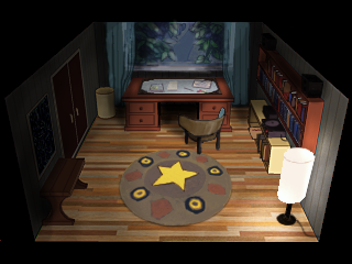
I like this room very much and I think the perspective will work sufficiently well with the character.

I also like the new floor, although my paintover is of an older version.


If the lamp in the right-hand corner is the only lightsource, I think the room could be darker overall, and the lighting a bit more diffuse. I also think the depth of the room could be improved with a few more highlights and deeper shadows. The same goes for the view from the window (if it's a moonlit night).
#58
Quote from: Peder Johnsen+ on Thu 26/04/2012 22:27:41
I must say I prefer most of Mad's smileys over the ones in use now..
Specially the roll eyed one, the tongue and grin ones.

Well, they're basically just a blatant copy of the old Roger ones. Not much creativity went into them.
So, I definitely prefer Darth's cups.

That being said, I think this tongue smiley :P and the "old" one convey slightly different things, so they could compliment each other. :-D
#59
shoot, right you are!

Still killed some time...

Edit:

#60
Hope this is still relevant, because I had some time on my hand...


I ripped off darth's cup, hope that's alright.

Maybe sombody wants to clean up the antialiasing, cause as I noticed once again, mine is up to scratch.
SMF spam blocked by CleanTalk