Ahh, you've already edited your sprite!
Well, I just post my take on it anyhow, maybe you still want to have another go at the sprite, if you like some of my edits...
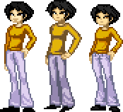
I thought Khris made some really good edits, some of which you already incorporated
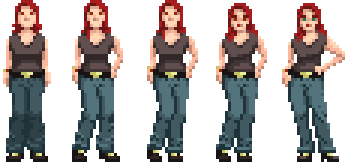
- I actually liked your palette on the clothes!
- I liked the length of the torso, but you could shorten the legs a little.
- I felt the lighting was a bit inconsistant, especially on the jeans.
Overall, I really like this sprite, and it definately gives of an asian vibe!
Well, I just post my take on it anyhow, maybe you still want to have another go at the sprite, if you like some of my edits...
I thought Khris made some really good edits, some of which you already incorporated
Quote from: Ghost on Fri 13/05/2011 10:16:49
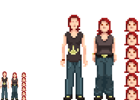
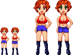
Khris, valid points, and several of them I could use to good effect.
* smaller feet- I really have to work on these
* chest- makes indeed a difference, even though I kept the general pose and didn't alter the hips)
* palette: Yeah. One day I'll really get the hang of it.
- I actually liked your palette on the clothes!
- I liked the length of the torso, but you could shorten the legs a little.
- I felt the lighting was a bit inconsistant, especially on the jeans.
Overall, I really like this sprite, and it definately gives of an asian vibe!