Menu

Show posts

This section allows you to view all posts made by this member. Note that you can only see posts made in areas you currently have access to.

Show posts Menu

Messages - Medical Waste

#81
Critics' Lounge / Re: Dragon
Fri 02/03/2007 09:44:49
I also felt that it could use some eyes to make it more lively.
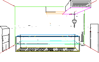
Did this quick and it isn't that good, but here is an idea:

#82
Critics' Lounge / Re: Some Mp3s
Fri 02/03/2007 08:04:16
Horror is great until the drums kick in, then it loses it's atmosphere, at least for me.
#83
AGS Games in Production / Re: Square John Boy
Thu 01/03/2007 23:46:45
This game looks amazing, not only because of the great graphics, which seem quite consistent, but the story as well. Thanks for making a game not about pirates or detectives! Can't wait to play it when it's finished.
#84
Critics' Lounge / Re: Living room
Thu 01/03/2007 20:51:14
That looks better, though the large shadow on the back wall is confusing me.
Another thing that bothers me is the thick black outlines on the wood furniture and the walls, which the couch, welcome mat don't have, and the window has a not so think outline.

The couch does look much better desaturated.
#85
General Discussion / Re: The Underdogs
Wed 28/02/2007 19:17:27
Quote from: Nefarious on Sat 24/02/2007 19:18:58
Yes I did download it, but when I do download the document it appears as a broken document, and it tells me to load the document with a different program or find it manually.

At that point, have you tried actually manually finding and selecting winRAR to open the file?
#86
On the subject of boobs, I noticed that on the side view they are too high, they are rigth up at her shoulder, which doesn't look very right.
#87
Critics' Lounge / Re: Background and sprite
Tue 27/02/2007 04:35:05
It definately helps to draw them, I am very new at this as well, I think I was taught it once as a kid but didn't absorb it.
#88
Critics' Lounge / Re: Background and sprite
Mon 26/02/2007 07:41:38
I went over it using focal point lines very roughly as an example, sorry it's so messy! I hope this helps.

#89
Critics' Lounge / Re: Background and sprite
Mon 26/02/2007 06:06:10
Well, let me try to explain. When something is farther away from you, it appers smaller, right? Like, if you look across the room at a window, it looks smaller then if you got up and walked right up to it, even though it has not changed size in any way, it now looks bigger.

On the door, the left side is further away then the right, so even though the door is a rectangle, and the two sides are the same height, the one of the left should be drawn shorter because of your perspective.
#90
Critics' Lounge / Re: Background and sprite
Mon 26/02/2007 05:54:24
I think what you're missing on the background is respect to the perspective is foreshortening. For example, if you take the door on the right, the left edge, which is further from us, should be drawn shorter then the right one. This will also force the angle of the top of the door to become closer to horizontal.
#91
The Rumpus Room / Re: The music thread
Mon 26/02/2007 05:23:03
Quote from: FSi on Tue 07/11/2006 18:24:18
I'm still in avant garde stuff... And Death Metal, so for me it's stuff like (in no order)
- Gorguts (the very definition of Techno Death)
- Naked City (the very definition of... well, sure thing it's the very definition of something, someone could name it Avantgarde Jazzcore Grind but not myself)
- Necrophagia (the most killing band - to listen on BIG speakers / headphones)
- Pungent Stench (Particularly Dirty Rhymes and Psychotronic Beats album, for it's Boogie/Brutal Death and bad Pink Floyd puns - DO NOT try later albums, they SUCK)
- Carcass (the classical in British Death Metal, everything from Necroticism, especially Heartwork)

I usually do not listen to *dumb* death (like Cannibal Corpse, SFU, whatever) nor "poser" one (COF, Children of Bodom, In Flames, etc). Though I did an exception for Dying Fetus (They have some neat tracks, and the growls are one of the best on scene) of former ones and for Arch Enemy (I mean, MAAN, it's MIKE AMOTT's!) of latter ones.


You've got some good taste man.
Carcass rules, but I like their first full length a lot more then their later stuff, even though Heartwork and Swansong are great. Why would you say CC is dumb?
#92
Critics' Lounge / Re: Skeleton Sprite
Sun 25/02/2007 20:10:11


Thanks so much for that Damien, it looks amazing! I agree with the shoulders and legs (Oliwerko you're right about stance haha!). The skull looks awesome now, thanks for explaining pillow-shading, I'll try not to do that anymore.

You don't mind if I use what you've done, right?


And I think my first game will be 640x480.
#93
Critics' Lounge / Re: Skeleton Sprite
Sun 25/02/2007 02:52:18
Thanks for the input m@ds, I really like the more yellow bone colour, I might try something like that. Those eyebrows are pretty comical, but it doesn't fit the character of the story I have.

Here's my attempt at some shading, I also think I have the hands looking less like claws and more like bones:


Edit: I shaded and coloured the bones a more realistic colour like m@ds. Pretty happy with this guy now.
#94
Critics' Lounge / Re: Logo Animation
Sun 25/02/2007 01:22:42
It seems rather dark, until the flash at least.
#95
Critics' Lounge / Re: Skeleton Sprite
Sat 24/02/2007 22:48:36
Thanks a lot for the feedback guys, I really appreciate it.
I have thought about removing the outline and adding some depth, I actually started trying that, but I really wanted to get the shape first at least.

As of now, with the resolution and outline I can't get the hands to look any more like bones, nor can I get the eyes round. But of course with shading and no outline I would have alot more pixels to work with. I'll probably try it today and see how it turns out.

I do like how it is now, but I always think a bit more work can make things look even better!

Any thoughts on the pant width and length, or the torso? Arm length?
#96
Critics' Lounge / Skeleton Sprite
Sat 24/02/2007 06:32:37
Hey there, I'm very slowly starting to make my first game, and this is my first decent sprite I have made. I am very new to this so I would like some critique and suggestions on it, especially proportions, and the hands.


Thanks!
#97
Critics' Lounge / Re: "Dark Jerry" sprite
Sat 24/02/2007 05:53:25
Quote from: Nefarious on Wed 21/02/2007 17:13:16
Oliwerko -
I know this is going to sound incredibly prejudiced, but maybe a mohawk? This would clear up any doubts about the hair, and also it would fit with the costume he is wearing.

A mohawk wouldn't be very metal at all. Would instantly make the character look like a punk.

I love the sprite by the way. Have you thought about giving him a leather jacket instead? I think that might look good too. Like a biker one, not some long goth thing.
#98
He looks more like a pot-belly kind of guy then a business man.
#99
Critics' Lounge / Re: Walkcycle Animation
Sat 24/02/2007 01:20:36
I agree with MadReizka, the first thing I noticed was how he leaned more to the right when he stepped that way then on the left. However, I'm not going to say it's wrong, or it looks bad, it actually looks like a kind of swagger, or limp. That is to say, a unique walk at least. Good stuff. I didn't really focus on the arms until you pointed it out, and I don't know which one you're talking about or what is wrong with it.
#100
Howdy AGS forum.

I just stumbled onto AGS a few days ago, because lately I've been playing adventure games again. Really cool program, so I like most people here I guess I'm going to try to make my own game. I'm in college for computer programming and analysis.

Anyways, you'll see me lurking around and posting from time to time (probably lots of questions!)
SMF spam blocked by CleanTalk