Menu

Show posts

This section allows you to view all posts made by this member. Note that you can only see posts made in areas you currently have access to.

Show posts Menu

Messages - Monsieur OUXX

#1101
Quote from: Crimson Wizard on Mon 18/01/2016 18:12:40
There was this wiki article that explained some of them:
http://www.adventuregamestudio.co.uk/wiki/Keyword:_attribute

Thanks. This is all very confusing I must say.
#1102
I'd like to devise a simple way to make this module as easy as possible to adapt to any custom struct.
(Note 1: by "any custom struct" I'm not talking about the ones you black-flagged, i.e. the ones that have a temporary life, like File* and such)
(Note 2: I'm not talking about the universal stack "Stack", which aims at storing all types at once, but more something like StringCache_t, which aims at storing one specific type at a time. Only then, why not, include that manually in "Stack" if necessary, to make it even more universal)

For example:
- In the module, I'd put a #define CUSTOMTYPE AnyCustomType
- Everywhere in the module, you (Monkey) only always use CUSTOMTYPE as argument to functions, or return value, etc.
- Then the end-user can import this script as many times as he wants (under a different name each time, e.g. MyStruct1Stack, MyStruct2Stack, etc.)  ...
- ...And in each import, he only changes the define line to #define CUSTOMTYPE MyStruct1, or #define CUSTOMTYPE MyStruct2, etc.
(I think this would be possible only thanks to the newer #define that can overwrite the previous definition each time you redefine it -- or am I mistaken?)


Any dirty trick like the one I described above is welcome, the goal is simply to be able to implement as many custom stacks as possible with as little human intervention as possible.
What do you think? Simpliicty is the master word here.


===========

also, an unrelated question: why did you define Grow and set_Capacity as extenders?
#1103
My habits in AGS programming are old, and my brain is still stuck with the features and keywords from 10 years ago. Help me transition to newer AGS programming features!

- what's the difference between protected, writeprotected, and readonly?
- what does "autoptr" mean? (please tell me even if it's not supported?) -- when I google "ags autoptr" I only get results from git, but Monkey uses it all the time.
- please direct me to the post about "managed struct" which I can't seem to find anymore? (EDIT: found this)
- what's the benefit of adding "attribute", inside a struct? (EDIT: OK so apparently this one is not new at all! I've found this.)


So I've found here that managed structs are very limited and cannot contain pointers or dynamic arrays,, and yet for years Monkey has been doing stuff like this :
Code: ags

autoptr managed struct StackData
{
    protected int _idata;
};

struct Stack
{
  protected StackData _items[];
};

void set_Capacity(this Stack*, int value)
{
  StackData items[] = new StackData[value];
  this._items = items;
}

//And then in the code:
...
Stack myStack;
myStack.set_Capacity(100);


What is this wizardry???

#1104
Sorry for necro-posting, but I would really, really like the source to this (flat-shaded 3D and texturing) to be made available. I genuinely think that it could benefit the AGS community, and it would be the base for some AGS tool that I'd like to develop. Khris, what says you?
#1105
Thi competition is a train wreck, lol. Should I give it two more weeks?
#1106
Nice, clean little game.
Two suggestions:
- make sure the descirption label that moves with the mouse stays within the screen boundaries. several descriptions cannot be read because of that.
- chaeck your character's Idle view. At the moment he's moonwalking when he stays idle. If you're too lazy to fix it, just increase the Idle delay to infinity so that it never happens.


I really appreciated the sets of colors.
#1107
Hey come one guys, wake up! Don't all of you have a favorite character? Mandle, who is yours?
#1108
Critics' Lounge / Re: Screen Mockup,
Thu 14/01/2016 14:43:44
You know what you could do? You could make the limit between the black background of your GUI and the scene's background uneven. A bit like the wave formed by the carpet underneath. Or like the upper edge of planks or wood. Or whatever. That would be neat.

However I strongly suggest that you move the sprites down in the black area. The lower margin is too big, and the upper margin too small (unless you keep that status label underneath like in the HoF screenshot)
#1109
I'm sorry I cannot spend more time on that, I wrote the code "as is" but I didn't test it and I don't have a test environment. :(
#1110
Something like this

Code: ags

////// VARIABLES /////////////////////////////////////////

//all critical variables are now global. Watch out for names conflicts!
int i ;
String text;
int delay;
 
///// SOME LOUSY, NON-BLOCKING WAIT //////////////////////
void NonBlockingWait(int d)
{
	delay = d;
}

//this means that we WERE waiting but just reached zero
bool IsWaitOver()
{	
	return delay==0;
}

//this means that we're not waiting (a.k.a our timer is null or doesn't exist, whatever)
bool IsWaitActive()
{
	return delay>=0;
}
void UpdateWait()
{
	if (delay>=0) delay--;
}

///// MAIN FUNCTION - now made parallel //////////////////

void Update_Rendering()
{
  if (i < text.Length) {
	if (!IsWaitActive())
	{
          displayedLine = String.Format ("%s%c", displayedLine, text.Chars[i]);
          if (display==eTypewriterDisplay_Overlay)
          {
            olTypedText.SetText (System.ViewportWidth - x, font, color, displayedLine);
          }
          else if (display==eTypewriterDisplay_UIElement)
          {
            if (element.AsButton!=null)   element.AsButton.Text=displayedLine;
            else if (element.AsLabel!=null)     element.AsLabel.Text=displayedLine;    
          }
		  
		  if (text.Chars[i] == ' ')
			NonBlockingWait(delay);
		  else if (text.Chars[i] == '[')
			NonBlockingWait(delay*4);
		  else {
			if (sound)
			  sound.Play ();
			  NonBlockingWait(delay);
		   }
	}
	else
	{
		if (!IsWaitOver()) UpdateWait();
		else
			i++;
	}
      
  } else {
	over=true;
  }
}

void Reset_Rendering(String t)
{
	over = false;
	i = 0;
	text = t;
}

bool IsRendering()
{
	if (text==null) return false;
	if (text=="") return false;
	if (i >= text.Length) return false;
	return true;
}

//// REPEATEDLY-EXECUTE //////////////////////////////

void repeatedly_execute()
{
	if (!IsRendering())
	{
		Reset_Rendering("this is a nice text to render")
	} else {
		Update_Rendering();
	}
}
#1111
Quote from: Kumpel on Wed 13/01/2016 13:51:40
That down scaling trick makes perfectly sense to me. automation-wise maybe the tool "batch conversion/renaming" of the grahic viewer http://www.irfanview.com/
could help you. In there you can change the resizing process in detail, put the whole folder of bigger rendered pictures in and get the smaller version with one mouse click.
I'm almost certain there's a way to do that directly in Blender, as some sort of post-processing step. I've seen similar things in the "video encoding" part of Blender.


EDIT: What we were looking for is compositing. It allowed us to play with the rendered video after it's rendered.
#1112
For the record: the alpha-blending style has to do with additivity (when you draw a pixel with transparency on top of another pixel with transparency), which was half-baked in older versions of AGS (it worked as designed, but that was rarely the behaviour instinctively expected by the developper). I can't see why that would fix your fonts issue, but hey, hurray!
#1113
@Dave Gilbert: Don't hesitate to convert a TTF font into a sprites font to be able to slightly rework it. It used to be a pain, but nowadays there are several tools that allow you to do it properly, and to preserve international characters. Have a look at the "Fonts" article in the wiki.
#1114
Blender : how to render for pixel-art but still with a tiny bit of softening?


We're currently struggling with one step in the rendering process, and we don't have sufficient knowledge of Blender to resolve this.
Basically we need to render at a final resolution of 320x200, and the rendering needs to meet the two following requirements:
1. needs to have a tiny bit of antialiasing so that the rendering is not as ugly as pure "nearest neighbour",
2. ...while not being some blurry, dirty antialiasing
Additionally, the outline of the rendred sprites should be perfectly crisp so that the transparent parts are preserved clean. (you know: no dirty pink pixels around).

I thought of asking our 3D artist to render the scene in 640x400 and then apply a nearest-neighbour 50% downscale in the last minute of the rendering -- that usually does wonders in pixel-art. But even that, we don't know how to do in an automated way.

--> Do you know how to do exactly that, or would you have some better process to recommend?

Any Internet resource would be approeciated. I couldn't find any, apart from "pixel art tutorials" which mostly focus on cell-shading, but not on resolution issues.
#1115
I would say at least 1200xSomething. Or even 1600x1200.
There was a time when 1024x768 was considered "hi res", and that's probably the resolution machinarium was made in 6 years ago, but nowadays, on 24 inches screens, that resolution would be considered "cheap" by millenials ;)

Also I've read somewhere that you should avoid 4:3 ratio for modern games, and turn to 16:9 ratios. I don't know what are the corresponding resolutions for that.
#1117
seems interesting
#1118
Shouldn't the second circle be drawn at (251,251) ?
#1119
So Mandle gently suggested this idea and I expanded the original concept :

Take any secondary character from a big franchise (In the point n click realm, it would be mostly: Lucasarts, or Sierra, but you can choose anything provided it "speaks" to other people. In the movies realm, it could be a Lucasfilm movie like Star Wars, etc.). Now, imagine what this character's very own personal space would look like: either their room, or their workplace, etc.
You can even skip the character entirely and focus on a secondary set that you think was not put forward enough in the original universe. BUT you must stick with the idea that this is some secondary set that does have something interesting to it, that people would like to know more about, and that reveals something from the original universe.

If you choose to go the "character" way, it could be that you draw the at-home room of a character from Indiana Jones... Imagine what the room the big hulky guy that fights Indy around the flying wing looked like...Or the creepy little Nazi with the round glasses... Or one of the worshipers of Kali... Or wherever Short-Round lived... Or how Nur Ab sal feels at home inside Sophia's necklace... Or how Alain Trottier has already all his kinky accessories ready in his room!


If you choose to go the "secondary set" way, it could be the Star Wars cantina seen from a different angle that reveals something about how Han shot first, or it could be what's going on down the moat of Prince Graham's castle, whatever. Just take an interesting approach!


=====================


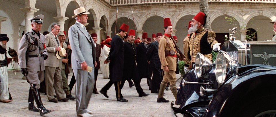
The tall red fez of the guy in the picture above will explode on Sunday, Jan. 17th, hence marking the end of the competition (unless someone asks for an extension).

There are several voting categories!

Artistic execution : the drawings that make you envious of their artsy skills, or simply that you find so pretty!
Playability : how well would this background fit in a real-life adventure game? Many interesting clickable areas? Perspective? Clear exits? so on.
Most stimulating secondary set or character: the one that makes you say "Wow, I would have never thought of that set/character, but it's actually so cool!"
That funny detail: When the artist has put some emphasis on an object in the scene, or onto something specific that cracks you up!


==============

PS: before you ask -- I know it's very Indiana Jones-centered, but what can I say, it's my current obsession. But it's not a cheap trick to use it in our Indiana Jones game, as I probably won't enter the competition, or even if I do the background won't fit in our Indy game. So, feel free to draw anything you like, nothing is forced onto you! To you pencils/mouses/tablets! ;-D
#1120
There are so many techniques, but asking how to re-use colors with a color-blindness criterium in a very interesting one.

I can suggest two techniques of color reduction; they are not exactly on-point of what you're asking, but can help you achieve "prettier" results when the right time comes.
I'm assuming you use Photoshop.

Technique 1 :
- Take the layer where you have your drawing, then add a "posterize" adjustement layer (this way you can choose exactly how many colors are left -- the colors will look ugly but don't worry that's not important yet),
- then add a "gray scale" adjustment layer (this way you get rid of the ugly colors and only have the pre-set number of tones you chose in the previous step),
- and the final step : add a "gradient map" adjustment layer. This layer allows you to "map" each gray scale" to any color you want in any gradient you want.
This way you can play around with your palette in real time, and focus on having the right contrast and such, if not the right tones.

Technique 2:
- Download the free trial of Photoshop plugin "Quantizer". This plugin is pretty much like "posterize" (it reduces the number of colors in the image) except it really calculates which colors are needed most, and does not output ugly colors.
- Bonus : you can adjust how much dithering there will be. Do you know the concept of dithering? It's those intermediate, lonely pixels between two plain colors, to make a gradient look smoother with only a handful of colors.
Long things short: I can imagine you using this plugin by choosing the start and end color of the gradient, and then reducing it successfully to the same handful of colors that you'll have in your final palette. I'm suggesting this because I think your chest sprite could do with a tiny bit of dithering. and also because the color-reeduction of the book is a bit extreme. Quantizer would have done it 1,000 times better than any of us can.
Then you can do a second, manuall pass, by using the floodfill tool, and replacing the colors you're not happy with, with the actual colors of your palette.

As I said, I know that this answer is not exactly on-topic, but, eh, the more you know...

SMF spam blocked by CleanTalk