OH BOY OH BOY OH BOY
- Welcome to Adventure Game Studio.
This section allows you to view all posts made by this member. Note that you can only see posts made in areas you currently have access to.
#1822
Completed Game Announcements / Re: GO NORTH
Fri 14/11/2014 16:09:25
SPOILER
I tried "GO FUCK YOURSELF" and was very disappointed that it didn't work. For real.
Spoiler
I tried "GO FUCK YOURSELF" and was very disappointed that it didn't work. For real.
[close]
#1823
Completed Game Announcements / Re: Owl Hunt
Thu 13/11/2014 11:32:54
It was really funny. Pity there is no gameplay at all! (like: at all). That would have added a little value and feeling of accomplishment.
#1824
Completed Game Announcements / Re: GO NORTH
Thu 13/11/2014 11:30:17
HAHAHAHAHA! 
(spoiler)
This game was the exact opposite of what I expected
(anotherspoiler)
This is like the anglo-saxon twin brother of OceanSpirit Dennis.
(spoiler)
Spoiler
This game was the exact opposite of what I expected
[close]
(anotherspoiler)
Spoiler
This is like the anglo-saxon twin brother of OceanSpirit Dennis.
[close]
#1826
General Discussion / Re: Just had a game idea...
Mon 10/11/2014 11:24:06Quote from: faerieevenstar on Sat 08/11/2014 14:59:08Just so you don't believe we would steal it "as is" and would include straight away in our game: I just threw the idea with the other team members, but the chances that we can fit it in our (already very dense) storyline are very, very weak.
Seriously, if people are using this idea, I want to be part of it, as I brought it here

#1827
Adventure Related Talk & Chat / Re: Leisure Suit Larry Reloaded (LSL1 remake) : what do you think?
Sun 09/11/2014 11:46:50
Talking about that, I've played LSL6 for the first time in 15 years yesterday, and I was amazed to discover it was hi-res (640x480?). I had no idea, because last time I played it, in was in 320x200 -- but I guess the CD version came in two resolutions, one of them taking advantage of young hi-res technology.
Which leads me to.. GOD, is LSL6 ugly-looking! I was shocked. I had already noticed how sloppy the graphics were in the 320x200 version. But it made it even more visible in hi-res. There is an overuse of shitty dithered gradients. But the bad kind of dithering: the one where the pixels are arranged in organized patterns, but those patterns conflict with each other. It's like Sierra digitized some pictures and then reduced color-depth with some cheap painting program that couldn't even do what Deluxe Paint was able to do for the last 10 years. Also, most of the flowers and trees are just digitized pictures that are badly copied and pasted over themselves and over the drawn background.
Long things short: a visual nightmare, and very newby-looking.
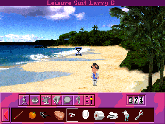
Worst beach in the history of point n' click
That's even more surprising when you see that LSL5 was very pretty. Seriously, Google it. It's close to DOTT, apart from the characters animation. Very good taste. Anyone know what happened to Sierra that year? Like, did they take shrooms?

Larry 5
Which leads me to.. GOD, is LSL6 ugly-looking! I was shocked. I had already noticed how sloppy the graphics were in the 320x200 version. But it made it even more visible in hi-res. There is an overuse of shitty dithered gradients. But the bad kind of dithering: the one where the pixels are arranged in organized patterns, but those patterns conflict with each other. It's like Sierra digitized some pictures and then reduced color-depth with some cheap painting program that couldn't even do what Deluxe Paint was able to do for the last 10 years. Also, most of the flowers and trees are just digitized pictures that are badly copied and pasted over themselves and over the drawn background.
Long things short: a visual nightmare, and very newby-looking.
Worst beach in the history of point n' click
That's even more surprising when you see that LSL5 was very pretty. Seriously, Google it. It's close to DOTT, apart from the characters animation. Very good taste. Anyone know what happened to Sierra that year? Like, did they take shrooms?
Larry 5
#1828
Adventure Related Talk & Chat / Leisure Suit Larry Reloaded (LSL1 remake) : what do you think?
Sat 08/11/2014 12:20:56
I've just come across that gameplay video, and it looks like a solid remake.
http://www.youtube.com/watch?v=J2TuF_v88yo
By "solid", I mean, it's only just a remake, but the new backgrounds seem to be excellent (not just the drawings, but also the composition, special effects, etc.) and the jokes and narration are preserved. Nice little touches like the transition effect between rooms with the shape of Larry's head (it's useless but it's those little things, y'know)
They've also re-thought the interface, they din't just copy-paste it. It seems to be much more intuitive now. A few examples: You now see the cab's itinerary. They didn't stuff all the casino's rooms on the ground floor. They re-thought the backgrounds to make them more dynamic.
So what do you say? Am I super naive or is this what you can call a good remake, as opposed to the Monkey Island SE?
#1829
General Discussion / Re: Just had a game idea...
Sat 08/11/2014 11:08:50
Yoink!
(that's the sound of me stealing this idea)
(for this)
|
|
|
|
\ | /
v
(that's the sound of me stealing this idea)
(for this)
|
|
|
|
\ | /
v
#1830
Modules, Plugins & Tools / Re: The next Tween Module! (Preview)
Mon 03/11/2014 10:44:14Quote from: Edmundito on Sat 01/11/2014 20:15:16
If you can move ahead without these things, feel free to download the source from Github. It's pretty stable at this point.
EXCELLENT.
#1831
Completed Game Announcements / Re: Harry Potter RPG
Sat 01/11/2014 14:53:39
Wow Marion you're still on your Harry Potter marathon! Great job as usual!
#1832
Modules, Plugins & Tools / Re: MODULE: Downhill v1.03 - Walk behind hills
Fri 31/10/2014 19:23:03
Sorry to dig out the thread.
MIRROR TO VERSION 1.03 ! http://duals.agser.me/Modules/Downhill_v1.03.rar [thanks to Dualnames]
(all older links are broken)
My personal version 1.04 https://www.dropbox.com/s/5uc9lnqgg7ardcd/Downhill%20v1.04.zip?dl=0
Version 1.04 notes :
- I upgraded from 2.x to 3.2.1, then from 3.2.1 to 3.3.0 RC1. It works like a charm.
- I re-defined macros that were missing since they disappeared from AGS
- I objectified the module ( DownHill.Functions(...) )
Overall, I almost didn't change anything, it was working out-of-the-box!
#1833
Modules, Plugins & Tools / Re: EDITOR PLUGIN: Notes 1.0
Tue 28/10/2014 18:40:51Quote from: selmiak on Mon 27/10/2014 19:26:38
specific notes, like you attach a note to a room
+1
#1834
Critics' Lounge / Re: An "Indiana Jones wearing his suit" sprite - which do you like best?
Mon 27/10/2014 09:40:49Quote from: Amélie on Mon 27/10/2014 01:26:08
No, that means definitely yes!

Haha don't worry about "cluttering", everyone likes to see nice sprites, especially when they stimulate creativity! If you feel like you'd like to contribute some sprites or animations, you can always send them to me in PM, I'd be happy to look at them. Thanks for putting your sprites back up! Me likey.
#1835
Critics' Lounge / Re: An "Indiana Jones wearing his suit" sprite - which do you like best?
Mon 27/10/2014 00:00:56Quote from: Monsieur OUXX on Fri 24/10/2014 10:19:13
Mind if we steal some bits and pieces?
Hmmmm.... Considering you removed the sprites you uploaded... I suppose that means no?
#1836
Critics' Lounge / Re: An "Indiana Jones wearing his suit" sprite - which do you like best?
Fri 24/10/2014 10:19:13Quote from: Amélie on Thu 23/10/2014 21:36:05
Couldn't resist, and pixeled some Atlantis-like sprites for it, quite fun!
Mind if we steal some bits and pieces? I have no idea if we would need that, but if we do, I'd sure be glad to be able to count on those sprites.
#1837
Critics' Lounge / Re: An "Indiana Jones wearing his suit" sprite - which do you like best?
Wed 22/10/2014 13:27:35Quote from: Hobo on Wed 22/10/2014 12:58:05That's true. But the idle sprite is the one the player spends the most time contemplating, and the one that gives the Player Character its personality. It's a tough choice!
Ultimately, you should base your choice on how the sprite fits together with the backgrounds and how comfortable do you feel animating it.

#1838
Critics' Lounge / Re: An "Indiana Jones wearing his suit" sprite - which do you like best?
Wed 22/10/2014 09:55:54
I've heard some different opinions about Mad's paintover. Some say it looks like an actual beard. As for me, I like it, but the scale made the mouth and details sort of disappear.
What do you say on the AGS forums?
What do you say on the AGS forums?
#1839
Critics' Lounge / Re: An "Indiana Jones wearing his suit" sprite - which do you like best?
Tue 21/10/2014 22:11:59
I've done two things:
1) The feet slightly longer (I tested the other sprite in-game, and the torso really looked massive on tiny feet )
2) I've added a shade under the chin. Which di you think looks best?
[imgzoom]https://38.media.tumblr.com/bcdefe6709ffba43084902cd430d5398/tumblr_ndtc3csKiD1tsfksfo1_250.png[/imgzoom]
1) The feet slightly longer (I tested the other sprite in-game, and the torso really looked massive on tiny feet
)2) I've added a shade under the chin. Which di you think looks best?
[imgzoom]https://38.media.tumblr.com/bcdefe6709ffba43084902cd430d5398/tumblr_ndtc3csKiD1tsfksfo1_250.png[/imgzoom]
#1840
Critics' Lounge / Re: An "Indiana Jones wearing his suit" sprite - which do you like best?
Tue 21/10/2014 21:51:43
I agree with all of you, I just didn't have the skills to draw a proper face.
Hobo, do you mind if we use your paintover in the game?
Hobo, do you mind if we use your paintover in the game?
SMF spam blocked by CleanTalk