Menu

Show posts

This section allows you to view all posts made by this member. Note that you can only see posts made in areas you currently have access to.

Show posts Menu

Messages - Monsieur OUXX

#3581
So there was I, loosely thinking about that Deluxe verison of discordance's "How they found silence" that we're going to make, with Piotr Obinsky.
To be really into what I was doing, I decided to play the game again, and this time I played it with my girlfriend, to know her opinion.

She actually had the mouse and I was barely guiding her.

The game's interface is super simple: Left-click = use, right-click = watch. The exits of each room are marked with big arrows drawn on the background. You don't even have to click on the actual exit of the room, just click on the arrow.
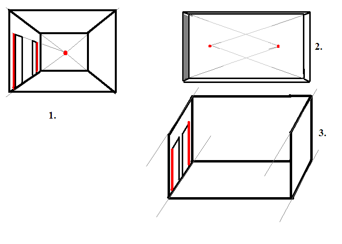
Also, there is strictly no perspective. The game is enirely in completely flat 2D. You exit rooms either to the left or to the right, or by clicking on the doors drawn in the background.

So you couldn't design something more straightforward.

And, to my great surprise...

...My girlfriend couldn't find her way in the game
. She was always failing to spot WHERE she was, and was often clicking randomly to go from one room to another. She was confusing the rooms, not remembering what door she just took, etc.

And it's not like she's dumb, she's very close to finish Machinarium. Also, she actually WAS enjoying the game. She was immersed in the plot, but she was highly frustrated by the game design/graphics.

I think this is very interesting from a scientific perspective. It deals with the following topics:
- how does the brain match an imaginary scene to a real place? I was very aware that most of the places are at the top of the cliffs, even when they're not explicitely drawn. However, my girlfriend told me she felt like she was only walking along a random garden wall.
- the difference between the geometric representation of space by boys and a representation based on remarkable "hotspots" by girls. There, the graphics were so basic that the geometrical aspect took over, despite the many details (lamps, doors, flowers, etc.)!

And, from a game designer's perspective: Always think your design choices through, depending on your intended audience! It's lucky discordance made his game for a handful of nerdy guys (just kidding  ;))

#3582
Critics' Lounge / Re: how are these?
Mon 28/06/2010 08:26:17
Quote from: Phemar on Mon 28/06/2010 08:06:04
I'm not entirely sure what they are to be honest. My first thought was that they were a bunch of vaginas...


Minus one. It's pretty obvious that they are paths in mountains/cliffs.
#3583
General Discussion / Re: law of atraction
Fri 25/06/2010 16:56:51
Serious answer:

The Law of Attraction is related to the New thought, which itself is yet one more metaphysical (and dualist) philosophy.

While it sounds attractive because it seems like it relies on the widely accepted fact that thoughts influence actions (focus, self-conditionning, subconscious process, etc.), it actually goes one step further and implies some sort of mystical dualism (which is in fact a pleonasm).

Long things short: no, I don't believe in the Force and all that b******t.  I'm a child of materialism.

Materialism FTW!

#3584
Critics' Lounge / Re: Background and palette
Fri 25/06/2010 14:09:18
Sephiroth FTW! :)
I hope you understand that I'm not trying to force my artistic choices onto you, it's only about tstrict consistency of the light sources.
And indeed, IMHO, I believe that after your edit it looks more realistic.
Now, all you have to do is to fiddle with the picture to find the "perfect" contrast balance between the dark and light tones, and there you go!


PS: a tiny remark: Strangely enough, you drew the bright parts on the sign on the bottom and right sides of it. Is there any good reason for that? The moon is supposed to be behind it.
#3585
Critics' Lounge / Re: A SoA teaser trailer
Fri 25/06/2010 14:04:29
Hey, I was very skeptical by watching the screenshots, but it actually looks great!!!!!!!
I wish you added the word "studio" in the video's tag. :-)
#3586
Critics' Lounge / Re: Background and palette
Fri 25/06/2010 12:11:49
Quote from: Sephiroth on Fri 25/06/2010 12:01:55
The light source: I didnt think it would be that important, maybe I should consider something like this and start working on colors/gradient from there?

You still didn't do what you need to do about the light source.

Maybe I wasn't clear. Let me explain again.

If you have a look at the wall in the foreground of your last post, you can basically see 4 faces of it :
- The front
- The top
- The left side
- The right side.

The light comes from above.
So you need to sort the faces in an order from "the face that receives the most light" to "the face that receives the least light"
Here it is, sorted properly :
- the top (it's horizontal so it receives the most light)
- the left and right sides (even - medium-lighted)
- the front (it's vertical, so it virtually doesn't receive any light)

Therefore, colorwise:
- The top must have the lighter color
- The left and right sizes must have a medium color
- The front must have a darker color

However, you sorted it randomly.
In your drawing :
- The left and right sizes are light
- The front is medium colored
- The top is the darkest face (That one, in particular, looks awkward).

You don't need to do anything fancy, just swap the colors!  :)

#3587
Quote from: Calin Leafshade on Fri 25/06/2010 11:33:46
what i need to do is make a 'map' of nodes and distort that map and then split the character sprite into a series of squares and distort those squares in relation to the map. This should stop the pixelly nature of the reflection.

I don't understand.
#3588
Critics' Lounge / Re: how are these?
Fri 25/06/2010 09:58:47
Keep on the good work!
If you're familiar with paint software (like Photoshop), you might want to start coloring a background layer, and keep your drawing as the "front" layer, to see what you're doing and keep it simple.
#3589
Critics' Lounge / Re: Background and palette
Fri 25/06/2010 09:50:28
This new post focuses exclusively on how to make a night scene.

Look at the second paintover :


I started from my first paintover, because, as said before, it's more colorful.

Here is what I did then, in order:

1/ I lower luminosity a lot, to make the scene darker (I also lowered the contrast not to make everything disappear in an all-black scene)

2/ I modified the shadows. It's been asked to you before: "Where does the light come from?". If it's a clear night, then the night come FROM THE SKY (above), so all things facing the "up" direction must be lighter, and all things covered by something else on top of them must be darker.
   --> The top of the walls are now lighter than the walls themselves (on your early drawings it's the opposite)
   --> The part of the wall that's under the roof is in the roof's shadow.

3/ even if it's the night, some things catch light (it makes the scene more alive and easier to read). Just add some bright outlines at the very top of each object directly facing the "up" direction.
   --> The top of the sign
   -->The top of the walls
   --> the bars of the door
   -->Some details on the sewer plate.
   On this same topic: I know exactly what you mean by "It always seem that the colors are too bright", but don't be afraid. If you do it moderately and add some subtle gradients, it will look good.

#3590
Critics' Lounge / Re: Background and palette
Fri 25/06/2010 09:22:08
You're absolutely right.
Additionally to what has been said before, the scene is too GRAY.

The trick here is that, even if the buildings are made of concrete and are supposed to be gray, they'll never be really gray in real life.

Look at my paintover :


ALL I did was:
1-  changing the "Hue" on the background wall and foreground wall (I made them more borwnish).
2- Also, I colored the sign, like it's been done before.
3- As a bonus, I added some moss on the foreground wall, because it's never so dead.

Please note that, if it's a scene night, then you might want to give a blue tone to the scene instead of a redish tone, as I did.
#3591
Critics' Lounge / Re: Trouble with Perspective
Fri 25/06/2010 08:54:28
Here is a more general answer.

Have a look at picture below :


You use perspective 1 (a real, hard core perspective). It forces you to do some scaling.

However, perspectives 2 and 3 don't.
- Perspective 2 consists of cheating with your perspective. the scene looks flatter, though.
- Perspective 3 is isometric 3D (that's the one seen in your first redraw, except for the stairs)

The perspective shown in the Beneath a Steel Sky (BASS) screenshot is a combination of 2 and 3. The horizon line is moved up a lot, but the doors and the walls are still standing perfectly vertical (isometric). State of the Art perspective cheating! :-)
#3592
General Discussion / Re: law of atraction
Fri 25/06/2010 08:15:57
Let's be accurate:
Law of attraction, law of atraction, or law of attrtion?  ;D
#3593
Quote from: ProgZmax on Thu 24/06/2010 16:13:32
The problem with the second one is that there's really nothing identifying or unique about it
(...)Here's just one example of a smoking room aboard a cruise liner that gives us a better sense of grandeur without being pompous: http://www.ssuganda.co.uk/educ/smoking%20room%20empty.jpg

Your post is interesting because it mostly questions the composition of the scene.
I'd be tempted to be partial on this one, because the cruise is actually on a medium-sized sailship of the late 19th century, not a liner, so in my opinion it actually makes sense: not much space for passengers, and rooms redecorated with 1950's-style.
#3594
Quote from: Ascovel on Thu 24/06/2010 15:09:38
the first one has an evidently chosen color palette for a specific effect

What do you mean? What effect?

I've understood what I don't like about the first one :
Every object in the scene uses ONE tone of color (let's say: a chair will be brown), but then the shadowy parts of those objects use the exact same color tone - just made darker - and the lighter parts also use the exact same tone - just made lighter.

As if the artist had just moved a slider in Photoshop to get the full range of shading tones for the object.

IMHO it's a very bad choice. For better results, you're supposed to take in account that the tone might vary with the intensity of the lighting.

For example, still using the example of a brown chair, the darker tones might have a higher Red value, while the lighter tones might be more yellowish.
#3595
General Discussion / Proust
Thu 24/06/2010 15:10:30
Everybody knows Proust, at least through Steve Carell's character in Little Miss Sunshine.  ;)

Has anybody read one of his books in another language than French? I'm curious about what memories and feelings you keep from that experience.


#3596
By the way, main character with the less colors EVER in the history of video games, comparatively to the number of colours in the game itself  :D
Game = 64 or 256 colors
Main Character = 2 colors (skin + brown)   + black+white.
#3597
Wait, that's not what I meant. I didn't paint THAT one, so no offense. I was just suddenly wondering how my conception of what's "pretty" influences my tastes in video games, and vice versa.
#3598
Quote from: wonkyth on Thu 24/06/2010 11:25:28
the lack of colour-variety in the second gives a blank and uninviting view to the player.

Shit, that's the way I paint. :) My friends probably never told me that I was doing crap!  :D :D :D ;)
#3599
It's funny because, once again, it's really the colors I like in the second one.
  - In the first one, they have more colors, but they are too bright, and, IMHO, it's horrible taste.
  - However, in the second one, there are less colors, but they are closer to those subtle colors you used to find in Amiga graphics, for example. Maybe it was historically for technical limitations (64 colors), but in the end I creates something more powerful, artistically speaking.

What I call "Amiga colors" :
#3600
That's why I asked. For me, the first one is ugly (lame contrast and detail level). But I knew people might see all that with a different eye.
I love the second one for his grayish (but not dull) tones. Pastel, should I say?
SMF spam blocked by CleanTalk