I think the enemies are awesome, and I heard from people who've already played it that Big Daddies are actually HARD to take down.
- Welcome to Adventure Game Studio.
This section allows you to view all posts made by this member. Note that you can only see posts made in areas you currently have access to.
#22
General Discussion / Re: BIOSHOCK-ed!!!
Wed 22/08/2007 13:34:44
Got my demo through Steam, no problems there.
#23
General Discussion / Re: BIOSHOCK-ed!!!
Wed 22/08/2007 09:53:47
Lucky you, I have to wait till friday for my PC version. And then I hope they have it on stock, I still preordered it but if every single person preordered in that shop...
#24
General Discussion / Re: BIOSHOCK-ed!!!
Tue 21/08/2007 22:55:13
True, I played through the demo. It's awesome. Had a number of bugs though, when I exited the sphere and looked back at it, for a short second I saw the splicer still on the batisphere and then it dissapeared. Just a still frame. And I got a case of a ragdoll-stuck-in-wall once. But other than that, goooood stuff.
#25
General Discussion / Re: BIOSHOCK-ed!!!
Tue 21/08/2007 21:14:13
Do you seriously need AA when running on 1280x1024?
#26
General Discussion / Re: BIOSHOCK-ed!!!
Tue 21/08/2007 08:45:21
The PC demo for Bioshock is out, I'm downloading it through Steam now!
#28
Critics' Lounge / Re: Backgrounds for Lost In The Nightmare- 2nd of August 2007
Sat 04/08/2007 11:46:37
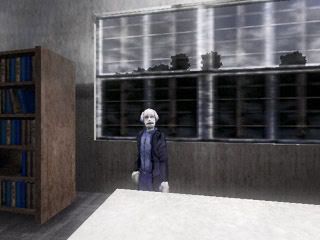
Hey Ahmet, good to see you're going through with this. Now, about the improvements, I really dig the new style. It definetly is an improvement, but the fact remains that it's half life 1. I realise that these are mostly alterations to the old backgrounds, and not newly taken hammer-shots or how ever you made them, but it's still half life 1. For example, maybe you could replace mister Polaski's hands with new photoshopped ones.
A quick example:
And on some of the models used the texture placing was not that great.
Take Cagri's picture here for example, maybe you can polish those inconsistencies away.
For example like so, another quicky:
Things I've done in the above picture:
- changed cagri's glasses and added a white-glassy look where the glasses are.
- tried to polish the texture inconsistencies away.
- added some very light shading underneath the table and chairs.
- added a strong shadow of Cagri.
Hope this gives you some ideas, looking forward to the re-release
#29
Critics' Lounge / Re: Concept background for Zombie-Project
Sun 29/07/2007 01:15:07
Thanks for the replies guys!
Here's another background I was working on today:
Here's another background I was working on today:
#30
General Discussion / Re: pokemon diamond screws up GBA game
Sat 28/07/2007 23:50:40Quote from: arthur.com on Sat 28/07/2007 23:48:09
in not a pokemon geek.

I'm afraid that is not for you to decide.
#31
Critics' Lounge / Concept background(s) for Zombie-Project
Thu 26/07/2007 18:37:42
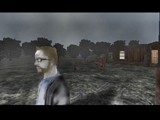
Hey there, as you might've seen in a previous thread of mine in C&C I'm currently beginning on a project involving, yes, zombies.
I'm still trying to decide to what resolution I should be using. So I decided to put away the high-res or low-res conflict in my brain and thought it would be good to try to make a background.
As you can see below it is not ideal for an ingame background. The exit area being at the bottom and all, which I personally hate.
Anyway, that's why I call it a concept background, just trying out a style and trying to get give it a bit of atmosphere.Now it is still a work in progress so it's a bit empty, still missing some bits and bobs like trash and other junk.
Anyway here it is:
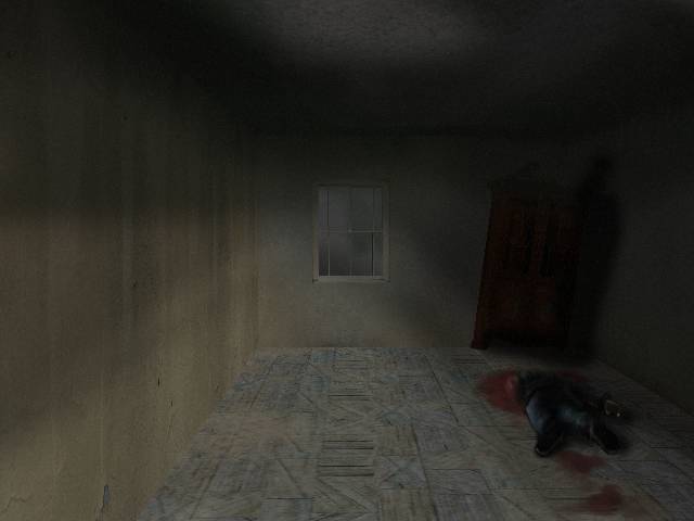
It's a bit hard to see but one of the cabinet's feet is broken of, so it's tilted against the wall.
C&C appreciated
-Mozesh
I'm still trying to decide to what resolution I should be using. So I decided to put away the high-res or low-res conflict in my brain and thought it would be good to try to make a background.
As you can see below it is not ideal for an ingame background. The exit area being at the bottom and all, which I personally hate.
Anyway, that's why I call it a concept background, just trying out a style and trying to get give it a bit of atmosphere.Now it is still a work in progress so it's a bit empty, still missing some bits and bobs like trash and other junk.
Anyway here it is:
It's a bit hard to see but one of the cabinet's feet is broken of, so it's tilted against the wall.
C&C appreciated
-Mozesh
#32
Critics' Lounge / Re: Character Sprite for C & C: Updated see last post
Tue 17/07/2007 23:07:51
Thanks for the reply Saber, this was actually made from a drawing I made:
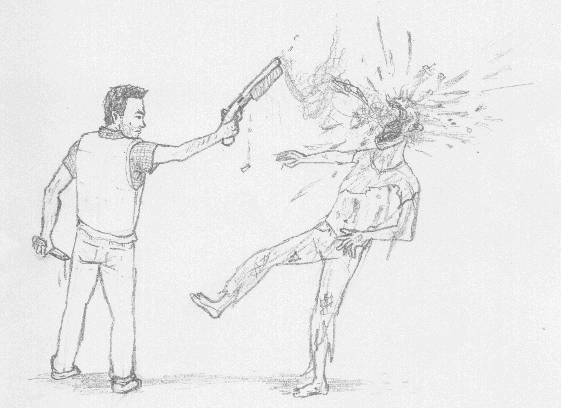
As you can see the pose is after he took a shot, by which the yellow lightning makes no sense.. just thought it looked cool.
As you can see the pose is after he took a shot, by which the yellow lightning makes no sense.. just thought it looked cool.
#33
Critics' Lounge / Re: Character Sprite for C & C: Updated see last post
Tue 17/07/2007 20:49:28
Thanks, and actually it's supposed to be a sawed-off shotgun but I kinda screwed it up...
#34
Critics' Lounge / Re: Character Sprite for C & C UPDATED
Tue 17/07/2007 18:30:22
Thanks for your reply Khris, I took your changes into account and changed it a bit.
Result here:
 Here's also one I quickly did just about now:
  It's a bit off at points...
Result here:
Here's also one I quickly did just about now: It's a bit off at points...
#35
Critics' Lounge / Character Sprite for C & C: Updated see last post
Tue 17/07/2007 10:03:53
Hey everyone, it's been quite a while since I last posted anything in the critics lounge... or any board for that matter.
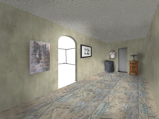
Anyway I'm working on a project now and this is a character from that project:

 **EDIT: Transparent background...**
I'm pretty statisfied with this attempt, but I'd like some comments on how to improve it. I especially have some trouble getting the hands right with only using 2 shades.
Thanks!
Ralph
Anyway I'm working on a project now and this is a character from that project:
**EDIT: Transparent background...**I'm pretty statisfied with this attempt, but I'd like some comments on how to improve it. I especially have some trouble getting the hands right with only using 2 shades.
Thanks!
Ralph
#36
Completed Game Announcements / Re: Infinity String - version 1.01
Wed 04/07/2007 00:22:01
When I first started the game up I was basically ready to go to bed. So I WAS going to skip all the intro text... but then I saw the beauty of the graphics. And I knew, that I was NOT going to NOT give this game the attention that it needs.
Anyway, I am going to try this game out for real soon. Looking forward to it!
Anyway, I am going to try this game out for real soon. Looking forward to it!
#37
AGS Games in Production / Re: CSI:MIAMI Horatio Caine Master Investigator
Sun 01/07/2007 13:57:45
Brilliant. The work of a genius!
#38
Completed Game Announcements / Re: A Cure for the Common Cold
Sun 27/05/2007 19:02:59
Great little game, loved it!
#39
General Discussion / Re: Help! XP went mad!
Fri 04/05/2007 10:10:52
I usually reinstall windows every 6 months to a year, it all depends on how smooth it's running. If it's running too slow for my taste and tweaking doesn't do too much. Bam, format.
Also next time you install windows, you might want to create 2 partitions. One for installing windows and everything, and another for just file storage, no files that windows uses for operating. That way you can format your 'windows-drive' and keep the files.
Though that partitions may become slow too, I'm not sure. But then you could place those files to the 'windows-drive' and format the 'files-drive' and put 'em back.
#40
General Discussion / Re: gmail love
Tue 01/05/2007 22:29:46
Googlemail works fine, if you ignore the spam. Personally I think hotmail is a lot better, but hey, that's just me.
SMF spam blocked by CleanTalk