Menu

Show posts

This section allows you to view all posts made by this member. Note that you can only see posts made in areas you currently have access to.

Show posts Menu

Messages - Questionable

#361
The Rumpus Room / Re: The MSPaint game
Tue 23/02/2010 04:00:57

My first thought was a mascot leading a mutiny against his sports team.... then I thought harder and weirder an came up with this!

P.S. Paint in Windows 7 is pretty badass... Pretty fun experiment.


NEXT!

A moustache that never should have existed...
#362
I think this instantly became the funniest thread on here...
#363
Critics' Lounge / Re: First impressions...
Fri 14/11/2008 07:06:40
The only thing I see that's holding back this female from appearing female is your use of lines. You have sharp angles all over the place.

Try drawing her without any straight lines, not as the final piece but just as an experiment. Also, in your last concept piece it seems as though her torso is sprouting from her hips, it has this odd faun/satyr look to it.

I understand that you're going for a tom boy look but most tom-boys are STILL women, what makes them instantly recognizable are their "chosen appearances." A Baseball cap, a hoodie, a short hair cut. They like maintenance free but still girly. You've drawn a man with boobs, there's nothing here that makes her a girl which is your MAIN problem. The tom boy thing is easy, her attitude will tell us that.

Let's focus on what Misj said. Curves!
#364
Quote from: derboo on Thu 13/11/2008 03:38:42
Last round, I had a great idea immediately, but couldn't find the time. Now it looks like I'm gonna have some time, but I guess I have to give some thought to the theme before I can sign up...

Same, I was going to have him trip and crash through the mirror and then the scene melts to a mental hospital. Now i've got to come up with a flea sales pitch.
#365
Critics' Lounge / Re: First impressions...
Thu 13/11/2008 17:28:19
I was just about to say:

Go look at some naked women. =P 

I suppose you got y point across though Prog.
#366
The only thing that irks me is:

The porch bulb is yellow but the porch is light like there's a white flood light on it. A little bit of color there might give it more of a subtle abmiance rather than an obvious -----------> Here's where something happens!
#367
Can you remove the light gray outline from the "mail" label? My eyes keep being drawn to it! =P
#368
Quote
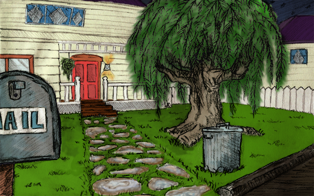
Questionable: How big do you like the picture to be colored at first? I love what you did with the cobble stones!
I resized your image to 960 x 600

I like starting with 1280 x 800 or 960 x 600 depending on the final size.
#369
The space between the Pteros belly and the egg (the white space) feels odd. I think his legs could point a little more toward the viewer, too.

I really like them both LeChuck! Great work.
#370
Quote from: Andail on Mon 03/11/2008 17:53:17
Dude(s), you have to use layers and build up your background and not just throw paint on top it.

It looks very flat and crayon-ish right now...I think there's long way to go from here

Agreed and Admitted.
#371
Five year old son... and here I am picturing you as a 26 year old...

You seem so youthful for some reason...

Wow, off-topic and mildly gay... I don't think I feel comfortable right now.
#372
I've used GIMP and I use Photoshop currently. They're both very good programs. The major difference between them is $400.

I wouldn't imagine doing this digitally without layers. It's more like traditional painting if you don't but that's not necessarily a good thing. Why paint over everything just to get it to look right when you can just repaint what you need, isolated from the rest of the image...

ANYWHO. Figured I'd throw up what I have so far. Now, keep in mind there's no way that I would use this in a game as is. You need to really straighten it out and tighten it up. I played around with some colors and these are the ones that felt the best. I've got to put some value into the image because right now there's no direction to the scene. What do you think so far?


#373
Something that I've always found helps me is to draw from the ground up. When I draw a person (with a pencil, at least) I start with bones, then I add muslces, then skin, then hair, then clothes.

When I draw a motorcyle I draw the engine, transmission, fuel lines.

I've never done a city scape but I would start off with a birds eye view. Streets, public transport, different neighborhoods... basically, making the city function, making it so that it actual COULD exist.

Before I draw something I always try to draw motive. Either what I'm drawing has a motive for existing, or the image itself is giving the viewer a motive to view it. What am I looking at this for? Is it to see how pretty the picture is? A glimpse at a dystopian future? A single frame story?

What's the focal point? a building? A monster? The Ship(s)?

I'm a little hungry and I'm not sure I just made any sense, so maybe after I eat i'll try to be more coherent.

TACO BELL... and away?
#374
I prefer to color as large as I can and then shrink it down to 2x the final size. Re-color and edit (Touch-ups, really.) Then I'll either o smaller than intended and blow it back up or just go to final size and put on polish. I'll have a color done tonight hopefully. I REALLY dig this image so I'm psyched to have a go. Maybe i'll give you some ideas of what's good, maybe i'll give you some ideas of what doesn't work. We'll see.
#375
Idea Ghost

Atmosphere Cobra 79

Composition Geraduatuza

Technique Geraduatuza

Functionality Coconut Shuffle
#376
I was going to write a long post but I think most of it can be summed up by the following:


Wow... those are some bright candles.
#377
Can you post a full sized image? or better, a link to one?
#378
His shoe gets cut off a bit on one side. I think the outline on his head and shoe could be a little less dark/closer to the head and shoe color, that is of course MY style, however, so don't do it unless you agree.

But the shoe... gotta fix it... IT'S BUGGING THE CRAP OUT OF ME!

Very nicely done though. *applauds*
#380
VKING!

The song was very well orchestrated and very cinematic. You didn't earn the gold for the quality of the song, however. You won because after reading your setup I could close my eyes, play the music and picture the scene unfold in such clarity I couldn't stand to not give you an award.


DEFINELICHT!

Personally, my favorite song of the bunch in terms of just listening to a song.  After reading your scenario, however, I completely did NOT expect the song you presented. It was a turn in a different direction than expected BUT it still fit the scene. Mostly you took silver because of the imagery of the scene and the quality of the song rather than them together.


BOOJIBOY!

I was incredibly conflicted about giving you third because I felt that the song deserved more than bronze but I just couldn't take the other guys down a notch. There was another entry with a similar twist but your song AND your scene felt more cohesive than the other. I suppose the only reason I couldn't move you up more is that in your scene you mention playing in the forest and a dark cave and the first half of the song didn't connect with that scene for me. At a certain point though it all caught up and fit gorgeously.


Congrats to all the winners and thank you to all the participants! Sorry for the delay I didn't expect that I would be moving into a new apartment as soon as I had to!
SMF spam blocked by CleanTalk