Wow... uh- I was going to type something but then I saw S's (lol) response. Spot on.
- Welcome to Adventure Game Studio.
This section allows you to view all posts made by this member. Note that you can only see posts made in areas you currently have access to.
#422
Critics' Lounge / Re: "Arcane" Board game sprites for C&C
Sat 19/07/2008 06:49:58Quote from: Hollister Man on Fri 18/07/2008 23:26:38
Those pieces look great indeed, the style *vaguely* reminds me of ... MUNCHKIN! The best card game EVAR
The main reason I posted was response to Questionable's edit. That looks rather ... questionable, if you look at it wrong, like he has a really big...*sword* :p
Everything I do is of questionable... something. It's part of being unique! =P
Thatnks for the shout-out man!
#423
Competitions & Activities / Re: Animation competition: Jump'n'run (July 6 - July 17) - WINNER ANNOUNCED
Sat 19/07/2008 06:45:58
I think a two week time period wouldn't get more entries but that it would make more sense. 14 days is a good time length and ensures that people like me, with one day off and a few nights to themselves would at least have more opportunities to finish one.
Though 3 days isn't much it can make a difference.
Also I have noticed a trend: people are coming up with more and more creative competition concepts but in doing so they are limiting the products more and more. Luckily Matti was very vague on the concept and the entries took full creative advantage but a lot of these comps weigh me down and slow me down by forcing me to adhere to there guidelines and themes.
#424
Critics' Lounge / Re: a cartoonish background *Updated with main character*
Mon 14/07/2008 08:06:32
I think the way he (face and jacket) is shaded makes him look weird... it's like you tried to hand make a gradient, which is unneccesary. Also I think that you can remove the cheek-bone definition... it looks a bit like a tumor. Other than that, it's good.
#425
Competitions & Activities / Re: Tune Contest (June 29 - July 13) ...or are you just glad to see me?
Mon 14/07/2008 02:50:14
Oh man! You should have given a time zone... =' [
#426
Competitions & Activities / Re: Tune Contest (June 29 - July 13) ...or are you just glad to see me?
Sun 13/07/2008 22:21:49
Can one person have more than one entry?
#427
Critics' Lounge / Re: "Arcane" Board game sprites for C&C
Fri 11/07/2008 22:02:10
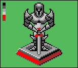
IMO the barbarian and the preist need to be touched up, the other two need two be polished and thfighter needs to be a fighter instead of a royal guard! =P
SO edits incoming:
{space reserved for edits}
SO edits incoming:
{space reserved for edits}
#428
Critics' Lounge / Re: "Arcane" Board game sprites for C&C
Fri 11/07/2008 21:10:27
I really liked KhrisUMCs edit, but I didn't think it was very intimidating! So I tried to mess around with it and utterly failed...
However I figured I'd put it up and Khris can berate me and maybe inspire you to make the fighter more of a TOTAL badass! =D
However I figured I'd put it up and Khris can berate me and maybe inspire you to make the fighter more of a TOTAL badass! =D
#429
Critics' Lounge / Re: The littlest walkcycle
Thu 03/07/2008 04:21:23Quote from: ProgZmax on Wed 02/07/2008 18:19:15
I made a couple of edits for you. One thing I noticed is that the program you're using places some random palette glitches in the frames, so...
Prog!!! OMFG! I love that liitle leg swing you have him doing! BADASSTOTHMAX!
Those are some killer edits there...
#430
Critics' Lounge / Re: Any Good?
Mon 30/06/2008 05:43:52
I like the look of it, but I DO have a couple of issues: The lines on the roof aren't even. The windows look a little bland, nobody just glues panes of glass to a building. The path could be a little more defined. Lastly, there's no real "tone" to the image. It's very neutral. If this is for a horror game, I want it dark. If this is for an action game I want vibrancy. If this is for a mystery game I want thinks to be ominous and detailed so I don't know what objects matter and which don;t until the last second.
There's nothing REALLY wrong with the image the way that it is (with the exception of that odd horizon/lake) but those little things could definately bump up the scene alot.
It's a real good style and a pretty badass look, polish this suck up and you've got a winner.
There's nothing REALLY wrong with the image the way that it is (with the exception of that odd horizon/lake) but those little things could definately bump up the scene alot.
It's a real good style and a pretty badass look, polish this suck up and you've got a winner.
#431
Critics' Lounge / Re: Crit on start menu for Farscape Game
Fri 27/06/2008 11:17:59
I think Kads edit is killer!
I do think that the face still needs more reworking, and I also think that the multi-colored and very high contracts highlights on the guy make it seem like these is a Plasma TV on, somewhere off to his left...
The pinks and purples just bother me... dunno why... but a REALLY killer edit.
I do think that the face still needs more reworking, and I also think that the multi-colored and very high contracts highlights on the guy make it seem like these is a Plasma TV on, somewhere off to his left...
The pinks and purples just bother me... dunno why... but a REALLY killer edit.
#432
Critics' Lounge / Re: artwork for my game (sprites and portraits)
Fri 27/06/2008 11:14:20
EDIT: Ben, I love what you did with that face.
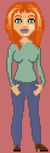
ANYWHO the proportions are usable, though to make them make sense you have to really nail the silhouette, I suggest drawing with only two colors until you can TELL that what you have drawn is a girl... and don't cheat and use clothes! They come later... Using this method I came up with this body:
 .
.
Also, you're using erroneous colors, like three colors on the shoe? I tried to reuse all of your colors, but I think you can clean up the image a bit.
Your Low-lights (shadows) and Hi-lights, appear totally random. I left Lydia Jr here fairly neutral but you can tell that the light source is coming from the top left of the screen. I left it neutral so that you can mess around with it more easily and get a feel for how I did, what I did and then re-draw Lydia and the rest of your characters with your new experience.
You will notice, that I did not draw a belt a sword or a scabbard strap. Well, to be totally honest I forgot at first. But, by the time I was done drawing Lydia I felt like she didn't need a belt, if was just one more thing to be annoying during animation. I drew a scabbard strap, but it seemed like a silly concept... how is that practical? Only if your hip or ribs have unavailable real estate. In actual combat it would be less beneficial to have your main offensive and defensive item on your back; an enemy can more easily remove it, a blow to the back cannot be defended, it is a cumbersome reach for the hilt and in order to pull the sword out you must have long arms or a hilt that twist... or a very roomy scabbard, additionally the scabbard cannot be easily removed and brandished as a bludgeoning device and the strap will hinder movement and it Will constantly rub while moving AND NOBODY LIKES CHAFING!
SO anywho... I just couldn't figure out why I've seen it in movies but, never in a historical context... That's when I realized: Because there are better places to keep your sword. SO I was going to draw a belt, but again I feel that the less there is to animate... THE BETTER! SO I figured I would explain it away b saying that she simply attach's her scabbard to a stout leather scabbard loop designed into the side of her pants...
But then i figured I'd tell the truth...
LASTLY! I didn't change her face because I thought that was the essence of who she is, you did a great job on the head.
On another note, why do you have so many images about Lydia... Why is she the first character you listed? It makes me think that you like her better than the main character, and if YOU do than i probably will, then I will wonder why I am playing the game about this less interesting character... All theories...
ANYWHO the proportions are usable, though to make them make sense you have to really nail the silhouette, I suggest drawing with only two colors until you can TELL that what you have drawn is a girl... and don't cheat and use clothes! They come later... Using this method I came up with this body:
.Also, you're using erroneous colors, like three colors on the shoe? I tried to reuse all of your colors, but I think you can clean up the image a bit.
Your Low-lights (shadows) and Hi-lights, appear totally random. I left Lydia Jr here fairly neutral but you can tell that the light source is coming from the top left of the screen. I left it neutral so that you can mess around with it more easily and get a feel for how I did, what I did and then re-draw Lydia and the rest of your characters with your new experience.
You will notice, that I did not draw a belt a sword or a scabbard strap. Well, to be totally honest I forgot at first. But, by the time I was done drawing Lydia I felt like she didn't need a belt, if was just one more thing to be annoying during animation. I drew a scabbard strap, but it seemed like a silly concept... how is that practical? Only if your hip or ribs have unavailable real estate. In actual combat it would be less beneficial to have your main offensive and defensive item on your back; an enemy can more easily remove it, a blow to the back cannot be defended, it is a cumbersome reach for the hilt and in order to pull the sword out you must have long arms or a hilt that twist... or a very roomy scabbard, additionally the scabbard cannot be easily removed and brandished as a bludgeoning device and the strap will hinder movement and it Will constantly rub while moving AND NOBODY LIKES CHAFING!
SO anywho... I just couldn't figure out why I've seen it in movies but, never in a historical context... That's when I realized: Because there are better places to keep your sword. SO I was going to draw a belt, but again I feel that the less there is to animate... THE BETTER! SO I figured I would explain it away b saying that she simply attach's her scabbard to a stout leather scabbard loop designed into the side of her pants...
But then i figured I'd tell the truth...
LASTLY! I didn't change her face because I thought that was the essence of who she is, you did a great job on the head.
On another note, why do you have so many images about Lydia... Why is she the first character you listed? It makes me think that you like her better than the main character, and if YOU do than i probably will, then I will wonder why I am playing the game about this less interesting character... All theories...
#433
Critics' Lounge / Re: Comic Style Wiesn
Thu 26/06/2008 20:35:09
I like it, but as mentioned before I think that you need to adress the dimensions of the image.
ie. There are no shadows, therefore, there is no depth.
I F***ING LOVE the colors and the style, though.
ie. There are no shadows, therefore, there is no depth.
I F***ING LOVE the colors and the style, though.
#434
Competitions & Activities / Re: June 20-27 - From the Nightmares of H.G. Wells Comes- SPRITE JAM!
Mon 23/06/2008 08:03:46
Is this more "Steampunk" or more "H.G. Wells?"
#435
Competitions & Activities / Re: Animation Competition: Behind the Mask
Mon 23/06/2008 08:01:13
Grrrrrr.... Internet isn't letting me upload it. I'll go over to a friends house after work tomorrow and try it there.
Sowwy everybody
Sowwy everybody
#436
Critics' Lounge / Re: My principal is a bloodsucking fiend... no really!
Mon 23/06/2008 07:59:30
I actually think the sprite is spot on, maybe lighten the skin and go more toward a pink color than a "peach" color.
The Portrait on the other hand, DOES look like an Asian tourist... a confused Asian tourist.
One of the most powerful indicators of emotion are eyes and, more so, eyebrows. By covering up his eyes and eye brows you leave him emotionless, then by having the mouth the shape it is he seems a combination of nervous, worried and pensive (read: perplexed.)
Eyes are generally in the middle of someones face... strange as it seems. (Sidenote, I've noticed that belly buttons seem out of place on naked people, it's in the middle of our torsos... but when wearing pants it seems lower... ANYWHO) So we lower his eyes... now his ears are out of place AND huge. Let's do some surgery on those. His nose looks like you're trying to slip in a subliminal "L." The shape of the face is weird, our faces are generally symmetrical. His head is placed very high up on his neck. Our jugulars do not actually get smaller the farther into our bodies it is. The shirt he is wearing does not appear to have buttons, nor does it seem to have a collar... of course he IS tiny, so they would be impossible to see, but for the most part you shouldn't add arbitrary details.
It's just a matter of tweaking. Once you get the general stuff fixed , then it's about polish, making it all fit nice.
You have a real good base, that sprite is pretty neat-o, so use THAT as the blueprint. Not a guide, not inspiration, the BLUEPRINT! That means a 2D replica of the final product.
Great job so far, man.
#437
Critics' Lounge / Re: Walking animation... Am I going in the right direction... PUNS!
Mon 23/06/2008 07:45:52
It looks like it is:
Frame 1 - Frame 2 - Frame 3 - Frame 2
*repeat*
1>2>3>2>1>2>3>2>1>2>3
I think you need to have 5 frames:
1 > 1.5 > 2 > 2.5 > 3 > 2.5 > 2 >1.5
*repeat*
Also, I believe that people have mentioned that you try twisting his torso and also having him "bob" up and down. Have you tried either of these?
Personally, I think you should focus on sideways movement first. In my experience characters move sideways more than they do north and south.
Lastly, this is an improvement over the original! I do feel you can make it EVEN better though, I've seen the improvements you've made on the backgrounds...
Good work so far.
#438
Critics' Lounge / Re: My new Backgrounds :D
Mon 23/06/2008 07:36:17
I'm going to have to agree with what has been said already.
The first background is good, it has a nice style and could definately work in a game, however, I think it might be a bit too dark to navigate. As this is just a proof of concept it doesn't make sense to be picky but, as soon as I examined the room I realized that the wall was basically tiled all across the room and I couldn't help but instantly lose interest in it... not entirely, but I wasn't as engaged. Yes, the light does stand out a little out of place; everything is so subdued in the image and that is a very vibrant few pixels. The shadow on the floor niggled at me as well, though I was more bothered by there being only the color blue outside.
Overall, you could use it in a game. There's nothing interesting in the scene to examine or make it an important setting but you're not looking to use it in a game. If all the backgrounds looked like this I would say that you would have a top-notch system... 3d rendering like this would probably be a little faster than drawing from scratch, too.
The second background feels very "Cut & Paste." The trees don't really root into the ground very well, instead it looks like they intersect with the ground. The lighting on the canopy seems arbitrary and makes it difficult to "believe" the setting. The tree on the right side of the intersection looks like a mirrored copy of the tree at the end of the path. The path in the foreground is fine but, the path in the mid/background doesn't blend into the horizontal path well, it seems more like something standing up off the path than an actuall part of the path . Lastly, the shape of the ground seems very lumpy, I've never seen a piece of ground that looks that dramatic, though this is a excusable because the earth can take virtually anyshape given the right conditions.
It's a very cool style and if you can get the process streamlined and refined, you'll have a very usable system.
Really nice work Bucket!
#439
Competitions & Activities / Re: Animation Competition: Behind the Mask
Sun 22/06/2008 11:46:09
Should have mine up tonight!
Couldn't reply... internet problems, sorry.
Couldn't reply... internet problems, sorry.
#440
Critics' Lounge / Re: C & C for outdoors BG
Sun 15/06/2008 10:04:57
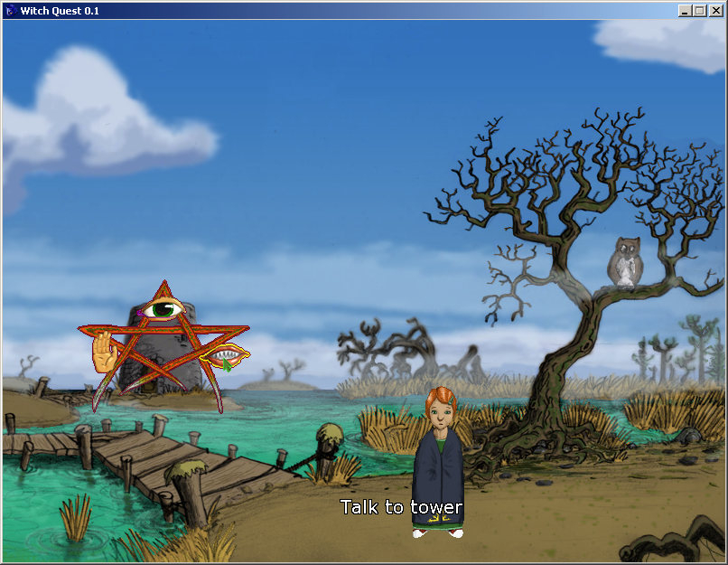
I'm sure I could find all kinds of examples of minimalist painting, that's a good point, but it would be just as valid for someone to say; "My characters look out of proportion 'cause I was channeling my inner Pablo Picasso."
Like I said, it could be part of the atmosphere: I don't know the scene, the setting, the music, the interactions that will occur, or practically ANYTHINg about this screen. All I know is what I see. When i'm playing the I will probably be focusing on A.) My character and B.) Things to interact with; I see an owl, a tree, some water and a tower. I would assume that the bridge is a gateway to another scene, or it's a scrolling background that will continue on in that direction. That's not a lot of stuff, of course it doesn't need to be alot of stuff. It wasn't a criticism as much as it was a PSA, I wanted you to know it so that if you didn;t want people to feel that way about it, you could change it, if that's something you don;t mind or were aiming for, now you know.
I believe that pslim means: On your GUI, there are interweaving lines (sticks?) and it is visually busy, especially with the icons, instead of having weaving lines, why not just the shape itself as one object.
Personally, I have to disagree with this, if that is the case. I think the style of the GUI is pretty sick, though I like where Garage is going.
all I did was highlight the aqua color and change the hue, so it's not as nice as it could look but it doesn;t take me out of the experience as much. I left the yellow outline on the lips, cause I think that's badass.
SMF spam blocked by CleanTalk