Menu

Show posts

This section allows you to view all posts made by this member. Note that you can only see posts made in areas you currently have access to.

Show posts Menu

Topics - Renegade Implementor

#21
Reality-on-the-Norm / Death clause exemption
Sat 24/07/2010 13:16:02
I recently had someone ask if the current death clause could be amended with the following exception: characters could be killed only by

a) the person who created the character in the first place

b) the death was done for story-telling reasons and not for shock value or dislike of a character.

Please discuss
#22
Taking the beginning work on walk animations started by Scruff & Brentimous, I've attempted (however poorly) to finish the remaining views with the goal of having a "base template" that can be easily adapted to other/new characters in this style.  The one difficulty is different characters have different degrees of spacing between the legs, going from none to a few pixels (see here for reference)

I've gone as far as I can with the animations I've done (Elandra's up view, Davy's down & up views, altered side, all of Simon).  Clearly improvements can (probably need) to be made but I'm unsure on how/what needs to be done to achieve something that looks decent or at the very least: presentable.

Elandra
   

Davy
   

Simon
   

I'm provide the sprite-sheets so anyone can have access to an individual frame to point out what needs to be done (or for paint-over purposes).
Elandra
http://farm5.static.flickr.com/4009/4585484996_9bf4651eab_o.png
http://farm5.static.flickr.com/4046/4585484970_dc505a2797_o.png
http://farm4.static.flickr.com/3304/4584859173_c9fb017c0f_o.png

Davy
http://farm3.static.flickr.com/2769/4532919873_2320031d61_o.png
http://farm5.static.flickr.com/4027/4585485080_10d416e820_o.png
http://farm5.static.flickr.com/4030/4584859235_6277a2d109_o.png

Simon
http://farm5.static.flickr.com/4048/4584859217_95b9d82856_o.png
http://farm5.static.flickr.com/4005/4584859203_79c62e7301_o.png
http://farm5.static.flickr.com/4006/4585485010_0338d20c10_o.png

Thanks
#23
Reality-on-the-Norm / Moving forward
Thu 01/04/2010 05:05:23
I was recently informed by the Reality-on-the-Norm Revitalization Committee that due to the lack of new/concerted interest since we got the site/form space back, they have come to the conclusion that the streamlined canon approach has failed.

Therefore they have voted & agreed that the way forward is to reboot the series (think of the Batman, James Bond, Star Trek movies for example).  There will be a post in a weeks time or so to begin discussion on what/who should be retained.
#24
Happy birthday RoN.

Nine years ago marks the anniversary of the release of the first RoN game.  So use the chance to celebrate and indulge in cake.  It is a birthday after all.  :)
#25
One of the things the series lacks is a proper logo that can be put on the website and banners and the like.

To that end, I'd like to propose & announce a project to create a suitable logo using the series title: "Reality-on-the-Norm".

If all are agreeable and any are interested in creating a logo for the series, it can be posted in this thread.

Shall we make the deadline: Jan 5th, 2010, which is when the community as a whole can debate and determine which logo is most suitable.

Edit: as for sizes:
for the banners: horizontal banners are about 468 x 60 in size? Vertical banners are around 137 x 490? These numbers are based on banner sizes I've seen on the net.

As a stand alone logo, I'd say it would be best to keep it's maximum dimensions at a width of 200 pixels.

I'd rather not impose too great a limit on things as I don't want to stifle creativity.  If a design is too large, just know that it would have to be shrunk down and so create accordingly.
#26
So "And Another Thing..." was released a few days ago and I'd like to hear the thoughts of anyone who's read it.  I realize that the book won't have Adams voice and will ready very differently.

Before I contemplate the possibility of buying it, I have one question.  As a piece of fiction, is it able to stand on it's own merits?  Or to put it more simply, is it any good or at least an enjoyable read?
#27
The sprites on the left are the 1st pass on the character, the four sprites on the right are the modifications that were passed back to me.  While I'm fine with the body & uniform, the face doesn't work.  The expression & facial structure come across as being too hesitant and "weak" which isn't right for the character.

I can't seem to find a visual layout that restores the confidence/experience of the character that doesn't revert to the original sprites, which might be a step backwards in graphical quality.  Does anyone have any suggestions on how the face/expression can be altered to make it "stronger" for lack of a better word.


x2 for ease of viewing

#28
I've received a request from DasTobias who would like his following games be removed from the RoN database due to his dissatisfaction of the quality of the games.

The games in question are: Intergalactic Life, Forest on the Norm, Toxically Earth, Intergalactic Life 2.0, Mika's Surreal Dream, It's Just a RON-Game, Easter in RON, Mika's Surreal Dream 2: The Dream Comes True

While I'm willing to accommodate his request, I'd like to hear from the RoN community so the community reaches a decision one way or the other.
#29
Reality-on-the-Norm / An update on graphics
Mon 02/03/2009 04:06:17
As the death of our previous forum killed the last progress report, here it is again:

Work is continuing on the newer Krysis-style of backgrounds and characters.  There are a number of characters (which can be seen here) that are considered ready enough to start the animation process.
#30
With the subject of how to rejuvenate RoN being mentioned recently, it seems like something that should be discussed and a decision made.  Below are several options that seem the most reasonable/able to implement.  Some have probably been discussed in the past.

Leave as is â€" No changes are made to the site.  The general size of the community will likely remain small as will yearly output of games.  Efforts focused in strongly promoting the series to become known and generate interest in new community members.
* Promoting the series is most likely a good thing in any case.

Reduce/Clean up character & game databases â€" Characters who fall under a certain classifications (such as high school students or merchants) or have appeared once/minor use could be bundled together on to one “themed” character page.  The more established characters would retain their separate pages.  A Wiki could be used as a resource for individual character bios.
Any games that has multiple versions could be condensed into one page.  The demos could be moved to the demo page.
Optional: This has been brought up in the past â€" a number of games could be removed and put on a separate location on the site so they would still be available for download.  In the past, this idea seems to stem from removing games that are dubious in quality.

Over-arcing theme â€" A scripted event that affects the series in an attempt to generate plot hooks and limit/temporarily remove characters for use.

Core team of writers â€" Rather than rely on the possibility of someone submitting a new game out of the blue, a team is formed with the purpose of generating new content and moving the series forward.  The Open submission format would still remain.

Reboot series â€" Series starts over from square one.  The general concept is retained as are a few character/character types.  For the reboot, the series is given a rough historical outline (and possible city map) to provide a bare-bones structure.  Every release from 2001 to the time of series reboot would be kept on a separate page, available for download.
#31
Critics' Lounge / RoN hands
Tue 23/12/2008 04:25:00
I'm trying to get a handle on hand design.  I've used a method to get the hand shapes below, but I'm not sure if they look right.  I don't know if they need to be shortened by a pixel or two, are two wide, or the colouring placement in the back view to simulate depth/shadow/whatever.  This is for RoN, so the style is certainly not realistic.

Any suggestions would be appreciated, paintovers are welcome.


x2
#32
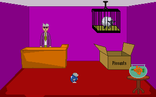
A man lies dead on the platform of Reality on the Norm's train station.  As PC Leon Evans, you'll have to discover the motive, the murder weapon and track down the murderer.

It can be downloaded from the RoN site or from this link.

Screenshot:
#33
You play Monty Mole, the 1980's video game character. Monty (on the run from Intermole) starts out in a pit full of body parts, then emerges from the hole in the center of town square. It's your mission to help Monty seal up the pit from which he emerged to escape his pursuers.


This is a reconstruction of the original game "Monty on the Norm" created by Mikko Salonen. The purpose of this reconstruction was to update the game to make it playable on more recent versions of Windows and to improve as many visual aspects of the game as possible.

The game can be found on this PAGE.
or just download directly from this LINK.

Update:
Monty on the Norm has been updated to AGS 3.3.
#34
You play the role of Death, the Grim Reaper, who has come to Reality to reclaim the soul of Michael Gower. Who's that? Michael Gower is better known as the zombie who is currently running for mayor of Reality.


This is a reconstruction of the original "The Repossessor".  The purpose of this reconstruction was to update the game to make it playable on more recent versions of Windows and to improve as many visual aspects of the game as possible.

Many thanks to Dave Gilbert, the author of "The Repossessor", for his permission and encouragement.

The game can be downloaded from this PAGE.
#35
After a few iterations and the assistance of Krysis and others on the RoN forum, I'm taking Krysis' suggestion and displaying the sprites here as there are a few things about them that I feel need work.


There are a few things about the top row side view(s) that strike me as needing improvement.  One: I'm not too sure about the shape/look of the face but I'm unsure if it could be improved given the size limits.  Two: the shape of the arm bugs me, I'm wondering if it's not the right shape/location, needs some sort of shoulder definition, or if the shape of the jacket itself might be causing problems.

With regards to the robed figures, my question relates to the sigils (gold lines).  Would (or should) the sigils be visible in the side view and if so, how far would they go (two-three pixels)?

Thanks in advance.
SMF spam blocked by CleanTalk