Menu

Show posts

This section allows you to view all posts made by this member. Note that you can only see posts made in areas you currently have access to.

Show posts Menu

Messages - Ryan Timothy B

#2661
General Discussion / Re: Indy Joneses!
Tue 03/06/2008 03:18:38
Ok.  I watched this on the weekend.  There were a few scenes that were pretty useless, but not many.  I didn't have the same negative feelings towards this film as the majority of you seem to have.  But the ending WAS definitely too much.

Spoiler
I didn't mind the whole crystal skull and what not.  Meh, it's just like the rest of the movies.  The thing I did NOT like was where the aliens starting circling around until all their bones merged into one living breathing alien.  That was just stupid.  It wasn't needed.  I would have been happy with the room falling apart as it was, they ran away like they did.  I don't care about that russian lady, so she can still burn.  But WHY oh WHY did they feel they needed this damn thing to come to life?

The one thing I noticed you guys saying about the skull how it looks like some cheap prop item.  I think the only reason it looks so bad, is because it should have had a small amount of dust on the skull when Indy first collected it.  I know it was already picked up very recently, so it shouldn't be too dusty.  But it lacks all interest when the item you're collecting is already polished and shiny with no need for elbow grease.  Just doesn't have the priceless and old feeling anymore.  Also NO one in that movie, that held the skull, acted out the real weight of it.  They all handled it like it was only a plastic skull.

Also the intro scene outside the Area51 bunker could have actually been outside.  There was no reason they needed spotlights pretending to be the sun.  It just doesn't cut it, they did a poor job on the lighting.
[close]

That's all I needed to say.
#2662
Quote from: Alarconte on Mon 02/06/2008 05:22:05
is an efect easy to do with the Smudge tool.

Okay, please please don't touch the smudge tool!  Looking at your first background with all the photoshop smudging and the lighting effects, it's really bad.  Just because the tool is there, doesn't mean it NEEDS to be used.  I even notice with your newest version how often you applied photoshop effects. 
-the grass is the photoshop brush stamp
-the path and building have the Noise effect
-the door is a bunch of random blobs of brown with the motion blur at an extreme amount going vertical
-the tree looks like it was made with the finger paint tool or the darken tool
All these different effects just look really bad.  You have this Paint approach to drawing with a heavy touch of poorly photoshop'd effects.
I'm not saying don't use photoshop effects ever.  I use them all the time.  Just try to keep it simple if you don't know how to use them (not that I'm saying I know the best techniques. it's just obvious you're over using them in this background).

All I'm saying is it's not a horrible background, it's only a crazy mess of different styles.  Pixelized here, smudging there, gradients here, etc.  Keep things as one style.


Also your characters legs are as tall as your door.  You're going to be doing some massive scaling on those character sprites.  One thing I've noticed is that character scaling looks like crap.
The character looks great, if only you would do your backgrounds with that pixelized style.
#2663
This is how I look at it.  I'm not a scientist.  I don't read many books on space, planets, theories and the what-not.

The only way I could see Mars once being able to support life is if the Sun was once hotter than it is now.  Which to me makes complete sense, it's a big fire that has been dying down for years (or at least it should be).  It would make Earth a very warm and most likely an unlivable planet.  Which to me also makes sense in the fact that we have a core that is molten lava.  If a big ball of molten glass was to float around the sun, (if the sun was cooling down) one can only imagine the outer layers will harden and cool turning into the 'crust' area of the molten ball.  And of course after a while, the center would harden and cool.

It's either that the sun was hotter, or the planets were closer.  I remember hearing once that the planets (and moons) are all spreading further and further away from each other and the sun.

Perhaps we are looking at this the wrong way, maybe our next livable planet will be Venus or Mercury (if we ever live that long).  I doubt it though.


Quote from: evenwolf on Sat 31/05/2008 03:18:06
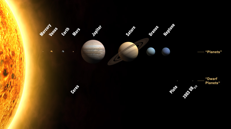
And there's 9 planets in the Solar System.

Also evenwolf, I thought they said they discovered there are 11 planets now?
#2664
Critics' Lounge / Re: Another BG for critique
Sun 01/06/2008 18:37:23
You guys don't think the washed out colors set the mood for a droopy and scary environment?  I thought it did, otherwise I wouldn't have led him into that direction.  Let me know.

I don't know really.  I just saw his first image and figured it was too bright with color like a family Disney cartoon.


Doesn't this look scarier?


I plan on making a horror game eventually; if I'm in the wrong direction perhaps it's better to know now before I start working on it.
#2665
Quote from: evenwolf on Sun 01/06/2008 06:48:26
NASA estimates that if there is ice on Mars, it will gladly scoop up enough to make snowcones for all the children of Africa.

Everyone likes snow cones.


Perhaps it's not ice though.  What if the soil on mars has a very low melting point and it turned into a glassy blob?  (but I doubt that completely. it is also 5:40am and I for some reason I haven't slept yet, so my mind has entered 'dream state'. g'night)
#2666
Critics' Lounge / Re: Another BG for critique
Sun 01/06/2008 10:19:29
Quote from: JuuJuu on Sun 01/06/2008 07:53:43
but I do think the shadows on the bed is great.
Yeah I was just giving him ideas on crossing objects with shadows to kind of connect the objects in the room, rather than separating them like they were in his first posting.
The darkness of the shadows probably don't look as good since I didn't darken the back wall (the one with the painting) on my edit.  I didn't even darken the shadow from the dresser.


Suitor:
I'm not a big fan of the peeling wallpaper that is on the left wall.  It almost makes the eye believe that the corner of the room is where the vertical line of the peeling wallpaper is.

What I'd seriously do is get rid of that hanging bit of wallpaper on that wall, and replace it with three slices in the wallpaper as if Wolverine slashed it with his 3 knives.  Or something along those lines.  Make the player think something bad may have once happened in this room.

And since JuuJuu mentioned it, I may as well say it too.  I'm not too fond of the picture on the wall.  Too cartoony and distracts the player from the possibly fearful environment this could be.
Perhaps something like this: http://i63.photobucket.com/albums/h128/MFX13/oil3__.jpg (googled up 'scary oil painting')

Also that separating line between the wallpaper sheets behind the painting should be very soft and almost unnoticeable.  I keep staring at it. (or just get rid of it completely)

I also like the stain in carpet, perhaps it could be a touch lighter as well.  I'd try it just to see what it looks like.
#2667
Critics' Lounge / Re: Another BG for critique
Sat 31/05/2008 18:10:51
There is nothing creepier than a dark room with dark shadows.  Could use a little darkening.


I lowered the brightness and contrast and darkened the shadows.  Looks a lot less inviting, much more creepy.
#2668
Critics' Lounge / Re: First Sprite C&C
Sat 31/05/2008 00:09:57
You have a nice style for those characters.  They have this cartoony feel to them that I like.

I think the chef could use some more work.  The face and hat just don't fit your style of the other characters, including the mustache.  His body is 'alright', perhaps you could draw the serving tray on a slight angle towards the camera so it doesn't look like he's balancing a bar in his hand.

I like the evil grinning kid though.  I hope that's the playable character.

    Oh, and fix that darned boob!  Looks like she has something wrong with her ribcage, doesn't look like a breast at all (by that I mean: the breast on the right should be moved to the left closer to the center of her chest).
#2669
The biggest scam that I forked over money for was the DVD infrared remote control and receiver for the original Xbox.  Without it, you couldn't play DVD's.  Why the hell not?  It's not like the infrared receiver did anything but connect you to the remote.  Why couldn't they just use the xbox controllers?  A for play.  X for pause.  B for stop.  Y for rewind/forward speed.  It was just a huge gimmick to cash in on more money.  I even think it was $40.
I think the 360's don't need a remote this time around though.

#2670
General Discussion / Re: Have you got a pony?
Wed 28/05/2008 04:20:50
I somehow couldn't help but notice that the name Dimitri is in GTA 4.  Perhaps Obi was playing GTA 4 too much?
#2671
I did not know that we were the only ones with Boxing day.  I would've sworn USA had boxing day also.  hmmm

Also on a personal note, I have NO idea what boxing day is supposed to be or where the name originated.  I just know there are amazing deals at almost every store on Boxing day.  Last boxing day I got in an already Big lineup with an hour and a half before Future Shop even opened.  You should have seen the line once the store did open.  OMG.  It wrapped around the whole building.
#2672
I noticed my challenge was on your blog.  Cool stuff.
#2673
Critics' Lounge / Re: First background C&C
Thu 22/05/2008 22:33:57
Not to be harsh, it is good but it's very square and boring.

Try adding some more items to the building to give the eye something to actually look at.


That's an image of an apartment building I searched up in Google.  I tried to find one closest to your building.
See how each window has something going on inside.  Some blinds are crooked, some are opened, some are closed.  There are lamps on the outside.  A nice canopy above the door.  Some plants out front.  Different colored bricks around the windows and on the corners of the building.  Some fancy brick work at the top of the building.


I also don't like how the sides of your building are slanted inwards at the top, with only 2 floors.
#2674
My website is www.bryvis.com - I got it from combining parts of my name and my brothers names: Brad + Ryan + Travis
It didn't take much thought, and I think it's catchy enough to remember.
You said you have a wife.  Perhaps a daughter/son as well?  Try combining parts of their names if you can't think of anything else.
#2675
The Rumpus Room / Re: The AGS Stickam Room
Wed 21/05/2008 23:53:31
AGS Happy Hour - what are you waiting for?
#2676
---Be warned, this video contains blood and graphic removal of limbs.---
http://www.youtube.com/watch?v=Sdjt6Bl5qdY
---Be warned, this video contains blood and graphic removal of limbs.---

I was in Stickam and LGM mentioned 'Gabelstapler' German forklift training, so I youtubed the video and watched it 3 times already.
LGM said the video was popular, but I decided to post it anyway just in case someone here hasn't seen it, or wants to see it again.  It has English subtitles.  First 2 minutes are boring.  It's very funny.
#2677
She looks much better in the second photo.  She's more human in it.

I'd rather date a girl who plays Halo (or video games in general), than one who doesn't.  Just make sure you aren't stepping on her brothers toes.
#2678
Sorry for the delay, I'll announce the winners now.

I found this to be somewhat challenging to decide, since they were all great!


1st Place: Lionmonkey
     I really love the work you put into him dematerializing.
Great Job!
  -  I'm looking forward to your new animation challenge.


2nd Place: Stajp
     There was something about that fly landing on his shoulder that I couldn't resist.  You also did a good job on the look of the fly-man.  Great job!


3rd Place: TwinMoon
     I watched this several times just to see his little arm flop through the air as it falls to the ground.
Great job!


Strange Visitor: BOTH of your entries gave me quite a chuckle, especially the Mor-Man. haha
Twirlly: I really loved the idea of him appearing in the vent and how he opens it. I was really amused by your entry.

Great job everyone!
#2679
Ignoring how you want the couch for now, the back wall should be visible through the bottom of the desk.

That's a big and crazy light.
#2680
You should change the perspective on the carpet before you start working on it.  It doesn't follow the tiles on both sides.
SMF spam blocked by CleanTalk